Wikipedia:Featured picture candidates/November-2008
| Featured picture tools |
|---|
Please cut and paste new entries to the bottom of this page, creating a new monthly archive (by closing date) when necessary.
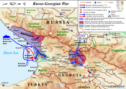
- Reason
- very informative, highly technical image.
- Articles this image appears in
- 2008 South Ossetia war
- Creator
- Andrei nacu
- Support as nominator --Nergaal (talk) 03:41, 22 October 2008 (UTC)
- Support Great EV, excellent vector image. Elucidate (parlez à moi) Ici pour humor 15:50, 22 October 2008 (UTC)
- comment. Sepparatists is misspelled. de Bivort 17:07, 22 October 2008 (UTC)
- Whereabouts? I can only see it once, where it's correctly spelt with one 'p' - Separatist. --jjron (talk) 07:11, 23 October 2008 (UTC)
- Breakaway is certainly misspelled (legend). MER-C 09:56, 23 October 2008 (UTC)
- It's been fixed. I just realised that the creator is updating this map as we comment and overwriting the nommed version rather than adding edits, so Debivort was right, separatist was misspelled on the version he looked at. --jjron (talk) 23:25, 23 October 2008 (UTC)
- Breakaway is certainly misspelled (legend). MER-C 09:56, 23 October 2008 (UTC)
- Comment - symbols and lines are used for the sea campaign that are never explained in the key. Specifically: The crossed swords, the Georgian red line (Was that an offensive? If not, it shouldn't have the same look at the line into South Ossetia) There's also an unexplained icon at Tskhinvali, looks like it might mean a paratroop drop? --Golbez (talk) 06:53, 23 October 2008 (UTC)
- Oppose, needs sources for verifiability. gren グレン 19:28, 23 October 2008 (UTC)
- and you need more edits and reading the refs in the article it is linked to. Nergaal (talk) 20:26, 23 October 2008 (UTC)
- Support Now that typos have been fixed, it's a detailed, accurate, and scalable image.--HereToHelp (talk to me) 15:55, 24 October 2008 (UTC)
- What verifiable sources do we have to prove this is accurate? It very well might be but diagrams, graphs, maps, must show sources to verify their accuracy. Especially wen they are trying to be featured. gren グレン 12:41, 26 October 2008 (UTC)
- Comment Wasn't there Russian artillery too? Why is Grozny spelled Groznyy? And it's not obvious why the location of airports is important. Narayanese (talk) 11:36, 25 October 2008 (UTC)
- Conditional support, with comment. Should war be capitalised? The article refers both the South Ossetia War and the South Ossetia war. Either way, excellent EV, very detailed and easy to read. Verify it and I'm good. Amphy (talk) 20:45, 30 October 2008 (UTC)
- Definitely OPPOSE Details in map require verifiable sources. Specifically, no reliable sources cited for depiction of naval blockade. A map that reflects the opinion of the maker does depict credible fact.Moryak (talk) 21:31, 25 August 2009 (UTC)
Promoted Image:2008 South Ossetia war.svg --Wronkiew (talk) 16:02, 2 November 2008 (UTC)
- Renamed to File:2008 South Ossetia war en.svg . MER-C 07:52, 17 February 2009 (UTC)
- Reason
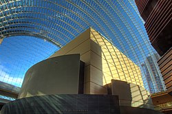
- I'm usually utilitarian when it comes to images, but I really like this picture. It provides a wonderful feeling of actually being inside the Kimmel Center, and is thus a great addition to the article. I really like the composition and lighting - it makes me want to visit the Center.
- Articles this image appears in
- Kimmel Center for the Performing Arts
- Creator
- Jon91870
- Support as nominator --Kubigula (talk) 17:50, 26 October 2008 (UTC)
- Oppose image too small for easily reshot image. Also it is soft even at this resolution, likely due to the HDR process. Mfield (talk) 18:15, 26 October 2008 (UTC)
- Oppose - very nice composition, but definitely too blurry for FP. Luca (talk) 19:06, 26 October 2008 (UTC)
- Regretful oppose Minorly lacking in sharpness. I like the composition, but... Elucidate (parlez à moi) Ici pour humor 17:51, 28 October 2008 (UTC)
- Oppose Also seems to have a lot of ghosting, almost polka dotted in places. Fletcher (talk) 20:42, 29 October 2008 (UTC)
Not promoted MER-C 01:49, 3 November 2008 (UTC)
- Reason
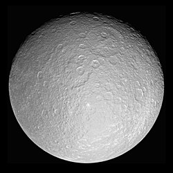
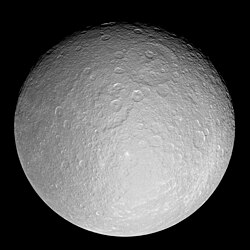
- Encyclopedic,illustrates subject well,hi-res.Visually striking and good quality.
- Articles this image appears in
- Rhea (moon)
- Creator
- NASA,uploaded by WolfmanSF
- Support as nominator --Fireaxe888 (talk) 17:25, 26 October 2008 (UTC)
- Comment How do I add the fpc tag to the image page? When I try in Wikipedia Commons it says I should put it on the English Wikipedia,but putting it on the enwiki page doesn't work because the image is transcluded.--Fireaxe888 (talk) 17:32, 26 October 2008 (UTC)
- Just create the page on enwiki, it will show up next to what is transcluded from Commons. Edit this image page to see the difference. —Vanderdecken∴ ∫ξφ 17:56, 26 October 2008 (UTC)
Oppose this version,Supportfull res version- brilliant quality, but why was a smaller version uploaded? —Vanderdecken∴ ∫ξφ 17:56, 26 October 2008 (UTC)- Comment
I uploaded a full-res version on commons,but it isn't showing up.--Fireaxe888 (talk) 18:13, 26 October 2008 (UTC)
Never mind,fixed --Fireaxe888 (talk) 18:14, 26 October 2008 (UTC)
- Oppose blown highlights --Uncle Bungle (talk) 10:53, 27 October 2008 (UTC)
- Comment The crop is too tight but it could be easily fixed if the nominator makes the file have more "black background".--Caspian blue 22:00, 26 October 2008 (UTC)
- Support the new version.--Caspian blue 03:26, 30 October 2008 (UTC)
- Support Though I would prefer a wider crop per Caspian Blue.--HereToHelp (talk to me) 23:58, 27 October 2008 (UTC)
- Edit one then.--HereToHelp (talk to me) 23:25, 28 October 2008 (UTC)
- Comment Sorry,I'm not too good at image editing.Could anyone here help? --Fireaxe888 (talk) 16:28, 28 October 2008 (UTC)
- Comment As requested by Fireaxe888, here's the picture with a larger black border. - Jameson L. Tai talk ♦ guestbook ♦ contribs 16:45, 28 October 2008 (UTC)
- Support Anti-Crop The original was too tight. The blown highlights are only a couple of dots here and there and are insignificant. Noodle snacks (talk) 04:31, 29 October 2008 (UTC)
- Scores in the southern hemisphere, as well as the northern edge of many impact craters. *shrugs* --Uncle Bungle (talk) 11:13, 29 October 2008 (UTC)
- Support new version with more black space. Highlights a pity, but this isn't easy to re-shoot... --Janke | Talk 07:53, 29 October 2008 (UTC)
- Comment I had originally uploaded a contrast-enhanced version of the NASA image that was also reduced in size. In switching to the full-size version, the contrast enhancement was lost. I have now restored that in the upper image, while the lower image is the original version with margin adjustment only. The original NASA image does look a bit washed out, due probably mostly to the surface characteristics of this ice world. WolfmanSF (talk)
Support I support the cropped version. Very nice. Elucidate (parlez à moi) Ici pour humor 14:01, 30 October 2008 (UTC)
- Comment At this point, the crop is similar on both versions; please specify whether you support the NASA original or the contrast-enhanced version. WolfmanSF (talk) 15:24, 30 October 2008 (UTC)
- Definitely NASA version - the contrast-enhanced version blows out more highlights. --Janke | Talk 16:53, 30 October 2008 (UTC)
Promoted Image:PIA07763 Rhea full globe5.jpg MER-C 01:50, 3 November 2008 (UTC)
Previous versions of Blood values picture and discussion
[edit]Original - Reference ranges for some major blood tests, sorted by mass.
- Reason
- In twelve octaves, it presents the constituents of your blood.
- Articles this image appears in
- Reference ranges for blood tests
- Creator
- Mikael Häggström
- Support as nominator --Mikael Häggström (talk) 07:37, 26 October 2008 (UTC)
- Oppose for now References would be nice. The upper value for C-reactive protein looks too low. Lighter colours would be a plus, atm the text is hard to read on purple and blue labels. Narayanese (talk) 09:28, 26 October 2008 (UTC)
- Comment I've made some colors a brighter. This is the new version. I may just as well promote the svg version, since it will likely be edited many many times.Mikael Häggström (talk) 20:31, 30 October 2008 (UTC)
- Colours look good now. There are a few references left (at least D-dimer and haemoglobin). I suggest using a permanent version of the wikipedia page as ref list (i.e. link with oldid). Narayanese (talk) 07:24, 1 November 2008 (UTC)
- I think it's a good idea with permanent link as reference, if we provide the external references for the article. Mikael Häggström (talk) 07:35, 1 November 2008 (UTC)
- Colours look good now. There are a few references left (at least D-dimer and haemoglobin). I suggest using a permanent version of the wikipedia page as ref list (i.e. link with oldid). Narayanese (talk) 07:24, 1 November 2008 (UTC)
- Comment I've made some colors a brighter. This is the new version. I may just as well promote the svg version, since it will likely be edited many many times.Mikael Häggström (talk) 20:31, 30 October 2008 (UTC)
Brighter and some values corrected - Reference ranges for some major blood tests, sorted by mass.
- Does anybody know by the way how to avoid having it appear so blurry as I see it on my computer? In Inkscape it appears completely sharp. Mikael Häggström (talk) 20:31, 30 October 2008 (UTC)
- I don't know, but unless it's fixed, it severely detracts from enc. SpencerT♦C 21:05, 30 October 2008 (UTC)
- Probably it's unfixable, since it's the Firefox plugin that makes it razor sharp when clicking on it, but the not-so-perfect WikiMedia plugin that shows the image in the article. So I suggest it is a derived .png version of the image which should be exhibited on the article, as well as being nominated as featured image. However, before deriving that .png image we have to make sure everything else is fixed in the original .svg version. So first we need to fill Image:Reference ranges for blood tests - by mass.svg#Edits needed as much as we can for the moment, avoiding having to upload and derive a .png file several times. Mikael Häggström (talk) 07:44, 1 November 2008 (UTC)
- I don't know, but unless it's fixed, it severely detracts from enc. SpencerT♦C 21:05, 30 October 2008 (UTC)
- Question: From the graph, I get the impression that blood is approx. 70% protein by weight (700 grams/liter). This conflicts with the article blood, which states Plasma, which comprises 55% of blood fluid, is mostly water (90% by volume) - this just doesn't make sense; if blood contains 49.5 % water, plus 70% protein, that sums to 119.5% in all... Sure, blood is thicker than water, but not that thick! ;-) --Janke | Talk 17:06, 26 October 2008 (UTC)
- Comment Sorry for that mistake. They were 10 times too large. It's corrected now.Mikael Häggström (talk) 20:31, 30 October 2008 (UTC)
- Question: I see the ref in the article, but I'm not sure about the maxiumum range for Ferritin. The article on Ferritin say the max range for males is 300 supported by this link. In addition the same link says 12 is the min range. SpencerT♦C 00:25, 28 October 2008 (UTC)
- Comment It's adapted to that additional reference. Feel free to add more to the main article if you come across other ones. Mikael Häggström (talk) 20:31, 30 October 2008 (UTC)
- You may want to fade the Ferritin from 12 to at least 25 for men and 12-15 for women because I'm getting different sources, too (My med book). SpencerT♦C 21:03, 30 October 2008 (UTC)
- Otherwise, this is pretty decent and informative. Support. SpencerT♦C 21:03, 30 October 2008 (UTC)
- You may want to fade the Ferritin from 12 to at least 25 for men and 12-15 for women because I'm getting different sources, too (My med book). SpencerT♦C 21:03, 30 October 2008 (UTC)
- Comment It's adapted to that additional reference. Feel free to add more to the main article if you come across other ones. Mikael Häggström (talk) 20:31, 30 October 2008 (UTC)
- Oppose at least until we can be sure everything is correct here. The total protein content still doesn't make sense. Hemoglobin is defined as a protein in its own article, so how can there be more of that than total protein? --Janke | Talk 22:04, 30 October 2008 (UTC)
- Comment It think it's because total protein is actually the total plasma protein, while hemoglobin is present inside the red blood cells. I agree it should be noted. Better make a list of things needed to be edited for the next update. Mikael Häggström (talk) 05:57, 31 October 2008 (UTC)
Not promoted MER-C 01:50, 3 November 2008 (UTC)
Click arrow button to play the historic recording:
- Reason
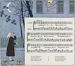
- A work by a major illustrator who studied and exhibited as a fine artist before turning to children's literature. The particular selection for this nomination is notable as the first song for which a recorded performance survives: "Au Clair de la Lune" (historic recording) is a traditional French folk song recorded in 1860. Restored version of Image:Au Clair de la Lune children's book.jpg.
- Articles this image appears in
- Au Clair de la Lune, Louis-Maurice Boutet de Monvel
- Creator
- Louis-Maurice Boutet de Monvel
- Support as nominator --DurovaCharge! 09:23, 25 October 2008 (UTC)
- Comment I like the image, but it seems too small (due to not only the file size but also the big portion of the score on the illustration)--Caspian blue 19:10, 25 October 2008 (UTC)
- The file size itself is within standard FP parameters. I'll leave it to fellow Wikipedians to decide whether the score deserves to be regarded as a separate element or a complementary part of the whole. To my eye they seem very closely tied. An English translation of the lyrics is available at the song page. DurovaCharge! 19:49, 25 October 2008 (UTC)
- Support Good EV and, as always, an excellent restoration by Durova. Great job. Elucidate (parlez à moi) Ici pour humor 20:54, 25 October 2008 (UTC)
ConditionalAt first I thought, "blah, there's not much enc in this", but after going to the article and listening to that recording... Put a link to the recording itself in the caption, and you get my support! --Janke | Talk 06:31, 26 October 2008 (UTC)- Good suggestion; done. DurovaCharge! 07:40, 26 October 2008 (UTC)
- It would be even better if you could put a nice little "Play" button into the caption... (I tried, but couldn't figure out how to do it neatly... ;-) --Janke | Talk 16:49, 26 October 2008 (UTC)
- That'd be a wonderful feature. I don't think I've ever seen it done. DurovaCharge! 22:48, 26 October 2008 (UTC)
- Please revert my button experiment if you don't like it... (Or, can anyone do it better?) --Janke | Talk 20:33, 27 October 2008 (UTC)
- Thanks very much for the edit! :) Does this mean you support? DurovaCharge! 21:51, 27 October 2008 (UTC)
- I guess that's what I said... ;-) --Janke | Talk 22:14, 27 October 2008 (UTC)
- I've taken the liberty of tweaking a bit further. I had to figure some of these out when working on featured sounds. Shoemaker's Holiday (talk) 02:12, 28 October 2008 (UTC)
- Great! I didn't know of that "noicon" trick... ;-) --Janke | Talk 09:28, 28 October 2008 (UTC)
- It's not very well-documented. I learned it from the {{Listen}} template when I was making a new template for use in DYKs. =) Shoemaker's Holiday (talk) 07:30, 29 October 2008 (UTC)
- Great! I didn't know of that "noicon" trick... ;-) --Janke | Talk 09:28, 28 October 2008 (UTC)
- I've taken the liberty of tweaking a bit further. I had to figure some of these out when working on featured sounds. Shoemaker's Holiday (talk) 02:12, 28 October 2008 (UTC)
- I guess that's what I said... ;-) --Janke | Talk 22:14, 27 October 2008 (UTC)
- Thanks very much for the edit! :) Does this mean you support? DurovaCharge! 21:51, 27 October 2008 (UTC)
- Please revert my button experiment if you don't like it... (Or, can anyone do it better?) --Janke | Talk 20:33, 27 October 2008 (UTC)
- That'd be a wonderful feature. I don't think I've ever seen it done. DurovaCharge! 22:48, 26 October 2008 (UTC)
- It would be even better if you could put a nice little "Play" button into the caption... (I tried, but couldn't figure out how to do it neatly... ;-) --Janke | Talk 16:49, 26 October 2008 (UTC)
- Good suggestion; done. DurovaCharge! 07:40, 26 October 2008 (UTC)
- Support Very nice. SpencerT♦C 19:12, 26 October 2008 (UTC)
- Support Per above --Massimo Catarinella (talk) 16:10, 28 October 2008 (UTC)
- Oppose, the FP criteria says about the resolution. "Still images should be a minimum of 1000 pixels along the smallest side; larger sizes are generally preferred." 681 × 600 is simply not enough for a FP. bogdan (talk) 14:18, 2 November 2008 (UTC)
- Support - very original and encyclopedic. Intothewoods29 (talk) 19:28, 2 November 2008 (UTC)
- Support plenty of resolution for this subject matter. --Leivick (talk) 23:27, 2 November 2008 (UTC)
Promoted Image:Au Clair de la Lune children's book 2.jpg MER-C 01:50, 3 November 2008 (UTC)
- Reason
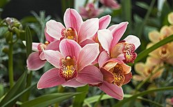
- Sharp detailed image clearly showing subject.
- Articles this image appears in
- Cymbidium
- Creator
- Flying Freddy
- Support as nominator --Flying Freddy (talk) 05:33, 25 October 2008 (UTC)
- Support nice--Caspian blue 19:13, 25 October 2008 (UTC)
- Support Great image, I like the level of detail. Elucidate (parlez à moi) Ici pour humor 20:53, 25 October 2008 (UTC)
- Support The background is a bit busy, but its the right comprimise between background blur and subject detail. The only thing unfortunate is the leaf covering out of focus pink petal. The technicals seem good and the subject itself is sharp and clear. Noodle snacks (talk) 04:34, 29 October 2008 (UTC)
- Support I like the image because it is very sharp, clear, and has a lot of detail. Meganmccarty (talk) 23:31, 1 November 2008 (UTC)
- Support well done. —αἰτίας •discussion• 01:54, 2 November 2008 (UTC)
Promoted Image:Orchidacea Cymbidium.jpg MER-C 01:50, 3 November 2008 (UTC)
- Reason
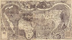
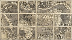
- Another gem from the LOC - a ridiculously high-res scan of the only surviving copy of the first map to name America. To get this under the 20 meg max I downsampled to 75%, then compressed (which left some artifacts, though these should be tolerable at 13,500 × 7,522 px). Others are welcome to try other combinations of downsampling and compression. This is a composite of 12 original sheets. Perhaps the original would be a better choice for featuring/articles, but my evidently inadequate computer plus awful internet connection have been giving me difficulties and I really can't spend the time to put that up myself. If others would like to try (hopefully with a decent connection it shouldn't take long!) it's also at http://hdl.loc.gov/loc.gmd/g3200.ct000725C (on the right).
- Articles this image appears in
- Waldseemüller map, Americas, Cosmographiae Introductio, Early world maps, Continent
- Creator
- Martin Waldseemüller
- Support as nominator --Calliopejen1 (talk) 03:56, 24 October 2008 (UTC)
- Comment I cannot view the full-res image on the commons, I get a red cross in the top left corner. - Mgm|(talk) 11:20, 24 October 2008 (UTC)
OpposeStitching needs attention. —Krm500 (Communicate!) 13:56, 24 October 2008 (UTC)- Is it possible to do it better? The 12 individual sheets don't seem to match up well enough to do it perfectly. I'm downloading the original right now and will fiddle with it. Chick Bowen 19:45, 24 October 2008 (UTC)
- I would support the alternate version with the twelve maps separated. —Krm500 (Communicate!) 02:15, 25 October 2008 (UTC)
- I'm having trouble with the jp2 file. Perhaps someone else would upload the separated version? (link--caution: it's rather large.) I agree with you--I don't think a stitch is a great idea, given that the map was not originally made in one piece. Chick Bowen 03:40, 25 October 2008 (UTC)
- Maybe this should be suspended until someone can upload the other version? I downloaded the other one but my computer does not have enough memory to open it. (The non-composite version is a 75 meg jp2, even larger than the composite 25 meg jp2.) Irfanview is a good free program that can handle jp2s and convert to jpg. Calliopejen1 (talk) 23:09, 25 October 2008 (UTC)
- I've tried both Irfanview and the jp2 plugin for GIMP and had no success. I think my view for now is
oppose stitched version; the original had latitude and longitude marks on every sheet, and I think the stitched one is something of a misrepresentation, sorry. I'd support the original as it stands if someone can manage to upload it. Chick Bowen 22:29, 26 October 2008 (UTC)
- I've tried both Irfanview and the jp2 plugin for GIMP and had no success. I think my view for now is
- Maybe this should be suspended until someone can upload the other version? I downloaded the other one but my computer does not have enough memory to open it. (The non-composite version is a 75 meg jp2, even larger than the composite 25 meg jp2.) Irfanview is a good free program that can handle jp2s and convert to jpg. Calliopejen1 (talk) 23:09, 25 October 2008 (UTC)
- I'm having trouble with the jp2 file. Perhaps someone else would upload the separated version? (link--caution: it's rather large.) I agree with you--I don't think a stitch is a great idea, given that the map was not originally made in one piece. Chick Bowen 03:40, 25 October 2008 (UTC)
- I would support the alternate version with the twelve maps separated. —Krm500 (Communicate!) 02:15, 25 October 2008 (UTC)
- Is it possible to do it better? The 12 individual sheets don't seem to match up well enough to do it perfectly. I'm downloading the original right now and will fiddle with it. Chick Bowen 19:45, 24 October 2008 (UTC)
- Enthusiastic support no matter what version is the final, though I would be happy to see a better stitch job done. This is indeed one of the most precious historical maps of all times and to make it public was a good action. Any idea how to get a decent copy of the Carta Marina Portugallenses of 1516? -- Alvesgaspar (talk) 21:04, 26 October 2008 (UTC)
- You mean this one? It's also weirdly stitched, sadly, and I can't find a high enough resolution version to be readable. Chick Bowen 03:47, 27 October 2008 (UTC)
- Yes, that is the one. -- Alvesgaspar (talk) 09:01, 27 October 2008 (UTC)
- Comment Jackaranga graciously helped out, taking advantage of computer power evidently superior to my own, and now we have a non-composite version above also. The commons page won't load the picture for me, but it seems to be a server/thumbnailing problem - if I download the image to my computer I can open it just fine. Calliopejen1 (talk) 21:29, 27 October 2008 (UTC)
- Support Non-composite version, very high encyclopedic value, very good resolution and detail. —Krm500 (Communicate!) 22:10, 27 October 2008 (UTC)
- Support non-stitched version per my comments above. Chick Bowen 03:23, 28 October 2008 (UTC)
- Comment The pages are lined up, but the illustrations are not. The minimal separation of the pages emphasizes the boundaries of the map illustrations. The misalignment therefore looks messy. I recommend separating the pages more and breaking them up with a darker color. Alternately, the illustrations could be lined up in a grid. Either way, the pages are separated by two different colors of margin, and this needs to be fixed. The rough edge of each page is backed by a light gray color. Some of the scans are also then separated by a white background. Wronkiew (talk) 05:16, 28 October 2008 (UTC)
Promoted Image:Waldseemuller map 2.jpg MER-C 01:50, 3 November 2008 (UTC)
- Reason
- A 1945 documentary film by a major Hollywood director about a World War II battle in Italy. John Huston's portrayal of the battle and its conditions was so frank that for some time the Army considered the work unusable except as a training film. Selected for the National Film Registry in 1991. Does not create a default thumbnail due to large file size.
- Articles this image appears in
- John Huston, The Battle of San Pietro, Battle of San Pietro Infine
- Creator
- John Huston, for the United States Army
- Support as conominator --DurovaCharge! 00:25, 29 October 2008 (UTC)
- Support as conominator (and .ogg converter) — Bastique demandez 01:51, 29 October 2008 (UTC)
- Oppose I think 320x240 is just too small. I understand the merits and would definitely support this if it was a large size, but this isn't near approaching original size. gren グレン 23:54, 29 October 2008 (UTC)
- Image:Shooting Captured Insurgents - Spanish-American War.ogv and Image:Searching for bodies, Galveston 1900.ogg were both recently promoted to featured and have the same size. DurovaCharge! 05:54, 30 October 2008 (UTC)
- This image is a motion picture, but I wonder this nomination is in this featured photo candidates".--Caspian blue 03:25, 30 October 2008 (UTC)
- We don't have a Featured Video Candidates page. There are plenty of videos and animations that have become featured pictures. Raven4x4x (talk) 04:57, 30 October 2008 (UTC)
- It's Featured Picture Candidates, not "featured photo candidates", and a video is a motion picture, i.e., it's a valid nom. --jjron (talk) 08:08, 30 October 2008 (UTC)
- Oppose. Sorry, but as the nom points out this doesn't create a thumbnail, in articles, or even on the image page itself. To me this is just getting too far from the concept of an FP being an image that makes a reader want to know more, given that it doesn't display as an image unless you run the whole thing. You'd have to be pretty committed before you'd manage to track down the actual picture part of this, and most users never would. --jjron (talk) 08:15, 30 October 2008 (UTC)
- Sometimes the dynamics of featured picture voting mystify me, and frankly this is one of those times. We're lucky to have a John Huston film in the public domain--this man directed many of Humphrey Bogart's best movies. This isn't a throwaway example of Huston's work either; it's been selected by the National Film Registry. And it's a documentary about a historic World War II battle--one gritty enough to use real body bags while the war was still underway. Yet it gets opposed for being the same size as other recently featured videos of less significance, and then because of a technical thumbnailing issue? We were very fortunate to get this into one upload without breaking it up into multiple files because it is much larger than the normal file limit. It's like showing The Maltese Falcon and getting bad reviews because of stale popcorn. DurovaCharge! 09:16, 30 October 2008 (UTC)
- I think that assessment (of my comment) is completely wrong. There are two categories of Featured Pictures. There are Wikipedian creations such as photos, diagrams, graphs, etc., and there are reproductions of already important works. This is a mediocre reproduction of a great video. I think of this as an 800x600 of Starry Starry Night. It doesn't mean Van Gogh isn't important. It doesn't mean we aren't lucky to have it. It just means that to properly capture the original and become an FP it should be larger. And, I use this criteria for all videos. As for the thumbnail, that's a problem with Wikimedia software not with the film... gren グレン 12:04, 30 October 2008 (UTC)
- With respect, it's currently the largest file on Commons. Shoemaker's Holiday (talk) 22:44, 30 October 2008 (UTC)
- I do my best to accommodate feedback, but the demand simply isn't feasible in this instance. Realistically, how would I approach a developer and justify a request that would further increase what is already the largest media file on Wikimedia Commons, when the playback dimensions of the current version are already the same size as other recent featured picture promotions of the same type? No reason has been provided why the minimum playback dimensions must be changed since last month. DurovaCharge! 00:09, 31 October 2008 (UTC)
- I must reiterate that I have not supported previous small videos. And the file size is not a function of quality but of length. I think my request is reasonable. Files on Wikipedia up for featured picture (video) should approach the native dimension of the original film (of course this is difficult to ascertain from an analog source but I think it's safe to say this is much smaller). This is the same requirement we have for images so why note for videos. Wikipedias technical limitations are no reason to change our expectations of quality. And, for the record, while I like that this video is in one file, I would prefer 6 files in 640x480 resolution (not just stretching this image, but of native quality) and I would support them for FP. I think the other recent featured videos to which you refer are just the result of a hankering for some featured video content. They shouldn't have been featured if they are that small. There are some 640x480 videos now (Galloping Gurdy, etc.) and they deserve to be FP in my opinion. Below that without suitable reason is tiny for me and I think this is a perfectly suitable criterion to have. gren グレン 02:51, 31 October 2008 (UTC)
- We've had this discussion about video size before, without a satisfactory result. I personally find 320x240px pretty small as well, and while Durova points out some recent promotions of that size, they haven't exactly been overwhelmingly supported. --jjron (talk) 07:41, 31 October 2008 (UTC)
- Gren, let me put this another way: at the current dimensions this is already more than five times the maximum file upload size. If it hadn't been for the help of a developer it would have had been a six part file with its current dimensions. DurovaCharge! 08:06, 31 October 2008 (UTC)
- I understand but technical limitations and the difficulty in overcoming them doesn't make it good quality for me. If Wikipedia ever hopes to have long clips in featurable quality it needs to make serious decisions about bandwidth and max file size because 20MB doesn't cut it. gren グレン 00:39, 4 November 2008 (UTC)
- Gren, let me put this another way: at the current dimensions this is already more than five times the maximum file upload size. If it hadn't been for the help of a developer it would have had been a six part file with its current dimensions. DurovaCharge! 08:06, 31 October 2008 (UTC)
- We've had this discussion about video size before, without a satisfactory result. I personally find 320x240px pretty small as well, and while Durova points out some recent promotions of that size, they haven't exactly been overwhelmingly supported. --jjron (talk) 07:41, 31 October 2008 (UTC)
- I must reiterate that I have not supported previous small videos. And the file size is not a function of quality but of length. I think my request is reasonable. Files on Wikipedia up for featured picture (video) should approach the native dimension of the original film (of course this is difficult to ascertain from an analog source but I think it's safe to say this is much smaller). This is the same requirement we have for images so why note for videos. Wikipedias technical limitations are no reason to change our expectations of quality. And, for the record, while I like that this video is in one file, I would prefer 6 files in 640x480 resolution (not just stretching this image, but of native quality) and I would support them for FP. I think the other recent featured videos to which you refer are just the result of a hankering for some featured video content. They shouldn't have been featured if they are that small. There are some 640x480 videos now (Galloping Gurdy, etc.) and they deserve to be FP in my opinion. Below that without suitable reason is tiny for me and I think this is a perfectly suitable criterion to have. gren グレン 02:51, 31 October 2008 (UTC)
- I do my best to accommodate feedback, but the demand simply isn't feasible in this instance. Realistically, how would I approach a developer and justify a request that would further increase what is already the largest media file on Wikimedia Commons, when the playback dimensions of the current version are already the same size as other recent featured picture promotions of the same type? No reason has been provided why the minimum playback dimensions must be changed since last month. DurovaCharge! 00:09, 31 October 2008 (UTC)
- With respect, it's currently the largest file on Commons. Shoemaker's Holiday (talk) 22:44, 30 October 2008 (UTC)
- I think that assessment (of my comment) is completely wrong. There are two categories of Featured Pictures. There are Wikipedian creations such as photos, diagrams, graphs, etc., and there are reproductions of already important works. This is a mediocre reproduction of a great video. I think of this as an 800x600 of Starry Starry Night. It doesn't mean Van Gogh isn't important. It doesn't mean we aren't lucky to have it. It just means that to properly capture the original and become an FP it should be larger. And, I use this criteria for all videos. As for the thumbnail, that's a problem with Wikimedia software not with the film... gren グレン 12:04, 30 October 2008 (UTC)
- Sometimes the dynamics of featured picture voting mystify me, and frankly this is one of those times. We're lucky to have a John Huston film in the public domain--this man directed many of Humphrey Bogart's best movies. This isn't a throwaway example of Huston's work either; it's been selected by the National Film Registry. And it's a documentary about a historic World War II battle--one gritty enough to use real body bags while the war was still underway. Yet it gets opposed for being the same size as other recently featured videos of less significance, and then because of a technical thumbnailing issue? We were very fortunate to get this into one upload without breaking it up into multiple files because it is much larger than the normal file limit. It's like showing The Maltese Falcon and getting bad reviews because of stale popcorn. DurovaCharge! 09:16, 30 October 2008 (UTC)
- Comment Can somebody make a still thumbnail from this movie, and package it together wih a play button as in the "Au Clair de la Lune" illustration? That would address the above concern... --Janke | Talk 17:15, 30 October 2008 (UTC)
- I'll get back to my point here, since the other discussion veered away from it. One of the risks of putting things up at FPC is that people may oppose them. I hardly think it's fair to say my oppose is akin to complaining about having stale popcorn. For mine, this is basically one step away from providing a link to an image on an external site and claiming that as a valid nomination; by following the link the reader could view it, so what does it matter that it's on an external site? If the wikimedia software can't display this, then perhaps it was unwise to nominate it until the technical issues are resolved. It reminds me of a nom made earlier in the year, that, if I remember correctly, was in PDF format and thus didn't display as an image, and was resoundingly opposed mainly for that reason. I can't remember any regulars rushing to its defence. And if plenty of other people find this non-image FPC worthy, then they will support it and my oppose won't matter anyway. --jjron (talk) 07:41, 31 October 2008 (UTC)
- I think it might be a recent issue with the thumbnailer. I just uploaded Image:Scincus scincus.ogv and, surprise, the thumbnailing is borked.
 Facepalm. See WP:VPT#More .ogv thumbnailing problems. MER-C 08:25, 31 October 2008 (UTC)
- I'll see if something can be done about that. .ogv thumbnailing has been an issue before. DurovaCharge! 08:28, 31 October 2008 (UTC)
- It's not the difference between .ogg and .ogv. Its the version of ffmpeg2theora I used which apparently is too current for our ffmpeg thumbnail generator to pick up its meta tags. When the developers update our generating program, the thumbnail will be updated. Bastique demandez 21:46, 31 October 2008 (UTC)
- I'll see if something can be done about that. .ogv thumbnailing has been an issue before. DurovaCharge! 08:28, 31 October 2008 (UTC)
- I think it might be a recent issue with the thumbnailer. I just uploaded Image:Scincus scincus.ogv and, surprise, the thumbnailing is borked.
Comment How do you view the .ogg format? I suspect my security settings are blocking it anyway, but just out of interest. TerriG 149.155.96.5 (talk) 11:09, 31 October 2008 (UTC)
- Given that the thumbnailing issue can't be resolved without developer attention (and they've got more urgent things on their hands), would it be appropriate to withdraw this nomination? DurovaCharge! 23:20, 31 October 2008 (UTC)
- Bug filed, though the devs are preoccupied with creating fundraising widgets. MER-C 09:04, 1 November 2008 (UTC)
- Reason
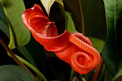
- Well lit, good technicals. I feel it has good enc in spathe, spadix and inflorescence in particular.
- Articles this image appears in
- Inflorescence, Spathe, Spadix, Anthurium, List of Anthurium species
- Creator
- Noodle snacks
- Support as nominator --Noodle snacks (talk) 00:01, 29 October 2008 (UTC)
- Support Good quality and to meet all the requirements Muhammad(talk) 15:55, 29 October 2008 (UTC)
- Support Stunning image, great sharpness. Serious 'Wow'. Good job. Elucidate (parlez à moi) Ici pour humor 13:59, 30 October 2008 (UTC)
- Support mostly per the above, very nice. Cat-five - talk 07:28, 31 October 2008 (UTC)
- Comment It's an amazing picture, but it seems to be floating in mid air, any idea where the stem is? TerriG 149.155.96.5 (talk) 11:10, 31 October 2008 (UTC)
- Brighten in photoshop and it is easier to tell, but it comes from about 2/3rds of the way across to the righton the bottom (its quite visible without brightening it but it doesn't really stick out). Noodle snacks (talk) 13:56, 31 October 2008 (UTC)
- Support —αἰτίας •discussion• 01:52, 2 November 2008 (UTC)
Promoted Image:Anthurium scherzerianum 2.jpg MER-C 07:05, 5 November 2008 (UTC)
- Reason
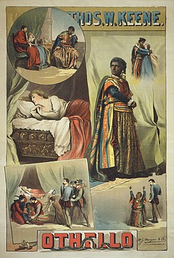
- Victorians knew how to make a theatrical poster. Hell, for that matter, they had far better staging and costumery than our minimalist modern-day performances usually reach. This poster of Othello shows some key scenes and characters in an attractive way.
I actually started doing a restoration of this, then decided I preferred the paler colours. If people like, I could happily provide an alternate.
Please look at this one at full zoom. It really does reward a closer look =)
- Articles this image appears in
- Pretty much all Othello-related articles. It features prominently in the template, and I added it to Othello, which lacked a strong lead image.
- Creator
- W.J. Morgan & Co. Lith.
- Support as nominator --Shoemaker's Holiday (talk) 14:13, 28 October 2008 (UTC)
- Support Bewareofdog 21:50, 28 October 2008 (UTC)
- Support. Great quality. Amphy (talk) 20:28, 30 October 2008 (UTC)
- Support. - Mgm|(talk) 12:34, 31 October 2008 (UTC)
- Support --Massimo Catarinella (talk) 20:26, 4 November 2008 (UTC)
Promoted Image:Thomas Keene in Othello 1884 Poster.JPG MER-C 07:05, 5 November 2008 (UTC)
- Reason
- A good quality, high resolution image of the city. Another version of this image was nominated here, but withdrawn due to some stitching errors. This image has both the sea level heights at the extreme left & right the same. The undulating horizon is a geographical feature due to the presence of the Pugu Forests, Pugu Hills and the Kisarawe Mountains. The image is unique with no other free or commercially available alternatives. It was originally meant to be 360 degree panorama but due to some problems, is a few degrees short of that with a few meters of the ocean view cut-off. Unfortunately, it is not possible to re-shoot as the building is not usually open to visitors and is currently undergoing some repairs.
- Articles this image appears in
- Dar es Salaam
- Creator
- Muhammad
- Support as nominator --Muhammad(talk) 12:54, 28 October 2008 (UTC)
- Support. A good improvement in alignment and shows good detail of the city. Diliff | (Talk) (Contribs) 13:02, 28 October 2008 (UTC)
- Conditional support there is still a tilt (50-60 px) in sea level left/right that needs to be fixed. --Janke | Talk 13:43, 28 October 2008 (UTC)
- Oppose It still looks boring to me. Sorry.--Caspian blue 19:33, 28 October 2008 (UTC)
- You have the right to your opinion, but I don't think that is a valid reason to oppose. Muhammad(talk) 14:50, 29 October 2008 (UTC)
- I'm sorry that you are hurt by my honest opinion, but that is almost same as "no wow factor" at Commons' featured picture. I don't believe the picture to be a featured material.--Caspian blue 20:13, 29 October 2008 (UTC)
- Commons and wikipedia have different criteria. While commons gives preference to quality and beauty, wikipedia considers encyclopedic value and uniqueness of the image. A no wow factor may thus be acceptable at commons but IMO it is not here. Muhammad(talk) 03:41, 30 October 2008 (UTC)
- I'm well aware of the difference, but I don't think the standards for FP here is not decided by you.--Caspian blue 13:06, 30 October 2008 (UTC)
- But can you tell us where in the criteria it refers to "wow factor"? I agree that it influences votes here, but it definitely is not in the criteria. Muhammad wasn't suggesting that he decides the standards. Diliff | (Talk) (Contribs) 13:41, 30 October 2008 (UTC)
- "Wow" is a plus, but not a requirement. (You could say that "It illustrates the subject in a compelling way, making the viewer want to know more." implies some "wow"... ;-) Enc should always be the most important criterium! --Janke | Talk 16:43, 30 October 2008 (UTC)
- Maybe you're right, but feature picture is for "perfection" and the gray image is not "eye-catching" in my opinion. If the picture is unique, that is because it is a panorama.--02:18, 31 October 2008 (UTC)
- The idea that featured pictures are 'for perfection' is one that has been mentioned quite a bit recently, but this is also completely wrong IMO. Nowhere does it say the picture has to be perfect. The word 'compelling' (as Janke alluded to) is probably the strongest adjective that should be used to describe a FP. A FP can be imperfect in many ways as long as satisfies the criteria. Also, I would say that the picture is fairly unique not just because the image is a 360 degree panorama, but also simply because there are not many (any?) other photos of Dar es Salaam taken from elevation. I'm not saying this alone should guarantee it to be a FP, but regardless, it's rarity should give it some leeway. Diliff | (Talk) (Contribs) 08:21, 31 October 2008 (UTC)
- But can you tell us where in the criteria it refers to "wow factor"? I agree that it influences votes here, but it definitely is not in the criteria. Muhammad wasn't suggesting that he decides the standards. Diliff | (Talk) (Contribs) 13:41, 30 October 2008 (UTC)
- I'm well aware of the difference, but I don't think the standards for FP here is not decided by you.--Caspian blue 13:06, 30 October 2008 (UTC)
- Commons and wikipedia have different criteria. While commons gives preference to quality and beauty, wikipedia considers encyclopedic value and uniqueness of the image. A no wow factor may thus be acceptable at commons but IMO it is not here. Muhammad(talk) 03:41, 30 October 2008 (UTC)
- I'm sorry that you are hurt by my honest opinion, but that is almost same as "no wow factor" at Commons' featured picture. I don't believe the picture to be a featured material.--Caspian blue 20:13, 29 October 2008 (UTC)
- You have the right to your opinion, but I don't think that is a valid reason to oppose. Muhammad(talk) 14:50, 29 October 2008 (UTC)
- Conditional support per Janke. DurovaCharge! 03:45, 29 October 2008 (UTC)
ConditionalSupport Edit 2per Jankelooks better now. Noodle snacks (talk) 04:32, 29 October 2008 (UTC)- Edit 1 Uploaded --Muhammad(talk) 14:44, 29 October 2008 (UTC)
- Something is wrong with the stitching - edit 1 has a clearly curved horizon in the right 1/4th of the image, while the original has not. How can we be sure which is right - or that any of them is right? --Janke | Talk 16:48, 29 October 2008 (UTC)
- The first panorama uploaded (Image:Dar_es_Salaam_City_360.jpg) was stitched using Autopano. It had a 100px difference in the levels of the left and right. This panorama was stiched with PTGui using the automatic control points. The edit 1 had a slight modification in the alignment.All, the Autopano's version, the PTgui's original version and the original individual images have the horizon in the first 1/4 with a slight curve. The edit must have been distorted during the rotation of the panorama to cause a slightly larger curve. I don't want to sound like a moaner but I have already spent more than 6 hrs stitching the panoramas, around 2 hrs with them in photoshop (with a more than 30000px image, photoshop seems to freeze) and over an hour uploading them (with my 5kbps). Is there any acceptable method of simply pulling the curve down or raising the level of the sea on the left? Do these few minor details make much of a difference? Muhammad(talk) 18:37, 29 October 2008 (UTC)
- Of these two, the first is the better one - less curvature. (A wobbly horizon in a panorama is very unappealing, unless I can be sure it's natural...) Could you just fix the tilt in the first version? --Janke | Talk 20:32, 29 October 2008 (UTC)
- Fixing a small tilt by simply rotating in something this long would most likely result in losing quite a bit of image after cropping back to straight edges. --jjron (talk) 08:29, 30 October 2008 (UTC)
- Of these two, the first is the better one - less curvature. (A wobbly horizon in a panorama is very unappealing, unless I can be sure it's natural...) Could you just fix the tilt in the first version? --Janke | Talk 20:32, 29 October 2008 (UTC)
- The first panorama uploaded (Image:Dar_es_Salaam_City_360.jpg) was stitched using Autopano. It had a 100px difference in the levels of the left and right. This panorama was stiched with PTGui using the automatic control points. The edit 1 had a slight modification in the alignment.All, the Autopano's version, the PTgui's original version and the original individual images have the horizon in the first 1/4 with a slight curve. The edit must have been distorted during the rotation of the panorama to cause a slightly larger curve. I don't want to sound like a moaner but I have already spent more than 6 hrs stitching the panoramas, around 2 hrs with them in photoshop (with a more than 30000px image, photoshop seems to freeze) and over an hour uploading them (with my 5kbps). Is there any acceptable method of simply pulling the curve down or raising the level of the sea on the left? Do these few minor details make much of a difference? Muhammad(talk) 18:37, 29 October 2008 (UTC)
- Something is wrong with the stitching - edit 1 has a clearly curved horizon in the right 1/4th of the image, while the original has not. How can we be sure which is right - or that any of them is right? --Janke | Talk 16:48, 29 October 2008 (UTC)
- Weak support. As I've commented before, I personally don't like 360° panos, however have previously supported them based on good EV, as seen here. However, without wanting to further impinge on Muhammad's time, I wonder if a restitched version showing the key parts of the scene wouldn't have similar EV, while simultaneously resolving the stitching concerns expressed above (I'm thinking of say the first 180° from left, or perhaps even the first 120° would be sufficient, and would result in a less 'stretched' look, and could still link to the 'full' version). --jjron (talk) 08:29, 30 October 2008 (UTC)
- Question
Since I can not fix the tilt,do the other voters agree with jjron's suggestion of cutting the panorama to half or a third? Let me know so I should know whether to upload an edit. Muhammad(talk) 14:41, 30 October 2008 (UTC) - It's a shame your internet connection is so slow. I'd be happy to try to stitch it myself to see if it could be improved, but it would simply take too long for you to upload the photos. It is a shame as I personally think that while there is definitely a curving/lean of the horizon, it is very hard to get exactly right, so I sympathise! Diliff | (Talk) (Contribs) 15:20, 30 October 2008 (UTC)
- Thanks for the offer but like you said, uploading 250mb will take forever :) Muhammad(talk) 11:06, 31 October 2008 (UTC)
- Edit 2 Uploaded. I think the tilt is now gone, though I had to crop a few pixels out. Muhammad(talk) 15:37, 30 October 2008 (UTC)
- Support edit 2 (which I still feel is a bit "wobbly"), mostly because of the high enc of the subject matter. If consensus can be reached for a shorter version, I'll support that, too. --Janke | Talk 16:43, 30 October 2008 (UTC)
- Support edit 2. A great pano of a part of the world currently lacking in images on WP. Mostlyharmless (talk) 07:02, 1 November 2008 (UTC)
- Support edit two I think it looks nice. SpencerT♦C 17:25, 2 November 2008 (UTC)
- Support edit two I love panoramas of cities I haven't ever seen before. Great encyclopedic value, few if any technical problems. --Leivick (talk) 23:26, 2 November 2008 (UTC)
Promoted Image:Dar es Salaam Panorama edit2.jpg MER-C 07:05, 5 November 2008 (UTC)
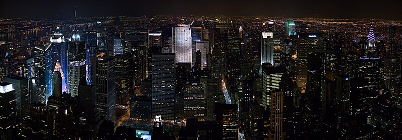
- Reason
- High-definition panorama with lots of detail
- Articles this image appears in
- New York City
- Creator
- Diliff
- Support as nominator --♪TempoDiValse♪ 18:03, 22 October 2008 (UTC)
- Comment I'd prefer a rectilinear stitch if at all possible - those curved buildings look a bit freaky... --Janke | Talk 19:20, 22 October 2008 (UTC)
- Is this a consequence of parallax or something else? Fletcher (talk) 20:04, 22 October 2008 (UTC)
- No, it's a result of curvilinear projection. Most (rectilinear) lenses correct for the fact that, in a given shot, objects in the corners of the frame are relatively farther from the camera. But once you turn the camera to make a panorama, you have to use software to correct (if so wanted) the changing perspective as the camera rotates. Here, it looks like a simpler cylindrical projection was kept. Thegreenj 04:45, 23 October 2008 (UTC)
- I tried the same panorama in the daytime and it turned out pretty marginal from a field of view and composition perspective. Which reminds me that I still need to stitch some more things from New York last January... -Fcb981(talk:contribs) 05:15, 23 October 2008 (UTC)
- No, it's a result of curvilinear projection. Most (rectilinear) lenses correct for the fact that, in a given shot, objects in the corners of the frame are relatively farther from the camera. But once you turn the camera to make a panorama, you have to use software to correct (if so wanted) the changing perspective as the camera rotates. Here, it looks like a simpler cylindrical projection was kept. Thegreenj 04:45, 23 October 2008 (UTC)
- Is this a consequence of parallax or something else? Fletcher (talk) 20:04, 22 October 2008 (UTC)
- Support - shiny. --Golbez (talk) 06:48, 23 October 2008 (UTC)
- Oppose too dark. Reywas92Talk 14:03, 23 October 2008 (UTC)
- Support At first, I thought the darkness of the picture wouldn't look well in the article, but in the article, it looks very nice. SpencerT♦C 19:56, 23 October 2008 (UTC)
- Support edit
OpposeI have to oppose, just too dark. I think there is enough info in the image to lighten it though. If this was done I would have to reevaluate. --Leivick (talk) 20:04, 23 October 2008 (UTC)The edited version is definitely up to FP standards especially given the fact that tripods are not allowed at the place where the image was taken. --Leivick (talk) 05:01, 3 November 2008 (UTC) - Oppose Too dark.--Caspian blue 23:03, 24 October 2008 (UTC)
- Comment Are the blue and yellow streaks through this white balance errors between successive frames or a result of light pollution? Noodle snacks (talk) 23:24, 24 October 2008 (UTC)
- Looks like light pollution to me. --Dschwen 18:02, 25 October 2008 (UTC)
- Hm, I have a comparable image which is not as dark and has four times the resolution. That makes me reluctant to support this nice picture. So neutral for now. --Dschwen 18:08, 25 October 2008 (UTC)
- Support Don't be misled by the fact that it appears dark as a small thumbnail: this is a night panorama and it shouldn't appear light. The detail is there, so it's obviously captured well enough. See how it looks in the NYC article: it does a wonderful job illustrating this marvellous (and even a bit scary for a mid-sized-town guy like me :P) cityscape. Image:NYC_TotR_night.jpg is not four times larger, but two times; furthermore, it's not a night shot and it isn't sharp enough to justify its size. Todor→Bozhinov
- Two times wider, two times taller = four times bigger. And sharpness is pretty good. --Dschwen 22:02, 25 October 2008 (UTC)
- It's a matter of how you see it: I'm talking about proportion. If this image is enlarged twice, it would pretty much fill your photo completely, i.e. yours is twice bigger. But it's true that this photo can fit four times in yours without any size changes. And I'm not saying your photo is bad, it's pretty nice, but it has some minor sharpness and artifacting issues. Todor→Bozhinov 12:16, 26 October 2008 (UTC)
- Two times wider, two times taller = four times bigger. And sharpness is pretty good. --Dschwen 22:02, 25 October 2008 (UTC)
- Support The view looks absolutely stunning. Technically speaking, I see nothing particularly flawed with the image. I don't think that a night view of this skyline can appear much better in a photograph. It somewhat reminds me of the Picture of the Year nominee HDR photograph [2], yet this one shows more detail and it captures the skyline scene ever better. -- mcshadypl TC 02:29, 26 October 2008 (UTC)
- There's so much wrong with this Picture of the Year runner-up that I wouldn't even call it an FA by today's standards. Yeah, it's intense when viewed smaller, but it has many technical flaws. HDR can do better. Todor→Bozhinov 12:16, 26 October 2008 (UTC)
- Oppose I don't mind the projection method, but the verticals at the edges need to be straightened. Mfield (talk) 19:55, 26 October 2008 (UTC)
- Oppose I find the resolution to be too small for a panorama and per Mfield. --Massimo Catarinella (talk) 00:00, 27 October 2008 (UTC)
- Support - a bit fuzzy in the corners, but good enough for our requirements. Stevage 00:22, 27 October 2008 (UTC)
- I like the edit a lot. Though the top half of this building at the right edge looks really weird, like it's transparent. Just a reflection, I think, but it's weird. Stevage 12:27, 4 November 2008 (UTC)
- Comment. I'm not sure if I would support this image either, as I agree that it is a bit too dark. To give you guys a bit of background to the shot, I took this at ISO 800, with an 85mm f/1.8 lens wide open (f/1.8) and 1/40sec exposures, which was at the absolute boundary of what I could shoot handheld - as good as it is going to get without a tripod at night (which is not allowed anyway). Even then, because of the extremes in the dynamic range of the scene, I had to underexpose it to avoid blowing out the highlights. At ISO 800, the ability to brighten the shadows was very limited, so that is why the image is so downsampled. You'd be apalled at the quality if you saw the originals - The images have some really strange diagonal moire/interference in the shadows that I suspect may have been due to the close proximity to high power transmitters on the top of the tower. Dschwen, maybe with your physics background you might be able to comment on that? In any case, all of the above effectively neutered my ability to take a truely uncompromised image. I would have loved to get there just after sunset but unfortunately poor planning and long waiting lines conspired against that idea! If I had the chance again, I'd shoot bracketed shots and get there a bit earlier! Diliff | (Talk) (Contribs) 13:20, 27 October 2008 (UTC)
- Comment Could a reshoot with an IS lens get a brighter exposure? (Not that I expect you to hop on a plane or anything). Fletcher (talk) 14:51, 29 October 2008 (UTC)
- Unfortunately not, as there are no IS lenses with f/1.8, particularly in that focal length range. The fastest IS lenses in that range (with lower image quality too) are f/3.5 or f/4. This is fine, but the problem is that at that aperture, you would need a shutter speed of around 1/8th of a second at 85mm, which is too slow to be sharp even with an IS lens. I had an IS lens with me when I shot this scene, but it was not viable in the conditions because of the shutter speed issue. Trust me, everything that could be done to make the most of this shot was done! Diliff | (Talk) (Contribs) 15:31, 29 October 2008 (UTC)
- Comment Could a reshoot with an IS lens get a brighter exposure? (Not that I expect you to hop on a plane or anything). Fletcher (talk) 14:51, 29 October 2008 (UTC)
- Oppose too dark --Base64 (talk) 13:07, 29 October 2008 (UTC)
- Strong Support (either, but Mfield's shadow lift looks good) I'm going against the grain here, but now I'm convinced people do not appreciate the difficulty of this shot, especially given no tripods allowed. (1) While conceding the extreme foreground is too dark, the landmark buildings are well lit. (2) I've seen brighter exposures that can be very pretty, but compromise on image quality. They are blurrier and blow the highlights. The brighter versions give a warm and inviting, almost painterly atmosphere, but just aren't as crisp and clear, which is important for our encyclopedia (non-free example). Compare Declan McCullagh's GE Building in this example (whose sign is too blurry to read) with Diliffs's which is sharper and clearer with no windows blown. (3) Dschwen has some nice shots but they don't directly compete with this one, being pointed downtown and taken with lingering daylight. This is the "city that never sleeps" so a night shot is enc. Further, even with less light, this one is sharper than Image:NYC Top of the Rock Pano.jpg (e.g., the lettering on MetLife and Verizon). On the downside, I wonder if the perspective could be improved and why does the left side have a cooler cast than the right side (even behind Times Square). But overall, just browsing flickr and pbase, there are many pictures that are really lovely, but I don't see anything quite like this one. Fletcher (talk) 20:25, 29 October 2008 (UTC)
- Strong Support This is so amazing, it almost makes my cry (Note: anonymous IPs have no suffrage, please log in to vote.) — Preceding unsigned comment added by 87.194.133.179 (talk • contribs)
- Comment. If the only main reason for opposition to this image is the brightness (or lack thereof), then I could go back to the original files and see what can be done. I don't think it will be at all possible to increase the brightness to many people's satisfaction (as I said, it was underexposed to preserve highlights and detail may simply not be there in the shadows), but it might be possible to improve it. Noise and artifacts will start to play their part too. Diliff | (Talk) (Contribs) 14:00, 30 October 2008 (UTC)

- A simple level correction would do - like this...--Janke | Talk 17:43, 30 October 2008 (UTC)
- Support. The thumb may look dark, but it's fine at full size. Great work, Diliff. Amphy (talk) 20:39, 30 October 2008 (UTC)
- Support Diego_pmc Talk 16:49, 1 November 2008 (UTC)
- Oppose too dark. —αἰτίας •discussion• 01:57, 2 November 2008 (UTC)
- Comment Add Edit1 to lift shadows per Opposes and per Janke. With the greatest respect to Diliff, I think it can easily support this much of a shadow lift wihout causing issues with either scene accuracy or noise. I've been up there enough times to know this isn't stretching the way it appears to the eye. Mfield (talk) 04:40, 2 November 2008 (UTC)
- Support It is a great picture. I especially like the new edited one better.Uturnaroun (talk) 03:45, 3 November 2008 (UTC)
- Support Edit Gorgeous! Clegs (talk) 04:22, 3 November 2008 (UTC)
Promoted Image:New York Midtown Skyline at night - Jan 2006 edit1.jpg MER-C 07:05, 5 November 2008 (UTC)
Wikipedia:Featured picture candidates/Image:Byzantine Constantinople-en.svg
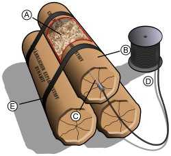
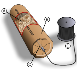
A. Sawdust (or any other type of absorbent material) soaked in nitroglycerin.
B. Protective coating surrounding the explosive material.
C. Blasting cap.
D. Wire connected to the blasting cap.
E. Tape to hold the dynamite in place.
- Reason
- Previous nomination was Wikipedia:Featured picture candidates/Dynamite. I believe that all concerns have been addressed.
- Articles this image appears in
- Dynamite
- Creator
- Pbroks13
- Support as nominator ----pbroks13talk? 16:25, 18 October 2008 (UTC)
- Neutral useful illustration for educational purpose, but I honestly think that the image is visually not appealing. Sorry.--Caspian blue 03:20, 20 October 2008 (UTC)
- Comment The sticks are not round at the bottom end of the picture, however the shadows are. This seems wrong to me. Noodle snacks (talk) 07:01, 20 October 2008 (UTC)
- As for shadow, I notice that it is placed on a wrong place. The light comes from the right side, so the shadow should be on the left? The reel's place is awkward (too close to the dynamite).--Caspian blue 07:15, 20 October 2008 (UTC)
- Furthermore the light on the sticks is quite soft, yet the shadow is hard, this is also wrong. Noodle snacks (talk) 09:53, 20 October 2008 (UTC)
- Comments - Significantly improved over last version. Still needs work on the shadow. Also, wire reel should be moved further to the left, IMO. Kaldari (talk) 21:16, 20 October 2008 (UTC)
- Neutral Quite a lot better than the previous versions but per above still has some serious issues. Cat-five - talk 01:09, 21 October 2008 (UTC)
- Oppose Does this really have the necessary enc for a FP? There are questionable statements in the caption, too: Why metal strips, when ordinary sticky tape is good enough? Why positive and negative wires - a blasting cap is not polarized. Plus, the visual problems mentioned by others. Furthermore, bunching together three sticks like this is rather improbable - explosives are usually inserted into drilled holes (e.g. in rock), one after the other - see 2nd picture in dynamite article. This still looks like it's out of a Road Runner cartoon. --Janke | Talk 09:23, 21 October 2008 (UTC)
- Strong Oppose If there are going to be shadows, then make it consistent. The dynamites have shadows on their left side and on the floor to the right. The thing the metal strips are coiled on doesn't have a shadow, nor does the wire itself. Also, the gradients are annoying and the bright colors make it look to "cartoony". —Black and White 15:54, 21 October 2008 (UTC)
- Comment Both tape and metal can be used , as seen here, they used metal strips. But if it will make things better, i'll change it to black tape. Also, it is not uncommon to bundle dynamite together, as seen in the image before, here, and here. I think the shadow should be fixed now, and so should the placement of the wire reel. Oh, and I changed the caption for D to simply just wire. --pbroks13talk? 18:12, 21 October 2008 (UTC)
- I wouldn't trust those photos too much - the first photo is obviously a staged (maybe even fake?) picture, with severe typos in the German spelling! (From that, I can also see it was the basis for your first attempt! ;-) The bands in the photo are not metal, looks more like the type of silvery ribbon you wrap around x-mas presents! Why is there English writing (DANGER) on the box when the dynamite is (supposedly) German? The second pic looks like a movie prop (i.e. a fake with a too short, improper "firecracker" fuse), the third is more genuine, but seems to be a (staged) museum exhibit, not dynamite in actual use. I'm afraid your research has led you a bit astray (good try, though). Sorry to say, this subject may not be the right choice for a FP candidate. (If you wonder why I'm so picky, and purport to know all this; I once made a movie about blasting and its dangers for a mining equipment company...) --Janke | Talk 16:42, 22 October 2008 (UTC)
- Oh no, trust me, I think that being picky in FPC is important, because shouldn't FP be the best of the best? --pbroks13talk? 00:44, 23 October 2008 (UTC)
Comment The perspective of the dynamite sticks and the spool seem mismatched to me. It looks like the top of the spool is angled forward.Wronkiew (talk) 06:38, 22 October 2008 (UTC)OpposeI figured out what was bothering me about the perspective of the spool and the shadow of the stick. I put together two illustrations of the problems. Image:Dynamite-5 spool perspective problems.png shows that the cylinder of wrapped wire is moved back on the spool cap. The two red lines should not be separate unless the bottom cap is not flat. The shading suggests that it is flat. For the stick, see Image:Dynamite-5 stick perspective problems.png. The vanishing point for the stick is different from the shadow. This should only be the case if the back of the stick is raised up off the surface it is casting a shadow on. I should mention that for all my nitpicking, the illustration is much better than I could have done. Wronkiew (talk) 17:26, 27 October 2008 (UTC)
- Yikes, you're absolutely right. I think I fixed the shadowing problem. Also, I fixed the spool, although I dont think the lines should match, as the first wire wrap is elevated. --pbroks13talk? 03:15, 28 October 2008 (UTC)
- Support Alt 1 I can't find anything else in the diagram to complain about. Wronkiew (talk) 03:38, 28 October 2008 (UTC)
- Comment I added an alternative. It contains only one stick of dynamite, and there is no tape. --pbroks13talk? 00:44, 23 October 2008 (UTC)
- Support Alt 1 -
Move the "B" marker so it's not up against the spool and move the hole in the top of the spool up a pixel or two so the perspective is right and I'll support it.Kaldari (talk) 18:59, 23 October 2008 (UTC) - Support. Good representation. LOL I like how each edit has had fewer and fewer sticks of dynamite. :) Thanks for putting up with us FPC reviewers ;) Intothewoods29 (talk) 00:23, 24 October 2008 (UTC)
- Conditional Support - I'd like to see an edit with -3 sticks of dynamite. Seriously though, per Kaldari if you also soften the shadows, hard shadows and softly lit objects looks wrong. Noodle snacks (talk) 02:31, 24 October 2008 (UTC)
- Comment Okay, I softened the shadow and adjusted the spool. How's that? --pbroks13talk? 07:38, 24 October 2008 (UTC)
- See Soft light for what i mean by soft shadows, the shadow currently has a clearly defined edge when it should fade from white to grey at the edges. — Preceding unsigned comment added by Noodle snacks (talk • contribs)
- Hah, sorry. How's that? --pbroks13talk? 18:07, 24 October 2008 (UTC)
- Its an improvement Noodle snacks (talk) 23:20, 24 October 2008 (UTC)
- Hah, sorry. How's that? --pbroks13talk? 18:07, 24 October 2008 (UTC)
- See Soft light for what i mean by soft shadows, the shadow currently has a clearly defined edge when it should fade from white to grey at the edges. — Preceding unsigned comment added by Noodle snacks (talk • contribs)
- Oppose - The perspective looks a bit wrong and, as per Noodle's comments, the shadow is also too sharp. Luca (talk) 21:09, 24 October 2008 (UTC)
- Comment The shadow in the both illustration look still not natural. Why don't you try with a whatever cylinder-like object and light? --Caspian blue 23:24, 24 October 2008 (UTC)
- You guys are a bit obsessive with your shadow critiques. Personally, I liked the original shadow just fine :) Kaldari (talk) 16:35, 27 October 2008 (UTC)
- Info The shadows have been edited again. --pbroks13talk? 03:15, 28 October 2008 (UTC)
Concerns seem addressed in the alternate, please comment on it. MER-C 10:49, 28 October 2008 (UTC)
- Since you ask: Oppose Reiterating: Does this really have the necessary enc for a FP? . . . This still looks like it's out of a Road Runner cartoon. (Almost...) --Janke | Talk 09:23, 21 October 2008 (UTC)
- Any suggestions for improvement? Kaldari (talk) 16:11, 4 November 2008 (UTC)
- Not really. All this shows is a symbolic, rather than accurate "tube", with some "stuff" in it, and a nondescript detonator and a spool of wire. Can't see the enc in that... --Janke | Talk 22:48, 4 November 2008 (UTC)
- Any suggestions for improvement? Kaldari (talk) 16:11, 4 November 2008 (UTC)
No consensus MER-C 07:18, 5 November 2008 (UTC)
Wikipedia:Featured picture candidates/Image:Komodo dragons video.ogv
- Reason
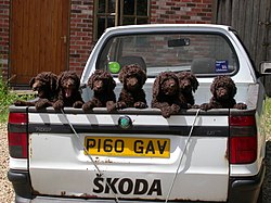
- It is an unusual image, in that it is hard to get seven pups to stay still for a pic
- Articles this image appears in
- Poodle
- Creator
- tufacave
- Support as nominator --Tufacave (talk) 15:43, 6 November 2008 (UTC)
- Oppose Very cute but not up to FP level. The puppies are not very sharp and there is a loss of shadow detail in their fur. The pickup truck is distracting. It does seem like an impressive accomplishment to get them lined up like this, but FPs are supposed to be high quality and encyclopedic, and I don't think this pic meets that. Fletcher (talk) 21:21, 6 November 2008 (UTC)
- Oppose Fletcher said it all... --Janke | Talk 21:23, 6 November 2008 (UTC)
- Oppose. As per above. Tufacave does have a bit of a history of submitting bizarre images to FPC and responding completely inappropriately to legitimate reasons for opposition. Diliff | (Talk) (Contribs) 00:07, 7 November 2008 (UTC)
- In fact the image has been removed from the Poodle article, rightfully so IMO. Tufacave added the image to the 'external links' section of all places... Diliff | (Talk) (Contribs) 00:10, 7 November 2008 (UTC)
- Oppose But it is an improvement technically over the dead bat :D Noodle snacks (talk) 00:28, 7 November 2008 (UTC)
- It was just resting. Diliff | (Talk) (Contribs) 07:24, 7 November 2008 (UTC)
- Oppose not in any article and thus ineligible, low encyclopedic value, & poor composition Thisglad (talk) 01:46, 7 November 2008 (UTC)
Withdrawn by nominator. Noodle snacks (talk) 09:01, 7 November 2008 (UTC)
- As with everything else they seem to do here: Dodgily. :-/ Diliff | (Talk) (Contribs) 10:43, 7 November 2008 (UTC)
- Reason
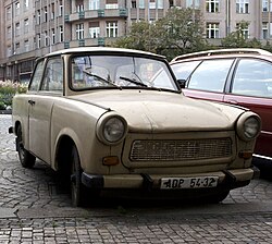
- A high quality photograph of an historic car in its "natural" environment, namely a former Eastern-European communist country (nowadays the Czech Republic). Note the parking permit stating Prague 1.
- Articles this image appears in
- Trabant and Eastern Germany
- Creator
- Massimo Catarinella
- Support as nominator --Massimo Catarinella (talk) 23:02, 2 November 2008 (UTC)
- Oppose - Sorry, but there's absolutely no wow-factor. Wikipedia FPs are supposed to be encyclopedic, this
alas is not really.has it somewhat but not enough for it top FP'd just upon quality. Ceran →(sing→see →scribe) 23:11, 2 November 2008 (UTC) - Strong Oppose Not just a lack of wow factor. It has distracting background elements, namely the car parked next to it. It also is in very poor condition which in my mind as well as others who have worked on the the conventions used for automobile images at WP:CAR is a problem. There are plenty of Trabies out there and some are in excellent condition so getting on without body damage isn't too big a deal. --Leivick (talk) 23:21, 2 November 2008 (UTC)
- comment the condition and background elements arguably add to the enc. I could weak oppose on that basis, unless someone tells me that this car's condition, e.g., is atypical. de Bivort 00:10, 3 November 2008 (UTC)
- The image conventions at WP:CAR (obviously not the final word) stipulate a clean vehicle without body damage as this gives the clearest idea of what the actual vehicle looks like. My feeling is that with cars, taking good photos without other vehicles nearby isn't all that hard as they are mobile. --Leivick (talk) 00:23, 3 November 2008 (UTC)
- You said that there are plenty of Trabies out there. Well, I've never seen one in Western-, Northern or Southern-Europe and this was the first and only one I've seen in Eastern-Europe (though I've only been to the Czech Republic so far in this part of Europe). Since most Eastern European countries are becoming more wealthier, people are more often buying new cars, such as BMW's and thus replacing there old cars. So I think it will become more likely, that in ten years from now the only Trabies you will see, are those that belong to collectors or those that can be rented in Berlin as part of a tour. Since Trabants now will be at least 20 years of age, most of them "in the wild" will not look good anymore. --Massimo Catarinella (talk) 01:04, 3 November 2008 (UTC)
- There are many clubs devoted to the Trabant particularly in Germany. All I am really trying to say is that I have seen better picture of Trabants and there is no reason someone can't make one and upload it. --Leivick (talk) 02:00, 3 November 2008 (UTC)
- I'm not sure the criteria at WP:CAR apply here. de Bivort 14:08, 3 November 2008 (UTC)
- There are many clubs devoted to the Trabant particularly in Germany. All I am really trying to say is that I have seen better picture of Trabants and there is no reason someone can't make one and upload it. --Leivick (talk) 02:00, 3 November 2008 (UTC)
- You said that there are plenty of Trabies out there. Well, I've never seen one in Western-, Northern or Southern-Europe and this was the first and only one I've seen in Eastern-Europe (though I've only been to the Czech Republic so far in this part of Europe). Since most Eastern European countries are becoming more wealthier, people are more often buying new cars, such as BMW's and thus replacing there old cars. So I think it will become more likely, that in ten years from now the only Trabies you will see, are those that belong to collectors or those that can be rented in Berlin as part of a tour. Since Trabants now will be at least 20 years of age, most of them "in the wild" will not look good anymore. --Massimo Catarinella (talk) 01:04, 3 November 2008 (UTC)
- The image conventions at WP:CAR (obviously not the final word) stipulate a clean vehicle without body damage as this gives the clearest idea of what the actual vehicle looks like. My feeling is that with cars, taking good photos without other vehicles nearby isn't all that hard as they are mobile. --Leivick (talk) 00:23, 3 November 2008 (UTC)
- Oppose Messy background, unappealing lighting and composition. Good enough in an article, but not FP. --Janke | Talk 09:41, 3 November 2008 (UTC)
- Oppose Front grille in shadow; just not lit well enough. --Bridgecross (talk) 21:52, 3 November 2008 (UTC)
- Oppose just not FP quality. DurovaCharge! 20:56, 4 November 2008 (UTC)
Not promoted MER-C 03:01, 9 November 2008 (UTC)
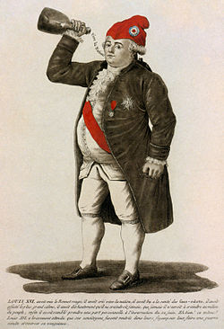
- Reason
- A king who is merely bad is boring, but there's something fascinating about epic failure. This 1792 tinted etching depicts an obese Louis XVI of France wearing the Phrygian cap of the French Revolution and drinking to the health of the radical sans-culottes. A derisive caption (translated to English on the image hosting page) spells out the incongruity of an absolute monarch joining the revolution against his own power, and accuses him of plotting vengeance against the revolutionaries. The revolution beheaded Louis XVI a few months after this etching was published. Restored version of Image:Louis le dernier.jpg.
- Articles this image appears in
- Louis XVI of France, Phrygian cap, The Legislative Assembly and the fall of the French monarchy, National Assembly (French Revolution)
- Creator
- unknown
- Support as nominator --DurovaCharge! 20:56, 1 November 2008 (UTC)
- Opinion I see that you cropped the mounted frame, and adjusted the general tone, and you did a good job. However, one thing that I am not satisfied with the picture is sharpness. Etching works tend to have sharper than other printing, and the texts on the picture are blurry. I would appreciate if you give more sharpness to the image.--Caspian blue 23:57, 1 November 2008 (UTC)
- As noted in the image page, this was scanned from slide film that was used to preserve a likeness of the original. The film was in soft focus. Holistic sharpening on an image of this sort is not feasible because it accentuates paper grain and gives a noisy appearance, so as described in the editing notes selected areas have had mild sharpening and contrast adjustment. Specifically the eyes, mouth, and descriptive text received that attention. DurovaCharge! 00:25, 2 November 2008 (UTC)
Not promoted MER-C 03:02, 9 November 2008 (UTC)
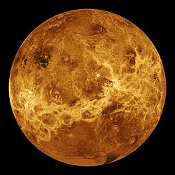
- Reason
- Good resolution, very high detail. It's the best we can get for a mosaic, especially of Venus, since it's covered in clouds almost every day of the earth year.
- Articles this image appears in
- Geology of Venus, Synthetic aperture radar, List of artificial objects on extra-terrestrial surfaces, List of artificial objects on Venus.
- Creator
- JPL Multimission Image Processing Laboratory
- Support as nominator --— Ceranthor (Sing) 12:18, 1 November 2008 (UTC)
- Support Stunning image, exceptional EV. Nice that it's high resolution. Coupled with the fact that it's a mosaic image that still manages to capture the planet in such excellent detail, I'd say this is FP quality. Elucidate (parlez à moi) Ici pour humor 15:11, 1 November 2008 (UTC)
- Support I'm a little concerned about the lack of data and grey gradient at the bottom (south) of the image. If this is the absolute best that can currently be obtained, though, so be it.--HereToHelp (talk to me) 17:17, 1 November 2008 (UTC)
- Comment just for the sake of accuracy: this image is included in the template {{dune-stub}}, meaning most of its image links are actually tiny and not particularly encyclopedic. Real uses are in Geology of Venus, List of artificial objects on Venus, and Synthetic aperture radar. It is not currently used in Venus. Separately, could someone clarify in plain English what exactly we're looking at? Based on the article synthetic aperture radar, it seems like this image is best described as a sort of extremely detailed radar-based map, rather than an image of the surface, which is of course unobtainable. That's not necessarily a reason not to feature it, but I just want to be clear on what it actually is. Thanks. Chick Bowen 22:18, 1 November 2008 (UTC)
- Comment I totally agree with Chick Bowen's opinion, so removed the articles that do not have direct relevance of the image. Morever, It would be more wonderful if the picture did not have the artificial hues on the bottom. (it looks like a patchwork)--Caspian blue 00:31, 2 November 2008 (UTC)
- Sorry caspian, but if I could have cropped that out I would have long ago. This is an extremely rare mosaic of Venus that we're probably never going to get again. As for Chick's question, it's a mosaic of Venus, itself, made from data collected by radar data (see the description). Ceran →(sing→see →scribe) 13:22, 2 November 2008 (UTC)
- I was hoping you'd clarify the description. The article on SAR is not entirely clear on how you get from the radar data to the image. The color, for example, is a complete fiction, right? The images in the SAR article are colored according to non-visual criteria, like this one. I gather that in the case of the Venus image, NASA has taken something similar to that Death Valley image and colored it red. Is this right? Chick Bowen 03:02, 3 November 2008 (UTC)
- "The simulated hues are based on color images recorded by the Soviet Venera 13 and 14 spacecraft" says NASA, so the colours aren't entirely fake. Narayanese (talk) 05:12, 3 November 2008 (UTC)
- I was hoping you'd clarify the description. The article on SAR is not entirely clear on how you get from the radar data to the image. The color, for example, is a complete fiction, right? The images in the SAR article are colored according to non-visual criteria, like this one. I gather that in the case of the Venus image, NASA has taken something similar to that Death Valley image and colored it red. Is this right? Chick Bowen 03:02, 3 November 2008 (UTC)
- Sorry caspian, but if I could have cropped that out I would have long ago. This is an extremely rare mosaic of Venus that we're probably never going to get again. As for Chick's question, it's a mosaic of Venus, itself, made from data collected by radar data (see the description). Ceran →(sing→see →scribe) 13:22, 2 November 2008 (UTC)
- Support —αἰτίας •discussion• 01:51, 2 November 2008 (UTC)
- Support Awesome! --Janke | Talk 12:57, 3 November 2008 (UTC)
- SupportRyan shell (talk) 19:26, 5 November 2008 (UTC)
- Support — That messy bit on the bottom is a tad distracting, but it seems to be the best there is. Looks great otherwise. –Juliancolton Tropical Cyclone 15:29, 6 November 2008 (UTC)
- Support Yeah the bit on the bottom is kinda weird... but hey... it looks like it's the best we've got... unless you guys got a friend who works @ JPL... :D - Jameson L. Tai talk ♦ guestbook ♦ contribs 15:33, 6 November 2008 (UTC)
Promoted Image:Venus globe.jpg MER-C 03:02, 9 November 2008 (UTC)
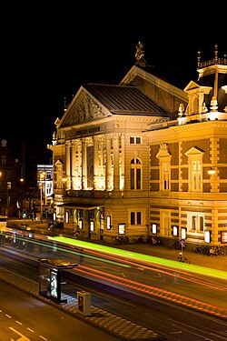
- Reason
- It is a beautiful picture illustrating the main facade of this building. This is the best view possible of the building and at night is the only time you are able to take a decent picture of it due to traffic, people, etc. Picture taken at nighttime are also often more attractive to readers.
- Articles this image appears in
- Concertgebouw
- Creator
- Massimo Catarinella
- Support as nominator --Massimo Catarinella (talk) 17:38, 31 October 2008 (UTC)
- Weak oppose The Concetgebouw is a wonderful building, but I feel a more clear shot of the front of the building would do it more service. In addition, I think the lights of the cars are somewhat distracting (this would be reduced in a daytime shot).149.43.220.27 (talk) 18:54, 31 October 2008 (UTC)
- Anonymous votes are usually given little weight - please login or register. Thanks! Mostlyharmless (talk) 20:42, 31 October 2008 (UTC)
It is impossible to still get a nice and more clear shot of the front of the building. You will get benches, bicycles, overhead wires, poles, etc. in your picture. The only way to get a nice shot of the building is from an elevation and since there is only one roof you are able to take a picture from.. If you would take this picture during the day, you will get people, bicyclists, cars, trams, etc. in your photo and that's not particularly beautiful. But thanks for the criticism. It's very constructive. I do have some shots without the tram passing through the image, so if more people prefer this than tell me so. --Massimo Catarinella (talk) 19:19, 31 October 2008 (UTC)
- Weak oppose Very nice picture, but not very sharp. I particularly like the passing car (tram?) lights, which add to the busy atmosphere of the area without distracting too much. Nice composition too, but the photo should be sharper for FP. Luca (talk) 21:49, 31 October 2008 (UTC)
- I don't see how it can be sharper, since it is pretty sharp. --Massimo Catarinella (talk) 23:51, 31 October 2008 (UTC)
- Oppose The image i have attached makes me think that a better angle is possible (maybe right on that little traffic island on the left there if you can brave traffic :D). I am not sure how it would affect traffic at the site, but I also think that taking it so late at night makes the sky completely black which tends to suck out detail and make the contrast too high. A shot in the blue hour would be better imo, if you can be bothered getting up at that hour, then a shot near dawn might minimize the traffic problems. Timing the light right would also lessen the required exposure time somewhat. Noodle snacks (talk) 23:37, 31 October 2008 (UTC)
- No, that's not a better angle. Trust me, I've had them all. The building will be too much up close and you will be able to clearly see all the overhead cables of the tram. As for the shutterspeed..six seconds isn't very long. Taken the picture at twilight will result in the same contrast, because otherwise the building will be overexposed. --Massimo Catarinella (talk) 23:49, 31 October 2008 (UTC)
- I was refering to the contrast between the building at the sky. Right now it is hard to tell where roof ends and sky starts. I frankly disagree on the angle, I find the other shot more informative as to what the building actually looks like. Noodle snacks (talk) 00:01, 1 November 2008 (UTC)
- If other voters agree, I could always give it a try. --Massimo Catarinella (talk) 01:03, 1 November 2008 (UTC)
- I was refering to the contrast between the building at the sky. Right now it is hard to tell where roof ends and sky starts. I frankly disagree on the angle, I find the other shot more informative as to what the building actually looks like. Noodle snacks (talk) 00:01, 1 November 2008 (UTC)
- No, that's not a better angle. Trust me, I've had them all. The building will be too much up close and you will be able to clearly see all the overhead cables of the tram. As for the shutterspeed..six seconds isn't very long. Taken the picture at twilight will result in the same contrast, because otherwise the building will be overexposed. --Massimo Catarinella (talk) 23:49, 31 October 2008 (UTC)
- Oppose Subject cut off. Cacophony (talk) 10:37, 5 November 2008 (UTC)
- A picture of the whole building is impossible! The building is largely surrounded by houses. So unless you rent a helicopter for me, this is an unfair argument. --Massimo Catarinella (talk) 22:26, 5 November 2008 (UTC)
- Support The subject is mostly the facade of the building, which is fully in view in the best way reasonably possible. Fransw (talk) 11:04, 7 November 2008 (UTC)
Not promoted MER-C 03:02, 9 November 2008 (UTC)

- Reason
- An amazing picture of an incredibly monumental and architecturally signficant structure.
- Articles this image appears in
- Brooklyn Bridge
- Creator
- Commons:User:S23678. Edited by Commons:User:Lycaon.
- Support as nominator --smooth0707 (talk) 13:36, 31 October 2008 (UTC)
- Comment and Oppose - am I going mad, or did this just not get nominated a few weeks ago? Mfield (talk) 17:31, 31 October 2008 (UTC) Either way, oppose it is smeary and artifacted at full resolution. The artifacts around the highlights are smoothed and resharpened jpeg compression probably maybe to it being a third party edit and the consequent editing and resaving of jpegs. I would support a better performed edit which probably means from the original. Mfield (talk) 17:36, 31 October 2008 (UTC)
- I don't think so. It was uploaded to Commons on the 17th of Oct. A few weeks back, I nominated another photo, which failed to pass through. If you think you can do a better edit to the original, I would like to see it. If not, I encourage you go consider the EV of this structure before you complain about artefacting. It is a National Historic Landmark and was at one point, the largest suspension bridge in the world. smooth0707 (talk) 19:47, 31 October 2008 (UTC)
- I could certainly perform a re-edit but I suspect it probably won't help much as the problem is that this has been edited from a jpeg and really the fixes need to be applied by the original photographer to avoid the extra saves. I'll have a go at it anyway. Mfield (talk) 20:15, 31 October 2008 (UTC)
- Support - I don't see any problem with the slight smearing and artifacting given the resolution. If it was scaled down to 2000px high it would virtually disappear, and the photo would still have a huge resolution; but there's obviously no point doing this. I do agree that the halos around the lights aren't perfect, but they don't detract enough for an oppose. Time3000 (talk) 15:56, 4 November 2008 (UTC)
- Oppose - Downsize this to 1000px high and imo it still looks blurred over with too much NR. Noodle snacks (talk) 00:03, 5 November 2008 (UTC)
- Oppose - The glare from the lights at full resolution makes my eyes water. Also, there are some ghosting problems with the flag. The flag can probably be fixed by a re-stitch, but reducing the glare would probably require more exposures and better optics. Wronkiew (talk) 02:08, 6 November 2008 (UTC)
- I think the flag is the result of a long exposure and some wind not a stitching error. Noodle snacks (talk) 03:10, 6 November 2008 (UTC)
- I am not sure that the flag problems are the result of stitching, but it does look like ghosting to me. It would be very helpful to see the original photos so I could determine if these are stitching/fusing artifacts, or if all the odd looking stuff is just the result of a long exposure, some haze, and inconstant wind. Wronkiew (talk) 04:58, 6 November 2008 (UTC)
- I think the flag is the result of a long exposure and some wind not a stitching error. Noodle snacks (talk) 03:10, 6 November 2008 (UTC)
- Support As the creator. The image is a stitch and enfuse of 50 images in 3 different expositions, done in JPEG that took all the juice out of my 2 batteries. Given the extra time for saving RAW files on my old DSC-V1 camera, I would not have been able to complete the panorama with my batteries. As for the flag, no long exposition picture will ever get a moving flag right. As for view at full resolution, I'll remind you of the size of the image, at more than 50 Mpx. If you want to downsample the image, you can do so by using the wide image template (like here, with the non-NR version), no need to get rid of the extra information from the file itself. As for the glare from the lights, I think it's acceptable given the wide dynamic range of this scene, but this is a personal choice. I consider that the beauty of the image can compensate for some little technical flaws. --S23678 (talk) 03:49, 6 November 2008 (UTC)
Not promoted MER-C 03:02, 9 November 2008 (UTC)
- Reason
- Large, high resolution file of artillery placements during the American Civil War. Provides a good perspective of the depth and supportive construction for earthworks of the Peninsula Campaign as well as several mortars and their crews. Restored version of Image:Yorktown artillery.jpg.
- Articles this image appears in
- Battle of Yorktown (1862), Peninsula Campaign, Siege artillery in the American Civil War, Photography and photographers of the American Civil War
- Creator
- James F. Gibson
- Support as nominator --DurovaCharge! 10:03, 31 October 2008 (UTC)
- Perhaps the contrast can be improved? I find it a tad dark. - Mgm|(talk) 12:29, 31 October 2008 (UTC)
- Here's an alternate edit. DurovaCharge! 17:22, 31 October 2008 (UTC)
- Support Impressive. smooth0707 (talk) 13:14, 31 October 2008 (UTC) (Oppose Edit1, I prefer the B&W schematic. smooth0707 (talk) 20:36, 31 October 2008 (UTC)
- Support Nice image, great EV. Support either of the two. Elucidate (parlez à moi) Ici pour humor 19:08, 31 October 2008 (UTC)
- Support the original--Caspian blue 00:18, 1 November 2008 (UTC)
- Weak Support With preference for the original. I wish the from mortar wasn't cut-off, but otherwise, very nice. SpencerT♦C 01:36, 1 November 2008 (UTC)
- Support - I think I can confidently say this is one of your best. — Ceranthor (Sing) 12:00, 1 November 2008 (UTC)
Promoted Image:Yorktown artillery2.jpg MER-C 03:02, 9 November 2008 (UTC)
- Reason
- Scanned from an old glass plate neg. It is dated June 6, 1944, the date of the Invasion of Normandy, however I am investigating this further. One editor (see discussion page) has stated that this is "A British Second World War A22 Infantry Tank Churchill."
- Creator
- Tufacave
- Articles this image appears in
- Armoured warfare
- Support as nominator --Tufacave (talk) 23:38, 8 November 2008 (UTC)
- Weak Oppose - The quality isn't so great, even for a world war II tank. —Ceran(sing / see) 01:58, 9 November 2008 (UTC)
- Oppose The photo quality is poor and it doesn't depict anything particularly interesting. Nick-D (talk) 06:49, 9 November 2008 (UTC)
- Oppose See above The Last Melon (talk) 08:28, 9 November 2008 (UTC)
- Comment maybe further research can shed more light where and when this photo was taken, the sign posts in the background may help in this regard Thisglad (talk) 10:02, 9 November 2008 (UTC)
- Comment This shot was taken somewhere in The Netherlands. I definitely recognize the architecture and the signs on the buildings are also in Dutch. --Massimo Catarinella (talk) 11:39, 9 November 2008 (UTC)
- Oppose per quality concerns and on grounds of user's previous behaviour. But mostly on quality. —Vanderdecken∴ ∫ξφ 21:26, 9 November 2008 (UTC)
- Comment A shame, since I'd love to see more featured pictures on tanks for Portal:Tank, but the angle on this photograph is poor. JonCatalán(Talk) 23:03, 9 November 2008 (UTC)
- Question: Why is the image being switched, mid-nomination? [3] SpencerT♦C 01:41, 10 November 2008 (UTC)
- Now he wants the duplicate originals deleted. I'm really tempted to kill this nomination right now. MER-C 01:59, 10 November 2008 (UTC)
- How about we suspend this until this gets cleared up? SpencerT♦C 02:39, 10 November 2008 (UTC)
- I don't think that's going to happen. The new one isn't used in any articles, the old ones are plausible speedy deletion candidates and the user's attitude to FPC isn't that great. MER-C 04:19, 10 November 2008 (UTC)
- In support of the above question; since he has changed the image why as he not changed the title or description as this is now clearly not a photo of any tanks or "tank action". The object in the rear is clearly a Universal Carrier (well one of the family of vechiles at least) commonly known as the Bren Gun carrier i.e. a personnel and equipment transporter; the one in the foreground is at a bit of an odd angle and partially obscured so a little difficult for myself to identify but i would stick my neck out and say it is another carrier (of some sort - a Wasp maybe?). So an Oppose from me for the time being.
- PS: Its my first time in this sort of area but whenever i have had to upload photos/images i have had to use other lisences (usually the historial one) has the correct on been used here and shouldnt there be something stating who the author and what the source was?--EnigmaMcmxc (talk) 02:28, 10 November 2008 (UTC)
Nomination withdrawn. MER-C 11:22, 10 November 2008 (UTC)
- Reason
- Well Christmas is coming, so the more festive featured pics the better
- Articles this image appears in
- Santa Claus
- Creator
- Myosotis Scorpioides
- Support as nominator -- Myosotis Scorpioides 19:47, 10 November 2008 (UTC)
- Oppose for several reasons: harsh flash light & shadows, dust spots, blown highlights, no notability re. time and/or place. --Janke | Talk 20:24, 10 November 2008 (UTC)
- Strong Oppose per reasons above, plus the fact that it lacks anything special. A SVG of Santa showing his characteristics/trademarks would be a lot more feature-worthy (something like Image:Piratey, vector version.svg). Diego_pmc Talk 21:08, 10 November 2008 (UTC)
Nomination withdrawn MER-C 02:23, 11 November 2008 (UTC)
- Reason
- High quality and informative for the relative articles, best possible vantage point for that area.
- Articles this image appears in
- Austins Ferry, Tasmania, Derwent River (Tasmania)
- Creator
- Noodle snacks
- Support as nominator --Noodle snacks (talk) 14:06, 5 November 2008 (UTC)
- Support High EV in this picture showing large scale features of terrain, river, as well as local plant life and architecture. Do you know what is going on at the far left... it looks like the river is dammed and there are some big cranes. Fletcher (talk) 17:14, 5 November 2008 (UTC)
- Hehe, It is the bridge shown in Image:Bridgewater Causeway Crop.jpg Noodle snacks (talk) 00:17, 6 November 2008 (UTC)
- Support. Haven't searched for hidden stitch errors or Waldo, though... ;-) --Janke | Talk 17:41, 5 November 2008 (UTC)
- Support Great panorama. Nice, broad view, good EV. Elucidate (light up) 18:54, 5 November 2008 (UTC)
- Support. Another quality panorama, and proof that you do actually get some sun in Tasmania. Out of interest (and something to add to the image page, perhaps), how many frames did you use for this pano? It is both very high res and fairly sharp, and it almost seems as though the foreground trees are slightly sharper than the background, although that could well be an illusion. One other thing, there is a strange line in the parkland about 3/4 of the way towards the right. Is that a stitching error (looks unlikely tho) or the path of where a mower has driven through? Diliff | (Talk) (Contribs) 22:39, 5 November 2008 (UTC)
- I think I can see the line you are refering to and I don't think its a stiching error. The grass there doesn't get mowed that often (I go birding there quite a bit). The most likely thing is probably a path that has been formed by people/animals walking along it repeatedly. It was 40 portrait orientation images (across about 150 degrees), which is tending towards the overkill side, but i prefer to have overlapping frames just in case one misses focus or something (eg richmond bridge) and stitching errors seem less likely.
- PS: I'd like to see you re-shoot the panorama from Mt Wellington sometime too.. Was that taken pre-DSLR? The quality isn't nearly as good, and ideally the composition would be focused more on Hobart itself. Would also be interesting to see at dawn/dusk when there is still a bit of light in the sky and a glow of the city lights, but a daylight shot would be fine too. Thanks in advance. ;-) Diliff | (Talk) (Contribs) 22:46, 5 November 2008 (UTC)
- I do have to get around to doing that, which should be fairly easy now exams are over. It will be a matter of timing to pick a day with fairly minimal haze. Dawn/Dusk could be cool as well but it'd be a matter of luck to avoid clouds on top of the mountain at that time of day, Not sure how much detail there is to see at that sort of time. It was taken pre-slr with a Panasonic Lumix DMC-FZ5. When repeated the whole field of view needs to be rotated left and the focus set more on hobart itself i think. Noodle snacks (talk) 00:15, 6 November 2008 (UTC)
- Support <joke>I would not be surprised if the Waldo is disguising as a shepherd and yodeling in the beautiful scenery.</joke> :) This is a really wonderful panoramic image.--Caspian blue 16:13, 7 November 2008 (UTC)
- Comment. I see the bridge on the far left side you nominated a couple of weeks back. :-) Diliff | (Talk) (Contribs) 14:28, 8 November 2008 (UTC)
- Support Nice detail, I like the view. SpencerT♦C 01:44, 9 November 2008 (UTC)
- Support well done. —αἰτίας •discussion• 04:13, 9 November 2008 (UTC)
Promoted Image:Austins Ferry and Derwent River from Poimenna Reserve.jpg MER-C 07:47, 11 November 2008 (UTC)
- Reason
- A unique picture, showing the side of something you might not usually think about. Plus, I think it's a really striking photograph: the perspective, the lighting for example. Peer review here. This picture (unknown to me) went up for FPC a while earlier, but was rejected mainly for reason of lighting/blown highlights. This version comes from a different source (National Archives vs. Department of Defense) and for whatever reason has much better lighting. It's also, hwoever, a smaller image in resolution, 1,349x1,097 px versus 3,000x2,105 px.
- Articles this image appears in
- Battlefield medicine
- Creator
- US Army
- Support as nominator --zafiroblue05 | Talk 22:20, 4 November 2008 (UTC)
- Peer Review --Noodle snacks (talk) 22:44, 4 November 2008 (UTC)
- Comment Could use some restoration. Mfield (talk) 23:22, 4 November 2008 (UTC)
- Support - The EV is pretty good, per the PPR. Ceran →(sing→see →scribe) 23:47, 4 November 2008 (UTC)
- Comment IMHO the other version is better because it is higher resolution and more detailed (you can see the surgical instruments) the blown highlights are probably unavoidable because there appears to be strong lighting used in the surgery room but was made worse by the high contrast of the scan Thisglad (talk) 09:58, 5 November 2008 (UTC)
- Oppose - first off, this pic lacks vital detail in what should be the main focus of the article. we can't even see the scissors on the white sheet. In addition, it really doesn't have much EV in the article it's in: it doesn't add to any of the medical advances and is just stuck on at the end. In addition, the focus, the surgery, is too small and isn't really detailed; the only reason we know it is surgery is because of the sign and the guy in a face mask. Intothewoods29 (talk) 22:48, 6 November 2008 (UTC)
- Just a note, the fact that the article it's in is poor shouldn't really affect it's EV. Other articles it could go include field hospital for sure or perhaps military medicine, but the fact that those articles aren't detailed as well shouldn't count against the image. The lack of seeing the scissors, though, is a fair point. zafiroblue05 | Talk 05:05, 8 November 2008 (UTC)
Not promoted MER-C 07:47, 11 November 2008 (UTC)
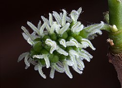
- Reason
- High quality, well lit, enc
- Articles this image appears in
- Morus nigra, Morus (plant)
- Creator
- Noodle snacks
- Support as nominator --Noodle snacks (talk) 10:26, 4 November 2008 (UTC)
- support - Interesting subject, well done. Ceran →(sing→see →scribe) 17:00, 4 November 2008 (UTC)
- Support sharp, good contrast, enc. subject. DurovaCharge! 20:57, 4 November 2008 (UTC)
- Support Intriguing macro of an interesting subject.--HereToHelp (talk to me) 00:03, 5 November 2008 (UTC)
- Support. Interesting and has great detail. - Mgm|(talk) 11:53, 5 November 2008 (UTC)
- Support What a strangely interesting image. I like it. Elucidate (light up) 18:49, 5 November 2008 (UTC)
- Comment These are not fruit shoots but female flowers of a monoecious variety. Lycaon (talk) 18:53, 5 November 2008 (UTC)
- I am no expert, but in a few months it will be edible fruit... Noodle snacks (talk) 00:19, 6 November 2008 (UTC)
- Correct description is an important part of the 'featurability' of an image on en:wiki. That said, unlike on commons, I can Support this enc picture here. Lycaon (talk) 07:52, 6 November 2008 (UTC)
- I am no expert, but in a few months it will be edible fruit... Noodle snacks (talk) 00:19, 6 November 2008 (UTC)
- supportRyan shell (talk) 19:24, 5 November 2008 (UTC)
- Support —αἰτίας •discussion• 00:23, 6 November 2008 (UTC)
Promoted Image:Black Mulberry Female Flowers.jpg MER-C 07:48, 11 November 2008 (UTC)

- Reason
- An attractive atmospheric shot of this town and river. I tried to get a balance as the mist lifted between the added visual appeal of the mist, and having it lifted enough to allow the town to be sufficiently seen for EV. If I was just using this as a pretty photo I would take out the road bridge at right, but included that for EV as well. I think it all works pretty well, but will leave up to others to make a call...
- Articles this image appears in
- Nelligen, New South Wales, Clyde River (New South Wales)
- Creator
- jjron
- Support as nominator --jjron (talk) 14:08, 3 November 2008 (UTC)
- Support Lovely colours, even through the mist. Very clear quality. The mist really sets the scene of it being early morning in a sleepy part of Australia... I love it! gazhileyUser talk:gazhiley 13:35, 5 November 2008 (UTC)
- Thanks for the vote. I thought this may be going to sneak through here without attracting a single comment... :-). --jjron (talk) 08:26, 7 November 2008 (UTC)
- no probs... I love this country - i kinda see it as my spiritual home in a way as I felt so at home while I was there - to a certain extent more than I do in my actual home! This really reminds me of my time in Aus... Plus it's a well taken pic to boot! You live here or just happened to be passing? --gazhiley (talk) 12:10, 7 November 2008 (UTC)
- I live about 600kms away from here, so I guess in Aust terms you could say I'm relatively local ;-). I was literally just passing through, heading from Batemans Bay to Canberra, and saw the photo op. --jjron (talk) 11:16, 11 November 2008 (UTC)
- no probs... I love this country - i kinda see it as my spiritual home in a way as I felt so at home while I was there - to a certain extent more than I do in my actual home! This really reminds me of my time in Aus... Plus it's a well taken pic to boot! You live here or just happened to be passing? --gazhiley (talk) 12:10, 7 November 2008 (UTC)
- Thanks for the vote. I thought this may be going to sneak through here without attracting a single comment... :-). --jjron (talk) 08:26, 7 November 2008 (UTC)
- Support Intothewoods29 (talk) 19:48, 7 November 2008 (UTC)
- Support Seems to meet the criteria except I don't find it a particularly compelling image for some reason. Noodle snacks (talk) 22:35, 7 November 2008 (UTC)
Promoted Image:Nelligen, NSW Early Morning Mist, Panorama, 25.9.2008.jpg MER-C 07:48, 11 November 2008 (UTC)
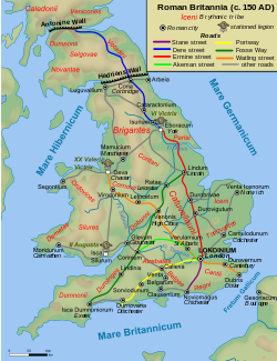
- Reason
- high quality, very informative
- Articles this image appears in
- Roman Britain, Roman roads in Britain
- Creator
- Andrei nacu
- Support as nominator --Nergaal (talk) 21:41, 7 November 2008 (UTC)
- Oppose - Poor cartographic and aesthetical quality. The map is not oriented, no coordinates are shown, the crop is too tight, the colours seem randomly chosen, base geographic information missing, etc.. Quite far from FP standards. BTW, what are the yellow coloured areas? -- Alvesgaspar (talk) 23:43, 7 November 2008 (UTC)
- I think the yellow areas are mountains/high hills. This is supposed to be a relief map. —Angr 14:59, 13 November 2008 (UTC)
- Oppose - no sources. Rmhermen (talk) 15:38, 8 November 2008 (UTC)
- Comment - The symbol for stationed legions looks like a splotch. Kaldari (talk) 17:21, 10 November 2008 (UTC)
- Oppose - Sorry, this just is not a professional-quality map. The coastlines are very roughly drawn, the colors of the relief too dominant, the lettering is typographically displeasing, etc. For an amateur-drawn map, it's very good, but nevertheless it is unambiguously an amateur-drawn map. —Angr 14:59, 13 November 2008 (UTC)
How do I withdraw the nom? Nergaal (talk) 17:08, 13 November 2008 (UTC)

- Reason
- high quality, very informative
- Articles this image appears in
- Byzantine Empire, History of the Eastern Roman Empire
- Creator
- Andrei nacu
- Support as nominator --Nergaal (talk) 21:34, 7 November 2008 (UTC)
- Oppose - I cannot assess the historical accuracy of the map. But a lot more of cartographic sophistication is to be expected from a FP. There is almost no base geographical information in the map, the colours are not explained (they seem randomly chosen to me) and the lettering doesn't look good. Also, the map is not oriented and lacks information on the geographical coordinates. -- Alvesgaspar (talk) 23:35, 7 November 2008 (UTC)
- Oppose - Sorry, this just is not a professional-quality map. The coastlines are very roughly drawn, the lettering is typographically displeasing, etc. For an amateur-drawn map, it's very good, but nevertheless it is unambiguously an amateur-drawn map. —Angr 15:00, 13 November 2008 (UTC)
Not promoted MER-C 07:51, 14 November 2008 (UTC)
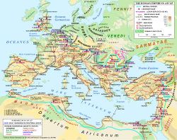
Location of the Roman Legions in 125AD
- Reason
- very detailed, high quality, very informative
- Articles this image appears in
- List of Roman legions, Hadrian
- Creator
- Andrei nacu
- Support as nominator --Nergaal (talk) 21:27, 7 November 2008 (UTC)
- Comment Part of current-day-egypt seems cut off at the bottom. I know it's at the very extreme edge of the roman empire, but if this picture is meant to give a complete and full view of the empire it should be included. Fransw (talk) 22:31, 7 November 2008 (UTC)
- Should I rename the nomination/caption to something like "Roman Legions in 125AD" instead?
- Question - Why is the Mediterranean tilted to northeast? -- Alvesgaspar (talk) 23:25, 7 November 2008 (UTC)
- Ha? Where do you see Mediterranean? Nergaal (talk) 00:21, 8 November 2008 (UTC)
- "Mare Internum" Gary King (talk) 03:11, 10 November 2008 (UTC)
- I saw that, but where is it to the NE? Or better said, where else shoud/could it be placed? Nergaal (talk) 03:15, 10 November 2008 (UTC)
- I'm assuming they were referring to the Sea's label, in that it's tilted towards the top-right corner of the image. I think it looks fine, since the label stretches across two bodies of water. Gary King (talk) 03:29, 10 November 2008 (UTC)
- I saw that, but where is it to the NE? Or better said, where else shoud/could it be placed? Nergaal (talk) 03:15, 10 November 2008 (UTC)
- "Mare Internum" Gary King (talk) 03:11, 10 November 2008 (UTC)
- Ha? Where do you see Mediterranean? Nergaal (talk) 00:21, 8 November 2008 (UTC)
- What I mean is that North is not pointing up! -- Alvesgaspar (talk) 08:03, 10 November 2008 (UTC)
- I don't think this Image:Map_of_Europe_(political).png is rotated by more than 10 degrees. It is definately not pointing towards NW. Nergaal (talk) 08:32, 10 November 2008 (UTC)
- I would guess about 20º. Please compare with this one -- Alvesgaspar (talk) 09:53, 10 November 2008 (UTC)
- The best way to resolve this would probably to have a compass on the image to show the direction of north. Gary King (talk) 14:00, 10 November 2008 (UTC)
- Not really, because this is not a cylindrical projection and the direction of north varies from place to place. The best way would be to depict the geographic grid of meridians and parallels, and rotate the whole map so that the central meridian is represenred vertical -- Alvesgaspar (talk) 14:07, 10 November 2008 (UTC)
- Ah yeah, that's better. Gary King (talk) 14:13, 10 November 2008 (UTC)
Note I updated the name of the nomination and the caption to focus on the legion locations. Nergaal (talk) 06:13, 10 November 2008 (UTC)
- Oppose - Sorry, this just is not a professional-quality map. The coastlines are very roughly drawn, the lettering is typographically displeasing, the legend doesn't fit inside its allotted box, etc. For an amateur-drawn map, it's very good, but nevertheless it is unambiguously an amateur-drawn map. —Angr 15:03, 13 November 2008 (UTC)
- Do you have concrete suggestions how to solve these issues? Nergaal (talk) 17:07, 13 November 2008 (UTC)
Not promoted MER-C 07:51, 14 November 2008 (UTC)
- Why has the caption been changed? This map is not just about the legions, it's about the whole empire, cities, provinces, roads, mines, barbarian tribes etc. Commentators have focused only on the quality of the geographical projection, not on the massive amount of detail, which makes it easily the most comprehensive of its kind available online. The map is useful for a whole range of articles. EraNavigator (talk) 11:40, 9 February 2009 (UTC)
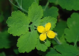
- Reason
- A clear, detailed and beautiful depiction of the flower and leaves of a common wild plant, adding significant value to the article
- Articles this image appears in
- Chelidonium.
- Creator
- Joaquim ALves Gaspar
- Support as nominator --Alvesgaspar (talk) 15:30, 6 November 2008 (UTC)
- Oppose - I don't like the harsh, front on, undiffused flash, apparently caused partly by the choice of aperture and shutter speed making this look like a night shot - Peripitus (Talk) 20:31, 6 November 2008 (UTC)
- Oppose Poor lighting, though generally flash is required for narrow apertures etc it needs to be softened or put off axis. Noodle snacks (talk) 09:06, 7 November 2008 (UTC)
- Oppose Per Noodle snacks --Fir0002 04:18, 13 November 2008 (UTC)
Not promoted MER-C 07:51, 14 November 2008 (UTC)
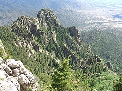
- Reason
- It appears to meet the criteria, and I think it illustrates the subject very well.
- Articles this image appears in
- Sandia Mountains
- Creator
- Nightscream
- Support as nominator --Nightscream (talk) 01:08, 8 August 2008 (UTC)
- This nomination was never listed by the nominator, listing it now. MER-C 05:48, 6 November 2008 (UTC)
- Oppose - Unsharp, not FP material. Ceran →(sing→see →scribe) 12:29, 6 November 2008 (UTC)
- Oppose for technical quality (sharpness, highlights on rocks, color somewhat washed out)Fletcher (talk) 18:40, 6 November 2008 (UTC)
- Oppose This only shows part of the mountains, and low technical quality. — BRIAN0918 • 2008-11-07 14:14Z
- Oppose due to weak technical quality. —αἰτίας •discussion• 04:11, 9 November 2008 (UTC)
- Oppose Blown highlights, washed out, jagged details. --Bridgecross (talk) 15:19, 10 November 2008 (UTC)
Not promoted MER-C 07:52, 14 November 2008 (UTC)
- Reason
- high quality, high resolution photograph of a historic painting depicting several important historical figures, high encyclopedic value. John Trumbull's other famous panting, Declaration of Independence, is already an FP, and this one is of the same quality.
- Articles this image appears in
- Battles of Saratoga, Saratoga, New York, John Burgoyne, Timeline of United States revolutionary history (1760–1789), Horatio Gates, Daniel Morgan, Siege of Boston, Saratoga campaign, William Prescott, John Trumbull, William Phillips (British Army officer), Robert Troup, United States Capitol rotunda, Barzillai Lew
- Creator
- Painting by John Trumbull, photographed by the Architect of the Capitol.
- Support as nominator --AutoGyro (talk) 01:13, 6 November 2008 (UTC)
- Comment. What's going on with the coloration in the far left and far right? Is this an artifact of the photography or the scanning, or is this an incomplete restoration of the painting? Spikebrennan (talk) 18:12, 6 November 2008 (UTC)
- It's from the painting, not the digitization process --AutoGyro (talk) 21:46, 6 November 2008 (UTC)
- For reference here is the painting as it appears in the US Capitol. I can't really make out the same shaded areas on the sides that Spikebrennan points out. Maybe it has to do with the lighting or the glass? Fletcher (talk) 23:37, 6 November 2008 (UTC)
- Possibly, in which case I hope someone would be able to take a better picture than the Architect of the Capitol!!! --AutoGyro (talk) 05:13, 7 November 2008 (UTC)
Not promoted MER-C 07:52, 14 November 2008 (UTC)
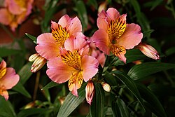
- Reason
- High quality, various stages of the flower provide good enc.
- Articles this image appears in
- Alstroemeria
- Creator
- Noodle snacks
- Support as nominator --Noodle snacks (talk) 13:56, 5 November 2008 (UTC)
- Weak Oppose The background looks too speckled -- either too noisy, or noise-reduced blur. The flowers look well exposed and sharp over enough of their area. Fletcher (talk) 17:05, 5 November 2008 (UTC)
- Support - I like the lighting and sharpness of the main subject. I like less the framing (I'd like to see some more space around, especially on top) and the flowers at left. -- Alvesgaspar (talk) 23:49, 7 November 2008 (UTC)
- Oppose Noisy Background --Fir0002 11:30, 11 November 2008 (UTC)
Not promoted MER-C 07:52, 14 November 2008 (UTC)
- Reason
- We have a number of photos taken by photographers in wedding photography, but this is the only one that shows the photographer's process. As such, its encyclopedic value is very high.
- Articles this image appears in
- Wedding photography
- Creator
- Mike Baird
- Support as nominator --howcheng {chat} 18:34, 11 November 2008 (UTC)
- Oppose Sorry, but I don't really see the enc in this: It's a rehearsal, the equipment is not very visible - I don't see anything of a "process" here... I'd much prefer a pic of a wedding photographer working in his/her studio, with all the paraphernalia, including studio flash units & 'brellas. --Janke | Talk 19:48, 11 November 2008 (UTC)
- Oppose Its not very educational from an off camera lighting perspective since none of that gear is visible (and yet is important to the final result). Noodle snacks (talk) 23:39, 11 November 2008 (UTC)
- Oppose per both above --MakE shout! 04:05, 12 November 2008 (UTC)
- Oppose Per above. Also disappointing sharpness given the camera and lens specs (also the EXIF doesn't show any excuses...) --Fir0002 04:12, 13 November 2008 (UTC)
- Oppose Firstly if it's depicting wedding photography,I would have thought a bridegroom would be necessary!I would prefer to see the trappings of the wedding too-a church,guests,confetti,bridesmaids,perhaps a vicar.It would be easy to show the process of them taking the photo with all these included.This regrettably does not show a wedding photograph-it shows a photographer with a model in a bridal gown. Lemon martini (talk) 11:35, 13 November 2008 (UTC)
- I guess you're not married or at least haven't been through the wedding photography experience. When one has wedding photographs taken, there are pictures of the bride and groom together, pictures of just the groom, pictures of just the bride, and a whole slew of other types of pictures, not necessarily during the service itself. howcheng {chat} 16:41, 14 November 2008 (UTC)
Not promoted MER-C 07:17, 17 November 2008 (UTC)
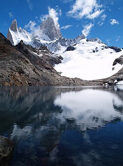
- Reason
- The picture is crystal clear, you can almost imagine being there. It's an absolutely stunning picture.
- Articles this image appears in
- Cerro Chaltén
- Creator
- Alex Torrenegra
- Support as nominator --Yerpdog (talk) 10:48, 11 November 2008 (UTC)
- Oppose - it's a nice image of a stunning scene, but it's not as sharp as you make out - below FP standard I'm afraid. There's also a small amount of chromatic aberration around the edges of the peaks. —Vanderdecken∴ ∫ξφ 14:34, 11 November 2008 (UTC)
- Oppose. Nice scene but my opinion is that it is not the ideal composition for EV. We don't need to see 50% of the image as a reflection in the lake and it could be better photographed from a higher vantage point (if possible, I don't know what is behind the photographer). Diliff | (Talk) (Contribs) 16:30, 11 November 2008 (UTC)
- This is what's behind. Alternatively this or any of the pictures in the Monte Fitz Roy gallery. —Vanderdecken∴ ∫ξφ 18:59, 11 November 2008 (UTC)
- Oppose - The composition is aesthetic, not encyclopedic. Crop the reflection off and it might qualify. Kaldari (talk) 18:00, 11 November 2008 (UTC)
- Cropping the reflection would delete information, not add any! de Bivort 18:32, 11 November 2008 (UTC)
- Yeah, it would delete information about the reflection. The article isn't about the reflection. Kaldari (talk) 22:53, 12 November 2008 (UTC)
- That's like saying the article isn't about the clouds, or the sky, or the lighting, or the composition. An FP photo can have valuable qualities other than its subject as long as it illustrates the subject well. de Bivort 05:07, 13 November 2008 (UTC)
- Yeah, it would delete information about the reflection. The article isn't about the reflection. Kaldari (talk) 22:53, 12 November 2008 (UTC)
- Cropping the reflection would delete information, not add any! de Bivort 18:32, 11 November 2008 (UTC)
- Oppose Agreeing with above, the choice of portrait orientation seems needed to get the full reflection, but there is less space on the sides, which would have been an encyclopedic view of the mountains. A conventional landscape shot might have captured more information, or with more effort, several stitched portrait frames. Fletcher (talk) 20:39, 11 November 2008 (UTC)
- Oppose-I agree with the cropping of the picture for re-submission. It would be the right picture for a Gallery on Wiki Commons, a sister website in the same Wiki tradition though. kdm85 —Preceding unsigned comment added by Kdm85 (talk • contribs) 02:20, 12 November 2008 (UTC)
- Oppose Cropping won't help the totally blown snow. (Yeah, I know snow is white, but I do expect something a little nicer than 252-255... ;-) --Janke | Talk 12:57, 12 November 2008 (UTC)
Not promoted MER-C 07:17, 17 November 2008 (UTC)
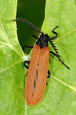
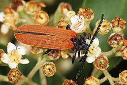
- Reason
- High quality macro shot - good sharpness and lighting
- Articles this image appears in
- Lycidae
- Creator
- Fir0002
- Support as nominator --Fir0002 08:29, 10 November 2008 (UTC)
- Weak support It's nice, but the antennae are blurry, and I personally find the white sports on the leaf a bit distracting. SpencerT♦C 22:01, 10 November 2008 (UTC)
- Support Alt 1. It's much better in focus here, though I have to admit, the background is a tad distracting. SpencerT♦C 02:26, 12 November 2008 (UTC)
Oppose - "Blurry antennae". 8thstar 01:10, 11 November 2008 (UTC)Alt1 is better... 8thstar 00:43, 12 November 2008 (UTC)- Support Alt1 for softer lighting, better focus. Background is interesting but not too distracting. Fletcher (talk) 14:29, 11 November 2008 (UTC)
- Support either - top one is actually better for identification since it shows the tarsi more clearly. de Bivort 16:00, 11 November 2008 (UTC)
- Support Alt1 - Better composition, lighting, and focus. Kaldari (talk) 18:01, 11 November 2008 (UTC)
- Support Alt1 You've done it again,Fir! --Fireaxe888 (talk) 18:46, 11 November 2008 (UTC)
- Support original Nice. I think the background of the alt 1 is pretty busy.--Caspian blue 21:22, 11 November 2008 (UTC)
- Support Alt1 I find it more interesting than the original Noodle snacks (talk) 23:43, 11 November 2008 (UTC)
- Support original the background makes the subject stand our more. Cacophony (talk) 07:01, 12 November 2008 (UTC)
- Support alternative Muhammad(talk) 12:06, 12 November 2008 (UTC)
Promoted Image:Metriorrhynchus rhipidius02.jpg MER-C 07:17, 17 November 2008 (UTC)
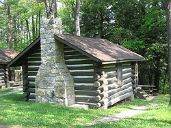
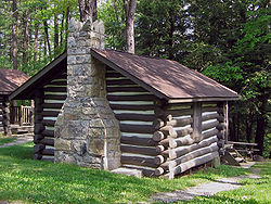
- Reason
- The image is used in the FA article about Black Moshannon State Park to illustrate the work of the Civilian Conservation Corps, which built the cabin and most of the park between 1933 and 1937. Today the cabin is part of a National Register of Historic Places historic district (one of three such districts in the park) and is still rented to visitors (hence the modern roof and steps). The image is also used in the Log cabin article to illustrate the section on the creation of modern log cabins in national and state parks. I believe the image meets the FPC criteria: it clearly shows the log cabin and the surrounding forest, is well lit and nicely composed, and is large enough for FP. The cabin is on a bit of slope and it is possible that the image may also be slightly tilted, but I have not manipulated the image in any way. I am submitting this here as Juliancolton suggested I nominate this for Featured Picture, and Shoemaker's Holiday seconded its nomination at PPR. Ceranthor also expressed support for the image at the PPR page.
- Articles this image appears in
- Black Moshannon State Park and Log cabin
- Creator
- Ruhrfisch
- Support as nominator --Ruhrfisch ><>°° 05:23, 10 November 2008 (UTC)
- Support, of course. Shoemaker's Holiday (talk) 05:36, 10 November 2008 (UTC)
- Oppose - chromatic aberation, the lighting is harsh if not blown out, and it seems desaturated. de Bivort 06:23, 10 November 2008 (UTC)
- Oppose Blown out lighting. Diego_pmc Talk 07:14, 10 November 2008 (UTC)
- Oppose obvious tilt. Mfield (talk) 14:38, 10 November 2008 (UTC)
- QUestion - would rotating the picture to correct for this be allowed? Ruhrfisch ><>°° 14:56, 10 November 2008 (UTC)
- It would certainly be allowed (and encouraged, since FPs are supposed to illustrate the article as best they can) but given the other reasons for opposition, it probably wouldn't make people change their votes. Diliff | (Talk) (Contribs) 15:09, 10 November 2008 (UTC)
- Thanks, I am more used to FAC, where most are more easily fixed (does anyone have a color saturator or chromatic aberation repair kit?) and wanted to make sure this could legally be fixed. I know this is not getting promoted, but appreciate everyone's feedback and wish I had a better camera. Diliff, I am literally in awe of your images - please keep up the amazing work, Ruhrfisch ><>°° 19:38, 10 November 2008 (UTC)
- It would certainly be allowed (and encouraged, since FPs are supposed to illustrate the article as best they can) but given the other reasons for opposition, it probably wouldn't make people change their votes. Diliff | (Talk) (Contribs) 15:09, 10 November 2008 (UTC)
- QUestion - would rotating the picture to correct for this be allowed? Ruhrfisch ><>°° 14:56, 10 November 2008 (UTC)
- A photograph's prospects for featuring is largely determined when the shutter button on the camera is pressed. The tools for editing pictures are Adobe Photoshop or The Gimp. Fixing CA is possible, but it's best done with what's called a RAW file. MER-C 02:30, 11 November 2008 (UTC)
- Don't worry, Rurhfisch. Content contributing is probably, more important than FPC. Best, —Ceran(sing / see) 22:17, 10 November 2008 (UTC)
- Support It looks like a featured pic to me. But I am not a professional. Dincher (talk) 00:19, 11 November 2008 (UTC)
- Oppose per de Bivort's criteria --MakE shout! 04:10, 12 November 2008 (UTC)
- Comment Add Edit1 to correct tilt, exposure and color balance as far as possible. CA is not easily fixable though. Mfield (talk) 05:35, 12 November 2008 (UTC)
- Thank you very much! Ruhrfisch ><>°° 11:39, 12 November 2008 (UTC)
Not promoted MER-C 07:17, 17 November 2008 (UTC)
- Reason
- First of all, high res, great quality. Already an FP on German &Spanish Wikipedias as well as Commons. I thought I was done with galaxy pics, but this one was just too good.
- Articles this image appears in
- Galaxy, Hubble sequence, Barred spiral galaxy, NGC 1300, List of spiral galaxies
- Creator
- HST
- Support as nominator --—Ceran(sing / see) 13:20, 9 November 2008 (UTC)
- Support Wow! Also fascinating: the hundreds of other galaxies you see behind this one... --Janke | Talk 18:16, 9 November 2008 (UTC)
- Support Higher quality compared to similar photos. Nice detail. SpencerT♦C 20:13, 9 November 2008 (UTC)
- Comment Can someone try to remove the chromatic noise?--HereToHelp (talk to me) 22:41, 9 November 2008 (UTC)
- I'd say that's a typical property of a Hubble image, so removing it wouldn't really be kosher, would it? Besides, it would erase some of the detail... --Janke | Talk 22:56, 9 November 2008 (UTC)
- Also, some of the "noise" may be an actual, faded star. SpencerT♦C 01:40, 10 November 2008 (UTC)
- Grumble grumble...support because evidently something with more color splotches than a Jackson Pollock painting is evidently the best NASA can muster. (Only half kidding).--HereToHelp (talk to me) 02:37, 10 November 2008 (UTC)
- Also, some of the "noise" may be an actual, faded star. SpencerT♦C 01:40, 10 November 2008 (UTC)
- Only half? —Ceran(sing / see) 21:23, 10 November 2008 (UTC)
- Support --Caspian blue 22:16, 16 November 2008 (UTC)
Promoted Image:Hubble2005-01-barred-spiral-galaxy-NGC1300.jpg MER-C 07:18, 17 November 2008 (UTC)
- Reason
- This is a great and sadly overlooked image of early nuclear testing with artillery cannons; although the image quality is somewhat low, this would be a hard subject of which to find a better picture.
- Articles this image appears in
- Artillery, M65 Atomic Cannon
- Creator
- Wikifreund (no user page)
- Support as nominator --The Last Melon (talk) 07:18, 9 November 2008 (UTC)
- Oppose This is an iconic image, but there must be a better version out there somewhere. This is too small, unsharp, it has dust spots, and the colors and contrast have been severely degraded. --Janke | Talk 09:20, 9 November 2008 (UTC)
- Comment previous nomination Thisglad (talk) 09:39, 9 November 2008 (UTC)
- Oppose Janke, as usual, sums up my opinion. SpencerT♦C 22:03, 10 November 2008 (UTC)
- Reluctant oppose, yeah per quality concerns. M.K. (talk) 11:39, 13 November 2008 (UTC)
- Oppose, but I'd have to reconsider if we could fine the higher res without the tight crop. gren グレン 10:09, 14 November 2008 (UTC)
Not promoted MER-C 07:18, 17 November 2008 (UTC)
Reference ranges for some major blood tests, sorted by mass.
- Reason
- In twelve octaves, it presents the constituents of your blood.
- Articles this image appears in
- Reference ranges for blood tests, Reference range
- Creator
- Mikael Häggström
- Fixed from previous version
- References added where missing in the main article Reference ranges for blood tests
- Clarified that the total protein is total plasma protein, while hemoglobin is inside erythrocytes
- By using the .png version of the file instead of the .svg, the resolution is much better
Otherwise, for minor edits and adjustments, we should put them on the Edits needed-list and update when long enough. It will be updated now and then, e.g. as new studies arise. So let's decide now whether it's featured or not.
- Support as nominator Mikael Häggström (talk) 07:13, 4 November 2008 (UTC)
- Comment Do I see an old version here? (No mention of plasma protein.) This one is not in the article. Purging cache doesn't change it here. --Janke | Talk 10:08, 4 November 2008 (UTC)
- Really? I can see it, at the bottom at the far right. Perhaps just wait for a while, or go to its page at the commons. Mikael Häggström (talk) 12:54, 4 November 2008 (UTC)
- Please don't archive nomination pages by moving them. Unlike other featured content processes, it doesn't quite work here - it screwed up the monthly archive. Instead, just whack a 2 on the end of the nomination title, e.g. "Wikipedia:Featured picture candidates/Blood values 2". MER-C 11:48, 4 November 2008 (UTC)
- Sorry about that. I'll try to avoid it in the future. This could be copied to a "Blood values 2", and then reverted to before the copy to "Previous versions", but perhaps it would just mix it up a second time, now that the monthly archive is adapted to it. Mikael Häggström (talk) 12:54, 4 November 2008 (UTC)
- Comment Carcinoembryonic antigen is the only item I can spot without ref. I'm poor at finding medical sources, but PMID 17926198 (which might not be applicable since it is a research paper) says 0.5-1.7ug/l. Otherwise the picture is good Narayanese (talk) 19:39, 7 November 2008 (UTC)
- Thanks for noticing! I've referenced the article and put it on the list for the next image update. Mikael Häggström (talk) 20:17, 7 November 2008 (UTC)
- Note: This is also in Reference range (making note at the top). I'm still looking through the article itself so wait a bit for my vote. SpencerT♦C 21:08, 7 November 2008 (UTC)
- Support After a lengthy, systematic ref and number check, it's pretty good. Some less-reliable sources had minor fluctuations with the given data, and I don't see any major reasons this would be inaccurate. However, there is a possibility I missed something, but otherwise, it looks pretty reliable. SpencerT♦C 20:35, 9 November 2008 (UTC)
- One comment, though: Can the colour for Bilirubin be changed...with the blue the same (or similar) colour as the lines, its hard to differentiate beginning and ending. SpencerT♦C 20:37, 9 November 2008 (UTC)
- Support After a lengthy, systematic ref and number check, it's pretty good. Some less-reliable sources had minor fluctuations with the given data, and I don't see any major reasons this would be inaccurate. However, there is a possibility I missed something, but otherwise, it looks pretty reliable. SpencerT♦C 20:35, 9 November 2008 (UTC)
- Comment Any reason this data can't be stored in an SVG? §hep • ¡Talk to me! 01:23, 8 November 2008 (UTC)
- We tried that, but unfortunately, we didn't find any way of making it appear with the same high resolution. See Previous_versions. Still, this png one is directly derived from the svg. Mikael Häggström (talk) 06:14, 8 November 2008 (UTC)
Conditionalsupport waiting for update to CEA range. I agree svg is not a good idea. But bilirubin could indeed use a more distinct background colour. Narayanese (talk) 21:05, 9 November 2008 (UTC)
- There, CEA updated, and colour of bilirubin changed. Mikael Häggström (talk) 06:48, 10 November 2008 (UTC)
- There is a gap (stitching error?) at transferrin's background. Narayanese (talk) 18:05, 10 November 2008 (UTC)
- Comment Why is the text aliased? It makes the image look like it was created as a raster; vector text exported into a raster format usually looks "typeset", not hinted. Fvasconcellos (t·c) 15:32, 10 November 2008 (UTC)
- I don't find jaggies on it. Where do you see any? The image was created by viewing the svg-file in Firefox, making screen shots and pasting them together (Inkscape's "export as bitmap" gave bad results). Mikael Häggström (talk) 16:20, 10 November 2008 (UTC)
- Comment Is there a reason for using dL on one of the scales? I know it's a perfectly valid unit, but I've never seen it anywhere else before. If it's a standard unit for blood test results though, that's fine. Time3000 (talk) 17:17, 10 November 2008 (UTC)
- It's a standard for blood values. —Cyclonenim (talk · contribs · email) 17:39, 10 November 2008 (UTC)
- Support Detailed, useful, good quality, reliably sourced. Why not? —Cyclonenim (talk · contribs · email) 17:39, 10 November 2008 (UTC)
- Comment Would you consider using a sans serif typeface on the individual test labels (e.g., "Free thyroxine") in future versions? Sans serif fonts are usually more legible for applications like this (that is, for 'headlines' instead of 'paragraphs'). It might be particularly helpful to select a sans serif typeface that was optimized for screen use instead of print use (e.g., Arial instead of Helvetica). WhatamIdoing (talk) 23:01, 10 November 2008 (UTC)
- Good point. It's on the list for the next update, so when we have gathered some more issues, e.g. more sources for blood values, then it might be worth to upload the images again. Mikael Häggström (talk) 14:26, 17 November 2008 (UTC)
Promoted Image:Reference ranges for blood tests - by mass.png MER-C 07:18, 17 November 2008 (UTC)
- Thanks everyone for your time and comments! It helped a lot in giving high quality and reliability in the picture. Mikael Häggström (talk) 14:28, 17 November 2008 (UTC)
- Reason
- How can not this be a featured picture look at all those people at Islam's most holy site, from above very sublime so many people
- Articles this image appears in
- Mosque, Mecca, Saudi Arabia, Islam, Masjid al-Haram
- Creator
- Govt. of Saudi Arabia
- Support as nominator --Zaharous (talk) 16:17, 17 November 2008 (UTC)
- Oppose and speedy close - Image too small, no caption. -- Alvesgaspar (talk) 16:34, 17 November 2008 (UTC)
- Oppose and speedy close - too small, likely copyvio. Calliopejen1 (talk) 17:43, 17 November 2008 (UTC)
Not promoted MER-C 01:30, 18 November 2008 (UTC)
- Reason
- High resolution and quality. Some other images in the article are brighter but I believe the exposure on this shot is the most realistic, it was taken on a sunny day.
- Articles this image appears in
- Port Arthur, Tasmania
- Creator
- Noodle snacks
- Support as nominator --Noodle snacks (talk) 11:12, 14 November 2008 (UTC)
- Support. Excellent detail although it would have been nice to see a bit more of the landscape above and behind the site just to serve as a backdrop. Diliff | (Talk) (Contribs) 16:23, 14 November 2008 (UTC)
- Support I agree with Diliff about more background. Its good to see the image as I didn't make it to the penal colony when in Tasmania earlier in the year. Mfield (talk) 17:32, 14 November 2008 (UTC)
- Support On the thumbnail I agree that it would be nice with some more background, but looking at it full size it doesn't bother me at all. Very nice image, sharp details. —Krm500 (Communicate!) 00:35, 15 November 2008 (UTC)
- Comment There is something weird going on the trees on far rhs for my eyes, looks almost like you were reaching your limit of focus, or am I going crazy? 124.177.18.199 (talk) 01:04, 15 November 2008 (UTC)
- As evidenced by the water it was a pretty windy day, could be movement in the trees although at 1/500th i doubt thats going to be a massive issue. I don't think it was missed focus as the foreground is sharp and the 70-200 rarely misses (like my 18-55 has a tendancy to do). Noodle snacks (talk) 01:12, 15 November 2008 (UTC)
- Support very nice composition. Matt Deres (talk) 02:17, 16 November 2008 (UTC)
- Support, though strikes me as a bit oversaturated, as well as tight at the top as previously mentioned. BTW, you didn't happen to get a decent shot of the convict church did you, which could replace that ordinary photo beside this one in the article? --jjron (talk) 13:48, 17 November 2008 (UTC)
- No on the church, I was there with company so didn't want to spend too long on the camera, in addition when I got to the church the sun was at the wrong angle, I have a feeling perspective might be a problem on a photo (trees nearby). I did however get a two year pass since I plan to go back there with my birding gear (there was quite a bit of stuff there), so I'll probably make another trip and hit the church at the time. I haven't changed the saturation from the neutral on camera default. Noodle snacks (talk) 05:01, 19 November 2008 (UTC)
Promoted Image:Port Arthur Panorama.jpg MER-C 23:57, 19 November 2008 (UTC)
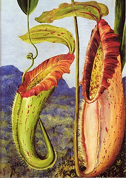
- Reason
- Very nice painting with encyclopedic value.
- Articles this image appears in
- Nepenthes northiana
- Creator
- Marianne North
- Support as nominator --Bewareofdog 22:11, 13 November 2008 (UTC)
- Oppose it looks like it needs restoration frankly. I also think that the enc in Nepenthes northiana is pretty poor compared to what a good photograph would provide. That said it would have suitable enc in the Marainne North page. Noodle snacks (talk) 11:22, 14 November 2008 (UTC)
- Oppose. It's a nice plant painting, but I find it hard to believe the original would be this tightly cropped, to the extent of cutting off the bottom of the right pitcher, and in fact the original little version of this isn't cutoff at the bottom. Looks to be in need of a better scan. --jjron (talk) 14:22, 14 November 2008 (UTC)
Not promoted MER-C 23:57, 19 November 2008 (UTC)

- Reason
- nicely illustrating the species
- Articles this image appears in
- Formica_rufa
- Creator
- quaoar10
- Support as nominator [self-submission] --Quaoar10 (talk) 20:48, 13 November 2008 (UTC)
- Oppose - Correct picture but not good enough to reach the present insect FP bar. The caption is not adequate either, it should say something about the species. Why this small size? -- Alvesgaspar (talk) 21:45, 13 November 2008 (UTC)
- quite simple - I don't have an SLR camera that would allow me to deliver a higher resolution. But the resolution is still decent I'd say, best Quaoar10 (talk) 22:14, 13 November 2008 (UTC)
- We're voting on the image, not the creator, so there are no concessions I'm afraid. If image isn't good enough, it's just not good enough, we're not going to support it to be nice to you. Remember, we're not voting whether to keep the image or delete it - just whether to call it one of our best. —Vanderdecken∴ ∫ξφ 09:49, 14 November 2008 (UTC)
- Sure, I don't expect any concessions?! It's just about the photo! 91.18.229.13 (talk) 11:39, 15 November 2008 (UTC)
- We're voting on the image, not the creator, so there are no concessions I'm afraid. If image isn't good enough, it's just not good enough, we're not going to support it to be nice to you. Remember, we're not voting whether to keep the image or delete it - just whether to call it one of our best. —Vanderdecken∴ ∫ξφ 09:49, 14 November 2008 (UTC)
- Oppose - The antennae gets out of focus. Same goes for some of the tips of the feet. A better angle would also be nice.
- Oppose Not enough resolution on subject. Papa Lima Whiskey (talk) 03:36, 14 November 2008 (UTC)
- Oppose - nice subject and angle, but a bit small, noisy and extremities are out of focus. —Vanderdecken∴ ∫ξφ 09:49, 14 November 2008 (UTC)
Not promoted MER-C 23:57, 19 November 2008 (UTC)
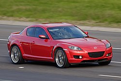
- Reason
- Interesting and dynamic photo of a great car. As pointed out on the FPC talkpage there aren't many (any?) car FP's and I feel this is a worthy candidate to begin to expand FP's in this category...
- Articles this image appears in
- Mazda RX-8
- Creator
- Fir0002
- Support as nominator --Fir0002 04:41, 13 November 2008 (UTC)
- support - is it tilted a bit CCW? The perspective seems a degree or two off to me. de Bivort 05:03, 13 November 2008 (UTC)
- Support it is probably better than the other one. Any tilt is inconsequential as roads are tilted to some degree in order to provide additional centripetal force in corners etc. Out of curiousity though, what sort of shutter speed were you panning these at? Noodle snacks (talk) 06:30, 13 November 2008 (UTC)
- This one was at 1/160s and the Daimler below was at 1/100s - four times slower than recommended for a 400mm! :) So yeah despite a monopod these were quite challenging - but I'm even more pleased with this, which despite some motion blur is pretty good IMO for 1/30s with a 400mm :) --Fir0002 08:36, 13 November 2008 (UTC)
- weak support - nice pic, but not sure if it's interesting enough for a featured picture. quality pic, but I would imagine it could be obtained by accessing mazda's website (most car companies have classy pics of their cars on their site) so not exactly rare. A great example of the car hence support, but no wow for me... Sorry... gazhiley Talk 15:33, 13 November 2008 (UTC)
- A small point, but any pic from Mazda's site wouldn't be freely licensed. —Vanderdecken∴ ∫ξφ 19:01, 13 November 2008 (UTC)
- fair point, and justification for having this picture in Wiki, but doesn't change the fact that if you wanted to view this car in a similar quality picture, it is normally easily available via their website... As before, this is still a support, but a weak one as there's nothing overly striking about it... It's just a car after all... gazhiley Talk 10:56, 14 November 2008 (UTC)
- I think the real point of featured pictures is to encourage people to find or create high quality images for use in an encyclopedia. I guess for most people that cars are seen every day, where as many landscapes, wildlife etc shots are not, but ultimately many featured pictures are "just a bird on a stick" or similar. Noodle snacks (talk) 11:05, 14 November 2008 (UTC)
- Sorry, I was under the impression that you could add any pic to Wiki, and these "featured pictures" were pictures of such outstanding quality or importance that they were good enough to be featured on the main page... Or have I missunderstood the point of this section... I read through the last 5 years of noms before starting to comment and that's the impression I got...gazhiley Talk 11:12, 14 November 2008 (UTC)
- Inevitably images with so called "wow" are more likely to get featured. But the only thing Wikipedia:Featured_picture_criteria says on the subject is "It illustrates the subject in a compelling way". In my mind illustrating the subject well through clear composition and good technicals are more important factors, since ultimately that is what is most useful to an encyclopaedia. Noodle snacks (talk) 11:19, 14 November 2008 (UTC)
- fair enough... Well It's still a support from me, even if slightly weak... gazhiley Talk 11:27, 14 November 2008 (UTC)
- Inevitably images with so called "wow" are more likely to get featured. But the only thing Wikipedia:Featured_picture_criteria says on the subject is "It illustrates the subject in a compelling way". In my mind illustrating the subject well through clear composition and good technicals are more important factors, since ultimately that is what is most useful to an encyclopaedia. Noodle snacks (talk) 11:19, 14 November 2008 (UTC)
- Sorry, I was under the impression that you could add any pic to Wiki, and these "featured pictures" were pictures of such outstanding quality or importance that they were good enough to be featured on the main page... Or have I missunderstood the point of this section... I read through the last 5 years of noms before starting to comment and that's the impression I got...gazhiley Talk 11:12, 14 November 2008 (UTC)
- I think the real point of featured pictures is to encourage people to find or create high quality images for use in an encyclopedia. I guess for most people that cars are seen every day, where as many landscapes, wildlife etc shots are not, but ultimately many featured pictures are "just a bird on a stick" or similar. Noodle snacks (talk) 11:05, 14 November 2008 (UTC)
- fair point, and justification for having this picture in Wiki, but doesn't change the fact that if you wanted to view this car in a similar quality picture, it is normally easily available via their website... As before, this is still a support, but a weak one as there's nothing overly striking about it... It's just a car after all... gazhiley Talk 10:56, 14 November 2008 (UTC)
- A small point, but any pic from Mazda's site wouldn't be freely licensed. —Vanderdecken∴ ∫ξφ 19:01, 13 November 2008 (UTC)
- Support Good quality and wow. Definite EV. The logo is not a violation of copyrights, is it? Muhammad(talk) 16:08, 13 November 2008 (UTC)
- Nope. See De minimis and Commons:De minimis.--HereToHelp (talk to me) 00:25, 14 November 2008 (UTC)
- Support Per all above.--HereToHelp (talk to me) 00:25, 14 November 2008 (UTC)
- Support good image, although it does appear to have non standard wheels which should perhaps be noted (as they are blured I don't see it is a big problem). --Leivick (talk) 00:35, 19 November 2008 (UTC)
Promoted Image:Mazda RX-8 on freeway.jpg MER-C 23:57, 19 November 2008 (UTC)
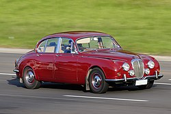
- Reason
- High quality image of a Daimler 250 doing what it was made for: driving. Dynamic interest is added to the photo thanks to some well controlled motion blur. The angle this was shot at IMO is near perfect as it shows the front and sides of the car whilst obscuring the driver.
- Articles this image appears in
- Daimler 250
- Creator
- Fir0002
- Support as nominator --Fir0002 04:39, 13 November 2008 (UTC)
- Support The only real flaw is the reflection of what appears to be a land cruiser or the lexus equivilent in the body work, it is otherwise pretty clean. Noodle snacks (talk) 06:28, 13 November 2008 (UTC)
- Looks to me like a Mazda badge on it, possibly a Tribute, and probably a Commodore beside that. --jjron (talk) 14:46, 14 November 2008 (UTC)
- Weak oppose the reflection distracts IMO Muhammad(talk) 16:03, 13 November 2008 (UTC)
- Comment I assume you blanked out the license plate? You should note this on the image page. Calliopejen1 (talk) 14:27, 14 November 2008 (UTC)
- Yeah I blanked it to protect anonymity - I'll update the description page now --Fir0002 12:32, 15 November 2008 (UTC)
- I have done so as well with the single car photograph I have uploaded, but I don't think there is a legal requirement to do so or anything (but i am no lawyer) Noodle snacks (talk) 12:45, 15 November 2008 (UTC)
- Yeah I blanked it to protect anonymity - I'll update the description page now --Fir0002 12:32, 15 November 2008 (UTC)
- Oppose again due to distracting reflection. --Leivick (talk) 00:33, 19 November 2008 (UTC)
Not promoted MER-C 23:57, 19 November 2008 (UTC)

- Reason
- Good quality, shows the two major landmarks for the town
- Articles this image appears in
- Ross, Tasmania
- Creator
- Noodle snacks
- Support as nominator --Noodle snacks (talk) 11:31, 12 November 2008 (UTC)
- Support, but Weak until sky fixed Nice, detailed. Question: Have you "burned in" the sky upper right - feels a bit like it, I'd like to imagine the right half of the sky as less gray... --Janke | Talk 12:51, 12 November 2008 (UTC)
- Haven't done any burning really, the dark branches top right are the result of a foreground tree with the light behind. The clouds on that side were actually darker (it rained not that long afterwards) Noodle snacks (talk) 00:32, 13 November 2008 (UTC)
- If you didn't do any burning, how come it looks like there's a weak halo around the trees, both left & right? Oh, you said "really"... ;-) --Janke | Talk 12:48, 13 November 2008 (UTC)
- Haven't done any burning really, the dark branches top right are the result of a foreground tree with the light behind. The clouds on that side were actually darker (it rained not that long afterwards) Noodle snacks (talk) 00:32, 13 November 2008 (UTC)
- Weak Support I like the image although the sky looks a little unnatural (I have some curiosity with Janke). Could you also fix the tilt?--Caspian blue 20:06, 12 November 2008 (UTC)
- No tilt, bridge is just closer on RHS Noodle snacks (talk) 23:24, 12 November 2008 (UTC)
- The bridge still looks tilted to me, especially for the shadow over the water.--Caspian blue 14:38, 15 November 2008 (UTC)
- Weak Support Nice scene and detail, but the sky just looks too unnatural for the foreground... --Fir0002 04:08, 13 November 2008 (UTC)
- Support Good EV and lovely mood. Reminds me of the weather last week in Dar :) Muhammad(talk) 16:07, 13 November 2008 (UTC)
Oppose Image is off level by about half a degree.No other complaints about this otherwise beautiful scene. Wronkiew (talk) 06:13, 15 November 2008 (UTC)- I disagree, and if it really is then its easy to rotate, try looking at the verticals on the bridge. The horizontals are misleading there since it is closer on the right hand side. Noodle snacks (talk) 06:25, 15 November 2008 (UTC)
- My analysis was done using only verticals. The roll is between 0.2 and 0.6 degrees. There is some uncertainty because I don't have the raw image(s) that it was created from. I agree that it should be easy to fix. Wronkiew (talk) 06:35, 15 November 2008 (UTC)
- I did level my tripod, but leveled again post raw. Do you think you could rotate and upload an edit? That would ensure it is right. Noodle snacks (talk) 07:38, 15 November 2008 (UTC)
- Done, and support. Feel free to revert if you don't like my edit. Wronkiew (talk) 22:35, 15 November 2008 (UTC)
- We generally upload modified versions as separate images and insert them into the nomination labelled as 'edits'. It allows voters to compare the different versions. With you having overwritten the original, it makes it hard to compare (and in general - not just at FPC - it's considered poor form to overwrite another user's photo unless there's a very good reason). --jjron (talk) 13:00, 17 November 2008 (UTC)
- Noodle snacks, what do you think? I am happy to revert my edit and create a new image at commons. Wronkiew (talk) 17:13, 17 November 2008 (UTC)
- Probably minor enough not to worry about fixing it in this case, but in future I'd upload a second image. Noodle snacks (talk) 21:41, 17 November 2008 (UTC)
- Thank you, I'll leave the edit but next time I'll create a new file. Wronkiew (talk) 05:55, 18 November 2008 (UTC)
- Probably minor enough not to worry about fixing it in this case, but in future I'd upload a second image. Noodle snacks (talk) 21:41, 17 November 2008 (UTC)
- Noodle snacks, what do you think? I am happy to revert my edit and create a new image at commons. Wronkiew (talk) 17:13, 17 November 2008 (UTC)
- We generally upload modified versions as separate images and insert them into the nomination labelled as 'edits'. It allows voters to compare the different versions. With you having overwritten the original, it makes it hard to compare (and in general - not just at FPC - it's considered poor form to overwrite another user's photo unless there's a very good reason). --jjron (talk) 13:00, 17 November 2008 (UTC)
- Done, and support. Feel free to revert if you don't like my edit. Wronkiew (talk) 22:35, 15 November 2008 (UTC)
- I disagree, and if it really is then its easy to rotate, try looking at the verticals on the bridge. The horizontals are misleading there since it is closer on the right hand side. Noodle snacks (talk) 06:25, 15 November 2008 (UTC)
Promoted Image:Ross Bridge.jpg MER-C 23:58, 19 November 2008 (UTC)
- Reason
- High Quality and informative for the related articles
- Articles this image appears in
- Burnie, Bass Strait
- Creator
- Noodle snacks
- Support as nominator --Noodle snacks (talk) 11:28, 12 November 2008 (UTC)
- Oppose this one, the composition feels unbalanced, kind of missing the bottom of the image. Got a better one? --Janke | Talk 12:51, 12 November 2008 (UTC)
- Oppose The Earth is round....The too flat horizontal line looks unreal and seems like stretched by Atlas's hands...--Caspian blue 20:11, 12 November 2008 (UTC)
- Try moving the image back and forth sideways (In a larger zoom). You can see the horizon rise and fall. I think its appropriate for this kind of image. A curve too drastic would decrease the image's quality. SpencerT♦C 22:28, 12 November 2008 (UTC)
- I already did before commenting here.--Caspian blue 22:47, 12 November 2008 (UTC)
- Try moving the image back and forth sideways (In a larger zoom). You can see the horizon rise and fall. I think its appropriate for this kind of image. A curve too drastic would decrease the image's quality. SpencerT♦C 22:28, 12 November 2008 (UTC)
- The earth may be round, but the curvature of the earth is not going to be visible until you get to a significant altitude, never mind sea level. A scene such as this should certainly have a flat horizon for enc value as it would not have appeared curved to the naked eye. We would oppose a curved land horizon for sure, and a sea horizon should be the same. If the image were taken from several tens of thousands feet then a properly visible curve might be acceptable. Mfield (talk) 16:34, 13 November 2008 (UTC)
- Weak Oppose Decent EV, but poor time of day for photography - the lighting is just too harsh with bright roofs, unappealing skyline and strong shadows. Also there appears to be some posterization in the sky (~1000px from the LHS) --Fir0002 04:10, 13 November 2008 (UTC)
Not promoted MER-C 23:58, 19 November 2008 (UTC)
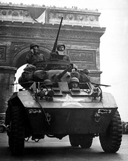

- Reason
- I believe that this meets the criteria for EV, especially with the Arc de Triomphe in the background. Admittedly, the quality of the image is not up the standards of a modern image, but I believe it does meet the requirements in regards to composition and lighting (problem is burn outs). The subject is the M8, and I believe that it shows the subject very well and adds it to a very important historical context (the liberation of Paris). This image will also be used on Portal:Tank if it passes.
- Articles this image appears in
- M8 Greyhound, Censorship, Liberation of Paris, Arc de Triomphe
- Creator
The U.S. National Archives website doesn't state who is the authorOffice for Emergency Management. Office of War Information. Overseas Operations Branch. New York Office. News and Features Bureau.
- Support as nominator --JonCatalán(Talk) 18:18, 11 November 2008 (UTC)
- Support Very powerful image . Bewareofdog 22:09, 12 November 2008 (UTC)
- Weak Oppose There's quite a few scratch lines I'd like to see fixed in PS before I'd consider this an FP --Fir0002 04:15, 13 November 2008 (UTC)
- I have an understanding of Photoshop, but you'd have to tell me to the tools to use. JonCatalán(Talk) 06:53, 13 November 2008 (UTC)
- Primarily the clone stamp tool but the heal tool can sometimes do a good job too. I'd have a go myself but it seems that holidays can be almost as busy as uni! :) --Fir0002 08:50, 13 November 2008 (UTC)
- Comment + Edit1 added I am ongoing with restoration. Question: should I go so far as to attempt to recreate the vehicle.unit identification numbers that were scratched out of the image at some point? Mfield (talk) 20:27, 13 November 2008 (UTC)
- I was wondering what those were, I think you have a good idea as long as it is done historically accurately Thisglad (talk) 04:37, 14 November 2008 (UTC)
- Looks like 20 X and 20R 1 to me.--HereToHelp (talk to me) 01:10, 15 November 2008 (UTC)
- Some important units had the insignias or numbers censored in release photographs otherwise it could aid enemy intelligence about their location, that is probably what was done here Thisglad (talk) 12:37, 15 November 2008 (UTC)
- Which is no longer a valid reason for censorship. Do we remain truthful to the photograph, or to the scene? I'm leaning on putting them back in, but it depends on how well it can be done.--HereToHelp (talk to me) 12:54, 16 November 2008 (UTC)
- After more thought, I am leaving the censorship as is. The numbers are still discernable (which shoes how ineffective that piece of censorship really was), and removing them would be removing something that really adds more enc value, displaying how such images had their numbers removed. So rather than removing them I have added the image to the article on Censorship Mfield (talk) 22:24, 16 November 2008 (UTC)
- I agree, the censorship is an important part of this image's history. JonCatalán(Talk) 23:39, 16 November 2008 (UTC)
- After more thought, I am leaving the censorship as is. The numbers are still discernable (which shoes how ineffective that piece of censorship really was), and removing them would be removing something that really adds more enc value, displaying how such images had their numbers removed. So rather than removing them I have added the image to the article on Censorship Mfield (talk) 22:24, 16 November 2008 (UTC)
- Which is no longer a valid reason for censorship. Do we remain truthful to the photograph, or to the scene? I'm leaning on putting them back in, but it depends on how well it can be done.--HereToHelp (talk to me) 12:54, 16 November 2008 (UTC)
- For the record, 20X (see notes here) would indicate a HQ (or other non-regimental) unit of 20th Infantry Division... which didn't exist. Our caption, taken from here, says it's the 102nd Cavalry, but I suspect that's in error - the numbers could as easily be 28X, which would indicate 28th Infantry Division, which was certainly in Paris for the parade and will have had an M8-equipped recon troop. If so, the second group would logically be 28R (28th Reconnaissance Troop), and then a specific vehicle number. Would anyone object to my correcting the caption based on this? Shimgray | talk | 22:53, 18 November 2008 (UTC)
- For the sake of avoiding "no original research" arguments, I would say no. JonCatalán(Talk) 23:12, 18 November 2008 (UTC)
- Fair enough :-) That said, I'd advise against using the detailed caption that's currently in, eg, Liberation of Paris - a general "American troops...", etc, as here, is accurate enough. Shimgray | talk | 23:27, 18 November 2008 (UTC)
- For the sake of avoiding "no original research" arguments, I would say no. JonCatalán(Talk) 23:12, 18 November 2008 (UTC)
- Some important units had the insignias or numbers censored in release photographs otherwise it could aid enemy intelligence about their location, that is probably what was done here Thisglad (talk) 12:37, 15 November 2008 (UTC)
- Looks like 20 X and 20R 1 to me.--HereToHelp (talk to me) 01:10, 15 November 2008 (UTC)
- I was wondering what those were, I think you have a good idea as long as it is done historically accurately Thisglad (talk) 04:37, 14 November 2008 (UTC)
- Support Edit1 Mfield (talk) 22:32, 16 November 2008 (UTC)
- Support Edit1 per above Thisglad (talk) 06:14, 17 November 2008 (UTC)
- Support Edit 1 - Looks good to me, and including the censorship is a nice idea. Skinny87 (talk) 12:00, 17 November 2008 (UTC)
Promoted Image:UStankParis-edit1.jpg MER-C 23:58, 19 November 2008 (UTC)
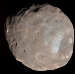
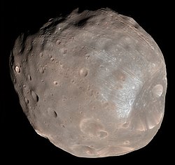
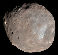
- Reason
- After my previous FPC nomination,Rhea,I found this striking image of Phobos.It will probably be the most detailed image available of Phobos until Phobos-Grunt arrives. Meets all featured picture criteria.
- Articles this image appears in
- Phobos (moon)
- Creator
- NASA,uploaded by Ævar Arnfjörð Bjarmason
- Support as nominator --Fireaxe888 (talk) 17:11, 11 November 2008 (UTC)
- Support as uploader (but obviously not author). This is on of the best pictures of a moon in the entire solar system. --Ævar Arnfjörð Bjarmason 18:08, 11 November 2008 (UTC)
- Question What's all that red noise most visible to the left? Can it be removed?--HereToHelp (talk to me) 18:15, 11 November 2008 (UTC)
- Comment Unfortunately,I'm not quite sure what it is.Perhaps someone with more experience should take a look?--Fireaxe888 (talk) 18:52, 11 November 2008 (UTC)
ConditionalFull support if the red dots can be edited out without changing the moon's surface too much. (I guess it might be some data transmission noise.) --Janke | Talk 19:51, 11 November 2008 (UTC)- Comment Perhaps the moon has measles... Lemon martini (talk) 11:38, 13 November 2008 (UTC)
- Comment - Why this extreme crop? Shouldn't be too difficult to add some more black space -- Alvesgaspar (talk) 21:06, 11 November 2008 (UTC)
- Support - One of the better pictures of the Martian moon. Red "dots" are a result of the process of taking a picture of an object thousands of miles away from Earth, and they are only apparent when viewed at higest resolution. As you can see here [4], even NASA didn't get rid of the dots, and they could if they felt it necessary. --AutoGyro (talk) 16:16, 12 November 2008 (UTC)
- Support edit 2,
but I'd prefer if the red dots were removed. It doesn't look like something extremely hard to do.Diego_pmc Talk 20:09, 12 November 2008 (UTC) - Support Edit 1 Impressive detail and colour is a plus --Fir0002 05:08, 13 November 2008 (UTC)
- Well done! support above is now full... (PS: Be sure to mention the retouching on the image page...) --Janke | Talk 20:43, 13 November 2008 (UTC)
Request Fir0002, could you also fix the red dots on that big crater? They pass right through it, and it's the only place where they're still quite that visible. Diego_pmc Talk 20:59, 13 November 2008 (UTC)- Support Edit 1 or whichever is deemed the best, if more are made. Great job, Fir!--HereToHelp (talk to me) 00:28, 14 November 2008 (UTC)
- Strong Support edit 1 (Fir). Now the red noise is gone, it's a magnificent image of an important object. —Vanderdecken∴ ∫ξφ 09:54, 14 November 2008 (UTC)
- Added edit 2 - I removed the line caused by the red dots on the bright crater (see image). Diego_pmc Talk 11:08, 16 November 2008 (UTC)
Promoted Image:Phobos colour 2008.jpg MER-C 23:58, 19 November 2008 (UTC)
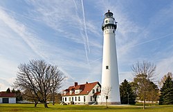

- Reason
- Already a FP on Commons and tr.wp, and a FPC on de.wp. A very beautiful picture that also illustrates its subject well.
- Articles this image appears in
- Wind Point Light, Racine, Wisconsin
- Creator
- JeremyA
- Support as nominator --Diego_pmc Talk 20:22, 6 November 2008 (UTC)
- Weak
OpposeSupport Edit1 I like the composition and it has enc. value. But I don't think it is sharp enough. I'm a little curious as to why -- camera settings seem ok. Fletcher (talk) 20:44, 6 November 2008 (UTC) - Support There is some CA at full size and sharpness isn't perfect, but scale it down to say 1000px high and it comes out practically perfectly therefore I'd say it is technically sufficient. Noodle snacks (talk) 00:26, 7 November 2008 (UTC)
- Did you save your edit? Fletcher (talk) 21:20, 7 November 2008 (UTC)
- Nope, it was just for references sake here is a 1000px preview bearing in mind I am not sure if wiki thumbnail generation uses the best algorithm, and that a mild sharpen could be appled after scaling. Noodle snacks (talk) 22:24, 7 November 2008 (UTC)
- Did you save your edit? Fletcher (talk) 21:20, 7 November 2008 (UTC)
- Weak support - I don't think the slight unsharpness is enough for an oppose. In case anyone's interested, I've been messing around with deconvolution for images recently, so I put this one through it. The sharpness is better, but it also emphasises the JPEG artifacts and unsharp masking from the original so it's not really an improvement. Time3000 (talk) 12:59, 9 November 2008 (UTC)
- Comment And here is a somewhat downsampled version per Noodle Snacks' suggestion. I thought it was improved even above 1000px so did not go that far. Any better? Time3000 stated his version was not for voting so I've called this Edit1. Fletcher (talk) 18:17, 9 November 2008 (UTC)
- While its letdowns are not that visible anymore, so are some some details (top of the tower for example). I honestly don't find the blur that bad, so that a downsized version would be needed. Just my two cents. Diego_pmc Talk 21:01, 9 November 2008 (UTC)
- That's fair. I wanted to put it out there for others who were bothered by sharpness. Fletcher (talk) 12:59, 11 November 2008 (UTC)
- Support --Avala (talk) 19:24, 11 November 2008 (UTC)
- Support Edit 2 - original has too poor sharpness IMO for a static (and therefore relatively easy to rephotograph) subject. Nice lighting and colours --Fir0002 04:38, 13 November 2008 (UTC)
- Support Edit 2 Intothewoods29 (talk) 04:14, 19 November 2008 (UTC)
Promoted Image:Wind Point Lighthouse 071104 edit2.jpg MER-C 23:58, 19 November 2008 (UTC)



- Reason
- The picture is of an exceptionally high, professional quality. The technical standard is superior and is of comparable quality to our featured pictures of Elizabeth II of the United Kingdom and Mohammed Alim Khan.
- Articles this image appears in
- Jigme Khesar Namgyel Wangchuck
- Creator
- Image sent to Wikipedia by the Bhutanese royal family.
- Support as nominator --Hemlock Martinis (talk) 19:24, 6 November 2008 (UTC)
- Weak oppose not very sharp and just above the minimum size Muhammad(talk) 19:29, 6 November 2008 (UTC)
- Support Technically weak (per Muhammad), but not terrible either. More important, this image, apparently donated here by the royal family, seems like it could be an extremely rare image -- if you go to Jigme Khesar Namgyel Wangchuck and look at the infobox showing his royal family, we have very scant coverage and no other pictures. We must have a gazillion photos of Obama, GWB, etc. This represents systemic bias. Fletcher (talk) 21:32, 6 November 2008 (UTC)
- Support - I absolutely agree with Fletcher here. Intothewoods29 (talk) 22:36, 6 November 2008 (UTC)
- Support Per Fletcher.--HereToHelp (talk to me) 00:12, 7 November 2008 (UTC)
- Support Edit 1 The portrait seems pretty good and asthetically pleasing. Quite a lot of blown highlights though unfortunately (mostly the red channel). The relatively low shutter speed seems to have caused some camera shake blur which I have compensated for as much as possible in the edit, the change is most visible around the eyes. Noodle snacks (talk)
- Support Edit 1 In the full size, I do notice the blur (around the eyes) on the original and correction made by Noodle snacks. Regards, Ganeshk (talk) 03:27, 7 November 2008 (UTC)
- Support Although the photo is a bit smaller than I would like to see, I will support until there is a larger copy available. smooth0707 (talk) 05:17, 7 November 2008 (UTC)
- Support edit 1. Any minor flaws (such as the fact that it's cropped a little too close, resulting in the loss of a bit of his right arm and left cuff) are more than made up for by the difficulty in getting a free image of this subject (no pun intended) at all. —Angr 07:07, 7 November 2008 (UTC)
- Support
edit 1edit 2 Diego_pmc Talk 08:24, 7 November 2008 (UTC) - Support edit 1 - Good portrait. --Caspian blue 16:00, 7 November 2008 (UTC)
- Support edit 1 slightly smaller then it could be but, very asthetically pleasing, very difficult to get image. Anonymous101 (talk) 21:11, 7 November 2008 (UTC)
- Support edit 1 User:Angr really sums up my opinion on this pic. It's not technically perfect, but its still nice enough and its rarity makes up for it. SpencerT♦C 21:15, 7 November 2008 (UTC)
- Request I just noticed some damage done by the sharpening process. On the back of this head, at the limit between his hair and the wall there is a bright line (artifact). Would someone please fix that, I find it pretty annoying. See this pic. Diego_pmc Talk 13:23, 9 November 2008 (UTC)
- Support either --Avala (talk) 19:24, 11 November 2008 (UTC)
Promoted Image:King Jigme Khesar Namgyel Wangchuck (edit).jpg MER-C 23:59, 19 November 2008 (UTC)
- Reason
- the picture has a very high resolution, good color ballance and the subject is perfectly in focus. It Makes an excelent wallpaper for one who's in monorails or trains
- Articles this image appears in
- Monorail and others
- Creator
- Gobeirne
- Support as nominator --BaratDavid (talk) 10:28, 17 November 2008 (UTC)
- Oppose Just a snapshot, messy background, some chromatic aberration, low enc. --Janke | Talk 14:21, 17 November 2008 (UTC)
- Oppose per Janke. This picture is used in the switching section of Monorail but doesn't really illustrate switching or the loop used in Sydney. Seems to me that this is just a tourist picture, not featured picture quality. Makeemlighter (talk) 06:12, 18 November 2008 (UTC)
- Oppose Having lived in Sydney for 6 months I can guarentee that a better pic can be taken of this - for a start the Monorail in Sydney crosses the harbour area at one point near a fantastic old warship - I would much rather that as a background with the sparkling blue sea than random office buildings and cars... Even the Sydney Tower or Sydney Bridge would make better backgrounds... Not FP quality... gazhiley Talk 09:46, 19 November 2008 (UTC)
Not promoted . --John254 06:13, 23 November 2008 (UTC)
- Reason
- Sorry if this is a lot of Doré - I am trying to be highly selective, as I'm preparing a complete set of all hundred or so illustrations Doré did of the Divine Comedy, and, obviously, I don't expect them all to be featured. However, I think this is easily the best of Doré's images of the hurricane of souls in the second circle of Hell, and the dramatic layout and imagery really illustrates this part of the plot very well.
Doré's Divine Comedy is usually considered one of his masterworks - certainly, it generally features heavily in any compilation of Doré - and there are more than 75 illustrations in Inferno (and about a dozen each for Purgatorio and Paradiso, proving what generations have thought: They just aren't as interesting.) I thought I'd try for the best 5 to 15 percent of the illustrations (in my view, of course), getting us an excellent selection of Doré's work, without overwhelming FP with Doré.
- Articles this image appears in
- Francesca da Rimini, The Divine Comedy
- Creator
- Gustave Doré
- Support as nominator --Shoemaker's Holiday (talk) 17:34, 19 November 2008 (UTC)
- Support. Excellent reproduction. Spikebrennan (talk) 17:44, 19 November 2008 (UTC)
- Support because of quality and awesome description on the image page. :) Intothewoods29 (talk) 01:25, 20 November 2008 (UTC)
- Support. Keep the Dore coming.--ragesoss (talk) 17:27, 20 November 2008 (UTC)
- Withdraw I just discovered the edition I used just didn't care, and cropped the images. Shoemaker's Holiday (talk) 21:51, 20 November 2008 (UTC)
- comment - these seem like a perfect group for a featured image set. de Bivort 07:06, 21 November 2008 (UTC)
- Yes, except that a Featured set must be complete. Since there are a finite number of engravings, we'd need all of them (and some of them aren't up to par). Not even these make it because, from what I understand, this image itself is not complete.--HereToHelp (talk to me) 18:32, 22 November 2008 (UTC)
- Reason
- Pretty much per below. Just thought one of Doré's big action scenes wouldn't go amiss. Typical of Doré's action scenes, it's quite complex and detailed - I believe he's here imitating the layout of Greek urns and the like - so it doesn't look as good in this small thumbnail.
- Articles this image appears in
- Charon (mythology), Gustave Doré.
- Creator
- Gustave Doré
- Support as nominator --Shoemaker's Holiday (talk) 22:58, 18 November 2008 (UTC)
- Support - wow... intense... yet funny. I think it's amusing to imagine Charon smacking naked dead people with an oar and shouting a lot. ;) Intothewoods29 (talk) 04:07, 19 November 2008 (UTC)
- Support. A well-reproduced Dore. What's not to like?--ragesoss (talk) 17:30, 20 November 2008 (UTC)
- Withdraw I just discovered the edition I used just didn't care, and cropped the images. Shoemaker's Holiday (talk) 21:51, 20 November 2008 (UTC)
- Reason
- Gustave Doré was a major engraver - usually considered amongst the masters of the craft - and this particular engraving is dramatic and very nicely composed. Even at this tiny 250px size, it's dramatic and interesting, at full size, it is spectacular.
- Articles this image appears in
- Charon (mythology), Gustave Doré.
- Creator
- Gustave Doré
- Support as nominator --Shoemaker's Holiday (talk) 22:58, 18 November 2008 (UTC)
- Support Excellent quality capture of excellent image. --Leivick (talk) 00:36, 19 November 2008 (UTC)
- Support - great job Intothewoods29 (talk) 04:09, 19 November 2008 (UTC)12356780-987654321246789890-90764445778900--0-noobnjxdnfdjed
- Support --Massimo Catarinella (talk) 22:11, 19 November 2008 (UTC)
- Support Stunning! You're right: at full size it is incredible. You should consider adding this, or one of the other Doré's, to Engraving. Two questions: What material was this engraved on? Did you scan it from a book? Sorry if I missed the answers elsewhere. Makeemlighter (talk) 00:46, 20 November 2008 (UTC)
- Oh, and what does that say in the bottom right corner? Makeemlighter (talk) 04:58, 20 November 2008 (UTC)
- IT's from an on-the-whole quite good edition of the Divine Comedy, though there's a couple engravings in the second circle that suffered severe printing errors - particularly the engraving of Francesca da Rimini being kissed by her brother in law, which has become a sea of undifferentiated black ink on the entire left hand side, obscuring both men. Oops! Luckily, I know engravings pretty well, so it's not hard for me to spot such errors, and they certainly don't appear in, say, this one. The text reads "Pannemaker", presumably Adolphe François Pannemaker (1822-1900) one of Doré's assistants in turning his art into a full-fledged engraving, and not a bad artist in his own right. Shoemaker's Holiday (talk) 20:49, 20 November 2008 (UTC)
- Oh, and what does that say in the bottom right corner? Makeemlighter (talk) 04:58, 20 November 2008 (UTC)
- Withdraw I just discovered the edition I used just didn't care, and cropped Doré's work willy-nilly. Shoemaker's Holiday (talk) 21:50, 20 November 2008 (UTC)
todo mundo e gay
- Reason
- High res, good quality, huge EV. Original restoration work by Tom, but I finished it off by touching up the image quite a bit.
- Articles this image appears in
- Grover Cleveland, United States presidential election, 1884, United States presidential election, 1892, United States presidential election, 1896, Republic of Hawaii, Villanova University, Rock Springs massacre, Lafayette Square, Buffalo
- Creator
- Frederick Gutekunst (edited by Tom and Ceranthor)
- Support as nominator --— ceranthor (strike) 13:10, 9 October 2008 (UTC)
- Oppose Not the best version available—the original LOC tiff [5] is about 5MP when cropped similaraly and is free from the huge amount of jpeg artifacting of this version. It does need a lot of restoration work, though. Thegreenj 20:20, 9 October 2008 (UTC)
- I disagree. That one would require even more substantial editing and therefore would leave more JPEG artifacts. Could you identify some of the artifacts, please, so I may fix them? —Ceran (Fly!) 20:39, 9 October 2008 (UTC)
- Editing doesn't produce jpeg arifacts; saving it at too high a compression does. The artifacts are visible in all out-of-focus areas, especially around his bow tie, if you need a reference point. They're what's causing the jagged OOF edges. As to the original needing more editing, that's what FP is all about: finding the best of the best. If you look at the historical pictures that have gone through here, you'll find incredible restorations that must have taken days, but that is what this is all about. Thegreenj 01:52, 10 October 2008 (UTC)
- Conditional oppose. Good find. Would support a new crop and restoration without the compression. Ceran, suggest you start from the original LoC file and work in .tif format (which is lossless), then convert to .jpg with maximum resolution as the final step before uploading. It'd be a good idea to save an interim .tif file or two along the way (particularly just prior to adjusting the histogram.). Best wishes; I'll look forward to changing this vote to support. DurovaCharge! 04:59, 10 October 2008 (UTC)
- I'm kind of a noob at editing, how would I convert it? —Ceran (Fly!) 19:26, 10 October 2008 (UTC)
- We're trading a couple of messages in userspace about this; suggest suspending the nomination for reediting? I'd be glad to coach. DurovaCharge! 23:16, 10 October 2008 (UTC)
- Sure. —Ceran (Fly!) 23:33, 10 October 2008 (UTC)
- We're trading a couple of messages in userspace about this; suggest suspending the nomination for reediting? I'd be glad to coach. DurovaCharge! 23:16, 10 October 2008 (UTC)
- Have requested the nominator that this be reopened or withdrawn since it's been down here for over a month with no further progress. I will move it back into the 'live' noms section next time I'm on if nothing else happens. I think a good rule of thumb is that noms don't stay 'suspended' for more than a month, as that's a more than generous time frame. --jjron (talk) 07:42, 21 November 2008
(UTC) Ok then, withdraw. —Ceran ♦ (talk) 01:43, 23 November 2008 (UTC)
- Reason
- Encyclopedic and beautiful image. (Featured on Commons.)
- Articles this image appears in
- Celebes Crested Macaque, Buffalo Zoo
- Creator
- Davepape
- Support as nominator --Dweeebis (talk) 15:43, 17 November 2008 (UTC)
- Oppose Soft - no fur detail - and lighting issues - subject in shadow with distracting bright background. Zoo shot so should be could and should be better for FP. Mfield (talk) 17:55, 17 November 2008 (UTC)
- Oppose. Sadly disappointing at fullsize. It's hard to tell what the original was like as this has been overcompressed. A better quality version could be requested, but I somehow doubt that it would reach the mark even then for some of the reasons Mfield gives. --jjron (talk) 08:04, 21 November 2008 (UTC)
- Oppose. I've always been far too aware of the lighting problems with this photo (I just liked his expression). Going back to the original would not help much, I'm afraid. (And it's not featured on Commons - I think that was a copy&paste mistake in the nomination.) --dave pape (talk) 07:08, 23 November 2008 (UTC)
Not promoted MER-C 03:37, 24 November 2008 (UTC)
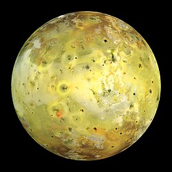

- Reason
- high quality, nice pic
- Articles this image appears in
- Io (moon) and several other article related to moons
- Creator
- NASA
- Support as nominator --Nergaal (talk) 07:37, 16 November 2008 (UTC)
- Oppose crop too tight, and the edges look a little rough—don't think it's like that in the original. Diego_pmc Talk 08:10, 16 November 2008 (UTC)
- Then look at the source: http://photojournal.jpl.nasa.gov/catalog/PIA02308 10:28, 16 November 2008 (UTC)
- That image is a lot smaller. The crop can be easily fixed, but the edges not so much. Diego_pmc Talk 11:12, 16 November 2008 (UTC)
- The link is the page of the image where you will find the full resolution picture too at http://photojournal.jpl.nasa.gov/jpeg/PIA02308.jpg. Nergaal (talk) 11:53, 16 November 2008 (UTC)
- That image is a lot smaller. The crop can be easily fixed, but the edges not so much. Diego_pmc Talk 11:12, 16 November 2008 (UTC)
- Conditional support if the image has more background with a little softening the edge which can be easily fixed. BTW, the moon looks awesome! --Caspian blue 22:14, 16 November 2008 (UTC)
- I tried to upload one with about 10% more width, but I can't get it to commons. Could somebody do it? Also, I haven't done this before, so I don't know what exactly you mean by softening. Nergaal (talk) 04:26, 17 November 2008 (UTC)
- Oppose - Honestly I've considered nominating this pic before - but it wasn't really eye-grabbing to me, and the detail really isn't that great. —Ceran ♦ (talk) 22:24, 19 November 2008 (UTC)'
- Question - Why did adding a bit of black margin increase the file size from 771 KB to 3.86 MB!?
- Probably the result of saving at jpg Quality 12 in Photoshop (or equivalent elsewhere). Unfortunately fewer and fewer people seem to understand the control of image filesize vs quality for web use, so just whack it on the highest settings they can find. Even saving at 11 would have probably only marginally increased the filesize, but would have shown no noticeable difference in quality. --jjron (talk) 07:58, 21 November 2008 (UTC)
Not promoted MER-C 03:44, 24 November 2008 (UTC)

- Reason
- The picture depicts Pauline Koch, the mother of famous scientist, Albert Einstein, Surely, she deserves as much credit as her son, shouldn't she?
- Articles this image appears in
- Pauline Koch,
- Creator
- Unknown
- Support as nominator Luke Farrelly-Spain (talk) 12:05, 9 March 2008 (UTC)
- Oppose Good encyclopedic value, but low resolution and pretty grainy and scratched up scan Thisglad (talk) 12:43, 15 November 2008 (UTC)
- Comment - Edit added. —Ceran↕(talk) 13:27, 15 November 2008 (UTC)
- Oppose The size in 400 x 600 pixel does not meet the minimal requirement for FP.--Caspian blue 15:03, 15 November 2008 (UTC)
- Comment Great picture, it makes a change from all the other fetured pictures. Karen Spain (talk) 10:11, 16 November 2008 (UTC)
- Comment I would love to see it on the main page, it would also help the einstein family wikiproject!!! Simptimes (talk) 10:20, 16 November 2008 (UTC)
- Oppose Good encyclopedic value, but it's at too low a resolution. It would make a change from other photos, but the change would be brought about partly by its inappropriateness.CharlieRCD (talk) 12:05, 16 November 2008 (UTC)
Not promoted MER-C 03:37, 24 November 2008 (UTC)
- Reason
- Quality photo with high encyclopedic value of one of the top prospects for the upcoming 2009 NHL Entry Draft.
- Articles this image appears in
- Magnus Svensson Pääjärvi, Timrå IK
- Creator
- Krm500
- Support as nominator --—Krm500 (Communicate!) 05:40, 15 November 2008 (UTC)
- Oppose, I don't really see a EV here, maybe if it was a picture of him standing in a suit, but you can't even see his face.--MakE shout! 17:59, 15 November 2008 (UTC)
- How would a picture of a ice hockey player standing in a suit be more EV then one showing him playing? —Krm500 (Communicate!) 18:31, 15 November 2008 (UTC)
- Oppose, Nothing special about this pic. and the object is cut as well as the stick -128.131.213.60 (talk) 09:41, 23 November 2008 (UTC)
Not promoted MER-C 03:38, 24 November 2008 (UTC)
- Reason
- High res and great quality, and our political leader FPs are greatly lacking. Let's grab this GFDL-licensed image and make it an FP. This has huge EV as a great image of the Supreme Leader and former President of one of the most interesting countries in the world.
- Articles this image appears in
- Iran, President of Iran, Ali Khamenei, Supreme Leader of Iran, Azerbaijani people, Lists of Azeris, Ethnic minorities in Iran
- Creator
- Iranian Foundation of Holy Defence Values, Archives and Publications (unspecified)
- Support as nominator --—Ceran(dream / discover) 00:11, 15 November 2008 (UTC)
- Support After looking at ridiculously high-rez macros of insects, I want more detail and zoom on the face. But do we really need to count his hairs? The Iranian flag in the background makes for great enc and a balanced composition. Clothing is also a plus. No noise, grain, color splotches, etc., and reasonably well-focused.--HereToHelp (talk to me) 00:29, 15 November 2008 (UTC)
- Oppose Ridiculous amount of jpeg artifacts, 130kb wont cut it. —Krm500 (Communicate!) 00:32, 15 November 2008 (UTC)
- Comment - I don't see any jpeg artifacts. Can you please clarify? -- Alvesgaspar (talk) 02:13, 15 November 2008 (UTC)
- They're visible around his turban and his glasses. Thegreenj 02:28, 15 November 2008 (UTC)
- Comment - I don't see any jpeg artifacts. Can you please clarify? -- Alvesgaspar (talk) 02:13, 15 November 2008 (UTC)
- comment: I've asked spikebrennan if he could try and remove them, as he is good with "people pictures" as I like to call them. —Ceran(dream / discover) 02:55, 15 November 2008 (UTC)
- I've never edited an image in my life. I think you've mistaken me for User:Durova or something. For what it's worth, I don't know whether it's really possible to remove JPG artifacts, per se-- they're the result of image compression, so what you would want to do is find the source image if it exists. Someone who is actually competent at image editing (i.e., not me) can chime in and correct me. Spikebrennan (talk) 19:23, 17 November 2008 (UTC)
- Support as HereToHelp Muhammad(talk) 08:43, 15 November 2008 (UTC)
- Oppose, this is only a mediocre portrait... most portraits from the Senate are better than this... and I don't think it's particularly rate. gren グレン 14:48, 16 November 2008 (UTC)
- Oppose. Image is far too compressed. Fixing the JPEG artifacting would only be possible by blurring or downsampling the entire picture, in which case the resolution would be too low I'm afraid. Kaldari (talk) 19:27, 17 November 2008 (UTC)
- Query - I'm concerned a bit. I don't honestly think this picture can be replaced so easily. Can we let it have sometime to possibly get extra feedback? —Ceran ♦ (talk) 23:57, 18 November 2008 (UTC)
- Do you think that there is a significant chance of a higher-quality picture being produced if this nom were suspended? I honestly don't see any reason for this nomination to be prolonged; if a better photo pops up in the future, you can always start a renomination. Thegreenj 21:28, 19 November 2008 (UTC)
- Well, the point I was trying to make was that it was close to irreplaceable, since Iran is becoming so reclusive. —Ceran ♦ (talk) 22:37, 19 November 2008 (UTC)
- Do you think that there is a significant chance of a higher-quality picture being produced if this nom were suspended? I honestly don't see any reason for this nomination to be prolonged; if a better photo pops up in the future, you can always start a renomination. Thegreenj 21:28, 19 November 2008 (UTC)
Not promoted MER-C 03:38, 24 November 2008 (UTC)
- Reason
- Well-known historical photo of two of the greatest recording artists of the 20th century. There's actually a remarkable story [6] beyond the meeting that was photographed, and that story is the subject of a film that has its own WP article. The photo is also, apparently, the most-requested image in the National Archives. It's also featured [7] on the Turkish wikipedia.
- Articles this image appears in
- Elvis Presley, Richard Nixon, Elvis Meets Nixon, etc.
- Creator
- Ollie Atkins (White House photographer; yes it's PD)
- Support as nominator --Spikebrennan (talk) 16:23, 14 November 2008 (UTC)
- Support High enc and public interest, in excellent condition.--HereToHelp (talk to me) 22:09, 14 November 2008 (UTC)
- Support per nom. Cacophony (talk) 06:42, 15 November 2008 (UTC)
- Support Great composition and encyclopedic value Thisglad (talk) 12:45, 15 November 2008 (UTC)
- Oppose The picture is staged shot, but too blurry and something looks missing and I am not persuaded by the nom.--Caspian blue 15:09, 15 November 2008 (UTC)
- Support Diego_pmc Talk 20:00, 15 November 2008 (UTC)
- Oppose as per my comments at the PPR nom. I find this an interesting photo, but highly question the EV. I can see no suggestion anywhere that this had any impact on the careers or lives of either Nixon or Presley. I've looked at the info linked to at the US archives, and it reads as though this had little impact beyond Nixon thinking Presley a bit of a nut. The WP article about the film is not particularly well written and fails to point out that it's a mockumentary (see here). I don't think it's a good enough photo of either of them alone to be featured as illustrative of them as individuals. So, in other words, it seems to be a brief meeting of two otherwise famous people, making it a nice interesting trivial 'celeb' photo, but not particularly encyclopaedic. --jjron (talk) 12:51, 17 November 2008 (UTC)
- Oppose per Jjron. Calliopejen1 (talk) 16:03, 17 November 2008 (UTC)
No consensus MER-C 03:39, 24 November 2008 (UTC)
- Reason
- Striking image of an aphid population feeding on a fennel plant
- Articles this image appears in
- Aphid
- Creator
- Fir0002
- Support as nominator --Fir0002 10:07, 18 November 2008 (UTC)
- Oppose Not to your usual standard. Low DOF, not crisp and not identified. Lycaon (talk) 18:58, 18 November 2008 (UTC)
- Oppose, decent image but the out of focus insects at the edges are quite distracting and I think it would be liable to be deposed from its position in the article by a high quality image of an individual specimen. Guest9999 (talk) 23:49, 18 November 2008 (UTC)
Not promoted . --John254 03:36, 26 November 2008 (UTC)

- Reason
- This image is of high resolution, is well composed and exposed, and accurately depicts the subject in the article. It is listed under a Creative Commons Attribution ShareAlike 2.5 license. The caption is cohesive, and the image is of high enough quality to fit under the FPC.
- Articles this image appears in
- Greater Crested Tern
- Creator
- Glen Fergus
- Support as nominator --Dsw4 (talk) 15:11, 19 November 2008 (UTC)
- Oppose Good EV but I don't think technical quality is high enough. Is it blown in the white area below the beak? I know it's white but I still can't make out texture. Also is not very sharp and seems to have some jpeg artifacts (e.g., outlining the belly). Fletcher (talk) 17:40, 19 November 2008 (UTC)
- Oppose I noticed this on the front page the other day, frankly there are already two FPCs in the article of superior quality, but I don't think its even up to the general bird standard. Noodle snacks (talk) 21:48, 19 November 2008 (UTC)
- Oppose Unsharp, artifacting in the sand and not much wow-factor. SpencerT♦C 01:25, 24 November 2008 (UTC)
Not promoted . --John254 03:37, 26 November 2008 (UTC)
- Reason
- Middle resolution, sharp, and has enormous EV for the brightest star in the night sky, and its dull little brother and/or sister.
- Articles this image appears in
- = Sirius, Stellar classification, White dwarf, Binary star, Artifact (observational), List of nearest bright stars
- Creator
- HST (again! ;))
- Support as nominator --—Ceran ♦ (talk) 20:56, 21 November 2008 (UTC)
- Oppose Conveys almost zero useful information. May as well be an overexposed car headlight. The overexposure and artifacts from the imaging totally ruin it, a single image is unable to capture the difference in brightness obviously, but overexposing one to this degree doesn't help either. It would be better for size comparison purposes as a composite of two correctly exposed images. Mfield (talk) 21:02, 21 November 2008 (UTC)
- Urgh - the entire reason I added that was because I knew people would make comments like yours - if not for the over-exposing, then you couldn't see Sirius B and then the EV would be fractured. —Ceran ♦ (talk) 21:04, 21 November 2008 (UTC)
- I respectfully disagree. A composite of two correctly exposed images would better display the relative sizes without all the artifacting from the massive overexposure. And an 8-bit output method is completely incapable of displaying the difference in brightness anyway, so any attempt to to this is flawed, we cannot deduce anything remotely exact about brightnesses of the two stars from this image except to say that one is a LOT brighter than the other. A bit of text with a large number factor on it would achieve the same, and be exact, hence I do not see this as having that high enc from the point of view of "illustrating the article content particularly well" criteria. Mfield (talk) 21:19, 21 November 2008 (UTC)
- There is no such thing as sizes when it comes to images of stars. They are all unresolved. Any perceived width is due to the point spread function of the optics and the atmosphere. Therefore a composite would be misleading. Your statement about an 8-bit method being "completely incapable" of conveying the difference is also incorrect. By using the PSF, you could infer the brightness of SiriusA based on the area of pixels that are of a particular within-photodetector-sensitivity value. de Bivort 22:48, 21 November 2008 (UTC)
- Is it possible to deduce the relative brightnesses of these two stars from this image alone? If so, I stand corrected. As it is, I don't believe you can without additional information that the viewer does not possess, thus this image does not add a huge amount of information to a WP reader - the accompanying text would do a better job of quantifying that. That was my point. An 8 bit image cannot display the brightness difference in a way that is meaningful to the eye, it requires knowledge of the optical system, the sensor used to capture the photons, the post processing of the consequent image, all followed by some mathematics. That's not using an image to illustrate content, not without using it to illustrate the Point spread function article at any rate.. Mfield (talk) 23:03, 21 November 2008 (UTC)
- There is no such thing as sizes when it comes to images of stars. They are all unresolved. Any perceived width is due to the point spread function of the optics and the atmosphere. Therefore a composite would be misleading. Your statement about an 8-bit method being "completely incapable" of conveying the difference is also incorrect. By using the PSF, you could infer the brightness of SiriusA based on the area of pixels that are of a particular within-photodetector-sensitivity value. de Bivort 22:48, 21 November 2008 (UTC)
- I respectfully disagree. A composite of two correctly exposed images would better display the relative sizes without all the artifacting from the massive overexposure. And an 8-bit output method is completely incapable of displaying the difference in brightness anyway, so any attempt to to this is flawed, we cannot deduce anything remotely exact about brightnesses of the two stars from this image except to say that one is a LOT brighter than the other. A bit of text with a large number factor on it would achieve the same, and be exact, hence I do not see this as having that high enc from the point of view of "illustrating the article content particularly well" criteria. Mfield (talk) 21:19, 21 November 2008 (UTC)
- Oppose. This is one particular representation of these two stars that is, like other possible representions, fairly arbitrary. It's an essentially artifactual image, in which the quality of the artifacts produced by the image system is meant to indicate the actual differences between the stars and/or their appearance from Earth. But the visual effect is two stars of different sizes; as the discussion above points out, the actual sizes of the stars are not what is recorded by the image. On top of that, it's not an attractive image, by FP standards, and it's not really all that sharp; there's very little extra detail apparent at full resolution compared to thumbnail size. If it was more attractive and more detailed, it would be possibly appropriate for FP as an illustration of observational artifact (one of its current uses where it does have a fair amount of meaningful detail).--ragesoss (talk) 20:31, 22 November 2008 (UTC)
- Oppose: You can't tell what it is, also, plenty of stars have binary/companion stars orbiting around them, what makes this poor quality picture any special? – Jerryteps 10:21, 24 November 2008 (UTC)
Not promoted . --John254 22:55, 26 November 2008 (UTC)
- Reason
- Dramatic photo of a famous historic landmark in San Francisco
- Articles this image appears in
- Golden Gate Bridge
- Creator
- Cabe6403
- Support as nominator --Cabe6403 (Talk•Sign!) 23:59, 18 November 2008 (UTC)
- Oppose There are plenty of Golden Gate Bridge pictures, and this one doesn't illustrate anything particularly important. So I think that's a no on EV. Caption says this is during morning, but the article says "On weekday mornings, traffic flows mostly southbound into the city, so four of the six lanes run southbound." Looks to me like there are three lanes going both ways. And fog is more distracting than anything. Makeemlighter (talk) 01:03, 19 November 2008 (UTC)
- Weekend mornings do exist too you know :P Cabe6403 (Talk•Sign!) 01:17, 19 November 2008 (UTC)
- Support - Makeemlighter brings up some good points, but this is the only picture in the article that shows 1) the people on the side and 2) the traffic (which is surprising, since there's always traffic!)... so I do think it does have EV. In addition, the fog is a must for the article: I don't know when most of the sunny and clear pics of the bridge were taken, since it's pretty much always cloudy there! It's useful and important to have a different view of the bridge. Intothewoods29 (talk) 03:59, 19 November 2008 (UTC)
- Oppose I do think it's fine to have FPs that are less artsy and more encyclopedic, but in this case, I don't really see a lot of EV in showing crowds and traffic. Decent addition to the article but not a FP. Fletcher (talk) 17:44, 19 November 2008 (UTC)
- Oppose I don't see any reason not be picky with such a commonly photographed and available subject. The composition and image size are both less than perfect. --Leivick (talk) 19:47, 19 November 2008 (UTC)
- Support Loads of detail and info in the picture, like amount of traffic, effect of fog on sight, rail design, division of lanes. Pleasant composition. Narayanese (talk) 20:45, 19 November 2008 (UTC)
- Support Per Intothewoods29 thanks Astuishin (talk) 08:59, 23 November 2008 (UTC)
- Comment I made an edit of your picture. Just some simple level twitching and the picture already looks a whole lot better. I suggest you do the same to the tif file or original RAW file to reduce compression. While your at it, also add some contrast, saturation and run a high pass filter over it. If you are unable to do so, but you do have a RAW file available, I'll be happy to do it for you. --Massimo Catarinella (talk) 11:45, 23 November 2008 (UTC)
- RE Looks good for the most part but some of the highlights on the car windscreens now look overblown and quite distracting. Cheers for the ideas though -- Cabe6403 (Talk•Sign!) 14:23, 23 November 2008 (UTC)
- Oppose: Looks like a million other pictures of the Golden Gate Bridge, also it looks like it's leaning to the side by a few degrees. Not a special picture, we've all seen picture of the bridge before and this one does not have any encyclopedic value other than "it's a bridge". – Jerryteps 10:26, 24 November 2008 (UTC)
- Oppose Nothing special in terms of GGB pictures. Both technically and artistically. -Fcb981(talk:contribs) 20:51, 24 November 2008 (UTC)
Not promoted . --John254 01:27, 27 November 2008 (UTC)
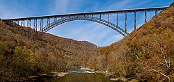
- Reason
- High quality photo that represents a great example of structural and bridge engineering. Already a FP on Commons and at German Wiki. 2007 POTY candidate (104th place!). I feel it meets all requirements of FP status.
- Articles this image appears in
- New River Gorge Bridge, Timeline of three longest supported deck arch bridge spans
- Creator
- JaGa
- Support as nominator --Wadester16 (talk) 04:36, 21 November 2008 (UTC)
- Support Wow. Lovely quality, great story to go with it (being closed for the base jumping) and lovely pic. Well framed IMO and the colours are fantastic on the surrounding landscape... Just wondering though, any idea what is behind the trees in the bottom right corner above a fork in a silver tree? Looks like rail lines but not quite - just curious as can't work out what it is... gazhiley Talk 09:55, 21 November 2008 (UTC)
- Support - Super image! Btw gazhiley they are railway lines --Childzy ¤ Talk 11:52, 21 November 2008 (UTC)
- Support, although maybe it should be rotated so that the bridge is horizontal. I went to Bridge Day last year and it was great with all the leaves changing colors. You should also add that besides base jumping, people also go rappelling down to the valley floor from underneath the bridge. — BRIAN0918 • 2008-11-21 14:01Z
- Support Both the quality and composition are great. --Massimo Catarinella (talk) 16:45, 21 November 2008 (UTC)
- Support Does not need straightening!! Lycaon (talk) 23:47, 21 November 2008 (UTC)
- Oppose I do not think the composition and balance between the bridge and sky are great. --Caspian blue 17:20, 22 November 2008 (UTC)
- Support. There's room for disagreement, but I rather like the composition, which highlights the river as much as the bridge.--ragesoss (talk) 20:35, 22 November 2008 (UTC)
- Weak Support I really wish there was a bit more space at the edges (in particular the LHS) but still a good shot --Fir0002 21:45, 23 November 2008 (UTC)
- Support Very nice high quality photograph. —Krm500 (Communicate!) 04:57, 26 November 2008 (UTC)
Promoted Image:New River Gorge Bridge.jpg MER-C 02:33, 27 November 2008 (UTC)
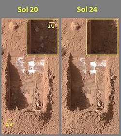
- Reason
- high quality, historical picture
- Articles this image appears in
- Phoenix (spacecraft)
- Creator
user:DragonFire1024NASA/JPL
- Support as nominator --Nergaal (talk) 03:11, 20 November 2008 (UTC)
- Comment - a very important image, but could we get a version with less JPG compression? —Vanderdecken∴ ∫ξφ 10:37, 20 November 2008 (UTC)
- Support I think we can forgive some JPG compression due to the high encyclopedic value of the image. How likely is it NASA will give us a better pic? Fletcher (talk) 15:15, 20 November 2008 (UTC)
- Strong oppose Horrid JPEG artifacts, ugly yellow text on gray background. I'm sure it wouldn't be too difficult to find the originals and arrange them properly. This really isn't FP material. Space images should be of highest quality, it's not like they're beamed to earth as tiny 75% quality JPEGs. TheOtherSiguy (talk) 02:46, 21 November 2008 (UTC)
- Strong oppose Not fp quality, and if zoomed close, shadow detail has coloration. —Preceding unsigned comment added by ZooFari (talk • contribs) 05:39, 21 November 2008 (UTC)
- Comment. The objections above are valid, but I wonder what quality camera these landers are using. This may well be as good as it gets, and EV does seem high, and certainly not easily repeatable photos. I wonder if someone into this stuff can clarify (sorry, I'm too lazy to try to look it up myself atm). --jjron (talk) 08:19, 21 November 2008 (UTC)
- Comment: Why, why such a cumbersome size reference as 2/3"? either 1", or 10mm or 20 mm, but not 2/3"! --Janke | Talk 09:00, 21 November 2008 (UTC)
- Comment: Here are the raw files. I haven't a clue how to Photoshop them into a color image. http://www.met.tamu.edu/mars/020.html and http://www.met.tamu.edu/mars/024.html Chicago god (talk) 22:19, 21 November 2008 (UTC)
- Open the red, green and blue images as layers (in the Gimp, it's File -> Open as layer) so that the blue is on the bottom and red on top. Set each layer to 33% opacity and add a white background layer. Colorize each image layer (Filters -> Colors -> Colorify) with their respective colors. Then flatten the image and boost both the brightness and contrast. I'm not sure of the true color accuracy of this, but hey it works. MER-C 01:53, 22 November 2008 (UTC)
- Those images are no larger and are also jpegs so it's probably not going to help much. I would be very surprised if they were beamed to earth with any kind of lossy compression - it would make any kind of reasearch on the images difficult. They are far more likely sending RAW sensor data of some kind with lossless compression. It's odd that they don't make anything larger or any TIFF versions available though. Mfield (talk) 01:58, 22 November 2008 (UTC)
- Actually had an engineer that worked on the design of the phoenix lander come and give a lecture at uni, one thing I took away from that was how limited the supply of energy was on the lander, and that the radiation hardened computers they use are relatively slow by today's consumer PC standards. I'd imagine that compression is probably relatively costly in terms of energy and computation time so a non artifacted version might be availible. I wouldn't be expecting a higher resolution shot though unfortunately. Noodle snacks (talk) 08:34, 22 November 2008 (UTC)
- Comment: I believe that evaporation and sublimation are different. If the ice is sublimating then the air pressure on Mars is such that liquid water cannot exist. Is that true? --BellCurve (talk) 21:53, 22 November 2008 (UTC)
- Probably a fair point. Are you suggesting the nomination is mistitled? --jjron (talk) 07:33, 25 November 2008 (UTC)
- They are different, but sublimation takes place on Earth too. Rich Farmbrough, 15:42, 23 March 2012 (UTC).
Not promoted MER-C 02:33, 27 November 2008 (UTC)
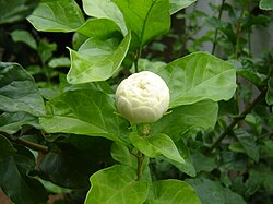
- Reason
- Stunning close up shot of Jasmine (Jasminum polyanthum) flower bud. This variety found in South India, is considered to be one of the largest Jasmine varieties. When in full bloom, it exceeds 5 cms in diameter.
- Articles this image appears in
- Jasmine
- Creator
- Aravindan Shanmugasundaram
- Support as nominator --Aravindan Shanmugasundaram (talk) 05:14, 19 November 2008 (UTC)
- Oppose Sorry, It isn't very strong on technical grounds, The highlights are blown or close to it and its soft everywhere. Try stopping down your lens a bit. Noodle snacks (talk) 09:21, 19 November 2008 (UTC)
- comment/undecided--the image has encylopedic value and is relevant to better the article and overall natural setting photographs, a closer zoom on the object with less vegetation would better the nominated image though kdm85 —Preceding unsigned comment added by Kdm85 (talk • contribs) 19:34, 20 November 2008 (UTC)
- Oppose - boring picture, no wow factor. Kaldari (talk) 19:39, 20 November 2008 (UTC)
Not promoted MER-C 06:53, 27 November 2008 (UTC)
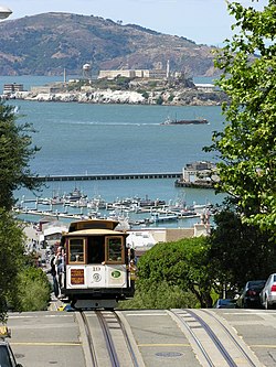
- Reason
- Images shows two historical landmarks in San Francisco, the cable cars and alcatraz
- Articles this image appears in
- San Francisco cable car system
National Register of Historic Places listings in San Francisco, California
List of National Historic Landmarks in California - Creator
- Cabe6403
- Support as nominator --Cabe6403 (Talk•Sign!) 23:51, 18 November 2008 (UTC)
- Support Good technicals, and iconic of San Fransisco.--HereToHelp (talk to me) 00:19, 19 November 2008 (UTC)
- Oppose distracting piece of a streetlight in upper left makes for only so so composition. Overall limited encyclopedic value as it illustrates neither cable cars nor Alcatraz particularly well and the combination of the two is in my opinion not particularly important. --Leivick (talk) 00:31, 19 November 2008 (UTC)
- Support - This is a great photo and screams San Fran. I say yes. ~ Wadester16 (talk) 00:32, 19 November 2008 (UTC)
- Oppose The photograph really needs to pick its subject better, there is lots of blank space and it could be better for such a common shot. I prefer the attached version but don't feel very strongly about it. IMO it should really be placed in a seperate nomination though as it isn't exactly an edit. Noodle snacks (talk) 03:09, 19 November 2008 (UTC)
- Weak Support - ahhh! I really like this picture and it really illustrates the area well... but I do agree somewhat with Daniel that it's not incredibly encyclopedic in its articles... but it does add some value... :) Intothewoods29 (talk) 04:03, 19 November 2008 (UTC)
- Oppose The comparison version is much better: it's bigger and shows more detail. I too like this picture, but the car and the track are just too far away to effectively illustrate San Francisco cable car system. Also, it doesn't show anything particularly unique about cable cars, other than that they crest hills. Makeemlighter (talk) 00:35, 20 November 2008 (UTC)
- Support: two of the highlights of San Fran in one picture. --SteelersFanUK06 ReplyOnMine! 13:57, 24 November 2008 (UTC)
- Oppose The street car needs to be bigger for any purpose. Compositionally, it would be fine but for that fatal flaw. Use of a shorter lens for a exaggerated foreground/background size ratio is the way of going about this. -Fcb981(talk:contribs) 20:56, 24 November 2008 (UTC)
Not promoted MER-C 06:53, 27 November 2008 (UTC)

- Reason
- Beautiful picture of the waterfall at the historic Scottish park of Rouken Glen
- Articles this image appears in
- Rouken Glen
- Creator
- Cabe6403
- Support as nominator --Cabe6403 (Talk•Sign!) 23:41, 18 November 2008 (UTC)
- Comment - Great composition, but there's what looks like a lot of overblown highlights. Is that a requirement of waterfall photography? I mean, maybe it is, and this comment has no merit, but if it isn't... Shoemaker's Holiday (talk) 23:49, 18 November 2008 (UTC)
- RE: Comment - Well, to get the smooth appearance of the water the shutter has to stay open for longer which allows more light in obviously giving these highlights. In bright sunlight, as it was when I took this picture, it's quite hard to get the balance right between highlights and smoothness of the water. I went through about 20 shots to get this one. Cabe6403 (Talk•Sign!) 00:02, 19 November 2008 (UTC)
- Exposure compensation is your friend. You're much better off shooting RAW (if possible) and using a tripod in this situation. Or you can simply shoot when there are clouds overhead or near sunrise/sunset. MER-C 02:20, 19 November 2008 (UTC)
- And if you still can't get a long enough shutter speed you need to invest in a neutral density filter. Noodle snacks (talk) 09:23, 19 November 2008 (UTC)
- Another thing, you can also afford to stop down your camera's aperture a bit, which will give you a longer shutter speed to play with. You will probably need a tripod though Noodle snacks (talk) 21:53, 19 November 2008 (UTC)
- And if you still can't get a long enough shutter speed you need to invest in a neutral density filter. Noodle snacks (talk) 09:23, 19 November 2008 (UTC)
- Exposure compensation is your friend. You're much better off shooting RAW (if possible) and using a tripod in this situation. Or you can simply shoot when there are clouds overhead or near sunrise/sunset. MER-C 02:20, 19 November 2008 (UTC)
- Oppose looks like some camera motion induced softness. Blown highlights certainly can be avoided in this sort of situation. --Leivick (talk) 00:25, 19 November 2008 (UTC)
Not promoted MER-C 06:53, 27 November 2008 (UTC)
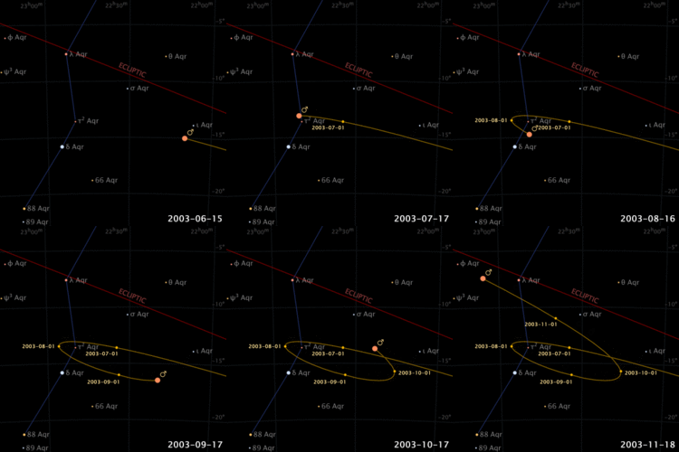

- Reason
- Great illustration of a concept that is difficult to convey in text. Very high EV for Retrograde and direct motion and good EV for Viewing section of Mars article which discusses retrograde motion. Size (400x400) is above average for a featured animation.
- Articles this image appears in
- Retrograde and direct motion, Mars
- Creator
- Seav
- Support as nominator --Kaldari (talk) 18:56, 18 November 2008 (UTC)
- Support - I'm AGF that this has EV since I know very little about retrograde motion... ;) Intothewoods29 (talk) 04:06, 19 November 2008 (UTC)
- Oppose This image only shows what the apparent motion of mars is from earth. I think to make it clear from an apparent retrograde motion perspective the two planets should be shown simultaneously from a viewpoint roughly orthogonal to the two planes of motion (ie a "birds eye" view). The attached image shows what I'd be after, adding animation and ditching the side on view. Such an image might also find relevance in orbit. Noodle snacks (talk) 01:33, 20 November 2008 (UTC)
- I don't really understand your objection. The whole point of the illustration is to show what retrograde motion looks like from earth, as this is typically where people observe planets from. This illustration is not to explain how apparent retrograde motion is created, but to show what it actually looks like. I think the animation you describe would be complementary to this one, not a replacement. Kaldari (talk) 16:12, 20 November 2008 (UTC)
- It shows what retrograde motion looks like from earth yes, but it would probably leave someone confused about why the motion looks like that. It could so easily show why the motion appears in such a fashion, and it doesn't. Noodle snacks (talk) 23:33, 20 November 2008 (UTC)
- I don't really understand your objection. The whole point of the illustration is to show what retrograde motion looks like from earth, as this is typically where people observe planets from. This illustration is not to explain how apparent retrograde motion is created, but to show what it actually looks like. I think the animation you describe would be complementary to this one, not a replacement. Kaldari (talk) 16:12, 20 November 2008 (UTC)
- Support per nom. I agree with Kaldari's response to Noodle Snacks. Spikebrennan (talk) 14:51, 24 November 2008 (UTC)
- Support. Also, If it was possible to combine the two images (nom and alt), I'd also support. Together they demonstrated and explained retrograde motion for me. But I'm okay with the demonstration of it. SpencerT♦C 03:12, 26 November 2008 (UTC)
- Question: When viewed as a thumb, why does the Mars symbol leave litle specks on the image, or is it my computer? SpencerT♦C 03:14, 26 November 2008 (UTC)
- Weird. It looks like it's only doing that in Internet Explorer. I wonder if this has something to do with the recent change in how the mediaWiki software handles GIF thumbnails. Kaldari (talk) 20:39, 26 November 2008 (UTC)
Promoted Image:Apparent retrograde motion of Mars in 2003.gif MER-C 06:57, 27 November 2008 (UTC)
- Reason
- Encyclopedic and beautiful image. (Featured on Commons.)
- Articles this image appears in
- Paris, Louise Marie Adélaïde de Bourbon-Penthièvre, Louis XIII style
- Creator
- Blieusong
- Support as nominator --Diego_pmc Talk 14:59, 16 November 2008 (UTC)
- Weak support. Good shot, would full support if there was an article on this actual building. Having said which, isn't Luxembourg Palace this place, and if so why isn't this pic in that article? BTW, being featured on Commons or elsewhere is irrelevant. --jjron (talk) 12:24, 17 November 2008 (UTC)
- Weak oppose - it's a nice photo, but the composition is awkward. It looks like there is some event (lots of people sitting on chairs facing *something*), yet we can't see what it is. Unclear subject - is it a photo of the chateau, of the people, or of the gardens? Not a fantastic angle for any of those. Stevage 10:01, 18 November 2008 (UTC)
- People are sunbathing and facing the sun. I believe that add some context around the palais. That park is full of people enjoying sun, and I think it's representative of parisian lifestyle, hence some encyclopaedic value... that's just my opinion though. Blieusong (talk) 13:12, 26 November 2008 (UTC)
- Oppose Angle isn't that great, issues with tilt, and quite soft (some people look painted). SpencerT♦C 03:05, 26 November 2008 (UTC)
- See tilt issues in image. SpencerT♦C 15:59, 26 November 2008 (UTC)
- This isn't because of tilt, but because of perspective. I guess you simply meant you didn't like the view. But there's no tilt. Blieusong (talk) 16:40, 26 November 2008 (UTC)
- The view would preferably be head-on, reducing distortion. SpencerT♦C 19:02, 26 November 2008 (UTC)
- This isn't because of tilt, but because of perspective. I guess you simply meant you didn't like the view. But there's no tilt. Blieusong (talk) 16:40, 26 November 2008 (UTC)
- Comment Please oppose for valid reasons... the picture is not tilted as far as I know (or point me where you see the tilt). It's certainly not soft as well... Keep in mind this is a 10mpix picture, not downsampled, which shows certainly much more details than many of the 1600x1000 pictures featured here. Blieusong (talk) 13:12, 26 November 2008 (UTC)
Not promoted MER-C 06:58, 27 November 2008 (UTC)
- Reason
- This is one of the coolest animations in astronomy. It is historically important and quite informative.
- Articles this image appears in
- Voyager 1, Jupiter, Atmosphere of Jupiter
- Creator
- NASA/JPL
- Support as nominator --Nergaal (talk) 07:47, 16 November 2008 (UTC)
- Support Diego_pmc Talk 08:12, 16 November 2008 (UTC)
- Support Is the color version available? This blue-channel version does show the bands and spots more clearly, though. --Janke | Talk 10:22, 16 November 2008 (UTC)
- Support Wow...but there seem to be a few specks that pop up, seemingly for only one frame. Are they moons (in which case leave them in) or transmissions errors/noise (in which case, can we clone them out)?--HereToHelp (talk to me) 12:50, 16 November 2008 (UTC)
- They're moons and shadows of moons... --Janke | Talk 16:19, 16 November 2008 (UTC)
- Ah...can we add that to the caption?--HereToHelp (talk to me) 22:55, 16 November 2008 (UTC)
- How is it now? It might need some polishing. Nergaal (talk) 03:24, 17 November 2008 (UTC)
- Ah...can we add that to the caption?--HereToHelp (talk to me) 22:55, 16 November 2008 (UTC)
- Support. Classic astronomy 'video' still gives me goosebumps, but as I commented at PPR I'd prefer the colour version that I seem to remember having seen (and Janke also mentions above). --jjron (talk) 12:24, 17 November 2008 (UTC)
- Support. Per Jjron. Would support this and color version as two versions of the same picture (with preference to this). Mostlyharmless (talk) 08:39, 18 November 2008 (UTC)
- Comment. What are the flickering white horizontal and vertical lines? Spikebrennan (talk) 16:54, 18 November 2008 (UTC)
- I am not sure but the NASA's release has them too - I would guess instrument artifacts? Nergaal (talk) 19:56, 18 November 2008 (UTC)
- Support I mean, wow. Shoemaker's Holiday (talk) 23:21, 18 November 2008 (UTC)
- Support - I saw the nom on Commons, and was going to ask Nergaal if he would nom. it here instead. —Ceran ♦ (talk) 23:55, 18 November 2008 (UTC)
- Comment A bit of digging reveals that there's a significantly higher resolution on NASA's website, which I've uploaded. It does have some partly blank frames though, which look like they've been removed from the smaller version. Time3000 (talk) 08:11, 19 November 2008 (UTC)
- Removed images from display, as GIF thumbnailing has been turned off (you have to download the whole thing, then the browser resizes it). It's not a good thing if you have 10 MB of GIFs on one page. :) MER-C 11:10, 19 November 2008 (UTC)
- Support: Very encyclopedic, accurately displays the subject in question, is a unique picture and clearly displays it's purpose. – Jerryteps 10:30, 24 November 2008 (UTC)
- Support: Great picture, of great historical value and an utterly fascinating subject. Constantine ✍ 17:08, 25 November 2008 (UTC)
Promoted Image:790106-0203 Voyager 58M to 31M reduced.gif MER-C 06:58, 27 November 2008 (UTC)
- Reason
- An interesting and unusual cloud formation with good technical quality
- Articles this image appears in
- Arcus cloud
- Creator
- Fir0002
- Support Edit 3 as nominator --Fir0002 12:27, 15 November 2008 (UTC)
- Comment Just an IMO, but i think the "Details Enhancer" or whatever its called in the program you used is cranked a bit high on the HDR, any chance of toning it down a bit to reduce the haloing? Noodle snacks (talk) 12:46, 15 November 2008 (UTC)
- The program I used was Tufuse, and as far as I know (admittidly I haven't used the program much) there aren't any settings... However personally I can't really see any significant haloes - can you point out which areas are of concern? --Fir0002 09:31, 17 November 2008 (UTC)
- Support Interesting and having high educational value. But the far right on the top, the "dark dot" in the sky looks smeared.--Caspian blue 15:01, 15 November 2008 (UTC)
- Support edit 1 or 3 --Caspian blue 17:06, 22 November 2008 (UTC)
- Comment could use a better caption... and, is this a very good representation of a shelf cloud? gren グレン 14:45, 16 November 2008 (UTC)
Weak OpposeSupport Edit 1 or 3 Nice scene but it looks and feels overprocessed. I really doubt that it actually appeared like this to the naked eye - if the HDR has enhanced the contrast etc. beyond how it would typically appear then there needs to be a clear reason for doing so AND it needs to me made clear or enc is diminished. Mfield (talk) 17:21, 16 November 2008 (UTC)- I'll post a version without HDR processing for comparison in the next day or so. However one significant feature of the HDR version (aside from an enhanced tonal range) is that the underside of the clouds is shown distinctly (cf. Image:Thunderstorm panorama.jpg) --Fir0002 09:31, 17 November 2008 (UTC)
- Ok here are low res versions: normal exposure, under exposure. If you prefer these I'll upload a higher res version (perhaps with some highlight/shadow recovery as appropriate - personally I like the HDR version) --Fir0002 02:32, 18 November 2008 (UTC)
- Yes, I think the normal exposure has adequate detail in the cloud and the underexposure feels right for how the lighting would appear with such a large cloud. Obviously only you know exactly how it looked to the eye, but the HDR feels too bright and unnatural. Maybe a PS manual masked blend instead of Tufuse would result in a more natural looking end product. I certainly wouldn't expect to see that much color and contrast with such a large amount of (subject and other) cloud in the sky. Mfield (talk) 02:36, 18 November 2008 (UTC)
- Ok here are low res versions: normal exposure, under exposure. If you prefer these I'll upload a higher res version (perhaps with some highlight/shadow recovery as appropriate - personally I like the HDR version) --Fir0002 02:32, 18 November 2008 (UTC)
- I'll post a version without HDR processing for comparison in the next day or so. However one significant feature of the HDR version (aside from an enhanced tonal range) is that the underside of the clouds is shown distinctly (cf. Image:Thunderstorm panorama.jpg) --Fir0002 09:31, 17 November 2008 (UTC)
- Comment: The original looks somewhat faked, the alternative is too bland. If you can get a version which is something between these two extremes, I'd gladly support. --Janke | Talk 09:08, 18 November 2008 (UTC)
- No problem - I'll get something done by tomorrow --Fir0002 10:05, 18 November 2008 (UTC)
- Pretty much what I am after as well with my comment above too. The HDR looks good but the tone mapping is such that the haloing between the right hand hill top and sky looks very unrealistic. Could you try creating the .hdr with tufuse (since i am guessing that will do them from panoramas) then if you have it photomatix for the tone mapping (which'd more control over things)? I'd recommend setting the black and white points to 0% if you do use photomatix then adjusting with curves in photoshop later - not doing so tends to blow highlights in photomatix in my experiance. I usually use PTGUI to stitch HDR panoramas and have had success with that (but it doesn't do tone mapping as well as photomatix does). Noodle snacks (talk) 03:17, 19 November 2008 (UTC)
- Let me know what you think of the above versions... --Fir0002 07:38, 19 November 2008 (UTC)
- Edits 1 and 3 look more realistic to me than the others, maybe its a psychological thing where the brain is used to knowing that clouds aren't sharp and move and consequently the clouds in the other edits that appear sharper and more contrasty jar with it? Mfield (talk) 04:36, 20 November 2008 (UTC)
- Let me know what you think of the above versions... --Fir0002 07:38, 19 November 2008 (UTC)
- Pretty much what I am after as well with my comment above too. The HDR looks good but the tone mapping is such that the haloing between the right hand hill top and sky looks very unrealistic. Could you try creating the .hdr with tufuse (since i am guessing that will do them from panoramas) then if you have it photomatix for the tone mapping (which'd more control over things)? I'd recommend setting the black and white points to 0% if you do use photomatix then adjusting with curves in photoshop later - not doing so tends to blow highlights in photomatix in my experiance. I usually use PTGUI to stitch HDR panoramas and have had success with that (but it doesn't do tone mapping as well as photomatix does). Noodle snacks (talk) 03:17, 19 November 2008 (UTC)
- No problem - I'll get something done by tomorrow --Fir0002 10:05, 18 November 2008 (UTC)
- Support Edit 3/4 - Added an edit of 3 to add confusion to the matter. The new HDR is better than the old one from a realism and haloing point of view but I felt the levels needed a little tweaking Noodle snacks (talk) 02:30, 20 November 2008 (UTC)
- Yeah personally I like your edit, but in light of Janke's and Mfield's comments I thought it best to keep it as natural as possible - quite possibly at the expense of visual appeal --Fir0002 04:52, 21 November 2008 (UTC)
- Support edit three Looks the most natural. E1 does too, but I like E3 better. SpencerT♦C 02:57, 26 November 2008 (UTC)
Support (edit 3) Nice shot. —Krm500 (Communicate!) 04:57, 26 November 2008 (UTC)
Promoted Image:Shelf cloud pano oct07 ver3.jpg MER-C 06:59, 27 November 2008 (UTC)
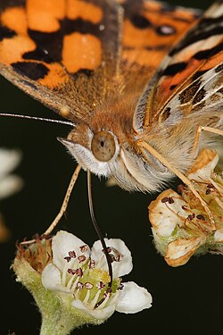
- Reason
- Previous nomination here failed to gain consensus due to votes of "poor enc" in the various articles. Given the test of time, and indeed the various references I cited in my rebuttal, has proven these claims incorrect I'd like to resubmit this nom as I think it's a really interesting and valuable image.
- Articles this image appears in
- Australian painted lady, Insect mouthparts, Nectar, Nectarivore and Pollinator
- Creator
- Fir0002
- Support as nominator --Fir0002 05:57, 12 November 2008 (UTC)
- Previous Nomination --Noodle snacks (talk) 10:49, 12 November 2008 (UTC)
- Support again. Good quality and informative Muhammad(talk) 12:05, 12 November 2008 (UTC)
- Support - I find it excellent, as I did when I saw the picture before. —Ceran(sing / see) (2102 uıןɐd) 20:29, 12 November 2008 (UTC)
- Hang on, hang on You are renominating this for no reason other than you didn't like the outcome of the first nom? Has anything else changed? Papa Lima Whiskey (talk) 01:32, 13 November 2008 (UTC)
- What has changed is that it is now very clear that the image has a valid home in the articles, and therefore opposes based on "poor enc" are groundless. I raised the closing of the nom on MER-C talkpage and he said that in the interests of transparency a renom would be most appropriate - a perfectly reasonable suggestion IMO. --Fir0002 03:10, 13 November 2008 (UTC)
- Oppose and speedy close - Nothing has changed from the previous nomination. The image is still irrelevant in some articles (Insect mouthparts and Australian painted lady) and misleading in others (Pollinator and Nectar). Alvesgaspar (talk) 08:54, 13 November 2008 (UTC)
- It is not irrelevant to any of those articles. One month in the articles clearly demonstrates that the community feels these images belong. One of the primary features of the image is the butterfly's proboscis which is obviously at home in the relevant section of Insect mouthparts. To claim that it doesn't have EV in insect mouthparts [because it] shows only the proboscis is laughably ridiculous since it would be highly unusual for an insect to have a Labrum, Mandible, Maxilla, Labium, Hypopharynx, Stylet, Labellum, and Proboscis simultaneously! It provides a detailed closeup of the Australian Painted lady and therefore is a valuable addition to scant article which benefits from the "thousand words" the image offers to readers. It belongs in Pollinator as the following links demonstrate: Pollinator, Pollination syndrome, [8] [9] [10] [11]. It belongs in Nectar since butterflies are mentioned in it's opening paragraph as a notable feeder of nectar (see also fact 5. And finally this shot, capturing a nectarivore action, makes a great illustration for the nectarivore article! Seems highly peculiar, if not completely illogical, to claim this image fails the "EV test" given it's relatively extensive use in the wikipedia! --Fir0002 09:14, 13 November 2008 (UTC)
- Agree with Fir. de Bivort 21:07, 13 November 2008 (UTC)
- Support de Bivort 21:07, 13 November 2008 (UTC)
- Fir, you have a misunderstanding here. Being retained in articles does not demonstrate exceptional EV. You added this image to every single article where it isn't in a gallery (and hence ineligible). Thank you for your attention. Oppose as per arguments in previous nom. Papa Lima Whiskey (talk) 03:34, 14 November 2008 (UTC)
- PLW, you have a misunderstanding here. The fact it has remained in the article implicitly demonstrates it's acceptance by article editors. If it was incorrectly used it would have been removed. --Fir0002 04:09, 14 November 2008 (UTC)
- You have to demonstrate exceptional encyclopaedic value, and you have not done that. Papa Lima Whiskey (talk) 12:09, 14 November 2008 (UTC)
- You do realize you just made up that criteria: 5. Adds value to an article and helps readers to understand an article. An image's encyclopedic value is given priority over its artistic value. - WP:WIAFP?. There is no requirement for "exceptional encyclopaedic value", and otherwise many of the current and past noms, including IMO this one, would fail on this point. As Calliopejen1 mentions below, its inclusion in nectarvore, alone satisfies the FPC criteria!. Therefore I can see no valid ground to oppose based on "lack of EV" --Fir0002 11:42, 19 November 2008 (UTC)
- Criterion 3 It illustrates the subject in a compelling way, making the viewer want to know more. Criterion 5 Adds value to an article and helps readers to understand an article. An image's encyclopedic value is given priority over its artistic value. Papa Lima Whiskey (talk) 18:24, 22 November 2008 (UTC)
- You have a misunderstanding of criterion 3. The requirement for an image to be compelling is not a requirement for "exceptional" EV. This is best illustrated with some examples: compelling, not compellling; compelling, not compelling; compelling, not compelling. Note in all these examples the encyclopaedic value is equal between the compelling and non compelling examples. And yes the EV is given precedence over artistic, or compelling value, which is only an additional reason why this image fulfils the criterion since even if you don't find it compelling it is unquestionably encyclopaedic in several articles. You have still to provide a logical and reasonable explanation why this image does not have the required EV - particularly as an illustration of a proboscis in the Insect mouthparts article. That said it seems you've invested too much argument in this debate and you'll continue calling black white than regardless of reason... For this reason, at the risk of being accused of vote canvassing, I propose as an objective test to ask the people actually involved in these articles whether or not they think this image has EV --Fir0002 01:01, 23 November 2008 (UTC)
- I've cited the criteria, and your image does not meet them. It is telling that you've chosen to entirely ignore the wording of criterion 5 in your attempt to represent my contribution. The fact that (after finally admitting that the presence of a proboscis may be the only component of this image with any encyclopedic value) you've now announced that you're going to go on a canvassing spree substantiates what several editors here have said - that you don't like the rules when they don't go your way. My personal feeling is that you're on a slippery slope to a community patience motion. What I find most worrying in all this is that you're choosing to ignore well-meaning suggestions such as those by Matt Deres and Noodle snacks that your other image covers the same ground already. Why is this not a satisfactory outcome for you? Papa Lima Whiskey (talk) 13:18, 24 November 2008 (UTC)
- I wasn't even going to bother responding to such tabloid-level misrepresentation of the facts but was curious as to what you meant by "community patience motion" - I've never heard of one...? --Fir0002 08:05, 26 November 2008 (UTC)
- I've cited the criteria, and your image does not meet them. It is telling that you've chosen to entirely ignore the wording of criterion 5 in your attempt to represent my contribution. The fact that (after finally admitting that the presence of a proboscis may be the only component of this image with any encyclopedic value) you've now announced that you're going to go on a canvassing spree substantiates what several editors here have said - that you don't like the rules when they don't go your way. My personal feeling is that you're on a slippery slope to a community patience motion. What I find most worrying in all this is that you're choosing to ignore well-meaning suggestions such as those by Matt Deres and Noodle snacks that your other image covers the same ground already. Why is this not a satisfactory outcome for you? Papa Lima Whiskey (talk) 13:18, 24 November 2008 (UTC)
- You have a misunderstanding of criterion 3. The requirement for an image to be compelling is not a requirement for "exceptional" EV. This is best illustrated with some examples: compelling, not compellling; compelling, not compelling; compelling, not compelling. Note in all these examples the encyclopaedic value is equal between the compelling and non compelling examples. And yes the EV is given precedence over artistic, or compelling value, which is only an additional reason why this image fulfils the criterion since even if you don't find it compelling it is unquestionably encyclopaedic in several articles. You have still to provide a logical and reasonable explanation why this image does not have the required EV - particularly as an illustration of a proboscis in the Insect mouthparts article. That said it seems you've invested too much argument in this debate and you'll continue calling black white than regardless of reason... For this reason, at the risk of being accused of vote canvassing, I propose as an objective test to ask the people actually involved in these articles whether or not they think this image has EV --Fir0002 01:01, 23 November 2008 (UTC)
- Criterion 3 It illustrates the subject in a compelling way, making the viewer want to know more. Criterion 5 Adds value to an article and helps readers to understand an article. An image's encyclopedic value is given priority over its artistic value. Papa Lima Whiskey (talk) 18:24, 22 November 2008 (UTC)
- You do realize you just made up that criteria: 5. Adds value to an article and helps readers to understand an article. An image's encyclopedic value is given priority over its artistic value. - WP:WIAFP?. There is no requirement for "exceptional encyclopaedic value", and otherwise many of the current and past noms, including IMO this one, would fail on this point. As Calliopejen1 mentions below, its inclusion in nectarvore, alone satisfies the FPC criteria!. Therefore I can see no valid ground to oppose based on "lack of EV" --Fir0002 11:42, 19 November 2008 (UTC)
- You have to demonstrate exceptional encyclopaedic value, and you have not done that. Papa Lima Whiskey (talk) 12:09, 14 November 2008 (UTC)
- Support per Fir. There is clear EV here. Is it in dispute that these butterflies are pollinators that eat nectar? A simple google search shows that butterflies are in fact pollinators (though not as important as other species) and that painted ladies specifically are nectarivores (see here). I would say that EV is satisfied by its use in nectarivore alone, which is where it's most relevant. Calliopejen1 (talk) 14:33, 14 November 2008 (UTC)
- Oppose per Alvesgaspar and previous nomination. Moreover, this is already featured and illustrates the subject much better. That one is definitely better for Australian Painted Lady, and probably better for Nectarivore and Pollinator, although I don't think either should be in Pollinator. Makeemlighter (talk) 06:04, 18 November 2008 (UTC)
- Note there is nothing in the FPC criteria which prohibits multiple FP's of similar subject matter (although I would like to stress this image has a distinct advantage over the previous FP thanks to the extra close up detail). Examples of similar FP's: 1, 2; 1, 2; 1, 2; 1, 2; 1, 2; 1, 2. Hence I can't understand your oppose... Also given that this was your first contribution to WP:FPC, can I just ask (out of curiosity) how it is that you came across this nomination in particular? --Fir0002 08:01, 18 November 2008 (UTC)
- The contributor has made perfectly valid points, is an established editor, and has even made contributions to one other FPC discussion, so I don't see the need for your question. Papa Lima Whiskey (talk) 18:09, 18 November 2008 (UTC)
- 150 edits is barely an "established" editor, and it struck me as unusual for an editor to delve straight into a (relatively) controversial nom rather than dipping his/her toe into a straightforward nom first. --Fir0002 11:42, 19 November 2008 (UTC)
- First contribution 19 March 2006. Err... yes, I think that counts as established. Controversial? Glad you admit it, people have been calling for a speedy close. Papa Lima Whiskey (talk) 18:24, 22 November 2008 (UTC)
- 150 edits is barely an "established" editor, and it struck me as unusual for an editor to delve straight into a (relatively) controversial nom rather than dipping his/her toe into a straightforward nom first. --Fir0002 11:42, 19 November 2008 (UTC)
- My point was that the already-featured picture would be better for those articles, which, I think, diminishes the EV of this picture. To answer your question: I've been following WP:FPC for a month or two to get a feel for it. This was the first time I felt compelled to chime in with my opinion. Makeemlighter (talk) 22:37, 18 November 2008 (UTC)
- In what way do you feel the existing FP better illustrates those articles? This image clearly has a much clearer focus on the butterfly feeding from the flower. That it is an Australian Painted Lady is secondary to this image. Whereas the existing FP is all about illustrating the Australian Painted Lady species. Furthermore as I pointed out the existence or non existence of similar subject FP's does not have any relevance to the current nom as long as this image is of comparable quality and value. Fair enough about your introduction to FPC, however it might have been a good idea, as I mentioned above to PLW, to start off with a few less controversial noms to establish a bit of experience in the process. --Fir0002 11:42, 19 November 2008 (UTC)
- It is my opinion that a picture's EV is diminished when another picture illustrates a subject better. I understand that we can have more than one FP on a subject, but I think the current one has a lot more EV than this one. I find the clear focus you mention more distracting than anything. The current FP gives me a better idea of what a Nectarivore is because I can see the entire butterfly, including its proboscis, and a significant portion of what it's feeding on. As for the Pollinator article: since the Australian painted lady isn't a terribly important pollinator, it doesn't have great value to that article. I also don't think this picture is very effective at illustrating Nectar. Finally, I jumped in here precisely because this is a controversial nomination; nobody needs my opinion when it's all support or all oppose. Sorry if I ruffled any feathers. Makeemlighter (talk) 00:27, 20 November 2008 (UTC)
- I guess we'll just have to disagree on Nectarivore and Pollinator, however surely an image with a clear focus on a nectarivore feeding on nectar serves a very useful purpose in Nectar? Although the current FP also shows the butterfly feeding, this image, particularly at thumbnail size, is far more effective and specific. And surely it is beyond contention that this image has better EV than the existing FP for illustrating Insect mouthparts thanks to the proboscis being far clearer and more detailed. Finally, yes you might think that your vote is immaterial in clear cut cases, but establishing a history on FPC is a good idea as otherwise you come across as a bit of a "blown in" - which in a controversial nom can be somewhat frustrating to the nominator... --Fir0002 06:23, 20 November 2008 (UTC)
- I guess the similarity with another of your previous pictures reminds me of this and this Noodle snacks (talk) 07:48, 20 November 2008 (UTC)
- I guess we'll just have to disagree on Nectarivore and Pollinator, however surely an image with a clear focus on a nectarivore feeding on nectar serves a very useful purpose in Nectar? Although the current FP also shows the butterfly feeding, this image, particularly at thumbnail size, is far more effective and specific. And surely it is beyond contention that this image has better EV than the existing FP for illustrating Insect mouthparts thanks to the proboscis being far clearer and more detailed. Finally, yes you might think that your vote is immaterial in clear cut cases, but establishing a history on FPC is a good idea as otherwise you come across as a bit of a "blown in" - which in a controversial nom can be somewhat frustrating to the nominator... --Fir0002 06:23, 20 November 2008 (UTC)
- It is my opinion that a picture's EV is diminished when another picture illustrates a subject better. I understand that we can have more than one FP on a subject, but I think the current one has a lot more EV than this one. I find the clear focus you mention more distracting than anything. The current FP gives me a better idea of what a Nectarivore is because I can see the entire butterfly, including its proboscis, and a significant portion of what it's feeding on. As for the Pollinator article: since the Australian painted lady isn't a terribly important pollinator, it doesn't have great value to that article. I also don't think this picture is very effective at illustrating Nectar. Finally, I jumped in here precisely because this is a controversial nomination; nobody needs my opinion when it's all support or all oppose. Sorry if I ruffled any feathers. Makeemlighter (talk) 00:27, 20 November 2008 (UTC)
- In what way do you feel the existing FP better illustrates those articles? This image clearly has a much clearer focus on the butterfly feeding from the flower. That it is an Australian Painted Lady is secondary to this image. Whereas the existing FP is all about illustrating the Australian Painted Lady species. Furthermore as I pointed out the existence or non existence of similar subject FP's does not have any relevance to the current nom as long as this image is of comparable quality and value. Fair enough about your introduction to FPC, however it might have been a good idea, as I mentioned above to PLW, to start off with a few less controversial noms to establish a bit of experience in the process. --Fir0002 11:42, 19 November 2008 (UTC)
- The contributor has made perfectly valid points, is an established editor, and has even made contributions to one other FPC discussion, so I don't see the need for your question. Papa Lima Whiskey (talk) 18:09, 18 November 2008 (UTC)
- Note there is nothing in the FPC criteria which prohibits multiple FP's of similar subject matter (although I would like to stress this image has a distinct advantage over the previous FP thanks to the extra close up detail). Examples of similar FP's: 1, 2; 1, 2; 1, 2; 1, 2; 1, 2; 1, 2. Hence I can't understand your oppose... Also given that this was your first contribution to WP:FPC, can I just ask (out of curiosity) how it is that you came across this nomination in particular? --Fir0002 08:01, 18 November 2008 (UTC)
- Oppose - Per all of the reason's Alv. listed on the first nomination + more. It just looks spammed across all these articles, and it is not the best picture we have to illustrate many of them. Simply being put in lots of articles does not EV make. Plus, I think the picture's composition is cluttered and un-aesthetic. It isn't immediately clear what's going on at the size used in articles. We've already got other featured pictures that are better, so sorry, but no. pschemp | talk 00:59, 23 November 2008 (UTC)
- Err is your monitor calibrated? Because if you can't tell this is a butterfly feeding on a flower at thumbnail size something is not quite right at your end... --Fir0002 21:39, 23 November 2008 (UTC)
- Fir, the unfortunate fact is that the one leg is stuck on the flower too, making it difficult to be sure what is the mouthpart at first glance. A truly spectacular picture of feeding would leave no doubt at first glance which is the mouthpart. Yours does leave doubt as two long appendages, both seemingly originating from nearly the same area are touching the vicinity. You have to enlarge it to really tell the difference and even then it's not clear. I asked several uninvolved people to look at the picture and they agreed that it was hard to tell which was the proboscis. The composition is still un-aesthetic, cluttered and confusing and you know quite well that this has nothing to do with calibrating monitors. Are you going to insist that the other leg is not near the flower now and insult my monitor again? This picture is no more encyclopedic now than before. pschemp | talk 23:06, 23 November 2008 (UTC)
- Simmer down pschemp - no I'm not going to say that leg isn't there because it is. But I will tell you that it doesn't take Sherlock Holmes to deduce that the proboscis is going to be the one which originates at the base of the head and terminates in the centre of the flower! Having just asked several uninvolved people myself I can assure you that it is difficult to confuse its leg with its proboscis - particularly given the clear colour distinction! --Fir0002 01:49, 24 November 2008 (UTC)
- Fir, the unfortunate fact is that the one leg is stuck on the flower too, making it difficult to be sure what is the mouthpart at first glance. A truly spectacular picture of feeding would leave no doubt at first glance which is the mouthpart. Yours does leave doubt as two long appendages, both seemingly originating from nearly the same area are touching the vicinity. You have to enlarge it to really tell the difference and even then it's not clear. I asked several uninvolved people to look at the picture and they agreed that it was hard to tell which was the proboscis. The composition is still un-aesthetic, cluttered and confusing and you know quite well that this has nothing to do with calibrating monitors. Are you going to insist that the other leg is not near the flower now and insult my monitor again? This picture is no more encyclopedic now than before. pschemp | talk 23:06, 23 November 2008 (UTC)
- Err is your monitor calibrated? Because if you can't tell this is a butterfly feeding on a flower at thumbnail size something is not quite right at your end... --Fir0002 21:39, 23 November 2008 (UTC)
- Comment -- Quoted from a recent edit above, by Fir0002: ... at the risk of being accused of vote canvassing, I propose as an objective test to ask the people actually involved in these articles whether or not they think this image has EV. If I understand well, this is a proposal for replacing the present FPC consensus by the opinion of a selected group of "experts". Really, the insistance is becoming ridiculous and I can't understand why this nomination is still open. -- Alvesgaspar (talk) 10:52, 23 November 2008 (UTC)
- Perhaps its still open due to EV... (Entertainment Value) :D Noodle snacks (talk) 11:05, 23 November 2008 (UTC)
- Well you haven't quite understood it. FPC is obviously not a vote tally. Votes need to have valid arguments for them to have value in determining the consensus. For example if I went and opposed Image:New River Gorge Bridge.jpg this image because it was too small and unsharp the vote would hold little value as it's patently incorrect. While FPC regulars can be expected to be familiar with technical aspects of photography this may not be true of EV. Sure there are hundreds of obvious cases, but where the debate centres on an images EV, I can see no problem in supplementing the FPC process with the input of experts. I mean if the above !votes claiming EV is lacking are correct than what have you to hide? Why all the fuss if the experts will agree with you? --Fir0002 21:39, 23 November 2008 (UTC)
- Your proposal to insist that the editors of the articles have input is a pretty clear attempt to circumvent the procedures of FPC when they don't go your way. I notice you've never proposed such a thing, nor supported it for anyone else's picture. You are basically saying that the people on FPC can't be trusted to know what they are talking about and that's quite disgraceful on your part. pschemp | talk 23:06, 23 November 2008 (UTC)
- Please read my original statement. I'm not proposing a new procedure, I'm not "insisting editors of the article have input" I'm simply suggesting that it would be constructive to resolve this debate to seek further input from editors experienced in the fields in question. How could I have supported such a move in other noms since I haven't been involved in a nom where the nominator has requested this?! And again - why are you getting so worked up if you are confident in your assessment? Finally I'd request you leave the personal attacks out of this discussion --Fir0002 01:49, 24 November 2008 (UTC)
- But this debate is already resolved, exactly the same way as all other nominations are settled in FPC. Why should we do otherwise and why are we opening an exception by allowing the discussion to proceed? It really looks like we are waiting for the experts to come!-- Alvesgaspar (talk) 19:33, 24 November 2008 (UTC)
- Your proposal to insist that the editors of the articles have input is a pretty clear attempt to circumvent the procedures of FPC when they don't go your way. I notice you've never proposed such a thing, nor supported it for anyone else's picture. You are basically saying that the people on FPC can't be trusted to know what they are talking about and that's quite disgraceful on your part. pschemp | talk 23:06, 23 November 2008 (UTC)
- Well you haven't quite understood it. FPC is obviously not a vote tally. Votes need to have valid arguments for them to have value in determining the consensus. For example if I went and opposed Image:New River Gorge Bridge.jpg this image because it was too small and unsharp the vote would hold little value as it's patently incorrect. While FPC regulars can be expected to be familiar with technical aspects of photography this may not be true of EV. Sure there are hundreds of obvious cases, but where the debate centres on an images EV, I can see no problem in supplementing the FPC process with the input of experts. I mean if the above !votes claiming EV is lacking are correct than what have you to hide? Why all the fuss if the experts will agree with you? --Fir0002 21:39, 23 November 2008 (UTC)
- Perhaps its still open due to EV... (Entertainment Value) :D Noodle snacks (talk) 11:05, 23 November 2008 (UTC)
- Support Personally, I find its use in Insect mouthparts acceptable. SpencerT♦C 02:52, 26 November 2008 (UTC)
- Support. While not particularly great EV for the butterfly itself, in insect mouthparts and pollinator it has much better EV. Mostlyharmless (talk) 06:15, 26 November 2008 (UTC)
- Support There seems to be some debate about this haha. I think there is enough EV in at least insect mouthparts to pass it, it is similar to another portrait shot though. Frankly though it seems like if someone else took this photograph then it would probably pass without issues and featured picture candidacy shouldn't be about who took the shot. The energy above would be better spent taking photographs or determining which articles the image is most suited to. Noodle snacks (talk) 11:31, 26 November 2008 (UTC)
- I'll repeat, for completeness, my comment from the last nomination: The reason it doesn't have EV in insect mouthparts is that it shows only the proboscis, and even so, only partially (that is, one out of five mouthparts that insects have). (emphasis added) Papa Lima Whiskey (talk) 16:22, 26 November 2008 (UTC)
- I'll repeat my respose to this: To claim that it doesn't have EV in insect mouthparts [because it] shows only the proboscis is laughably ridiculous since it would be highly unusual for an insect to have a Labrum, Mandible, Maxilla, Labium, Hypopharynx, Stylet, Labellum, and Proboscis simultaneously! --Fir0002 22:44, 26 November 2008 (UTC)
- Fortunately, Wikipedia can provide some education on this matter: Image:Evolution insect mouthparts.png. Papa Lima Whiskey (talk) 23:32, 26 November 2008 (UTC)
- I have been following the thread for quite some time and have made up my own mind thank you. Noodle snacks (talk) 00:45, 27 November 2008 (UTC)
- Fortunately, Wikipedia can provide some education on this matter: Image:Evolution insect mouthparts.png. Papa Lima Whiskey (talk) 23:32, 26 November 2008 (UTC)
- I'll repeat my respose to this: To claim that it doesn't have EV in insect mouthparts [because it] shows only the proboscis is laughably ridiculous since it would be highly unusual for an insect to have a Labrum, Mandible, Maxilla, Labium, Hypopharynx, Stylet, Labellum, and Proboscis simultaneously! --Fir0002 22:44, 26 November 2008 (UTC)
- I'll repeat, for completeness, my comment from the last nomination: The reason it doesn't have EV in insect mouthparts is that it shows only the proboscis, and even so, only partially (that is, one out of five mouthparts that insects have). (emphasis added) Papa Lima Whiskey (talk) 16:22, 26 November 2008 (UTC)
- Comment - I strongly disagree with the last arguments. If it were another creator then the nomination would have been closed much sooner! Furthermore, suggesting that we should spend our energy looking for a suitable article for the photo is a gross distortion of point 5 of the guidelines. Finally I must protest against the artificial extension of the normal evaluation period which I regard as an unacceptable arbitrariness. -- Alvesgaspar (talk) 12:32, 26 November 2008 (UTC)
- Seconded. Papa Lima Whiskey (talk) 16:22, 26 November 2008 (UTC)
I guess the obvious result here is no consensus . MER-C 02:47, 27 November 2008 (UTC)
- It is 8-4 in favour inclusive of the nominator's support. You'd have to be a brave man to close it otherwise though. Noodle snacks (talk) 03:10, 27 November 2008 (UTC)
- On the 19th, when it should have been closed, it was a clear 5s - 3o which would lead to not promoted. Papa Lima Whiskey (talk) 12:57, 27 November 2008 (UTC)
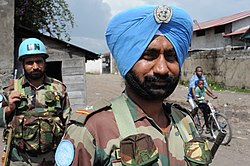
- Reason
- Great composition; the peacekeeper in the foreground's expression is (what I find to be) a really world-weary smile. The gun just briefly shown on his left shoulder is just a haunting reminder of what his purpose in the country actually is. The people in the background on the bike and the peacekeeper at left are blurred to varying degrees, leaving a nice focus on the foreground.
- Articles this image appears in
- 2008 Nord-Kivu war (is under a different, smaller version; Image:Congopeacekeepers.jpg)
- Creator
- Julien Harneis
- Support as nominator --Master of Puppets Call me MoP! :D 01:24, 23 November 2008 (UTC)
- Support - Good res, good EV, high quality. —Ceran ♦ (talk) 12:34, 23 November 2008 (UTC)
- Support --Massimo Catarinella (talk) 15:59, 23 November 2008 (UTC)
- Oppose--User:kdm85 There is no clear proof these are peacekeepers and the head shot is too close-a picture should show a man or woman engaing in the action of the article, this is just a face-very weak in encylopedia importance —Preceding undated comment was added at 04:58, 24 November 2008 (UTC).
- The fact that they are wearing a blue helmet is clear proof. Not to mention the black children in the background. JonCatalán(Talk) 03:54, 25 November 2008 (UTC)
- Note the United Nations emblem on the turban... Master of Puppets Call me MoP! :D 09:29, 27 November 2008 (UTC)
- Oppose: Does not display the peacekeepers purpose, does not have any encyclopedic purpose, if it showed him actually performing his duties then i'd support it. – Jerryteps 10:19, 24 November 2008 (UTC)
- Not to pick points, but how does one show a peacekeeper's purpose? In the shot they're... well... keeping peace... besides, you can see the guns. It isn't too hard to imagine their role. Master of Puppets Call me MoP! :D 09:29, 27 November 2008 (UTC)
- Weak Oppose I find the composition a bit awkward, not sure why, it just doesn't work well for me. I think I'd prefer a wider angle if we are going to show a deep DOF with other stuff happening in the frame. It's not all bad though, and a good addition to the article. The portrait of the child strikes me as more FP-worthy. Fletcher (talk) 15:33, 24 November 2008 (UTC)
Not promoted . --John254 03:42, 28 November 2008 (UTC)
- Reason
- The child's face is incredibly expressive, the wide eyes portraying a sliver of fear yet mostly wonderment at the events about to take place. It's face is in great contrast with the rest of the picture, as the face to the left is very dark, while the hands on the child's shoulder are slightly blurry, lending a great focus to the kid.
- Articles this image appears in
- 2008 Nord-Kivu war
- Creator
- Julien Harneis
- Support as nominator -- Master of Puppets Call me MoP! :D 01:33, 23 November 2008 (UTC)
- Comment. It's not currently being used in any articles.--ragesoss (talk) 01:48, 23 November 2008 (UTC)
- Oops. It was in the article I said it was in but I guess it got removed... or maybe I'm hallucinating. Master of Puppets Call me MoP! :D 03:11, 23 November 2008 (UTC)
- It does have to be used in an article. Can you figure out why it was removed and add it back if possible? Fletcher (talk) 12:48, 25 November 2008 (UTC)
- Oops. It was in the article I said it was in but I guess it got removed... or maybe I'm hallucinating. Master of Puppets Call me MoP! :D 03:11, 23 November 2008 (UTC)
- Oppose -- Great Picture to look at but no encyclopedic value as you dont really see whats going on. 128.131.213.60 (talk) 09:30, 23 November 2008 (UTC)
- Above IP: - If you are not already a user, it is recommended you sign up, because Ip !votes are not counted at FPC. Thanks. —Ceran ♦ (talk) 17:31, 23 November 2008 (UTC)
- We don't bite the newbies - IP comments are given less weight but not completely disregarded (unless the consensus has changed, and then it should be made explicit in instructions above). Mostlyharmless (talk) 23:36, 23 November 2008 (UTC)
- We don't bite, but traditionally IP's (particularly those with few edits) have not been given suffrage --Fir0002 01:06, 24 November 2008 (UTC)
- Nothing's changed - Paragraph 3 at the top of the page seems pretty clear when it says: "Note, however, that anonymous votes are generally disregarded...". We generally leave the comment (unless it's abusive or clearly a sockpuppet) but disregard the 'vote'. --jjron (talk) 06:25, 24 November 2008 (UTC)
- We don't bite the newbies - IP comments are given less weight but not completely disregarded (unless the consensus has changed, and then it should be made explicit in instructions above). Mostlyharmless (talk) 23:36, 23 November 2008 (UTC)
- Oppose per IP. You can't see what's going on - lacks EV. Calliopejen1 (talk) 00:23, 24 November 2008 (UTC)
- Oppose per IP, and also, the subject's head is cut off severely. SpencerT♦C 01:22, 24 November 2008 (UTC)
- Oppose: per above, you can't tell what's going on. – Jerryteps 10:17, 24 November 2008 (UTC)
- Support Quality portrait of a child in a part of the world most of us don't see, amidst an ongoing war. Framing is up close and personal -- there's times when something getting cut off is clearly a mistake by the photographer, but this isn't one of those times. In fact, everything in this picture, not just the child's head, is cut off in some way, but I think it works very well. Furthermore, a portrait photo is, by definition, a person just standing around -- there's not supposed to be anything "going on." Now if this were intended to show the medical process of vaccination, I suppose it would lack EV, but it's not -- it's about the people in this war. DOF was too shallow to get the ears, but the reflections in the eyes are amazing. Fletcher (talk) 15:03, 24 November 2008 (UTC)
- Oppose Without being able to see what's truly going on, we're basically just left with a picture of an African child, and we have many of those that are considerably better than this one. -- Mike (Kicking222) 00:11, 25 November 2008 (UTC)
- Oppose. It's an evocative, almost beautiful photograph, but the principal standard here is encyclopedic value. The picture is in the article about the war but it doesn't illustrate the war. It doesn't clearly illustrate subject matters such as "inoculation" either: my vote would be different if it could be shown that this photograph does clearly and appropriately illustrate a subject in an encyclopedic manner. For further illustration of my point, see this discussion Spikebrennan (talk) 03:35, 28 November 2008 (UTC)
Not promoted . --John254 03:43, 28 November 2008 (UTC)
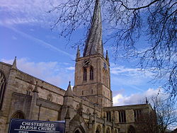
- Reason
- This image is of high resolution, with good contrast and accurate exposure. There are no others like it on Wikipedia, it has not been digitally manipulated and is available in the public domain. The church is centred in the image, with the name in the bottom left hand corner and tree branches draped across the top right, illustrating the surroundings the church is located within.
- Articles this image appears in
- Church of St Mary and All Saints, Chesterfield
- Creator
- Schumi555
- Support as nominator --Kiano1234 (talk) 19:31, 25 November 2008 (UTC)
- Oppose subject obscured by branches, very grainy and with purple tinging just about everywhere. --Leivick (talk) 19:37, 25 November 2008 (UTC)
- Oppose. There's a tree in the way. Kaldari (talk) 20:19, 25 November 2008 (UTC)
- Oppose per above, plus the sign is distracting (all or none). ~ Wadester16 (talk) 21:00, 25 November 2008 (UTC)
- Oppose Despite the "hype" in the nom, this photo illustrates what a FP is not: Tilted, cut off, partially obscured. --Janke | Talk 23:17, 25 November 2008 (UTC)
- Oppose Cluttered, cut off, obscured, & not horizontal. Skier Dude (talk) 03:06, 27 November 2008 (UTC)
Not promoted . --John254 03:44, 28 November 2008 (UTC)
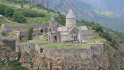
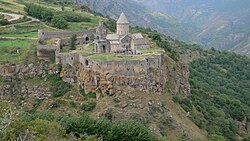
- Reason
- An encyclopedic example of a cliffside fortified monastery with only one entry point. Certainly has a wow factor.
- Articles this image appears in
- Tatev
- Creator
- Eupator
- Support Edit 1 as nominator -- Ευπάτωρ Talk!! 17:53, 23 November 2008 (UTC)
- Weak Oppose Unfortunately, the subject, which is interesting, is cut off at left, and I'd also like to see a little more at the bottom. If this indeed is a panorama (which I doubt, I guess it is not stitched from several images) - but if, can we get a new stitch with a little more at left & bottom? --Janke | Talk 18:12, 23 November 2008 (UTC)
- It's not a stitched panorama. However I have an alternative shot from the same vantage point that shows more of the left and bottom . I'll upload it now.-- Ευπάτωρ Talk!! 18:38, 23 November 2008 (UTC)
- Comment: Encyclopedic how? – Jerryteps 10:16, 24 November 2008 (UTC)
- It shows the entire monastery, clearly indicating the scale of the complex and its (rather dramatic) cliffside location. I'm not sure what more you want. Raven4x4x (talk) 10:58, 24 November 2008 (UTC)
- Comment an intermediate crop and some levels would be really nice. Something along these lines: Stevage 12:32, 24 November 2008 (UTC)

Edit 1 by Stevage, just a quick demonstration of a better crop, and some more contrast would be nice too.
- Oh, and did I mention straightening? Stevage 23:22, 24 November 2008 (UTC)
- Support The edit by Stevage also does an excellent job in bringing out the red tint of the cliffs as well as the sparkling white tone of the church itself.--Marshal Bagramyan (talk) 05:26, 25 November 2008 (UTC)
- Oppose Too small file size. —Krm500 (Communicate!) 04:53, 26 November 2008 (UTC)
- Weak Support: Great picture, what I meant was that you didn't explain how it was encyclopedic, you just said it was. I'd change to support if the caption was changed. The people/cars in the picture just ruin it for me. – Jerryteps 02:55, 28 November 2008 (UTC)
- Oppose I don't like any of the crops... the features of the buildings seem soft and there isn't enough detail. These are useful pics but not featurable ones in my opinion. gren グレン 07:01, 29 November 2008 (UTC)
Not promoted . --John254 03:18, 30 November 2008 (UTC)
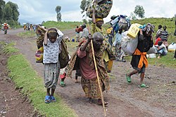
- Reason
- Very powerful picture illustrating just what displacement really means. A bit grainy at full-size but it's about four times the minimum size so downsampling could eliminate this. Imperfect composition, but I think this is mitigated because we so rarely get decent imagery from Africa, especially war-torn parts of Africa.
- Articles this image appears in
- Internally displaced person, 2008 Nord-Kivu war
- Creator
- Julien Harneis, who just graciously relicensed many of his images, leading to the flood here... :)
- Support as nominator --Calliopejen1 (talk) 23:26, 23 November 2008 (UTC)
- Weak Oppose Though powerful, it's really grainy, and I'm not sure downsampling would fix that. It's also a soft image, and there's a person cut off on the right side. There's also some blown highlights on the yellow jug. SpencerT♦C 01:18, 24 November 2008 (UTC)
- Oppose: I agree with the above, there are some problems with the picture, it looks like a cheap camera was used as the film quality is fairly bad, also the picture does not really tell the story behind it, the only thing we have to go on is the caption, they could be going to the market for all we know. – Jerryteps 10:10, 24 November 2008 (UTC)
- Support per nom. Very valuable image, and the graininess does not bother me. Spikebrennan (talk) 14:48, 24 November 2008 (UTC)
- Weak Oppose This was not taken with a cheap camera, nor was it film, but unfortunately I don't think the lighting and composition are up to FP standards. Good addition to the article. Fletcher (talk) 15:07, 24 November 2008 (UTC)
- Well, maybe "cheap" wasn't the word I should of used, what I meant was that it doesn't look like it was made with very high quality film. – Jerryteps 12:04, 25 November 2008 (UTC)
- Support It's ridiculour to carp about the finer points of picture quality with such important subject matter. The quality is quite adequate for the purpose - e.g. look at that kid with US tanks on his T-shirt.
- Oppose Too grainy. Clegs (talk) 17:29, 25 November 2008 (UTC)
- Support Excellent for illustrating an article's description. Also, the graininess is only noticeable if you're zooming in past 2000x2000. Desktop-width looks fine for me. Master of Puppets Call me MoP! :D 09:34, 27 November 2008 (UTC)
- Weak oppose The graininess doesn't bother me too much given the content, but the composition isn't FP quality; taking a step further toward the right would at least have put the two women in the centre side-by-side rather than on top of each other. Time3000 (talk) 16:31, 28 November 2008 (UTC)
Not promoted . --John254 03:19, 30 November 2008 (UTC)
- Reason
- The image doesn't intend to display what a twist drill bit looks like. It does convey useful information in how the drill bit works however. The control of the highlights is pretty good considering the lustrous nature of metal.
- Articles this image appears in
- Drill bit, Drilling
- Creator
- Noodle snacks
- Support as nominator --Noodle snacks (talk) 13:02, 24 November 2008 (UTC)
- Support Why am I worried Robert Patrick is going to congeal out of that? It's a well done and very unusual macro... might be helpful to state the magnification if it can be approximated. If that is a standard drill bit it looks to be quite high mag., in which case my biggest concern about softness of surrounding metal fragments is probably forgivable. Fletcher (talk) 14:40, 24 November 2008 (UTC)
- Oppose for technical reasons: The drill flute is almost totally black, contrast is too high - loses enc. Easy to shoot a better one. Suggest using a nitride-coated drill, easier to see flute(s) because of its lighter, yellow color. --Janke | Talk 15:09, 24 November 2008 (UTC)
- Oppose per Janke, I also think it feels a little busy which would be corrected with a slightly looser crop. Mfield (talk) 18:07, 24 November 2008 (UTC)
- Comment - easy to shoot another one? Good luck :) I do find it a bit oversharpened and difficult to see what's going on. And I don't see what the lubricant has to do with anything - can you even see it? Stevage 23:21, 24 November 2008 (UTC)
- Regretful oppose Per all above, and a lack of context. I've spent a fair amount of time in a machine shop and it took me a moment to figure out what I was looking at.--HereToHelp (talk to me) 00:23, 25 November 2008 (UTC)
- Oppose Overy sharpened, takes a while to figure out what it is, the contrast is to high and all of the above :-Adam (talk) 07:10, 26 November 2008 (UTC)
- Comment Could at least say what size drill bit it is. —Pengo 14:08, 27 November 2008 (UTC)
Not promoted . --John254 03:20, 30 November 2008 (UTC)
- Reason
- Despite the fact that there is already a pomegranate FPC (Pomegranate03_edit.jpgnomination) I believe that this one is different enough, in that it is from a different point of dissection of a pomegranate, that it merits it's own go. This image meets the size guidelines and then some and is very encyclopedic in that it is a high quality shot of the subject and it adds a lot to the article that it is in.
- Articles this image appears in
- Pomegranate
- Creator
- SriniG (original upload), JRaber (current version)
- Support as nominator --Cat-five - talk 18:03, 24 November 2008 (UTC)
- Oppose I love the concept and shot BUT the lighting lets it down. It can easily be reshot with a second source and more diffusion/a tent to remove the big highlights and provide better definition of the shape and form, as it is it seems very flat. Mfield (talk) 18:12, 24 November 2008 (UTC)
- Oppose per Mfield. Seeing the too bright white background makes my eyes itch.--Caspian blue
- Neutral: Has encyclopedic value as it displays the contents of the fruit, although the picture itself isn't that well done, as others have said, it looks flat, i'm not too fussed with the lighting though, plus the white background hurts my eyes a bit, although that may be because it's 11pm (in Australia). – Jerryteps 12:00, 25 November 2008 (UTC)
Not promoted . --John254 03:20, 30 November 2008 (UTC)
- Reason
- Nice PD portrait
- Articles this image appears in
- Ségolène Royal, Nicolas Sarkozy, French presidential election, 2007
- Creator
- Jastrow (Marie-Lan Nguyen)
- Support as nominator --Spikebrennan (talk) 19:22, 24 November 2008 (UTC)
- Comment Added Edit1 to address obvious issues with distracting elements and noise. Mfield (talk) 19:43, 24 November 2008 (UTC)
- Comment is there any bigger res? M.K. (talk) 21:04, 24 November 2008 (UTC)
- Comment the picture is not sharp.--Caspian blue 01:10, 25 November 2008 (UTC)
- Oppose: What encyclopedic value does this hold? As far as I can tell, it's just a regular picture. – Jerryteps 11:56, 25 November 2008 (UTC)
- I'm not sure you appreciate encyclopedic value. It is simply the extent to which the image illustrates its subject. This clearly does that. Would be appropriate in a print encyclopedia like Britannica? Clearly yes. Therefore encyclopedic. de Bivort 20:04, 25 November 2008 (UTC)
- What encyclopedic content does this hold other than illustrating Ségolène Royal? Just because it's a picture used for an infobox does not mean it's a featured picture. – Jerryteps 21:46, 25 November 2008 (UTC)
- You are right that just because it is in an info box it isn't a featured picture. However, it illustrates the subject of an article so it has encyclopedic value. What else other than illustrating Segolene Royal would it have to show in order for you to think it has EV. --Leivick (talk) 03:57, 26 November 2008 (UTC)
- It doesn't illustrate anything other than Sed. But she is the only subject. And since it illustrates her clearly -> high enc. de Bivort 05:50, 26 November 2008 (UTC)
- Weak Oppose I think images of important figures have plenty of encyclopedic value. Although I think the quality of this particular image is just below standards (A tiny bit soft after the noise removal and a little on the small side). --Leivick (talk) 19:46, 25 November 2008 (UTC)
Not promoted . --John254 03:21, 30 November 2008 (UTC)


