Wikipedia:Featured picture candidates/delist/Franklin Pierce
Appearance
Voting period is over. Please don't add any new votes. Voting period ends on 28 Oct 2014 at 10:11:41 (UTC)
- Reason
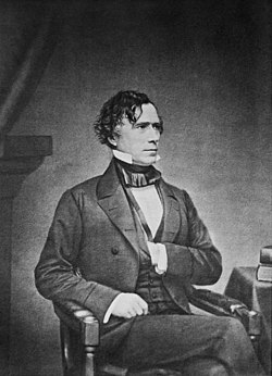
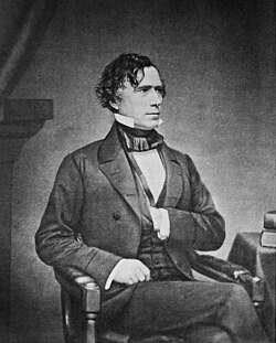
- ...This just passed yesterday. And then I was looking at it today, and realized - hang on a moment, if I crop that just a bit differently, I can balance out the image and improve the appearance immensely. See, it's normal for Victorian pictures to have a lot of headroom, but in this one, the headroom is an inky lake of darkness. If it's cropped down a bit, the glow around Pierce becomes symmetrical.
I will admit to feeling very stupid about this. But, nonetheless, our goal is to promote the best we can do, so I, rather blushingly, suggest my new alternative. Luckily, this hasn't happened to me before; hopefully, it'll be a long time before it happens again. - Articles this image appears in
- Franklin Pierce et al.
- Previous nomination/s
- Wikipedia:Featured picture candidates/Franklin Pierce, Wikipedia:Featured picture candidates/Franklin Pierce redux
- Nominator
- Adam Cuerden (talk)
- Delist and replace — Adam Cuerden (talk) 10:11, 18 October 2014 (UTC)
- Comment - it is difficult to compare when the pictures are not the same size, I would prefer to have them at same size, like this they are kind of jumping and vibrating before the eye. Like this is easyer to compare what happened. I am not sure, Adam. When looking like this original looks more balanced.Hafspajen (talk) 13:59, 18 October 2014 (UTC)
- In articles, the width is the parameter that matters; they'll be the same width in articles, not the same height. Further, since the replacement was only cropped on the top, not the sides, presenting them at different widths makes the wider one look like it's been zoomed in on Pierce, since Pierce would be larger in the thumbnail; but he is not, and won't appear like that in articles because the replacement won't change the width. I've done a tiny bit more contrast, and a tiny bit more cleanup, but the crop is the main thing. Adam Cuerden (talk) 14:02, 18 October 2014 (UTC)
- @Hafspajen: Let's go with vertical, then? Adam Cuerden (talk) 15:51, 18 October 2014 (UTC)
- Let the others decide, Hafspajen (talk) 20:22, 18 October 2014 (UTC)
- Support — Inveterate fan of tight cropping that I am, I find the recropped version more focused & therefore more interesting. Sca (talk) 14:42, 18 October 2014 (UTC)
- And, even though I'm normally opposed, centring it on the glow just makes sense in this case. Adam Cuerden (talk) 15:06, 18 October 2014 (UTC)
- Support I'd hate to have been the poor sod who drew this from a daguerrotype (bet it wasn't Brady). Xanthomelanoussprog (talk) 21:47, 18 October 2014 (UTC)
- D&R... — Crisco 1492 (talk) 08:37, 19 October 2014 (UTC)
- Support - Since I !voted for the original, I will agree that the crop is tighter and more appealing. Jusdafax 21:47, 19 October 2014 (UTC)
- Support - Cropped is better. Kaldari (talk) 03:37, 20 October 2014 (UTC)
Replaced with File:Mathew Brady - Franklin Pierce - alternate crop.jpg --Armbrust The Homunculus 14:04, 28 October 2014 (UTC)


