Wikipedia:Graphics Lab/Image workshop/Archive/Aug 2009
  | This page, part of the Graphics Lab Wikiproject, is an archive of requests for August 2009. Please do not edit the contents of this page. You can submit new requests here. |
Stale
SVG Not done Properly
Article(s): Ulyanovsk
Request: The SVG above is very blurry, and looks like a raster. Can it be redone? Connormah (talk) 18:35, 8 July 2009 (UTC)
Graphist opinion(s):
- Is there an original raster? An external link works too. ZooFari 22:56, 9 July 2009 (UTC)
- It looks like the crown if from the top of this coat of arms. Connormah (talk) 03:34, 10 July 2009 (UTC)
- Well I can't fix it. I'd need a much higher res pic. ZooFari 19:23, 11 July 2009 (UTC)
- It looks like the crown if from the top of this coat of arms. Connormah (talk) 03:34, 10 July 2009 (UTC)
US 5th Infantry Division Distinctive Unit Insignia
Article(s): 5th Infantry Division (United States)
Request: Please SVGify. - Jameson L. Tai talk ♦ guestbook ♦ contribs 23:31, 12 July 2009 (UTC)
Graphist opinion(s):
Coat of Arms of Eritrea
Article(s): Eritrea
Request: Alright, I know this image is fair-use, but I think it needs to be converted to a vector. The quality of this image, I feel in innapropriate for Wikipedia and NEEDS a SVG. Thanks in advance to whoever does this. Connormah (talk) 23:07, 19 June 2009 (UTC)
- One question: Can you find a free raster of it somewhere, so the SVG can be free? A copyrighted country coat of arms feels like a throwback to the bad old days of vector-images and would destroy most of its usefulness... 76.117.247.55 (talk) 01:48, 29 June 2009 (UTC)
- Where would you suggest I search? Connormah (talk) 05:28, 2 July 2009 (UTC)
- Actually, can you just upload it under a non-free use rationale? Connormah (talk) 02:59, 6 July 2009 (UTC)
- I think I was very confused when I made that comment. I'm pretty sure people have created free SVGs from fair use ones (That Commonwealth Games one comes to mind), so finding a "free" raster is not required? 76.117.247.55 (talk) 01:43, 17 July 2009 (UTC)
Graphist opinion(s):
Panorama of Târgovişte
-
Panorama of Târgovişte, Romania
Article(s): Târgovişte
Request: Hi. I need this photo to be fixed. There are some issues:
- In the left section of the photo it can be seen the difference between the last 2 joined photo.
- The bottom left part of the image is occupied by a stone pillar. Can it be removed?
- The colors may need adjusting as well as the brightness, contrast, etc.
- I think the horizon can be straighted.
This is all it needs to be done (in my opinion). If you find out other issues please solve them. Thank you very much.—Sebitalk 12:47, 3 July 2009 (UTC)
Graphist opinion(s): The easiest way to fix this would be to use the source images to create a completely new panorama. Do you have access to them? wadester16 05:31, 6 July 2009 (UTC)
- Yes, I do, they are made by myself. Here is a link with a .rar file containing the images. It would be great if you can make a better panorama, because it is the only I know to exist on the Internet. Thank you very much for your help.—Sebitalk 16:45, 9 July 2009 (UTC)
- I have restitched the panorama to get rid of the stripe on the left, but there's not much I can do about the brightness/contrast and stone block. I've already pushed the brightness so far it won't really take any more and the pillar is a bit beyond my abilities with a cloning brush; maybe someone else can have a go. Time3000 (talk) 09:06, 13 July 2009 (UTC)
- OK, thank you for your work. If someone else can resolve the other requests, please do it. Thank you again—Sebitalk 15:27, 13 July 2009 (UTC)
- I have restitched the panorama to get rid of the stripe on the left, but there's not much I can do about the brightness/contrast and stone block. I've already pushed the brightness so far it won't really take any more and the pillar is a bit beyond my abilities with a cloning brush; maybe someone else can have a go. Time3000 (talk) 09:06, 13 July 2009 (UTC)
- I would suggest you to upload the source images to commons. →AzaToth 00:02, 23 July 2009 (UTC)
Indian cultural zone
Article(s): Indian cultural zone
Request: Wikify-that is, stylistically, grey land, fix borders... Chris (クリス • フィッチュ) (talk) 09:36, 23 July 2009 (UTC)
Graphist opinion:
Hebrew version of banner
-
In English
Request: Hi, my user-name is MT0, and i'm a User in the hebrew wikipedia (my user page). me and some other hebrew wikipidians re-opened our graphic lab, and i saw on the commons graphic lab this image; File:Graphic Lab Animated Banner.gif. i wanted the creator of this animation to make me the same animation with a hebrew sentence, but he said he don't have time to do that, and he said i can ask here for someone to do it for me. so, can someone make me this animation (or something like that)?. if yes, i'll give the hebrew sentence. thanks. (you can answer me here or on my discussion page here) --87.68.28.232 (talk) 09:56, 26 July 2009 (UTC)
Kinetic Theory request
Article(s): User:Logger9/Kinetic_Theory_of_Solids
Request: I have several images (simple curves on a 2-d plot) that I have scanned from an original text. I would like to have them included in this article. I can email them to you if you like. -- logger9 (talk) 03:41, 16 July 2009 (UTC)
Graphist opinion:
Post them somewhere and link to them here (don't upload to WP if they're copyrighted). Also I'd like to point out that this image File:Coll_3.jpg unless you operated the SEM and captured that image then you can't claim copyright, you put a source that is clearly within range of applicable copyright laws. That image probably will be prodded for deletion as soon as it leaves your personal namespace or until someone else sees it. Also for your article be sure to include as many sources and references as you can, didn't see many when I browsed it. — raeky (talk | edits) 13:49, 18 July 2009 (UTC)
- Thanks for the response !
- I created that micrograph personally on the scanning electron microscope @ UCLA (Boelter Hall). In fact, that is a collage, and I was up most of the night getting it all done! There is no conflict whatsoever :-) In addition, I have published it previously on my own personal website, which has been declared as Public Domain in its entirety.
- Regarding the article, all of the main sections were rewritten by me from a single source, and that is stated clearly in the references (on top).
- Regarding the figures: the entire (Mott & Jones) text is available in digital format here. Open up the text ("Look Inside This Book") and paginate to Figure 1 on page 7 (using arrows on top next to "Contents" and "Search"). Also Figure 5 (p. 16) and Figure 7 (p. 24). Let me know if you have any problems. Thanks again ! -- logger9 (talk) 02:18, 23 July 2009 (UTC)
- Are you the author of this research/book? The book was published in 1936, so copyright has not expired yet. Also the Google book scans you provided does not provide perfect detail of the smaller text, even zoomed in. I can't guess what some of the symbols are. Since by the name you provided in the micrograph image, I'm assuming you're not Mott Nf or Jones H which is the published authors of "The theory of the properties of metals and alloys." Explain how these graphs/data would be within the copyright rules of wikipedia for inclusion/digitalization? — raeky (talk | edits) 00:43, 26 July 2009 (UTC)
- Of course I'm not the author. I just want someone to re-sketch those simple graphs -- and I have larger scanned copies. The first one is not even quantitiatve. It's just a comparison of 2 different types of curves.
- If that is against the rules, then forget about it....-- logger9 (talk) 01:07, 26 July 2009 (UTC)
- I don't know if a graph it's self can be copyrighted, but the data used to make the graph probably can be. Someone else with some experience here should weigh in.... — raeky (talk | edits) 02:46, 26 July 2009 (UTC)
- Who knows....maybe 10 years or so from now, we could actually accomplish something here. Now isn't THAT a scary thought ??? -- logger9 (talk) 21:08, 27 July 2009 (UTC)
COA of the US Virgin Islands
Article(s): US Virgin Islands
Request: Please vectorize. Connormah (talk) 17:38, 27 July 2009 (UTC)
Graphist opinion(s): Here is a higher resolution version which might help. Here is for the legislature which has some differences but might help. gren グレン 22:34, 28 July 2009 (UTC)
- Note that you can take part of the rope from the Image:United States Department of the Navy Seal.svg. 76.117.247.55 (talk) 20:56, 29 July 2009 (UTC)
Seal of Vermont
-
Seal of Vermont
Article(s): 100s, including Vermont
Request: Vectorize. Svgalbertian (talk) 17:12, 26 July 2009 (UTC)
- I second this request, if possible. 76.117.247.55 (talk) 20:31, 14 August 2009 (UTC)
Graphist opinion(s):
PA and CT boundary dispute, aka Pennamite-Yankee War
Article(s): Pennamite Wars
Request: Here are some book references with relevant maps:
Klein, Philip (1980). A History of Pennsylvania. University Park: Pennsylvania State University Press. p. 189. ISBN 0271002166.
Fisher, Sydney George (1896). The Making of Pennsylvania. Philadelphia, PA: J. B. Lippincott Company. pp. frontispiece.
Fisher, Sydney (2003). The Making of Pennsylvania. City: Ross & Perry. pp. frontispiece. ISBN 1932109439.
Here is website reference with a relevant map:
[[1]] This is the map I want (from Fisher) with the relevant boundaries shown more clearly. Since the Fisher book was published in 1896, there is assurance that any derived map is not a copyright violation. This map could be a version with the Connecticut dispute shown without the VA or MD disputes. Note that the historical dispute in the article was whether the western boundary of Connecticut at the time could skip over NY and NJ and resume westward from the Delaware River to the Pacific Ocean. --DThomsen8 (talk) 14:59, 16 July 2009 (UTC)
- I would expect this request to be fairly easy, but no one seems ready to take it on. --DThomsen8 (talk) 11:08, 29 July 2009 (UTC)
- The link is defective (for me @least). 76.117.247.55 (talk) 02:06, 5 August 2009 (UTC)
Graphist opinion:
Rorschach test staging
See http://www.gettyimages.com/detail/3323202/Hulton-Archive
Article(s): Rorschach test
Request: Create a similar free image depicting the administration of the Rorschach test. Photograph is preferred to drawing. File:Rorschach1.jpg is probably the ideal card to use in the staging. –xenotalk 22:36, 6 August 2009 (UTC)
Graphist opinion(s):
Papua
Article(s): Papua_(province)
Request: SVGify... Chris (クリス • フィッチュ) (talk) 14:34, 3 August 2009 (UTC)
Graphist opinion:
- Far too low quality to work with, unless you are a super-expert or something. We would need to find a better example, perhaps from Google. James1293 (talk) 19:08, 21 August 2009 (UTC)
- Agree SPLETTE :] How's my driving? 19:09, 21 August 2009 (UTC)
Don't Stop Me Not Record Cover
Article(s): Don't Stop Me Now
Request: Please convert to .jpg or png, and remove record imprints. Connormah (talk) 01:52, 7 August 2009 (UTC)
Graphist opinion(s):
Changing compression won't make the image any better (not that we can based on WM fair use policies) and removing the record mark will be imperfect. I recommend you use this image instead or find your own low resolution version and upload and source it and put the other image up for deletion. 173.75.221.232 (talk) 06:08, 8 August 2009 (UTC)
Resolved
Lee Family Coat of Arms
-
SVG by ZooFari
Article(s): Richard Henry Lee, various other articles
Request: Perfect candidate for SVG conversion. Fairly high-res, and in a poor state. Could someone look at this? Thanks! Connormah (talk) 16:49, 27 July 2009 (UTC)
Graphist opinion(s):
![]() Request taken by ZooFari.
Request taken by ZooFari.
![]() Done. How's that? ZooFari 16:48, 30 July 2009 (UTC)
Done. How's that? ZooFari 16:48, 30 July 2009 (UTC)
- Wow, that's great! Awesome job! Connormah (talk) 22:41, 30 July 2009 (UTC)
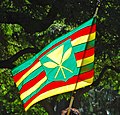
Kanaka Maoli flag
![]() Done
Done
Article(s): Flag of Hawaii
Request: SVGify, please... Chris (クリス • フィッチュ) (talk) 02:49, 31 July 2009 (UTC)
Graphist opinion:
![]() Request taken by ZooFari.
Request taken by ZooFari.
![]() Done Colors based on other sources I found as well. How's that? ZooFari 15:46, 31 July 2009 (UTC)
Done Colors based on other sources I found as well. How's that? ZooFari 15:46, 31 July 2009 (UTC)
Where is it? I can't find any new SVG you created. Help? :)Chris (クリス • フィッチュ) (talk) 16:50, 31 July 2009 (UTC)- Found it (on Commons!), that's killer, thank you! Chris (クリス • フィッチュ) (talk) 16:55, 31 July 2009 (UTC)
- OMG, did I really forget to place it here? :-) ZooFari 18:28, 31 July 2009 (UTC)
- Found it (on Commons!), that's killer, thank you! Chris (クリス • フィッチュ) (talk) 16:55, 31 July 2009 (UTC)
Signature request
![]() Done
Done
-
Nicolae Ceausescu Signature
Article(s): Respective signers
Request: I've been trying to vectorize these for a while now, can somebody please assist me? Thank you. Connormah (talk) 18:50, 15 July 2009 (UTC)
- I`ve done Churchill`s. ||||
Graphist opinion(s):
User:Ssolbergj has apparently completed the Ceauşescu signature. hydrox (talk) 05:39, 2 August 2009 (UTC)
Patrick Swayze
![]() Done
Done
Article(s): Patrick Swayze
Request: Trim off left side glow or someone's finger or whatever it is, thanks... Chris (クリス • フィッチュ) (talk) 17:03, 31 July 2009 (UTC)
Graphist opinion: Is this OK? CountingPine (talk) 02:49, 2 August 2009 (UTC)
- That's great, but now there's a grey band on the right hand side all the way down. Chris (クリス • フィッチュ) (talk) 02:52, 2 August 2009 (UTC)
- Gone now. In order to prevent the rest of the image getting new JPEG artifacts, I used JPEGJoin to splice the left of the new and the right of the old together. It's not designed for this (I don't know of any tool that is), and that gray area was a side-effect I forgot to remove. CountingPine (talk) 03:00, 2 August 2009 (UTC)
- Perfect, complete, thanks! Chris (クリス • フィッチュ) (talk) 03:10, 2 August 2009 (UTC)
ISS ECLSS
-
Diagram showing International Space Station Environmental Control and Life Support System (ECLSS).
Article(s): International Space Station, Life support system
Request: I was wondering if it would be possible, please, to convert this diagram to SVG (and, for that matter, give it a more descriptive filename). Many thanks in advance, Colds7ream (talk) 11:06, 15 July 2009 (UTC)
Graphist opinion(s):
![]() Not done There is already one in existence: File:SpaceStationCycle.svg. ZooFari 20:46, 21 July 2009 (UTC)
Not done There is already one in existence: File:SpaceStationCycle.svg. ZooFari 20:46, 21 July 2009 (UTC)
- Cheers for pointing that out! Colds7ream (talk) 23:35, 30 July 2009 (UTC)
ISS & Endeavour Shadow STS-127
Article(s): International Space Station
Request: Would it be possible, please, for someone to get rid of the ghostly reflections of the solar arrays on the centre-right of the image? Many thanks in advance, Colds7ream (talk) 23:27, 30 July 2009 (UTC)
Graphist opinion(s): ![]() Done I uploaded over the file, assuming nobody would ever want those reflections. Let me know, though, if you'd prefer a separate file (you may need to leave a msg on my talk, if I don't respond here anytime soon; sometimes I forget about this place. :-) wadester16 18:13, 3 August 2009 (UTC)
Done I uploaded over the file, assuming nobody would ever want those reflections. Let me know, though, if you'd prefer a separate file (you may need to leave a msg on my talk, if I don't respond here anytime soon; sometimes I forget about this place. :-) wadester16 18:13, 3 August 2009 (UTC)
Passing the parameter
— BOLDly marking this one done, per remarks in the discussion. 76.117.247.55 (talk) 02:07, 5 August 2009 (UTC)
Article(s): NH 1
Request: Can i know how to replace 1 with X ? And send the parameter from outside Naveenpf (talk) 13:29, 3 June 2009 (UTC)
- Hi i want to a image as a function, something like [[File:National_shield|No=2| 100 px]] to get--Naveenpf (talk) 00:13, 4 June 2009 (UTC)
Graphist opinion:
Non-graphist opinion - I don't believe it is a parameter - the value "1" is incorporated into the image. I just created
in Commons, is this the type of thing you need, or must it be parameter driven?
- I need a parameter driven image.Thanx in advance--Naveenpf (talk) 03:37, 4 June 2009 (UTC)
- Template it. Create a template with text [[File:Image {{{1}}}.png|thumb|200px|blah blah]], then use the template. This requires, however, that you have for every (relevant) value of {{{1}}} a corresponding image. Shouldn't be too hard with SVG, just boring. MER-C 10:38, 4 June 2009 (UTC)
- I need a parameter driven image.Thanx in advance--Naveenpf (talk) 03:37, 4 June 2009 (UTC)
- That is really boring. any other option ? --Naveenpf 02:28, 5 June 2009 (UTC)
- What is it you want to do? Generate a set of images with a shield with the number on it? Or do you want to dynamically create such an image. I really don't understand the idea here. If you are doing this by yourself on your local computer, you can simply put a string in place of the X that won't appear up in the SVG, such as REPLACEME, then use Bash+sed/python/whatever to use regular expressions to solve your problem. If you can provide more background on the problem, then a solution might be available. User A1 (talk) 05:55, 8 June 2009 (UTC)
Take a look @ {{MES-E}}. You need nearly identically named files, but that's the most elegant way. As far as I know there's no way to pass the number directly to the SVG rendered (Which is good, that would be a massive security hole). 76.117.247.55 (talk) 02:01, 29 June 2009 (UTC)
I see that this request is stale, but there will be others like it in the future. Can we satisfy them all at a single (if challenging) stroke? Let's make a template which takes a text parameter for the road number and superimposes it on a background SVG of an unnumbered shield for this road type. We can model this on {{Location map}} to allow syntax like
{{Road shield|India NH|width=30|number=1|color=black|font=whatever}}
This would require "Road shield India NH.svg" with the yellow shield and letters NH and a blank space for the number. However, we only need one simple SVG per road type (maybe five SVGs per country), not one per individual highway. ("Number" here is a shorthand for any road designator: "number=A601(M)" could give a valid British road sign.) Certes (talk) 13:51, 30 June 2009 (UTC)
- Would that work for scaled images? IE. would the letter show up in the right place, size, etc? If so, that would be VERY useful. 76.117.247.55 (talk) 19:18, 30 June 2009 (UTC)
- I'm trying it now but I'm about to have a Wikibreak and don't think I'll get anything useful published before I go away. First indications are that it is difficult and the resulting templates will be confusing, but it will probably work. Scaling should just be a matter of doing some arithmetic in the template to set position and font-size = width * some scaling factors.
- A few design tweaks: The "India NH" bit is not just an SVG but a simple template specifying the background image (any usual format) and the font, colour and size of the text to add. Let's call it "marker" rather than "shield" so it will be attractive to nations like the UK with other sign shapes. I'd also like to use standard country codes followed by a country-dependent road class. That gives us a simplified use like
{{Road marker|IN NH|1}}
- The font, default size, etc. come from sub-template Road_marker_IN_NH but can be over-ridden with named parameters if desired. Certes (talk) 19:39, 30 June 2009 (UTC)
{{Road marker|IN NH|123}} The template is now available for testing. For example, the shield shown on the right is not an SVG file specific to one (fictional) route; this paragraph contains the template usage {{Road marker|IN NH|123}}. Please see {{Road marker}} for further details, including a full list of optional parameters such as custom captions. I suggest we pause to collect comments at this point before rushing into using the template in articles. Certes (talk) 21:17, 10 July 2009 (UTC)
- Thanks a lot .... --naveenpf (talk) 12:32, 14 July 2009 (UTC)
File:Spider internal anatomy.png
-
Diagram of the internal anatomy of a spider
-
SVG version
Article(s): Spider anatomy
Request: Convert to SVG and label with words or numbers. See image description for labels. This webpage may also be helpful. Kaldari (talk) 21:06, 7 July 2009 (UTC)
Graphist opinion(s):
![]() Request taken by Pbroks13. This could take a while to finish however. --Pbroks13talk? 21:40, 7 July 2009 (UTC)
Request taken by Pbroks13. This could take a while to finish however. --Pbroks13talk? 21:40, 7 July 2009 (UTC)
- Please let me know if you have any questions about the anatomy. Thanks! Kaldari (talk) 18:48, 20 July 2009 (UTC)
- Will do. Just so you know, this image has my full attention now, so it should be finished in the near-future. --Pbroks13talk? 17:33, 21 July 2009 (UTC)
- BTW, I would prefer that the labels are for particular organs rather than the different systems listed in the image description, e.g. book lungs, sucking stomach, digestive gland, heart, brain, etc. Hope that's not a problem. Kaldari (talk) 23:17, 22 July 2009 (UTC)
- Will do. Just so you know, this image has my full attention now, so it should be finished in the near-future. --Pbroks13talk? 17:33, 21 July 2009 (UTC)
![]() Done how does that look? --Pbroks13talk? 20:22, 4 August 2009 (UTC)
Done how does that look? --Pbroks13talk? 20:22, 4 August 2009 (UTC)
- Wow! That looks amazing. A few small requests. I haven't been able to figure out what the gray branch-like feature connected to the abdominal intestines is, nor does it appear on other spider anatomy diagrams, so I think maybe we should just remove it to reduce confusion. Please change "Silk gland" to "Silk glands" as there are several (and they are of different types). You might want to move the red dot connected to the Brain label up some (closer to the eyes) so that it's easier to see what it's pointing to (right now it's located near several other features, so it might not be clear that it's indicating the blue blob underneath). Also, would it be possible to make the outline for the body wall a tad thicker? Right now it's a bit hard to make out in thumbnails. Kaldari (talk) 21:13, 4 August 2009 (UTC)
- Okay, hows that? --Pbroks13talk? 21:20, 4 August 2009 (UTC)
- Looks good. What did you think about the idea of removing the unlabeled gray branch-like feature attached to the intestine? Kaldari (talk) 21:34, 4 August 2009 (UTC)
- Also, it's a little bit difficult to follow the path of the esophagus to the stomach since it's similar in color to the obscured blood vessel right where the two of them cross under the intestine, i.e. if you follow the wrong path it leads to the heart rather than the stomach. If there's a way to make it more obvious that the esophagus is connected to the stomach, that would be great. Sorry to be so picky! Kaldari (talk) 21:42, 4 August 2009 (UTC)
- Its not a problem. I made the stomach greener, what do you think? --Pbroks13talk? 22:05, 4 August 2009 (UTC)
- Hmm, something went wrong. The image looks messed up now (weird yellow arch over the middle of the image). I actually like the entire digestive system being the same color (yellow) so that you can see that it is one system. Would it be possible to adjust the paths of the blood vessel and the esophagus so that they don't both pass under the intestine at the same place? Kaldari (talk) 22:10, 4 August 2009 (UTC)
- Adjusted. hows that? --Pbroks13talk? 22:22, 4 August 2009 (UTC)
- Awesome. Kaldari (talk) 22:35, 4 August 2009 (UTC)
- Wouldn't it be better to use numbers as labels, so editors can add a legend - see for example File:Spider main organs labelled.png and how it's used at Spider. Advantages of this approach:
- Easier to rescale the image.
- Easier to use for other purposes, perhaps using legend text that emphasises specific aspects.
- easier to adapt to WPs in other langages. --Philcha (talk) 22:40, 4 August 2009 (UTC)
- It should be possible to do both I imagine. Kaldari (talk) 22:44, 4 August 2009 (UTC)
- Its not a problem. I made the stomach greener, what do you think? --Pbroks13talk? 22:05, 4 August 2009 (UTC)
- Okay, hows that? --Pbroks13talk? 21:20, 4 August 2009 (UTC)
- Another nitpick - In the original graphic, the tube connecting the stomach to the intestines passes between the two major cephalothorax blood vessels. In your version, it passes behind both of them, which is a bit odd since those vessels go to the left and right sides of the cephalothorax, while the stomach is supposed to be sitting in the center. Kaldari (talk) 22:43, 4 August 2009 (UTC)
- A correction - The yellow dead-end labeled "Digestive gland" in the cephalothorax (front part of the body) actually has a specific name. It is called a "Digestive cecum". The yellow branching thing labeled "Digestive gland" at the back of the body is actually called a "Digestive tubule". Can you change those labels? Kaldari (talk) 22:57, 4 August 2009 (UTC)
- Another correction - I found out what the gray "thing" was. It's a "Malpighian tubule". Can you put it back and add a label. Thanks! Kaldari (talk) 23:27, 4 August 2009 (UTC)
- One more. The bladder-looking thing near the anus is the "Stercoral pocket". Can you label that? Kaldari (talk) 23:31, 4 August 2009 (UTC)
- Okay, done. Dont worry about the requests, they make the image better. Anything else? --Pbroks13talk? 07:57, 5 August 2009 (UTC)
- The only thing left is the position of the stomach relative to those two blood vessels. It should sit between them instead of behind both of them. Also it looks like the body outline may have reverted to the thinner line size. Kaldari (talk) 15:39, 5 August 2009 (UTC)
- Also, can you make the lines for the stomach muscles (the parallel lines that connect the stomach to the body wall) less prominent. I think changing them to a shade of gray rather than black should do it. See the original diagram for comparison. Kaldari (talk) 15:44, 5 August 2009 (UTC)
- Okay, done. Dont worry about the requests, they make the image better. Anything else? --Pbroks13talk? 07:57, 5 August 2009 (UTC)
Supreme Court SVG request(s)
![]() DyceBot (talk) 07:08, 2 August 2009 (UTC)
DyceBot (talk) 07:08, 2 August 2009 (UTC)
-
Second emblem
Article(s): SCOTUK
Request: The Supreme Court has subsequently released photos, and the crown motif is not being used. Additionally, there are a few graphical changes to the version we currently have. Here is the clearest pic (this may also help) – there are changes to the design of the thistle, the layout of the plants and to the colour and shape of the surrounding omega.
Also, there is a second emblem used in carpets, using mainly the same symbols as the first. It shouldn't be too difficult for anyone competent (so that's me out!)... Could anyone help? Thanks! ╟─TreasuryTag►Woolsack─╢ 20:01, 15 July 2009 (UTC)
Graphist opinion(s):
Here is my go at the new version, do you want the simple version vectorised as well?--23230 talk 13:00, 17 July 2009 (UTC)
- That would be amazing, if you could. ╟─TreasuryTag►without portfolio─╢ 11:19, 18 July 2009 (UTC)
- There you go. The colours are a bit dreary but I copied them from the source image.--23230 talk 15:00, 18 July 2009 (UTC)
Zimbabwe Stop Sign
-
SVG by ZooFari
Article(s): Stop sign
Request: Vectorize..thanks in advance Connormah (talk) 19:01, 3 August 2009 (UTC)
Graphist opinion(s): Are these photographs of actual signs best left as PNGs (or even JPGs)? To me, the image of an actual sign "in the wild" seems more encyclopaedic than even the most talented wikigraphist's interpretation of it, however accurate and concise the artwork. Certes (talk) 22:33, 3 August 2009 (UTC)
- It doesn't necessarily need to be used in the article, though, just for reference on Commons. Connormah (talk) 01:34, 4 August 2009 (UTC)
 Done. How's that? ZooFari 04:58, 4 August 2009 (UTC)
- It doesn't necessarily need to be used in the article, though, just for reference on Commons. Connormah (talk) 01:34, 4 August 2009 (UTC)
- Is it just me, or are the lines on the letters a little slanty? 76.117.247.55 (talk) 01:13, 5 August 2009 (UTC) (PS. The SVGs of street signage is preferable for the encyclopedia since it shows exactly what it is as simply as possible, so there's no confusion about background stuff, dirt on the sign, etc. The photo ofcourse remains, if nothing else than to proove that the sign exists as shown in the SVG and that it wasn't just made up.)
- They are slanty on the photo. I can fix them if you would like... ZooFari 15:39, 5 August 2009 (UTC)
- For the SVG, I think that would be preferable (I'm assuming they are straight normally, but the photo introduced a little skew to them). 76.117.247.55 (talk) 18:26, 5 August 2009 (UTC)
- They are slanty on the photo. I can fix them if you would like... ZooFari 15:39, 5 August 2009 (UTC)
Oman
76.117.247.55 (talk) 19:07, 19 July 2009 (UTC) (See if this works)
-
PNG map of Oman, and its location relative to the rest of the world.
-
JPG detailed map of Oman, showing its exlaves
-
SVG with enclaves
Article(s): Oman
Request: The first map doesn't show Oman's two exclaves (areas of Oman within the United Arab Emirates. Could the map (a) be modified to show these areas, and (b) be converted to an SVG? The second map can be used to determine the location of the exclaves. For bonus points, the second map is a JPEG and could really do with being converted to an SVG - but now I'm just pushing my luck ;-) I don't know if it's relevant, but the first map comes from Commons - commons:File:LocationOman.png- if I need to make the request there let me know (I've watchlisted this page, or you can ping me on my talk page. Cheers, This flag once was redpropagandadeeds 14:36, 6 April 2009 (UTC)
Graphist opinion: There's an SVG version of the location map, it will need to be shown I'd guess at least at 700-800px for both the enclaves to be visible.--Goldsztajn (talk) 01:56, 8 April 2009 (UTC)
- Awesome! I think that so long as a user clicking on the map (and seeing an enlarged version) can see the exclaves then that should be fine. Thanks for your work on this, it's appreciated. Cheers, This flag once was redpropagandadeeds 14:37, 8 April 2009 (UTC)
- I've made the nominal size larger (from 600px to 1000px), this way one click to the image will reveal the external territories (rather than having to click and zoom).--Goldsztajn (talk) 01:14, 9 April 2009 (UTC)
- Thanks, Goldsztajn! This flag once was redpropagandadeeds 18:09, 9 April 2009 (UTC)
- Apologies, but moving final comment, seems that DyceBot is not reading this as resolved and suspect because of extra comments in tag.--Goldsztajn (talk) 02:01, 19 May 2009 (UTC)
- Thanks, Goldsztajn! This flag once was redpropagandadeeds 18:09, 9 April 2009 (UTC)
- I've made the nominal size larger (from 600px to 1000px), this way one click to the image will reveal the external territories (rather than having to click and zoom).--Goldsztajn (talk) 01:14, 9 April 2009 (UTC)
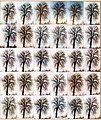
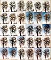
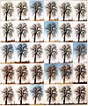
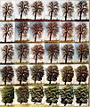
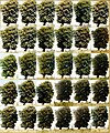
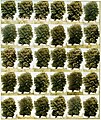
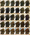
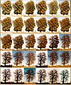
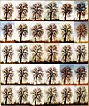
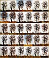
"365 days" 1979. Day 1 -365. One photo a day of a tree. Lund, Sweden.
-
January 1979
-
February 1979
-
March 1979
-
April 1979
-
May 1979
-
June 1979
-
July 1979
-
August 1979
-
September 1979
-
October 1979
-
November 1979
-
December 1979
-
Last 5 days 1979
Article(s): None yet
Request: Really encyclopedic images, though I think an animation would be better to be used in an article (crossrequest from commons:Commons:Graphic Lab School/Images to improve →AzaToth 01:30, 30 July 2009 (UTC)
Graphist opinion(s):
Very sorry, but I cannot do this at this time, because of computer problems. Chzz ► 15:17, 30 July 2009 (UTC)
![]() Doing... I'll have a crack at it. Chzz ► 01:36, 30 July 2009 (UTC)
Doing... I'll have a crack at it. Chzz ► 01:36, 30 July 2009 (UTC)
![]() Request taken by Tango22.: I'll get started on it.
Request taken by Tango22.: I'll get started on it.
- How's this for the animation? I used all 365 days. Let me know if it is too fast or if the quality isn't up to scratch, although it is 9MB already XD Tango22 (talk) 18:16, 4 August 2009 (UTC)
Finished animation
Version with different colour map
- It's really good, I understand that it is rather difficult to get them aligned. →AzaToth 19:02, 4 August 2009 (UTC)
- A question though about color map used, could you upload an layered RGB image as well so can I look into it. →AzaToth 19:05, 4 August 2009 (UTC)
- Note, added animation to Season →AzaToth 19:14, 4 August 2009 (UTC)
- Unfortunately I can't upload a layered RGB image as its filesize is in excess of the 100MB upload limit. I realise that the colours aren't perfect compared to the original JPEGs, but because its an animation it has to be in GIF format which allows for a maximum of 256 colours. Tango22 (talk) 19:51, 4 August 2009 (UTC)
- It's correct that gif limits to 256 colors, though it's per layer, so each layer can have own colormap. →AzaToth 20:18, 4 August 2009 (UTC)
- I have uploaded a slightly larger version with an adaptive colour map as opposed to the previous selective one. I also reduced the lossy and colour reduction algorithm hence the larger filesize. Is it any better? Tango22 (talk) 21:17, 4 August 2009 (UTC)
- Yea, much better thanks. →AzaToth 21:36, 4 August 2009 (UTC)
- I have uploaded a slightly larger version with an adaptive colour map as opposed to the previous selective one. I also reduced the lossy and colour reduction algorithm hence the larger filesize. Is it any better? Tango22 (talk) 21:17, 4 August 2009 (UTC)
- It's correct that gif limits to 256 colors, though it's per layer, so each layer can have own colormap. →AzaToth 20:18, 4 August 2009 (UTC)
- Unfortunately I can't upload a layered RGB image as its filesize is in excess of the 100MB upload limit. I realise that the colours aren't perfect compared to the original JPEGs, but because its an animation it has to be in GIF format which allows for a maximum of 256 colours. Tango22 (talk) 19:51, 4 August 2009 (UTC)
hathor
I would like to have pictures with at least 1200 DPI for the article Hathor in Wikipedia: http://en.wiki.x.io/wiki/File:Hathor.svg. This concerns both the first image of Hathor and the one at the bottom of the page (the cow). Thank you. cat
Request: Do something with them... 68.252.45.245 (talk) 17:29, 5 August 2009 (UTC)
Graphist opinion(s):
- The image you linked is a SVG (or vector graphic) so it can be reproduced at whatever DPI you want.... — raeky (talk | edits) 17:32, 5 August 2009 (UTC)
Raster SVG
Article(s): Karachi
Request: The said SVG above appears to be a raster saved in a SVG format. Can someone please fix this? Thanks. Connormah (talk) 21:03, 19 July 2009 (UTC) Connormah (talk) 21:03, 19 July 2009 (UTC)
Graphist opinion(s):
![]() Request taken by Hydrox. | Yes indeed, it's a JPEG image in a SVG file. It could as well be a .jpeg. I am working on this. Does someone know about the copyright status of Pakistani coat of arms? The image is currently under fair-use. hydrox (talk) 10:13, 1 August 2009 (UTC)
Request taken by Hydrox. | Yes indeed, it's a JPEG image in a SVG file. It could as well be a .jpeg. I am working on this. Does someone know about the copyright status of Pakistani coat of arms? The image is currently under fair-use. hydrox (talk) 10:13, 1 August 2009 (UTC)
- The coat of arms is done. Now if I just knew if I can upload it to Wikipedia/Commons.. hydrox (talk) 04:42, 2 August 2009 (UTC)
- Just do it under a fair-use rational for now until more info is found. 96.52.53.138 (talk) 23:07, 4 August 2009 (UTC)
- There is {{PD-Pakistan}}, but that requires knowledge of when it was first adopted. 76.117.247.55 (talk) 01:31, 5 August 2009 (UTC)
 Done I have uploaded the vectorization under the same copyrght notice as the original. hydrox (talk) 20:48, 5 August 2009 (UTC)
- If the old one is a fake SVG, should it be deleted? 76.117.247.55 (talk) 21:04, 6 August 2009 (UTC)
Bahonar-Khamenei
Article(s): multiple
Request: trim away unwikilike bordering... Chris (クリス • フィッチュ) (talk) 15:37, 4 August 2009 (UTC)
Graphist opinion: ![]() Done. I uploaded the cropped version over the original, assuming there was no need for a bordered version. Tango22 (talk) 18:38, 4 August 2009 (UTC)
Done. I uploaded the cropped version over the original, assuming there was no need for a bordered version. Tango22 (talk) 18:38, 4 August 2009 (UTC)
- Wonderful, thank you! Chris (クリス • フィッチュ) (talk) 16:31, 6 August 2009 (UTC)
Corazon Aquino & Ferdinand Marcos Signature
-
bitmap
-
vector
-
bitmap
-
vector
Article(s): Corazon Aquino; Ferdinand Marcos
Request: Please vectorize. Connormah (talk) 22:56, 5 August 2009 (UTC)
Graphist opinion(s):
- Hi, i have one done, but i have a trouble uploading it, i don't know which link i should click for the question "Where is the work from?" on the upload page. i think it's derivative work, but your original file isn't in the commons, so i can't select that. do you mind assisting me? i'm new. Isometrik (talk) 15:06, 6 August 2009 (UTC)
- Can't you link to the files on Wikipedia? Connormah (talk) 17:34, 6 August 2009 (UTC)
- Awesome job on that! Are you on the Aquino one as well? Connormah (talk) 20:19, 6 August 2009 (UTC)
- done! so i put that i'm the creator? can you make the correct links to the original files on the svg files' pages? i still don't know how to do that properly. thanks. Isometrik (talk) 22:31, 6 August 2009 (UTC)
- Super! Thanks, I'll do that. Connormah (talk) 01:51, 7 August 2009 (UTC)
- done! so i put that i'm the creator? can you make the correct links to the original files on the svg files' pages? i still don't know how to do that properly. thanks. Isometrik (talk) 22:31, 6 August 2009 (UTC)
- Awesome job on that! Are you on the Aquino one as well? Connormah (talk) 20:19, 6 August 2009 (UTC)
- Can't you link to the files on Wikipedia? Connormah (talk) 17:34, 6 August 2009 (UTC)
ISS Configuration 2J/A
-
ISS Configuration 2J/A
Article(s): International Space Station, Assembly of the International Space Station, Integrated Truss Structure
Request: I'd be grateful if someone could look this SVG over, as I'm at a loss. For some reason, in articles and the image description page, the petals on PMA 3 have no colour fill, but then when the SVG is viewed directly, they do. However, MRM 1 and the Multi-Purpose Laboratory Module turn black, as do the support struts on the left of Columbus. I've checked the code is valid, which it is, and so I really have no idea as to why its behaving in this manner. Any ideas would be greatly appreciated. Oh, and if someone could separate the S0 truss segment from the MSS/Canadarm2 and rotate the truss 180 degrees, that'd be grand too. Many thanks in advance, Colds7ream (talk) 16:57, 29 July 2009 (UTC)
Graphist opinion(s):
![]() Request taken by ZooFari.. I'll see what I can do. ZooFari 18:37, 29 July 2009 (UTC)
Request taken by ZooFari.. I'll see what I can do. ZooFari 18:37, 29 July 2009 (UTC)
- Nope, I don't know what's wrong. Maybe an expert at SVG codes can take a look at it. ZooFari 19:00, 29 July 2009 (UTC)
I'm no SVG expert but line 5106 (MRM 1?) looks suspicious: it has both color:black and fill:url(something pink and clever). Perhaps these two attributes are inconsistent, and some renderers give priority to color whilst others show the desired gradient? Certes (talk) 22:13, 29 July 2009 (UTC)
- Petals fixed. Simply an issue the definitions not being in the start of the file. So a "dumb" svg viewer such as MediaWiki uses sees the call for a particular pattern it doesn't know anything about (yet).
- Did notice however that one of the components of the "European Lab Columbus" has no colour fill since "linearGradient6936" and "linearGradient6952" aren't defined. But I'll leave this for someone with artistic skills to fix. Same for the MSS/Canadarm2 edit.
- Removing the "color:black;fill:url" inconsistency doesn't seem to change anything but I did it anyway for the sake of good coding. The purple going black was a result of there being two different ways of defining the stop colour. I changed to the one used for the US colours which solved the issue. The black in "European Lab Columbus" is due to another missing definition (and the two mentioned above). /Lokal_Profil 00:16, 3 August 2009 (UTC)
- As always you might have to purge your local buffers to see the changes. /Lokal_Profil 00:17, 3 August 2009 (UTC)
- Fixed the "European Lab Columbus" missing definitions problem. I'll leave the S0 truss MSS/Canadarm2 edit for someone else though. When I use anything but a text editor on this file the resulting saved file becomes a mess. /Lokal_Profil 00:29, 3 August 2009 (UTC)
- Well done and thanks, Local Profil. I also tried fixing this image in a text editor, but I didn't upload my work as it looked no better than the original. Certes (talk) 09:09, 3 August 2009 (UTC)
- Thanks very much indeed for fixing this folks, it's much appreciated! :-) Colds7ream (talk) 20:57, 7 August 2009 (UTC)
- Well done and thanks, Local Profil. I also tried fixing this image in a text editor, but I didn't upload my work as it looked no better than the original. Certes (talk) 09:09, 3 August 2009 (UTC)
- Fixed the "European Lab Columbus" missing definitions problem. I'll leave the S0 truss MSS/Canadarm2 edit for someone else though. When I use anything but a text editor on this file the resulting saved file becomes a mess. /Lokal_Profil 00:29, 3 August 2009 (UTC)
- As always you might have to purge your local buffers to see the changes. /Lokal_Profil 00:17, 3 August 2009 (UTC)
Slight correction to SVG.
76.117.247.55 (talk) 23:13, 7 August 2009 (UTC)
Articels: Anything SCOTUS
Request: At the top (12 Oclock) of the halo around the stars, there's a bizzare line that appears over the top of it. Can someone remove it (Upload the new version over the current one)? 76.117.247.55 (talk) 03:21, 7 August 2009 (UTC)
Oppinion: Looks like something that was forgotten there. Removed. ![]() Done hydrox (talk) 21:00, 7 August 2009 (UTC)
Done hydrox (talk) 21:00, 7 August 2009 (UTC)
- Perfect! 76.117.247.55 (talk) 23:13, 7 August 2009 (UTC)
SVGify computer diagram
76.117.247.55 (talk) 14:03, 8 August 2009 (UTC)
-
svg diagram updated
Articels: KVM switch
Request: SVGify. The final product doesn't have to look exactly like the initial one. 76.117.247.55 (talk) 00:26, 7 August 2009 (UTC)
Oppinion:: I'm on it. Isometrik (talk) 02:24, 7 August 2009 (UTC)
- here. i hope i didn't go too far. Isometrik (talk) 05:12, 7 August 2009 (UTC)
- One request: Can you add a little space in the cables within the switch, so it doesn't look like they're hard wired to the computer on the right, but can be switched to the other 2? Other than that it looks excellent. 76.117.247.55 (talk) 23:20, 7 August 2009 (UTC)
- there, now it's better. Isometrik (talk) 00:15, 8 August 2009 (UTC)
- One request: Can you add a little space in the cables within the switch, so it doesn't look like they're hard wired to the computer on the right, but can be switched to the other 2? Other than that it looks excellent. 76.117.247.55 (talk) 23:20, 7 August 2009 (UTC)
Indian National Congress flag
Article(s): Indian National Congress
Request: The current image has got all the proportions of the hand election symbol of the Congress wrong. In fact, it looks like it was drawn by a small child. Please try to improve the image by using a reference image found here which itself is taken from the party's manifesto that can be found at the party website, so speaks rohith. 20:17, 19 May 2009 (UTC)
Graphist opinion(s): It looks like you want the hand bigger right? I don't see any obvious errors with the hand itself but rather how large it is. I'll take a stab at it, but this is my first time, so bear with me.75.93.119.255 (talk) 13:44, 14 June 2009 (UTC)
- Forgot to sign in. Anyway, I'm not sure if the versions you are posting are the correct ones. I'm finding on google alot that support the current version.Drew Smith What I've done 13:50, 14 June 2009 (UTC)
- There is nothing wrong with the current image. Look at all the examples on the web where people are actually waving the party flag, and you'll see that it looks like the current image. Marking as resolved. --Slashme (talk) 07:25, 9 August 2009 (UTC)
David Thompson Signature
Signature of Mapmaker David Thompson
Article(s): David Thompson (explorer)
Request: Please make an SVG of the signature basing it off of the image provided above. A hand retrace job would be the best. Connormah (talk) 17:03, 26 July 2009 (UTC)
Graphist opinion(s):
![]() Request taken by Hydrox.
Request taken by Hydrox.

![]() Done hydrox (talk) 20:26, 7 August 2009 (UTC)
Done hydrox (talk) 20:26, 7 August 2009 (UTC)
- Wow, that's great! Thanks! --Connormah (talk) 19:25, 9 August 2009 (UTC)
Article(s): John Amaechi
Request: Please crop it and clean image in any way possible. It is the lede image for the article. .... -- Banjeboi 14:40, 31 July 2009 (UTC)
Graphist opinion(s):
![]() Request taken by slashme.: Looks easy enough --Slashme (talk) 07:45, 9 August 2009 (UTC)
Request taken by slashme.: Looks easy enough --Slashme (talk) 07:45, 9 August 2009 (UTC)
![]() Done: Because this was just a re-compose, I just saved over the original. --Slashme (talk) 07:57, 9 August 2009 (UTC)
Done: Because this was just a re-compose, I just saved over the original. --Slashme (talk) 07:57, 9 August 2009 (UTC)
- Beautiful! Thank you so much! -- Banjeboi 06:34, 10 August 2009 (UTC)
-
outside of the Black Cap
-
Straightened, colour-corrected version
Article(s): The Black Cap
Request: Please crop and clean-up, this is the lede image. -- Banjeboi 07:57, 1 August 2009 (UTC)
Graphist opinion(s):
![]() Request taken by Slashme.: Seems doable. --Slashme (talk) 11:50, 9 August 2009 (UTC)
Request taken by Slashme.: Seems doable. --Slashme (talk) 11:50, 9 August 2009 (UTC)
![]() Done: GIMP perspective transformation, fix fog effect: colour contrast, colour saturation. --Slashme (talk) 12:14, 9 August 2009 (UTC)
Done: GIMP perspective transformation, fix fog effect: colour contrast, colour saturation. --Slashme (talk) 12:14, 9 August 2009 (UTC)
- Lovely, thank you again! -- Banjeboi 06:36, 10 August 2009 (UTC)
Legislation Hall
76.117.247.55 (talk) 03:36, 10 August 2009 (UTC)
-
First map
-
Second map
-
Third map
Articels: Many on State legislatures
Request: In a list:
- First map:
- Remove the legend on the lower right (It's too small to be read in articels and prevents easy use in other languages)
- Color Nebraska black: It's legislature is officially nonpartizan
- Second map:
- Remove legends again
- Third map:
- Take either of the first two maps and recolor them to match this one (The thicker white borders on the previous ones help the borders appear between states of the same color).
- Change Nebraska to black to match the above.
- Change Tennessee to purple because of the lower house nonsense.
Thanx, 76.117.247.55 (talk) 14:24, 8 August 2009 (UTC)
Oppinion:![]() Request taken by Connormah. How's that look? You'll need to F5 a bit before you can see the changes. --Connormah (talk) 15:24, 8 August 2009 (UTC)
Request taken by Connormah. How's that look? You'll need to F5 a bit before you can see the changes. --Connormah (talk) 15:24, 8 August 2009 (UTC)
- Everything is OK except the last map looks bad: Long Island's disappeared, Alaska is two separate landmasses, and other stuff. Can you just upload one of the first 2 maps over the 3rd and then correct the colors? My idea is to get them all to look exactly the same (Except for the colors, obviously) and have them side by side or something in an articel, so the difference between 1/2 and 3 is kindof glaring. 76.117.247.55 (talk) 15:49, 8 August 2009 (UTC)
- No problem, I'll try to get it up by tomorrow. --Connormah (talk) 21:53, 8 August 2009 (UTC)
- Wouldn't File:Blank US Map.svg be a better SVG basis then File:Map of USA with state names.svg (which is the basis of the current maps)? The source code of e.g. File:Map-of-US-state-cannabis-laws.svg (based on File:Blank US Map.svg but with some nifty css) could be converted to create the three maps above in a few minutes. /Lokal_Profil 00:24, 9 August 2009 (UTC)
- Got all three done. Can upload them if required. BTW which colour should DC have in the first two maps (if applicable) /Lokal_Profil 01:02, 9 August 2009 (UTC)
- Wouldn't File:Blank US Map.svg be a better SVG basis then File:Map of USA with state names.svg (which is the basis of the current maps)? The source code of e.g. File:Map-of-US-state-cannabis-laws.svg (based on File:Blank US Map.svg but with some nifty css) could be converted to create the three maps above in a few minutes. /Lokal_Profil 00:24, 9 August 2009 (UTC)
- No problem, I'll try to get it up by tomorrow. --Connormah (talk) 21:53, 8 August 2009 (UTC)
- I would leave DC out of it since it isn't a state. If DC is included, then PR, VI, NMI, AS and GU will have to be included as well. 76.117.247.55 (talk) 01:45, 9 August 2009 (UTC)
- OK will do. Should I up them? Connormah you ok with this? /Lokal_Profil 16:21, 9 August 2009 (UTC)
- No problem. Connormah (talk) 19:37, 9 August 2009 (UTC)
- Voila (you might need to purge your cache to see them). /Lokal_Profil 00:57, 10 August 2009 (UTC)
- No problem. Connormah (talk) 19:37, 9 August 2009 (UTC)
- OK will do. Should I up them? Connormah you ok with this? /Lokal_Profil 16:21, 9 August 2009 (UTC)
- I would leave DC out of it since it isn't a state. If DC is included, then PR, VI, NMI, AS and GU will have to be included as well. 76.117.247.55 (talk) 01:45, 9 August 2009 (UTC)
Nice! 76.117.247.55 (talk) 03:36, 10 August 2009 (UTC)
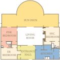
Little White House Floorplan
-
Base off of
-
First try
Article(s): Little White House
Request: Vectorize to the color scheme of the White House Floorplan SVG. Connormah (talk) 16:58, 31 July 2009 (UTC)
Graphist opinion(s):
![]() Request taken by slashme. I'll get started on this, see how far I get. --Slashme (talk) 08:07, 9 August 2009 (UTC)
Request taken by slashme. I'll get started on this, see how far I get. --Slashme (talk) 08:07, 9 August 2009 (UTC)
![]() Done: It doesn't look exactly like the White House diagram, but then this house wasn't made of pillars. Let me know if you need anything changed, but drop a note on my talkpage, because I'm not very active this year (newjobitis). --Slashme (talk) 11:41, 9 August 2009 (UTC)
Done: It doesn't look exactly like the White House diagram, but then this house wasn't made of pillars. Let me know if you need anything changed, but drop a note on my talkpage, because I'm not very active this year (newjobitis). --Slashme (talk) 11:41, 9 August 2009 (UTC)
- Great job. --Connormah (talk) 19:34, 9 August 2009 (UTC)
- A pleasure! --Slashme (talk) 15:07, 10 August 2009 (UTC)
- Great job. --Connormah (talk) 19:34, 9 August 2009 (UTC)
John Quincy Adams/Abigail Adams Signatures
-
Traced full signature
-
John Quincy Adams Signature
-
John Quincy Adams Signature tracing
Article(s): John Quincy Adams, Abigail Adams
Request: Hey. I waswondering if someone could vectorize John Quincy Adams, and Abigail Adams, in her original form (with the thick letters), signatures as vectors? I've had trouble doing these. Thank you so much in advance. Connormah (talk) 20:53, 7 August 2009 (UTC)
Graphist opinion(s):
![]() Request taken by Slashme.: On the job --Slashme (talk) 12:30, 9 August 2009 (UTC)
Request taken by Slashme.: On the job --Slashme (talk) 12:30, 9 August 2009 (UTC)
![]() Done: The original is really low res, so I'm not sure how much of the blobbiness is original. --Slashme (talk) 13:40, 9 August 2009 (UTC)
Done: The original is really low res, so I'm not sure how much of the blobbiness is original. --Slashme (talk) 13:40, 9 August 2009 (UTC)
- Thanks, great job! Could you please do the Abigail Adams one too? Thanks! Connormah (talk) 15:30, 9 August 2009 (UTC)
- Done. --Slashme (talk) 16:35, 10 August 2009 (UTC)
- Wow, that is just great. Thank you for all of your work, it's greatly appreciated! --Connormah (talk) 18:06, 10 August 2009 (UTC)
- Only a pleasure! --Slashme (talk) 18:24, 10 August 2009 (UTC)
Generra Hypercolor
Article(s): Hypercolor
Request: please remove text, really belongs in caption... Chris (クリス • フィッチュ) (talk) 13:53, 11 August 2009 (UTC)
Graphist opinion: ![]() Done. Also lessened the .JPG noise around the edges. Cureden 17:09, 11 August 2009 (UTC)
Done. Also lessened the .JPG noise around the edges. Cureden 17:09, 11 August 2009 (UTC)
- Thank you so much! Chris (クリス • フィッチュ) (talk) 06:25, 12 August 2009 (UTC)
Last Friends
Article(s): Last Friends
Request: Please straighten... Chris (クリス • フィッチュ) (talk) 06:22, 12 August 2009 (UTC)
Graphist opinion: ![]() Done. Cloned in a tiny bit to cover up margins left by the rotate/crop, saved all the relevant detail I could. --mikaultalk 07:39, 12 August 2009 (UTC)
Done. Cloned in a tiny bit to cover up margins left by the rotate/crop, saved all the relevant detail I could. --mikaultalk 07:39, 12 August 2009 (UTC)
- Great, thank you! Chris (クリス • フィッチュ) (talk) 07:51, 12 August 2009 (UTC)
Tram systems in the US
-
German images
-
SVG, translated
Article(s): List of tram and light-rail transit systems, Light rail in the United States
Request: Can we get a translation of the key into English? (If you want to SVG that works too but definitely not important)
Here's what I think they should be:
- S-Bahn-Netz -- Regional rail network
- Metro - Metro
- Strassenbahn/Stadtbahn - Tramway / Light rail (see Stadtbahn for some explanation)
- Stadtbahn in Bau - Light rail under construction
- Uberlandstrassebahn - Interurban is what is wikilinked and it's referring to the River Line (New Jersey Transit) which is a Diesel light rail line... as oppose to regional rail... my guess might be call it Interurban light rail?
- O-Bus - Trolleybus
- Hangebah - Aerial tramway (since it only refers to Roosevelt Island Tramway) but might also be SkyTrain or (Aerial?) Monorail... I think Aerial tramway is most broad and best
- People Mover - People Mover
- Streckengebundene Nahverkehrssysteme = I think "Rail Transit Systems" is the best (Improve distance/rail transport systems (per google))
- Signaturen und Verkehrssysteme - Key and transit systems (google) = Key to transit systems?
Thank you --gren グレン 11:04, 22 July 2009 (UTC)
Graphist opinion(s):
![]() Request taken by slashme.: I think I can get this onto the blank US svg map. --Slashme (talk) 16:56, 10 August 2009 (UTC)
Request taken by slashme.: I think I can get this onto the blank US svg map. --Slashme (talk) 16:56, 10 August 2009 (UTC)
 Done: Hope this is what you had in mind. The title of the map would be better in the caption than on the picture, IMO. --Slashme (talk) 18:21, 10 August 2009 (UTC)
- Nice work! Though, maybe the font could be a bit larger? Right now it renders unreadably small both in Firefox and Opera. Other option would be scaling the whole SVG so that it renders initially larger, and the fonts become readable. Right now I need to magnify (Ctrl-+) 4 times in Firefox and 5 times in Opera to tell letters apart. hydrox (talk) 09:47, 12 August 2009 (UTC)
- Great job and many thanks. I think some of hydrox's problems are with the MediaWiki SVG renderer. Thanks very much, the main issue is resolved but anyone is free to try to improve the fonts, of course. gren グレン 21:18, 13 August 2009 (UTC)
NYC subway TIFF image harvest
Article(s): New York City Subway-related article
Request: Can someone harvest this tiff and make and make it into a good sized jpg keeping as much quality as possible. It can and should be used in a NYC subway article talking about subway construction. Thanks. gren グレン 08:02, 8 August 2009 (UTC)
- "Temporary file open error. Display failed.". Can you find a permanent link to it? 76.117.247.55 (talk) 14:13, 8 August 2009 (UTC)
- Well, I'm stupid... I will see if I can find it again but so far no luck. gren グレン 22:58, 8 August 2009 (UTC)
- I failed to find it so I'll mark this resolved since nothing else can be done to it. I will repost if I find the image. gren グレン 20:23, 13 August 2009 (UTC)
Graphist opinion(s):
David McHattie Forbes
Article(s): David McHattie Forbes
Request: trim down to image alone for Wikification... Chris (クリス • フィッチュ) (talk) 17:52, 15 August 2009 (UTC)
Graphist opinion: Trimmed. Please let us know whether the new image is what you wanted (or just mark the request as done). Certes (talk) 19:02, 15 August 2009 (UTC)
- Perfect, thank you! Chris (クリス • フィッチュ) (talk) 02:36, 16 August 2009 (UTC)
Caper
Article(s): Caper
Request: trim off or fade in shading on left side... Chris (クリス • フィッチュ) (talk) 17:54, 15 August 2009 (UTC)
Graphist opinion: Is that better? I have set the background to a single colour at the lighter end of the existing range. Certes (talk) 22:19, 15 August 2009 (UTC)
- Much better, brilliant job, thank you! Chris (クリス • フィッチュ) (talk) 02:37, 16 August 2009 (UTC)
Coast Guard SVGification
76.117.247.55 (talk) 19:35, 16 August 2009 (UTC)

-
Seal of the United States Coast Guard Auxiliary
-
United States Coast Guard Auxiliary "Stripe"
-
United States Coast Guard "Stripe"
-
Seal of the United States Coast Guard Auxiliary
-
United States Coast Guard Auxiliary "Stripe"
-
United States Coast Guard "Stripe"
Articels: USCG and related license tags
Request: Vectorize the 3, and preferably upload the SVGs with better file names than the current rasters are provided with. 76.117.247.55 (talk) 23:19, 7 August 2009 (UTC)
Oppinion:
![]() Request taken by hydrox.
Request taken by hydrox.
- What do you think? I tried to be as honest to the original as possible. I did not use the the provided vector source because the ribbon is a bit different from the auxiliary seal. hydrox (talk) 09:06, 12 August 2009 (UTC)
- It looks good; can I request you mark the old ones VVA? I'm on a slower than normal connection... 76.117.247.55 (talk) 17:18, 12 August 2009 (UTC)
- They have been marked with {{SVG available}}. I don't know what is the Graphic lab policy on replacing raster versions with newly created vector versions? hydrox (talk) 12:28, 14 August 2009 (UTC)
- It's usually left to the requester. I'll deal with it. Thanx, 76.117.247.55 (talk) 20:29, 14 August 2009 (UTC)
More SVGs for computer hardware
-
RGU image to be replaced
-
vector diagram
Articels: Remote graphics unit
Request: SVGify, preferably in a similar manner to the KVM diagram above. Again, I don't ask that the SVG look exactly like this (Especially the 4 monitors, which are a little ridiculous), only that it represent the idea correctly. 76.117.247.55 (talk) 14:10, 8 August 2009 (UTC)
Oppinion:
- Comment Just like to point out that the four monitors illustrate the power of the product, the product is gear'd for people who would use multiple monitors. This isn't a simple KVM, it's sending the whole PCI bus across a fiber optic cable to a remote non-3d graphics card. It's intended for ultra-secure/quite/space-limited solutions where the end-user is very likely to be using multiple monitors. So I would probably suggest that the new version use four monitors like this. — raeky (talk | edits) 06:45, 10 August 2009 (UTC)
- Well, the artist can draw it with 4 or 1 monitor, I'm just asking for a SVG in the spirit of the KVM request above (IE. Not slavishly faithful to the current one). 76.117.247.55 (talk) 02:57, 11 August 2009 (UTC)
Does anyone know who drew the original? If it's public domain, doesn't the author still have the source files? It seems like such a waste to re-draw a perfectly good drawing. --Slashme (talk) 16:45, 10 August 2009 (UTC)
- I strongly suspect it's not really PD, which is one of the reasons I'm looking for it to be superseded with an SVG. 76.117.247.55 (talk) 02:57, 11 August 2009 (UTC)
I'm on it. Isometrik (talk) 07:41, 14 August 2009 (UTC)
- there it is! as always, i'm open to suggestions. cheers Isometrik (talk) 02:11, 15 August 2009 (UTC)
- Nice, only 2 things: I think that the 3 monitors should be all connected at once (The description appears to make it into a monitor extender, rather than just a KVM), and the port attached to the computer can be removed. 76.117.247.55 (talk) 00:26, 16 August 2009 (UTC)
- done?Isometrik (talk) 16:58, 16 August 2009 (UTC)
- I think so. 76.117.247.55 (talk) 19:35, 16 August 2009 (UTC)
- You should do a broken line to the computer to indicate distance, this is intended for LONG distance, ergo fiber optic connection, and it's actually transferring the actual PCI Express bus across the fiber optic line to the remote video card, it's entirely different than a KVM where the video card signal is transfered thus GREATLY limiting distance. Since the bandwidth across the bus is vastly less than that from the video card to the monitor it allows MUCH greater distance (and security). — raeky (talk | edits) 21:47, 16 August 2009 (UTC)
- I think so. 76.117.247.55 (talk) 19:35, 16 August 2009 (UTC)
- done?Isometrik (talk) 16:58, 16 August 2009 (UTC)
- Nice, only 2 things: I think that the 3 monitors should be all connected at once (The description appears to make it into a monitor extender, rather than just a KVM), and the port attached to the computer can be removed. 76.117.247.55 (talk) 00:26, 16 August 2009 (UTC)
Correct broken image
76.117.247.55 (talk) 20:34, 11 August 2009 (UTC)
Articles: The one on the OE ligature.
Request: Fix so the letters aren't all run together. For some reason, it displays correctly here, but not on that page. 76.117.247.55 (talk) 03:11, 11 August 2009 (UTC)
Opinion: Done. Should be fixed now. --Pbroks13talk? 09:47, 11 August 2009 (UTC)
- Correct! 76.117.247.55 (talk) 20:34, 11 August 2009 (UTC)
- Text to path: my pet peeve. ZooFari 21:41, 13 August 2009 (UTC)
- Why is that? --Pbroks13talk? 17:48, 16 August 2009 (UTC)
- Text to path: my pet peeve. ZooFari 21:41, 13 August 2009 (UTC)
William Henry Harrison daguerreotype
-
Original
-
Edit
Article(s): William Henry Harrison
Request: Remove inperfections Connormah (talk) 18:22, 30 July 2009 (UTC)
Graphist opinion(s):
![]() Request taken by Vearthy.: I think I can do something with this mess.
Request taken by Vearthy.: I think I can do something with this mess.
 DoneI decided to have a go at it seeing it had been left for some time, hows this? I've updated the image in the related article, feel free to revert if not happy with it :) Fallschirmjäger 22:59, 17 August 2009 (UTC)
Proper size for GIF - advice please
-
GIF
-
JPG
Article(s): Edinburgh's Telford College
Request: The first image in Edinburgh's Telford College is displayed at 400px but the GIF is 3540×2610 pixels (3.89 MB). It is used nowhere else. Should we replace it with a smaller version, say 400x295px as displayed (54kB)? I can do this myself; I'm just not sure what size to choose and whether to take action at all, as there is a good argument for preserving all the resolution we have. (Reducing in GIMP produces a grainy picture, even after changing mode from indexed colour to RGB first, but I expect I'm doing something silly. IrfanView does the job well.) Certes (talk) 18:10, 16 August 2009 (UTC)
Graphist opinion(s): First off, I changed the file to jpg, reduced the size some, and reduced the grainyness (not sure of the technical term). But to answer your question, we should keep the file as large as possible because the file may be used at some point on a different article, different wikimedia project, or outside of the wikimedia foundation. --Pbroks13talk? 03:23, 17 August 2009 (UTC)
- Thanks, I agree that's the best solution. I've edited the article: the JPG looks better than the GIF at that resolution as well as being smaller. (It also loads much faster but, as the GIF was in my Firefox cache, I think the delay was in rendering rather than transmission.) Certes (talk) 10:11, 17 August 2009 (UTC)
Rick James
Resolved as well as possible with the material available; we really need a new photo.
Article(s): Rick James
Request: Could anyone improve the quality of this image? I have put in a request for a new image, but some one might be able to improve this one a little bit. Thanks in advance! Captain n00dle T/C 08:52, 10 August 2009 (UTC)
Graphist opinion(s):
- It's really hard to fix focus and overexposure. Rather just leave it as it is and wait for a better one. --Slashme (talk) 16:42, 10 August 2009 (UTC)
I agree that we need a new image but I've attempted to improve the old one as an interim measure. My version looks terrible if you zoom in but perhaps it's acceptable at the scale used in the article. Feel free to revert if you disagree. Certes (talk) 22:09, 17 August 2009 (UTC)
Thank you very much for your help, as you know it is difficult to find free photos and you have done a great job cleaning this up! I owe you an e-cookie: (::) Captain n00dle T/C 10:17, 18 August 2009 (UTC)
Saudi Arabian Airlines
-
Fixed version
Article(s): Saudi Arabian Airlines
Request: Correct the rolling shutter skew. ed g2s • talk 11:46, 28 July 2009 (UTC)
Graphist opinion(s): Not perfect, but hopefully that is good enough. I was unable to fix that bend on the top left, sorry. wadester16 18:21, 3 August 2009 (UTC)
Atom smashing
-
Illustration of the production of a quark-gluon plasma through the smashing of highly energetic nuclei
-
Vector version
Article(s): Strangeness production
Request: Bluntly: un-uglify. The blue ovals should be replaced by two atomic nuclei (compressed horizontally, so they are oval-shaped) smashing each other. The burst in the middle should be kept more or less the same (blurby thing labeled QGP, with a ton of arrows sticking out). The rest of the decorations can be removed. Headbomb {ταλκκοντριβς – WP Physics} 21:33, 15 August 2009 (UTC)
Graphist opinion(s): Does this phenomenon occur with nuclei of any particular element(s)? For example, would helium-4 look ok as "a generic nucleus"? Certes (talk) 21:54, 15 August 2009 (UTC)
- I'm pretty sure it occurs with lead ions (no need to be accurate with the number of protons/neutrons, but there should be more than 2/2).Headbomb {ταλκκοντριβς – WP Physics} 22:38, 15 August 2009 (UTC)
Is this a bit less ugly? Do you want the arrows or text restored on the nuclei, or were they unwanted decoration? Certes (talk) 14:45, 18 August 2009 (UTC)
- Well it is less ugly, but still could be tweaked. Specifically:
- There should be arrows indicating that the two nuclei are moving towards each other and are about to collide in the middle of the QGP area.
- The nuclei are also rather ugly (no offense) and unrecognizable compared to the usual style (mainly because of the gaps between protons/neutrons), and the pancaking effect is too subtle. Perhaps you can steal the nuclei artwork from File:Beta-minus_Decay.svg or File:Nucleus_drawing.png, and compress it 50% horizontally (but maybe that is too extreme and 66% would be best?).
- It would be "more readable" if "Quark–gluon" was kept on the same line.
- The way the pink area is drawn is a bit misleading, it should be less of an "hourglass" shape and more of a shapeless blob.
- Headbomb {ταλκκοντριβς – WP Physics} 17:27, 18 August 2009 (UTC)
- Well it is less ugly, but still could be tweaked. Specifically:
Second attempt - how's that? The QGP is circular but I hope the blur makes it suitable amorphous. Certes (talk) 19:29, 18 August 2009 (UTC)
- Yes the QGP looks great. But the nuclei look too big for the picture I think. Shrinking them by 50% should yield a nice result, and I would further increase the pancaking. I doubt there will be more tweaking necessary after than. Headbomb {ταλκκοντριβς – WP Physics} 22:59, 18 August 2009 (UTC)
(Comments above here refer to a previous version of the SVG.)
Shrunk and pancaked to 3:1. Certes (talk) 00:04, 19 August 2009 (UTC)
- Yes that looks good enough. Thanks a bunch. The other picture can be deleted now. Headbomb {ταλκκοντριβς – WP Physics} 01:52, 19 August 2009 (UTC)
Flag of Greater Melbourne
-
Original PNG
-
Current SVG
Article(s): List of Australian flags
Request: The ship in the SVG version was created using a poor autotrace method. Someone please make the ship higher quality. The original bitmap file may help. Hugh Jass (talk) 07:36, 10 August 2009 (UTC)
Graphist opinion(s):
![]() Request taken by hydrox. The colors, and especially the propotions, are a bit off from the original. Should they be fixed as well to be more similiar with e.g. File:Murray_River_Flag_(Upper).svg? hydrox (talk) 11:35, 12 August 2009 (UTC)
Request taken by hydrox. The colors, and especially the propotions, are a bit off from the original. Should they be fixed as well to be more similiar with e.g. File:Murray_River_Flag_(Upper).svg? hydrox (talk) 11:35, 12 August 2009 (UTC)
- The colours in the PNG version seem to be arbitrary. The colours in the SVG version, however, were taken from "File:Flag of the United Kingdom.svg", a far more relevant source.
- As for the proportions, only the overall ratio and the width of the white stripes should be changed, every-thing else is fine.
- The original PNG's proportions were mostly absurd so I simplified them to:
- The thickness of the white section is 17/60 of the vertical height of the flag. By the white section, I don't mean each individual white stripe, I mean the total white area behind the blue one, just like how I made it in the SVG.
- The thickness of the blue sections are 1/6 of the vertical height of the flag.
- The diameter of the eight-pointed stars are 1/8 of the vertical height of the flag. This also means that they occupy 2/3 of the space they could possibly fit in.
- The eight-pointed stars are regular octagrams with one point facing straight up.
- The centres of the octagrams are arranged so that one is at the very centre of the entire flag, and the rest of them are equidistant from the centre and any edge of the flag.
- I just estimated the size and placement of the ship.
- The original dimensions from the PNG are exactly (in terms of the vertical height of the flag):
- Thickness of white section: 5/18. This sounds more reasonable than my simplication, come to think of it.
- Thickness of blue sections: 37/216.
- Diameter of eight-pointed stars: 25/216.
- Type of eight-pointed star: Impossible to tell. Looks similar enough to a regular octagram facing straight up, anyway.
- Arrangement of stars: Same as my simplification.
- Ship: Vertical height is 37/108. Placement is that it is centred in the red area given.
- The original PNG's proportions were mostly absurd so I simplified them to:
- Concerning the overall ratio: the PNG's ratio is 216:385, which is completely ridiculous and cannot be simplified, so I reasoned that this was erroneous and re-made it with 2:3 as it is a common ratio. However, looking at Flags of Australia, it is clear that nearly all (if not all) Australian flags have the 1:2 ratio, so that is what it should be changed to.
- If it helps, the flag being flown on the ship is "File:English_White_Ensign_1620.svg".
- So, in summary, your task is now:
- Make the ship better.
- Make the flag 1:2 ratio, while keeping to my simplified proportions (because the original ones were absurd), with the exception of the white area.
- Change the thickness of the white area to 5/18 of the height of the flag.
Hugh Jass (talk) —Preceding undated comment added 03:46, 13 August 2009 (UTC).
- Yes, I'm working on this over the weekend. hydrox (talk) 12:29, 14 August 2009 (UTC)
- Sorry that it took so long. I have uploaded a new, 1:2 ratio version. Vectorizing the frigate was an easy job, but the reason why it took so long was because I was looking at flags like File:Australian_Federation_Flag.svg and File:Australian Colonial Flag.svg which have similiar bordering stars in a bit different location. Their arrangement places the bordering stars a bit closer to the flag edges and makes the flag look more symmetric. However, in the original, as you posted above, the centers of each star are arranged mid-way between the center star's center and each border, an arrangement which places them all closer to the center of the flag, and which I have honoured in my version (if I did my math right.. ) hydrox (talk) 05:49, 19 August 2009 (UTC) edit: third recalculation still proves valid. The center top legs of each star are located at (x,y): 450, 196.875; 225,196.875; 675,196.875; 450,309.375; 450,84.375. Each star is 56.25 x 56.25. Total flag dimensions: 900x450. hydrox (talk) 07:20, 19 August 2009 (UTC)
- Thank you very much for cutting out the Inkscape garbage code as well. 'Tis a pain to get rid of it. I've just added some code that makes the octagrams mathematically perfect, so now the file is final and the status has been changed to 'resolved'. Hugh Jass (talk) 03:03, 21 August 2009 (UTC)
SVG a stopsign and some civil engineering
76.117.247.55 (talk) 20:40, 21 August 2009 (UTC)
Articels: Stop sign for one and Octagon for the other.
Request: SVGify. Unfortunately, I don't know what the exact Farsi text is. 76.117.247.55 (talk) 21:00, 2 August 2009 (UTC)
Oppinion: Stop-sign done. ╟─TreasuryTag►without portfolio─╢ 21:09, 2 August 2009 (UTC)
- That was fast. BTW, is the Supreme Court request a few pages up done? 76.117.247.55 (talk) 21:18, 2 August 2009 (UTC)
- I have tweaked the SVG to include the border, and for the writing not to be transparent. Connormah (talk) 22:10, 2 August 2009 (UTC)
Can someone do the middle image? 76.117.247.55 (talk) 19:36, 16 August 2009 (UTC)
 Done. How's that? ZooFari 17:53, 21 August 2009 (UTC)
Need Korean building icon
-
Namdaemun.JPG
-
Namdaemun.svg
Article(s): {{WikiProject Korea}}
Request: I don't know how big of an ask this is, but what I need is an svg icon based on the above building. It doesn't need to be overly detailed, just so long as it retains the basic shape and is recognisable. Primariliy this would be for use in the project banner linked above. Thanks in advance for any help! :) PC78 (talk) 10:38, 16 August 2009 (UTC)
Graphist opinion(s): Would this simple silhouette be recognisable to someone with an interest in Korea, or do we need more colours and detail? Certes (talk) 18:45, 16 August 2009 (UTC)
- If it's not too much trouble, I would prefer a splash of colour and detail. Cheers! PC78 (talk) 10:18, 17 August 2009 (UTC)
- Second version. How does that look? I don't think much more detail than this would show clearly in an icon. Sorry it's still a bit drab but that's how they built it: these are actual colour samples from GIMP's eyedropper. Certes (talk) 11:59, 17 August 2009 (UTC)
- Looks better. :) I agree about it looking a bit drab; perhaps that is the fault of the photo? I've added a night photo which brings out the colours a lot more, if it helps. PC78 (talk) 10:31, 18 August 2009 (UTC)
- Ah, now I understand. The turquoise and red weren't as obvious in daylight. Is this OK, bearing in mind the size the icon will appear, or do we need more detail in the patterned storeys? Certes (talk) 13:13, 18 August 2009 (UTC)
- Looks good. I'll have to see how it looks in the banner, but I can't think of anything else at this point. Thanks for your help! :) PC78 (talk) 11:58, 19 August 2009 (UTC)
- Ah, now I understand. The turquoise and red weren't as obvious in daylight. Is this OK, bearing in mind the size the icon will appear, or do we need more detail in the patterned storeys? Certes (talk) 13:13, 18 August 2009 (UTC)
- Looks better. :) I agree about it looking a bit drab; perhaps that is the fault of the photo? I've added a night photo which brings out the colours a lot more, if it helps. PC78 (talk) 10:31, 18 August 2009 (UTC)
- Second version. How does that look? I don't think much more detail than this would show clearly in an icon. Sorry it's still a bit drab but that's how they built it: these are actual colour samples from GIMP's eyedropper. Certes (talk) 11:59, 17 August 2009 (UTC)
Beatific vision image request
-
Dante and Beatrice and the beatific vision
-
alternate of the same image
Article(s): Beatific vision
Request: This is one of the few artistic interpretations of the beatific vision available to us that I know of, and I have to think we would really benefit from having the best possible copy of the image. John Carter (talk) 17:01, 22 August 2009 (UTC)
Graphist opinion(s):
![]() Done: This is just a matter of sourcing a higher quality version of an artistic interpretation of a vague concept. The second image seems decent enough quality for the article, I personally would of went pure grayscale but the last editor of it decided to go duotone. Unless someone here actually wants to create an entirely new artwork and freely license it for wikipedia then I'm not sure what we at the image workshop can do to get the best possible image your talking about. Using tineye.com the image we have is the highest quality currently indexed on the search engine for that. Unless someone wants to buy a higher quality scan from [2] to post here (since that site can't claim copyright of the original work since it's in public domain now), then I don't think we're getting a higher quality version of it, as a result I'm marking this as resolved. — raeky (talk | edits) 04:46, 23 August 2009 (UTC)
Done: This is just a matter of sourcing a higher quality version of an artistic interpretation of a vague concept. The second image seems decent enough quality for the article, I personally would of went pure grayscale but the last editor of it decided to go duotone. Unless someone here actually wants to create an entirely new artwork and freely license it for wikipedia then I'm not sure what we at the image workshop can do to get the best possible image your talking about. Using tineye.com the image we have is the highest quality currently indexed on the search engine for that. Unless someone wants to buy a higher quality scan from [2] to post here (since that site can't claim copyright of the original work since it's in public domain now), then I don't think we're getting a higher quality version of it, as a result I'm marking this as resolved. — raeky (talk | edits) 04:46, 23 August 2009 (UTC)
Corrupt svg
Article(s): Radura
Request: I tried to vectorize an image, but it's corrupt/faulty/won't show up. Can someone help me out please> HereToHelp (talk to me) 22:12, 22 August 2009 (UTC)
Graphist opinion(s):
 Fixed. Is that what's supposed to show up? I removed an embedded raster but I also spotted a small green dot outside the document. I removed it but just wondering if you needed it or placed it there by mistake. ZooFari 01:59, 23 August 2009 (UTC)
- Yes, that's what is meant to show up. The embedded raster was probably the raster I had vectorized it from, although I created most of the image geometrically. So it looks like I just need to pick up after myself next time. Thanks.HereToHelp (talk to me) 02:14, 23 August 2009 (UTC)
Los Altos CoA/Flag of Medieval France
Article(s): Los Altos, French occupation of Santo Domingo
Request: Please vectorize. Connormah (talk) 22:28, 22 August 2009 (UTC)
Graphist opinion(s):
![]() Done with the second one. How's that? ZooFari 01:48, 23 August 2009 (UTC)
Done with the second one. How's that? ZooFari 01:48, 23 August 2009 (UTC)
- Also please help me find a source and its appropriate license. Otherwise it will be deleted :( ZooFari 01:53, 23 August 2009 (UTC)
- Hm, all I can confirm is the one you've done is old. So probably PD-Old? Connormah (talk) 04:47, 23 August 2009 (UTC)
Singapore dollar
Article(s): Singapore dollar
Request: trim to wikilike... Chris (クリス • フィッチュ) (talk) 08:44, 23 August 2009 (UTC)
Graphist opinion: Done. Changed the levels, too. SPLETTE :] How's my driving? 17:50, 23 August 2009 (UTC)
- Way better, you rock! Chris (クリス • フィッチュ) (talk) 18:09, 23 August 2009 (UTC)
G. V. Desani
![]() Done
Done
Article(s): G. V. Desani
Request: trim off unwikilike bordering... Chris (クリス • フィッチュ) (talk) 09:09, 23 August 2009 (UTC)
Graphist opinion: Done. SPLETTE :] How's my driving? 17:44, 23 August 2009 (UTC)
- Great, thank you! Chris (クリス • フィッチュ) (talk) 17:47, 23 August 2009 (UTC)
- There seems to be an issue with the picture. [3] Perhaps you could have a look? Thx. SPLETTE :] How's my driving? 19:34, 23 August 2009 (UTC)
Easy SVG fix
-
Women's power logo
Article(s): Mostly used by the Feminism Task Force
Request: Already SVG. Just needs wider margins so that the logo isn't cut off on the edges. Kaldari (talk) 15:23, 26 August 2009 (UTC)
Graphist opinion(s):
![]() Request taken by splette.: Done. Really was an easy fix... SPLETTE :] How's my driving? 18:33, 26 August 2009 (UTC)
Request taken by splette.: Done. Really was an easy fix... SPLETTE :] How's my driving? 18:33, 26 August 2009 (UTC)
![]() Done:
Done:
-
Runner Caster Semenya
-
Cropped
Article(s): Caster Semenya
Request: Please crop the image so we have just her head and maybe her upper torso (with her name visible on her running jersey), and any image clean-up that seems appropriate. Thank you! -- Banjeboi 18:18, 27 August 2009 (UTC)
Graphist opinion(s):
![]() Done: File:20090819_Caster_Semenya_cropped.jpg. Kaldari (talk) 18:43, 27 August 2009 (UTC)
Done: File:20090819_Caster_Semenya_cropped.jpg. Kaldari (talk) 18:43, 27 August 2009 (UTC)
- Thank you! -- Banjeboi 19:36, 27 August 2009 (UTC)


