Wikipedia:Featured picture candidates/delist/Steve Jobs
Appearance
Voting period is over. Please don't add any new votes. Voting period ends on 21 Feb 2024 at 16:40:23 (UTC)


- Reason
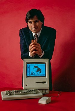
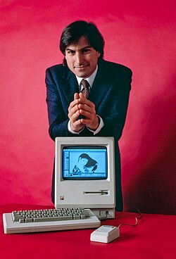
- Wilfredor made a new version, which fixes some issue with the current FP. See discussion on Commons.
- Articles this image appears in
- Steve Jobs, Macintosh
- Previous nomination/s
- Wikipedia:Featured picture candidates/Steve Jobs
- Nominator
- Yann (talk)
- Delist and Replace — Yann (talk) 16:40, 11 February 2024 (UTC)
- Comment I think this new restoration has gone too far and deviates too much from the original. I quote what I wrote on another nom: "Many issues in the photo could be fixed with today's programs, but I think you should only go so far with restorations. I like the original photo to be preserved as much as possible for a historic FP. Making too wild edits and you end up with an image that is more "based on a photo by" than a restoration. (Like when filmmakers make movies "based on a novel by Xxx..." and re-warp old classic stories to fit the modern narrative.)" Cart (talk) 17:00, 11 February 2024 (UTC)
- I removed any denoise (because film grain is not noise) and also any AI reconstruction, applied a white balance taking the color of the computer as a reference. I also removed a lot of dirt from the original film, leaving the details present intact. I think that although this photo does not look yellowish (due to the wear and tear of time), they are more representative colors and a more respectful restoration. Wilfredor (talk) 22:41, 11 February 2024 (UTC)
- Sorry its not a computer, its a Mac ;) Wilfredor (talk) 22:42, 11 February 2024 (UTC)
- I removed any denoise (because film grain is not noise) and also any AI reconstruction, applied a white balance taking the color of the computer as a reference. I also removed a lot of dirt from the original film, leaving the details present intact. I think that although this photo does not look yellowish (due to the wear and tear of time), they are more representative colors and a more respectful restoration. Wilfredor (talk) 22:41, 11 February 2024 (UTC)
- Keep. Saturation and contrast better in the original. --Janke | Talk 18:48, 11 February 2024 (UTC)
- Take another look, saturation not changed, I just applied a white balance taking the color Wilfredor (talk) 22:43, 11 February 2024 (UTC)
- Delist and Replace the "New edited version". – Hamid Hassani (talk) 02:51, 12 February 2024 (UTC)
- Keep, per my comment above. Also per what Wilfredor wrote on Commons FPC about this new version: "My restoration aims to show how the scene actually looked at that moment, not how a photo taken in the 80s appeared." It's a noble intention, but that's not how restoring photos works. We don't have time machines to go back and see exactly what the scene looked like in 1984 to compare. The work of the original photographer should be respected. Cart (talk) 09:39, 12 February 2024 (UTC)
- Technically speaking, what I did was remove stains and dirt, and also remove the yellowing from the negative. Please, could you be more specific and say which of these two things I did do you disagree with? Thanks for your feedback Wilfredor (talk) 10:19, 12 February 2024 (UTC)
- With photo restorations, there is a such a thing as cleaning up too much. Also, removing so much yellow component from this photo was a bit misguided. The tif was taken from a color slide (not a negative) and such film doesn't age and yellow as quickly as the paper prints that restorations often are made from. Color fade/(desaturation) is a more common problem. (I have color slides that my grandfather took some 50-60 years ago and they show not a hint of yellowing.) The color in the "old" version was graded by Janke (who is a professional film maker, and owns a Mac 512K) to match the actual original color of the Mac in the photo. I think we should defer to his expertise. Cart (talk) 10:45, 12 February 2024 (UTC)
- Thanks for the explanation and taking the time to respond, I agree with you, but I have one question, raising the shadows resulting in an error in the red border around the hands wasn't a very big alteration away from the original? Wilfredor (talk) 11:41, 12 February 2024 (UTC)
- The halos were not from raising the shadows, just a byproduct of converting the tif to jpeg and overall brightening of the photo. They already existed in the tif, but became augmented. Today I might have done that differently, but it was not challenged by reviewers so I have to live with it. Cart (talk) 11:59, 12 February 2024 (UTC)
- Thanks for the explanation and taking the time to respond, I agree with you, but I have one question, raising the shadows resulting in an error in the red border around the hands wasn't a very big alteration away from the original? Wilfredor (talk) 11:41, 12 February 2024 (UTC)
- With photo restorations, there is a such a thing as cleaning up too much. Also, removing so much yellow component from this photo was a bit misguided. The tif was taken from a color slide (not a negative) and such film doesn't age and yellow as quickly as the paper prints that restorations often are made from. Color fade/(desaturation) is a more common problem. (I have color slides that my grandfather took some 50-60 years ago and they show not a hint of yellowing.) The color in the "old" version was graded by Janke (who is a professional film maker, and owns a Mac 512K) to match the actual original color of the Mac in the photo. I think we should defer to his expertise. Cart (talk) 10:45, 12 February 2024 (UTC)
- As I say on Commons, Wilfredor's version is brighter, and has more cleaning of spots and scratches, so Apple may rather choose it for marketing purpose. But is it faithful to the other original? It is another question. Yann (talk) 15:54, 12 February 2024 (UTC)
- I don't think Apple would choose Wilfredor's version for marketing, since the color of the Mac is wrong in it (see previous nom). Cart (talk) 16:24, 12 February 2024 (UTC)
- OK, I withdraw this nomination. It was useful to have your feedback. Yann (talk) 19:44, 12 February 2024 (UTC)
- The original mac color was not yellow, The typical yellowish color is due to the passage of time, the negative or photo ages and turns that color, coinciding with the color that computers also acquire. I am particularly against this yellowish color and I consider that it is part of the restoration to eliminate it. Wilfredor (talk) 21:38, 12 February 2024 (UTC)
- If the original photo (the color slide) had yellowed with age, changing the color of the Mac, as you claim could have happened, how come that the collar of the shirt Jobs is wearing in the photo is still white? Shouldn't that part of the photo have turned yellow too? Even burned out highlights in a photo on a medium (film, paper, whatever) that has yellowed with age have a yellow tint.
- You might also want to take a look at the article about the color of early computers, where you can read that Macs didn't turn desaturated gray until 1987, three years after this photo was taken. Cart (talk) 22:48, 12 February 2024 (UTC)
- Indeed, you're correct. Apple's choice of the warm, desaturated gray known as 'Platinum' was a significant shift in their design philosophy. This color, part of the iconic Snow White design language crafted by Frog Design, was introduced between 1987 and 1990. It marked a departure from the previous generation's 'Pantone 453' beige tone that adorned Apple II and early Mac products. The Platinum hue not only endured throughout the 1990s in Apple's product line but also set a trend, widely emulated by competitors and still visible today. The initial preference for beige was influenced by the Apple I's typical wooden housing, with beige offering a more refined look compared to brown. However, the early production process of Apple Beige, involving hand-painted plastic cases, led to inconsistent coloration and visible variations, particularly after hand sanding. This lack of uniformity was unacceptable to Steve Jobs, who insisted on enhanced production quality. The original plastic used tended to develop an orange tint over time, due to the combined effects of UV light and heat. This prompted Steve to challenge Jerry Manock, the chief designer, to develop a more stable and high-quality beige. The chosen Pantone 453 color for the 1983 Macintosh 128k also faced its challenges. Yes it was designed to resist heat, but these machines are now often seen with a yellowed appearance. This yellowing is not due to heat but to UV light reacting with bromide flame retardants in the ABS plastic. FYI, it's possible to reverse this yellowing in these vintage machines using the 'Retrobrite' process, restoring them to their original Platinum glory See more. Seeing images of the original color I can conclude that Apple Beige is not yellowish Wilfredor (talk) 07:45, 13 February 2024 (UTC)
- I don't think Apple would choose Wilfredor's version for marketing, since the color of the Mac is wrong in it (see previous nom). Cart (talk) 16:24, 12 February 2024 (UTC)
Kept --Armbrust The Homunculus 05:39, 15 February 2024 (UTC)
