Wikipedia:Featured picture candidates/Warship diagram


Articles: Warship, Naval warfare
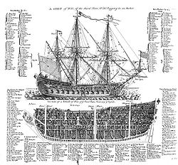
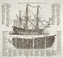
Another great find from the 1728 Cyclopaedia. It's like an anatomy chart for 18th century warships. The image could probably handle a little more cleanup, but as it stands, it's a highly detailed and informative diagram.
- Nominate and support. - BRIAN0918 07:19, 19 March 2006 (UTC)
Support.See below! Funny perspective, though, those cannons point straight forward and could hit one another... Brian, are you going to nominate all the plates in the 1728 Cyclopaedia? ;-) --Janke | Talk 07:29, 19 March 2006 (UTC)- Nope. The rest of the plates are just collections of figures. See the 2nd page of Category:Cyclopaedia for the other plates (I still have a couple more to upload). — 0918BRIAN • 2006-03-19 07:31
- Support. Rad.--ragesoss 07:52, 19 March 2006 (UTC)
- I prefer the colored original.--ragesoss 01:44, 26 March 2006 (UTC)
- Support Pegasus1138Talk | Contribs | Email ---- 08:32, 19 March 2006 (UTC)
- Comment: I don't want to rain on the parade, but I find the JPEG compression artifacts distracting. Do we have a lossless or low compression source image for this?--Eloquence* 09:45, 19 March 2006 (UTC)
- This is the best there is. I've tried asking the University of Wisconsin for larger versions before, but was turned down. I'm not sure what other Universities have this book; the only way to get a better image would be go to there and scan the book. — 0918BRIAN • 2006-03-19 16:20
- Actually, it appears that my school's library has a more recent copy. I'll see what I can find... — 0918BRIAN • 2006-03-19 16:32
- Support Great picture, great clarity and resolution, it is very hard to do a better picture than this of a page, congratulations! Msoos 15:23, 19 March 2006 (UTC)
SupportStill supporting but updated vote below. Excellent diagram & a wonderful find. If you can scan a better version, all well and good, but I think the original is already every bit good enough. It's a diagram, not a photograph, and in any case the details are as clear as I've ever seen them on plates of this age ~ Veledan • Talk 19:14, 19 March 2006 (UTC)- Support Has alot of information. --Lewk_of_Serthic contrib talk 22:40, 19 March 2006 (UTC)
![]() Support Have uploaded an edit, but wouild support either --Fir0002 www 23:34, 19 March 2006 (UTC)
Support Have uploaded an edit, but wouild support either --Fir0002 www 23:34, 19 March 2006 (UTC)
- Levels --Fir0002 www 21:38, 21 March 2006 (UTC)
 Support the edit. These old diagrams that were created w/o computers are so astounding.. drumguy8800 - speak? 02:54, 21 March 2006 (UTC)
* Comment: You all realize that this picture is not used in any article? It can't really be a featured picture until that happens. Mstroeck 10:52, 21 March 2006 (UTC) Sorry, I looked at the edit instead of the original picture :-) Mstroeck 10:55, 21 March 2006 (UTC)
- Support. Both informative and stunning. Would support having the initial image replaced with the edited version (without the artefacts). - Mgm|(talk) 11:09, 21 March 2006 (UTC)
- Support color original per above. –Joke 23:30, 21 March 2006 (UTC) (added "color original" Joke 18:02, 23 March 2006 (UTC))
- Strong Support. Stunning (both pictures). — Webdinger BLAH | SZ 02:34, 22 March 2006 (UTC)
- -
 Support ~Linuxerist L / T 05:25, 22 March 2006 (UTC)
 - Support edited - cool. Ha, they called it a "cock pit". --Deglr6328 05:37, 22 March 2006 (UTC)
- Support original color file only. You know, I'd really prefer the the original file, showing the faded, brownish paper. The edits are just so clinically antiseptic looking! If a document is old, I'd like to see it in the scan, too. Struck out my vote further above. --Janke | Talk 10:16, 22 March 2006 (UTC)*
- Support colour version only. Agree with Janke, gives more character. |→ Spaully°τ 14:10, 22 March 2006 (GMT)
- Support colour original only I knew it looked wrong for some reason. Much better. chowells 13:37, 23 March 2006 (UTC)
- I think the cleaned up versions are closer in appearance to what the image was originally intended to be, not browned and damaged with time. The image is supposed to be for educational purposes, not historic purposes. — 0918BRIAN • 2006-03-23 14:06
- Personally, I find the color version the most legible, and the most "cleaned up" version the least. –Joke 18:08, 23 March 2006 (UTC)
- Support original colour scan Per my vote on the typefaces, there is no contest here IMO. The edits sharpen at an unforgiveable cost in detail ~ Veledan • Talk 22:12, 23 March 2006 (UTC)
- Support edit. Artifacts are basically gone in the edit; the "character" of the original color version is only nice at huge size, while at the size it is in the article, the grey is just hard on the eyes. zafiroblue05 | Talk 03:49, 24 March 2006 (UTC)
- I think we're discussing the images here, though, not the thumbnails! With that said, for some images (such as this one) it would be nice to have a different crop and levels for the thumbnail sized reductions. –Joke 16:59, 24 March 2006 (UTC)
- Support original only. - Mailer Diablo 00:20, 25 March 2006 (UTC)
- Support original only. The edit is not that bad, I compared the versions side by side for quite some time. But still some characters with very fine lines are more legible in the original and the tones of the fill patterns look nicer in the original. --Dschwen 09:16, 26 March 2006 (UTC)
- Support any version; it's a wonderful plate. A "translation" of the descriptions in the image into wiki-text on the image page would make it even better. –Gustavb 23:18, 27 March 2006 (UTC)
- Support, awesome pic! --Cyde Weys 07:32, 28 March 2006 (UTC)
- Support. Nice detail. Prefer the original. Covington 08:55, 29 March 2006 (UTC)
- Comment: not a fan, While it's a beautiful diagram, the huge number of labels are unworkable. For this to be useful in learning it would need mouse-over labels. I don't know how you'd do that within the MediaWiki framework. Note: I'm being slightly hypocritical here as I've been doing the labels for Haeckel's images in commons. —Pengo 09:01, 1 April 2006 (UTC)
Promoted Image:Warship diagram orig.jpg The colored version seems to have the edge. --PS2pcGAMER (talk) 08:51, 2 April 2006 (UTC)
