Unica (typeface)
 | |
| Category | Sans-serif |
|---|---|
| Classification | Neo-grotesque |
| Designer(s) | Team ’77 (André Gürtler, Christian Mengelt and Erich Gschwind) |
| Foundry | Haas Type Foundry (defunct in 1989) Lineto (Unica77 LL) Monotype (Neue Haas Unica) |
| Date released | 1980 |
| License | Proprietary |
| Design based on | Helvetica, Univers and Akzidenz-Grotesk |
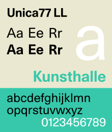
Unica or Haas Unica is a neo-grotesque sans-serif typeface developed at Haas Type Foundry in the late 1970s and originally released in 1980. Initiated as a project that sought to combine the strengths of both Helvetica and Univers, it had the misfortune of being released for phototypesetting just as the technology was being made obsolete by desktop publishing, and subsequent corporate mergers and a copyright dispute kept a digital version off the market. In 2015, two digital revivals were released: one by the rights holders, and the other with the blessing of the team that originally developed it.
Original Versions
[edit]In 1972 the now defunct Haas Type Foundry (Switzerland) bought its French competitor Deberny & Peignot. The latter was the holder of the copyright of the Univers. Thus Helvetica (a.k.a. Neue Haas Grotesk) and Univers were from then on held by the same company. During the 1970s Haas decided to introduce an updated version of Helvetica for electronic on-screen phototypesetting. The task was given to Team ’77 (André Gürtler, Christian Mengelt and Erich Gschwind). The result was a hybrid of mainly Helvetica and Univers, which gave it the name Unica (a portmanteau of Univers and Helvetica), but they incorporated also features of other typefaces, like Akzidenz-Grotesk.[1][2] Unica was released in 1980. Because of the rise of desktop publishing software and an ownership dispute, the typeface disappeared very soon from the market.
Digital Release
[edit]Until 2008 there was a digital implementation available from Scangraphic in the fontstore of Elsner+Flake, but this implementation had to be removed from the market because Linotype claimed the copyright of the defunct Haas Type Foundry. As the typeface is no longer legally available, its technical details have become unclear. However, it has been suggested that this typeface has two optical sizes, namely SB (Scangraphic Body; designed for body text) and SH (Scangraphic Headline; designed for headings and display).[3] Unica SH has tighter letter spacing than Unica SB.
Modern Revivals
[edit]Unica Intermediate (Unreleased)
[edit]Created by Louise Paradis, this revival was never publicly released.[4][5]
Neue Haas Unica (2014-2015)
[edit]Designed by Toshi Omagari for Monotype, this is a revival based on the Team '77's Unica phototypesetting files found in the Monotype's archive in Germany.[6]
The font family includes 9 weights in 1 width, with complementary italics, totalling 18 styles. It does not offer rounded dots, but does include small caps. Neue Haas Unica also has a Paneuropean (W1G) version that offers Greek and Cyrillic character coverage. Neue Haas Unica Paneuropean is sold separately from the basic version.[7]
LL Unica77 (2015-2016)
[edit]This is a revival based on the original drawings from the 1970s. It was created in cooperation of Maurice Göldner and Christian Mengelt (who was a member of Team ’77 and authorised this implementation of Unica) for the Swiss type foundry Lineto.[8] According to the type designer, Albert-Jan Pool, Lineto is (contrary to Monotype) paying a licence fee to Team ’77.[9] This release uses stylistic alternates to offer a version with round dots and punctuation.
The initial release on 7 March 2015 had 8 fonts in 4 weights (light, regular, bold, black) and 1 width, with complementary italics. Six fonts in 3 additional weights (Thin, Medium, Extra Black) were released in February 2016. In term of language support, Unica77 offers 4 versions, namely "Latin", "Cyrillic", "Greek", and "PanEuro".
Differences between Neue Haas Unica and Unica77
[edit]
The character designs of Neue Haas Unica and Unica77 are very similar as both are based on the original Haas Unica. However, they do have a number of subtle differences: Unica77 has a slightly taller x-height than Neue Haas Unica; at the same weight and point size, Unica77 has tighter letter spacing by default and its characters are heavier than Neue Haas Unica. These differences are more noticeable with long text set at small size.
The Euro sign in Neue Haas Unica has horizontal terminals as in Helvetica (Neue Haas Grotesk), while the one in Unica77 has vertical terminals as in Univers and Neue Helvetica.
See also
[edit]References
[edit]- ^ Vanhemert, Kyle. "A Legendary Redesign of Helvetica, Reborn After 30 Years". Wired. Retrieved 2 November 2017.
- ^ Farris, Jessica. "The History Behind Monotype's Neue Haas Unica". Print. Retrieved 2 November 2017.
- ^ "Haas Unica research". Retrieved 6 February 2022.
- ^ "Haas Unica in use". Retrieved 9 February 2022.
- ^ "TM Research Archive website". 7 May 2014. Retrieved 9 February 2022.
- ^ The History Behind Monotype’s Neue Haas Unica
- ^ "Neue Haas Unica Paneuropean Font". Retrieved 2022-07-07.
- ^ "Unica". Lineto. Retrieved 2 November 2017.
- ^ "Neue Haas Unica comparison". Typography.Guru. Retrieved 21 November 2018.
External links
[edit]- Linotype pages: Neue Haas Unica
- Lineto pages: LL Unica77
- Specimen sheets (Stephen Coles)
- Fonts in Use
- Comments by Christian Mengelt
- Biblioteca Francesca Bonnemaison – a usage case of Unica77
- Neue Haas Unica on MyFonts.com
