Talk:Warming stripes
| This article is written in British English with Oxford spelling (colour, realize, organization, analyse; note that -ize is used instead of -ise) and some terms that are used in it may be different or absent from other varieties of English. According to the relevant style guide, this should not be changed without broad consensus. |
A fact from Warming stripes appeared on Wikipedia's Main Page in the Did you know column on 16 August 2019 (check views). The text of the entry was as follows:
|
| This article is rated B-class on Wikipedia's content assessment scale. It is of interest to the following WikiProjects: | ||||||||||||||||||||||||||||||||||||||||||||
| ||||||||||||||||||||||||||||||||||||||||||||
- Did you know entry: Displayed on Main Page 00:00 through 11:59 UTC Friday 16 August 2019. Archive: https://web.archive.org/web/20190816102231/http://en.wiki.x.io/wiki/Main_Page —RCraig09 (talk) 15:20, 16 August 2019 (UTC)
"Stripe diagram" listed at Redirects for discussion
[edit]
An editor has asked for a discussion to address the redirect Stripe diagram. Please participate in the redirect discussion if you wish to do so. signed, Rosguill talk 18:13, 8 August 2019 (UTC)
Featured picture on en.WP
[edit]
I've just learned that this image was chosen as a Featured picture. See:
- Wikipedia:Featured picture candidates/Warming stripes
- https://web.archive.org/web/20210118015423/http://en.wiki.x.io/wiki/Wikipedia:Featured_pictures#Sciences
- https://web.archive.org/web/20210119171614/http://en.wiki.x.io/wiki/Wikipedia:Featured_pictures_thumbs/69
- https://web.archive.org/web/20210124042712/http://en.wiki.x.io/wiki/Wikipedia:Featured_pictures/Sciences/Others
Microsoft Excel .xlsx files that automatically generate XML code for SVG graphs, including warming stripes
[edit]Click at right to show/hide preliminary comments
|
|---|
|
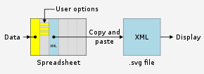
I've written a Microsoft Excel .xlsx spreadsheet file that semi-automates generation of SVG files of warming stripes graphics, so you don't have to buy really expensive software. You simply paste a vertical list of temperatures or other data. The spreadsheet automatically generates a column of cells containing xml code, each cell representing one "stripe" per cell. Simply copy that column and paste it into a text editor (TextEdit for Mac, presumably Notepad for Windows), and save the text file as
|
Update:

(five examples compared)
I've uploaded spreadsheets that automatically generate XML code for charts in SVG format.
Summary: You simply paste or enter your data into the spreadsheet, and specify image dimensions, number of grid lines, data ranges, font sizes, etc. The spreadsheets instantly and automatically generate a column of XML code. You simply copy and paste that code into a text editor and save as an ".svg" file. The spreadsheets produce lean SVG code, and should save you time in creating SVG charts. Though my original spreadsheets are written in Microsoft Excel, I've received reports that they also work if read into other spreadsheet programs.
Feedback and suggestions on my talk page are welcome. RCraig09 (talk) 23:41, 19 February 2021 (UTC)
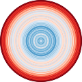
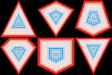
- Warming stripes — Accepts a single dataset and converts to SVG code portraying Ed Hawkins' warming stripes graphics. User chooses vertical or horizontal stripes; normal or reverse data ordering; or from a variety of geometric shapes (updated 17 May 2023). . . . . Click here to see examples of warming stripes embedded in different shapes.
- Warming stripes bar chart — Accepts a single dataset and creates a conventional bar chart whose individual bars/columns are coloured according to Dr. Hawkins' warming stripes colour scheme. Alternate option: choose one colour for ascending bars and another colour for descending bars. (updated 28 August 2023)
- Line charts — Accepts up to six datasets. (updated 30 August 2023)
- Vertical bar charts (column charts) — Accepts up to six datasets. Toggle between clustered and stacked charts; user can adjust "Yfloor"—the Y level (usually=0) from which columns rise or fall; user chooses to keep or ignore negative input values. (updated 27 August 2023)
- Horizontal bar charts — Accepts up to six datasets. Toggle between clustered and stacked charts; user can adjust "Yfloor"—the value (usually=0) from which bars extend; user chooses to keep or ignore negative input values. (updated 27 August 2023)
- Scatter plots — Accepts up to five datasets. (updated 28 August 2023)
- Pie charts — Accepts a single dataset of up to 36 items. (updated 17 May 2023)
- Variable-width bar charts — Accepts up to six datasets; is like "Vertical bar charts", above, but user can choose different widths for different bars. (updated 27 August 2023)
Examples (warming stripes):
-
20210502 Warming stripes comparison of Global Mean Surface Temperature datasets.svg
+I manually combined five automatically generated images into this one -
20210507 Warming stripes - ellipses - global warming.svg
-
20210522 Warming stripes - longitudes - meridians on a globe - global warming.svg
-
20210526 Warming stripes - hearts - global warming.svg
-
20210507 Warming stripes - triangles - global warming.svg
-
20210530 Warming stripes - diamonds - global warming.svg
-
20210604 Warming stripes - XLSX to SVG - various Diamond etc configurations - GIF.gif
-
20210507 Warming stripes - rectangles - global warming.svg
-
20210517 Warming stripes - pentagrams - stars - global warming.svg
-
20210508 Warming stripes - hexagons - global warming.svg
-
20210507 Warming stripes - octagons - global warming.svg
- The spreadsheet user can toggle a switch to reverse the order of data, so red is in the center (or left side of first graphic) and blue is at the outside (or right side of first graphic).
- The spreadsheet user can choose height and width (in pixels), to compress or expand shape vertically and horizontally, for example, to change an ellipse to a circle or a rectangle to a square.
- To download the spreadsheet, go to User:RCraig09/Excel to XML for SVG.
- Don't try to edit inside this colored box; make any comments about the spreadsheets or graphics at User talk:RCraig09 —RCraig09 (talk) 20:43, 20 May 2021 (UTC)
- That is cool! I had no idea that this was possible. Is it possible to automate updating your collection of instrumental data sets with this? (There is a new version out for HadCRUT, finally agreeing with all the other data sets by not ignoring the poles). FemkeMilene (talk) 08:41, 20 February 2021 (UTC)
- (on design: black title and text is calmer). FemkeMilene (talk) 08:42, 20 February 2021 (UTC)
- @Femkemilene:
- Oh, it's possible! But spreadsheets are clumsy tools for some tasks. I had to catenate text strings and calculated-numbers to create the XML elements.
- Re 5-trace graphs: people who understand a little XML can separately make five unique .SVG files, and then copy the main 'path' text from four svg files into the fifth svg file (using the fifth file's plot area and grid lines etc).
To quickly generate 5-trace graphics within the spreadsheet, it would require almost about 22 columns to generate each trace. It would add a bit of complication for the user, also. Version 1.0 was meant for people who basically understand spreadsheets but don't know SVG or Inkscape etc.I plan to update the 5-trace GST graphic manually, in Inkscape,when all 2020 data is in.- I used blue for experimentation... and forgot to change to all black characters! D'oh! I will change in future versions. —RCraig09 (talk) 22:52, 20 February 2021 (UTC)
- @Femkemilene: I am now adding to the spreadsheet, to expand to more than one trace. (At first I was intimidated by the project. :-) ) —RCraig09 (talk) 04:48, 21 February 2021 (UTC)
- @Femkemilene:
- Brilliant! I wish we could fully automate loads of those graphs and this is a step on the right direction :). FemkeMilene (talk) 08:07, 21 February 2021 (UTC)
- @Femkemilene: Version 2.x is uploaded to Dropbox (link is above). Upgrading to five traces was more straightforward than I feared (though time-consuming!). Five actual temperature data series are included in the v2.x example. I haven't decided how to position five text legends for five traces, since different users will want them in different positions for different datasets. But this is a start.
- Spreadsheets are relatively simple for non-techy people to use, but they aren't as flexible as Inkscape etc. Maybe User:Efbrazil can share how he semi-automated making his SVG files. —RCraig09 (talk) 23:07, 21 February 2021 (UTC)
- @Femkemilene: I've updated the five-trace .svg graph (at right) with 2020 data and used the spreadsheet to generate the XML code. The only pre-processing needed in this case is to adjust some of the data sets to account for different base/reference periods. Spreadsheet Version 2.2 allows you to choose which 'quadrant' in which to put legends, to accommodate differently shaped graphs. —RCraig09 (talk) 07:54, 25 February 2021 (UTC)
- Brilliant! I wish we could fully automate loads of those graphs and this is a step on the right direction :). FemkeMilene (talk) 08:07, 21 February 2021 (UTC)

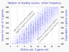
Update (2024): The downloadable spreadsheets are on Google Drive (drive.google.com); download link is updated above. I've just added the chart at right, which shows an example of using the spreadsheet's concatenate function ("&") to assemble text and values into XML code for the SVG files. It's not necessary for users of the spreadsheet to understand the internal details; the spreadsheet itself does the dirty work. —RCraig09 (talk) 20:46, 30 December 2024 (UTC)
Featured picture scheduled for POTD
[edit]Hello! This is to let editors know that File:20181204 Warming_stripes_(global,_WMO,_1850-2018)_-_Climate_Lab_Book_(Ed_Hawkins).png, a featured picture used in this article, has been selected as the English Wikipedia's picture of the day (POTD) for November 3, 2023. A preview of the POTD is displayed below and can be edited at Template:POTD/2023-11-03. For the greater benefit of readers, any potential improvements or maintenance that could benefit the quality of this article should be done before its scheduled appearance on the Main Page. If you have any concerns, please place a message at Wikipedia talk:Picture of the day. Thank you! — Amakuru (talk) 16:14, 27 October 2023 (UTC)

|
|
Warming stripes (sometimes referred to as climate stripes or climate timelines) are graphics that use a series of chronologically ordered coloured stripes to visualize trends in the temperature record of Earth. They employ a minimalist style, avoiding technical distractions by using colour alone to intuitively convey trends in global warming to non-scientists. The initial concept of visualizing historical temperature data has been extended to use animations, to visualize sea level rise and predictive climate data, and to visually juxtapose temperature trends with other data series, such as the concentration of carbon dioxide in Earth's atmosphere, global glacier retreat, precipitation, the contribution of aviation emissions to global warming, and biodiversity loss. These warming stripes were published by the British climatologist Ed Hawkins in 2018, using data from the World Meteorological Organization. The colours represent the annual mean global temperature for each year from 1850 (left) to 2018 (right) – the progression from blue (cooler) to red (warmer) stripes is indicative of global warming. Graphic credit: Ed Hawkins
Recently featured:
|
- Here is a link to an archive of Wikipedia's front page early on 3 November 2023: https://web.archive.org/web/20231103104846/http://en.wiki.x.io/wiki/Main_Page . —RCraig09 (talk) 06:01, 4 November 2023 (UTC)
Possibly feature on Wikimedia Commons
[edit]Hello ! I would like to promote Warming Stripes as featured picture in Commons ! Could you come and vote for it ? Effco (talk) 15:33, 4 November 2023 (UTC)
 Done I don't know anything about the decision and implementation process, however. —RCraig09 (talk) 16:02, 4 November 2023 (UTC)
- Update: The image has passed the nomination process at Wikimedia Commons and will be included in Commons' Featured Picture Gallery. I don't know if or when it will be featured on the Commons front page. —RCraig09 (talk) 18:33, 13 November 2023 (UTC)
Stripes are based on Ellie Highwood's crocheted blanket
[edit]- Primary source
- https://elliehighwood.com/2017/06/12/climatechangecrochet-the-global-warming-blanket/
- Secondary source
- https://www.bbc.com/future/article/20231206-the-coloured-stripes-that-explain-climate-change
Uwappa (talk) 09:39, 11 December 2023 (UTC)
- Thanks User:Uwappa, I also noticed the BBC article in the morning news. I've incorporated its summary teachings into this article, to introduce the numerous existing examples in the /* Applications and influence */ section. You may be aware, primary sources have limited acceptability on Wikipedia, and Ellie Highwood's contribution is already described in the /* Background, publication and content */ section; this is why I haven't added her blog post to the references. —RCraig09 (talk) 23:14, 11 December 2023 (UTC)
- Wikipedia articles that use Oxford spelling
- Wikipedia articles that use British English
- Wikipedia Did you know articles
- B-Class Environment articles
- Low-importance Environment articles
- B-Class Climate change articles
- Low-importance Climate change articles
- WikiProject Climate change articles
- B-Class Graphic design articles
- Mid-importance Graphic design articles
- B-Class United Kingdom articles
- Low-importance United Kingdom articles
- WikiProject United Kingdom articles


