Segoe
Segoe (/səˈɡoʊ/ sə-GOH[1]) is a typeface, or family of fonts, that is best known for its use by Microsoft. The company uses Segoe in its online and printed marketing materials, including recent logos for a number of products. Additionally, the Segoe UI font sub-family is used by numerous Microsoft applications, and may be installed by applications (such as Microsoft Office and Windows Live Messenger). It was adopted as Microsoft's default operating system font, and is also used on Outlook.com, Microsoft's web-based email service. On August 23, 2012, Microsoft unveiled its new corporate logo typeset in Segoe, replacing the logo it had used for the previous 25 years.[2]
The Segoe name is a registered trademark of Microsoft Corporation, although the typeface was originally developed by Monotype.
History
[edit]
Segoe was designed by Steve Matteson during his employment at Agfa Monotype. Licensed to Microsoft for use as a branding typeface replacing Franklin Gothic and its user interface font replacing Tahoma, it was designed to be user-friendly and legible. Matteson created a range of weights and italics with a humanist feel.
Licensing dispute
[edit]In 2004, Microsoft registered certain Segoe and Segoe Italic fonts as original font designs with the European Union trademark and design office. The German font foundry Linotype protested, citing Segoe UI's similarity to its licensed Frutiger family of typefaces. In its submission to the EU, Microsoft claimed that Linotype had failed to prove that it had been selling Frutiger and Frutiger Next prior to 2004. The EU rejected these claims, and the EU revoked Microsoft's registration.[3] Microsoft did not appeal the decision. Microsoft still holds United States design patents for various Segoe-based fonts.
During the same period, in late 2004, after six years under the Agfa Corporation, TA Associates acquired the Monotype assets and incorporated the company as Monotype Imaging. Later, Monotype Imaging acquired Linotype.[4] By the end of 2006, the company that had challenged Microsoft's Segoe patents (Linotype) was a subsidiary of the company that had originally licensed Segoe to Microsoft (Monotype).

Several letters have distinctly different forms in Segoe UI and Frutiger, reflecting Segoe UI's different intended use: low-resolution screen display, rather than airport signage (Frutiger). However, Ulrich Stiehl asserts that many of these differences were introduced in later versions of Segoe UI – earlier versions of Segoe UI were closer to Frutiger.[5][6]
In June 2005, Scala, an electronic signage company (unrelated to the typeface FF Scala) removed Segoe from its InfoChannel product "due to licensing issues".[7] Scala replaced Segoe with Bitstream Vera fonts.
Simon Daniels, a program manager in Microsoft's typography group, stated that "The original Segoe fonts were not created for or by Microsoft. It was an existing Monotype design which we licensed and extensively extended and customized to meet the requirements of different processes, apps and devices."[8]
A Microsoft public relations spokesperson, who asked not to be named, stated:
Segoe was an original design developed by Agfa Monotype (now Monotype Imaging) in 2000. In 2003, we acquired the original Segoe fonts and used them to develop an extended family of fonts retaining the Segoe name. Many of these new fonts received design patent protection in the United States. Segoe was not derived from Frutiger. Microsoft also has a current up-to-date license that allows us to distribute certain Frutiger fonts in connection with Microsoft products, including Office and Windows. There are distinct differences between Segoe and Frutiger. Additionally, unlike clone typefaces, the Segoe family of fonts are not metrically compatible with Frutiger so cannot be used as replacements.[9]
Under United States copyright law, the abstract letter shapes of functional text fonts cannot be copyrighted; only the computer programming code in a font is given copyright protection. This makes the production and distribution of clone fonts possible.
An early version of Segoe, possibly an evaluation version, was included with certain versions of SuSE Linux, but no longer ships as part of that operating system.
Segoe UI
[edit] | |
| Category | Sans-serif |
|---|---|
| Classification | Humanist |
| Designer(s) | Steve Matteson |
| Foundry | Microsoft Typography |
| Date released | 2003 |
 | |
| Sample | |
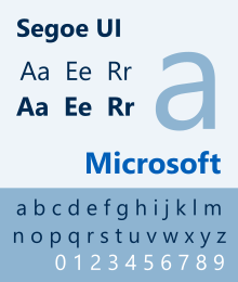
Segoe UI ("User Interface") is a member of the Segoe family used in Microsoft products for user interface text, as well as for some online user assistance material, intended to improve the consistency in how users see all text across all languages. It is distinguishable from its predecessor Tahoma and the OS X user interface font Lucida Grande by its rounder letters. Segoe UI was produced by Monotype Imaging.[10]
Segoe UI was first introduced with Windows Vista. Light, Semibold and Symbol versions of Segoe UI were introduced with Windows 7. A Semilight version of Segoe UI was introduced with Windows 8 in order to make a perfect lightweight down to 11 pixels. Black and Emoji versions of Segoe UI were introduced with Windows 8.1, but only for Latin, Greek and Cyrillic scripts.[11] An Historic version of Segoe UI was introduced with Windows 10. A Variable version of Segoe UI was introduced with Windows 11.[12]
I remember the team creating a special ligature in the Segoe UI font (used in Windows) to make "S" and "t" align beautifully for the word "Start".[13]
says Jensen Harris, former Director of User Experience at Microsoft.

In October 2011, Segoe UI underwent a number of changes and stylistic additions that remain present in subsequent versions:[14][15][16][17]
- True italic variants were introduced for the Light, Semilight, and Semibold weights.
- The Light and Semibold versions were tuned for better screen legibility.
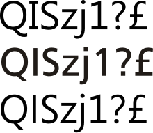
- The uppercase letters I and Q and the digits 1, 2, 4, 5, 7 and 8 were altered to closely resemble the Segoe WP font family with similarities to Frutiger.
- Support for additional scripts and character sets, such as Arabic, Armenian, Georgian (Mkhedruli and Khutsuri), Hebrew, and Fraser alphabet (Lisu), was added.[11]
- OpenType variants were included.

Characteristics
[edit]Segoe UI is optimized for its default ClearType rendering environment, and it is significantly less legible when ClearType is disabled, except at key user interface sizes (8, 9 and 10 point) where Segoe UI has been hinted for bi-level rendering. The standard font size increased to 9 point to accommodate for better layout and readability for all languages.
Version 5.00 of Segoe UI contains complete Unicode 4.1 coverage for Latin, Greek, Cyrillic and Arabic (Romans only), totaling 2843 glyphs in the regular weight.
Segoe UI uses distinct cursive italic script, whereas Frutiger and Helvetica use oblique type for italics.
Variations
[edit]- Segoe UI Mono is a variation of Segoe UI with monospace characters. It supports Latin (including Eastern European, and Turkish), Greek, Cyrillic, Hebrew and Thai characters, and symbols, geometric shapes and drawing elements. The family includes two fonts in two weights, without italics. It is the system kernel font.[18]
- Segoe UI Symbol is a new font that includes new scripts/symbols such as Braille and Deseret, and, previously, Ogham and Runic glyphs. It is not, however, a "symbol charset-encoded font" (like MS Symbol), but rather it is a Unicode-encoded font with symbols assigned to respective Unicode code points.[11] Segoe UI Symbol also has some other miscellaneous symbols such as chess pieces, playing card and dice symbols (these glyphs formed the basis of the Segoe Chess and Segoe News Symbols fonts[citation needed]), box-drawing characters, block elements, technical symbols, mathematical operators, arrows, control pictures, and OCR-optimized glyphs.[19] It was later extended to support Glagolitic, Gothic, Old Italic and Old Turkic (Orkhon) scripts,[11] all now moved to Segoe UI Historic. It later gained support for Meroitic Cursive (now moved to Segoe UI Historic) and Coptic script (found in both fonts).[11] The updated Segoe UI Symbol has also been backported.[20]
- Segoe UI Historic is a new font to support ancient scripts. Glagolitic, Gothic, Meroitic Cursive, Ogham, Old Italic, Old Turkic, and Runic were moved from Segoe UI Symbol to Segoe UI Historic. Additionally supported are Brahmi, Carian, Coptic, Cypriot, Egyptian hieroglyphs (except for phallic ones since v 1.01), Imperial Aramaic, Inscriptional Pahlavi, Inscriptional Parthian, Kharosthi, Lycian, Lydian, Old Persian, South Arabian, Phoenician, Shavian, Sumero-Akkadian Cuneiform, Syriac (ʾEsṭrangēlā style), and Ugaritic scripts.[11]
- Segoe Boot is a vertically stretched font based on Segoe. Its vertical stretching allows the font to be rendered as the normal version when a 4:3 image (like the BIOS screen) is stretched to fill a screen with an aspect ratio of 16:9.
- Zegoe UI is a Zune-specific variation on Segoe.[21]
- Microsoft later added unofficial color support to fonts, first implemented in the Segoe UI Emoji font.[22][23][24] This later has been formally supported with UWP applications natively using DirectWrite/Direct2D for text rendering with color font support, and first-class emoji support including an emoji keyboard.[25]
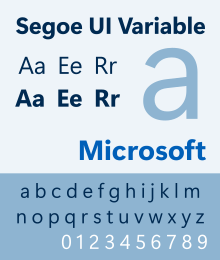
- Segoe UI Variable is a variable font added that scales better than Segoe UI on high-DPI monitors.[26] It has display, text, and small faces designed for specific font sizes. The glyphs have been redrawn moving away from the humanist design in favour of a more geometric look.[27]
Availability
[edit]- The Segoe UI font family can be obtained as part of Microsoft Windows and Windows Server operating systems:
- The classic Segoe UI design is included with Windows Vista, Windows Server 2008, Windows 7 and Windows Server 2008 R2.
- Certain Segoe fonts, but not Segoe UI, were included in Windows XP Media Center Edition 2005, replacing Trebuchet MS. Microsoft Word Viewer and Microsoft PowerPoint Viewer 2007 were also install certain Segoe fonts.
- Segoe UI is installed into Windows XP and Windows Server 2003 if the user installs Microsoft Office 2007, Microsoft Office 2010, Windows Live Messenger or Windows Live Mail.
- The updated Segoe UI design is included with Windows 8 (since build 8130), Windows Server 2012 (since build 8140), Windows 8.1, Windows Server 2012 R2, Windows 10, Windows Server 2016, Windows Server 2019, Windows Server 2022, Windows 11 and Windows Server 2025.
- A semilight version of Segoe UI is installed into Windows 7 and Windows Server 2008 R2 if the user installs Microsoft Office 2013 or Microsoft Office 2016.
- The classic Segoe UI design is included with Windows Vista, Windows Server 2008, Windows 7 and Windows Server 2008 R2.
Other Segoe fonts
[edit]


Other members of the Segoe family include:
- Segoe Print is a font family based on the handwriting of Monotype Imaging employee Brian Allen, developed by Carl Crossgrove, James Grieshaber and Karl Leuthold.[28] The family includes 2 fonts in 2 weights, without italics. It supports WGL character sets. It is famously used as a default font for titles in Windows Movie Maker.
- Segoe Script is a font family designed by Carl Crossgrove, based on the handwriting of Brian Allen, but includes extended strokes found in cursive handwriting. It is produced by Monotype Imaging. By using the stylistic alternate OpenType feature, the unlinked letters become accessible. The family includes 2 fonts in 2 weights, without italics. It supports WGL character sets.
- Segoe Chess is a symbol encoded chess font, designed by Steve Matteson and Jim Ford. It is included with Microsoft Office versions 12 and 14.
- Segoe Media Center is a font family built for and privately installed with Windows Media Center in 2 weights: light and semibold. It resembles the original Segoe, but is not optimized for ClearType rendering.
- Segoe TV is a font family built into MSN TV set-top-boxes. It retains characteristics of the original Segoe, such as sans-serif capital I and straight tail in capital Q, whereas other characters have been redrawn such as the i and j.
- Segoe WP is the Windows Phone 7 specific version of Segoe. The Segoe WP family is distributed with Microsoft Visual Studio version 10. Currently, only a release candidate beta version is available.[citation needed][dubious – discuss]
- Segoe Fluent Icons was added to display images via the font face.[29]
At one time, Microsoft also posted a package called Print Ad for Microsoft Dynamics Business Management Solutions Brief Description to the Microsoft downloads center. The package included TrueType and PostScript Type 1 beta versions of the Segoe branding fonts along with PowerPoint templates and marketing material.[30]
Windows Phones also include a more customized version called Segoe WP N which is designed with more clarity and narrow to enhance their take on ClearType.
- Segoe Pro is a custom font used by Microsoft and its affiliates for branding. Segoe Pro contains the same glyphs that Segoe UI does, only that it has specific emojis of Microsoft products attached as well. Segoe Pro comes in Black, Bold, Condensed, Display, Semibold and Semilight, along with their italic versions of each.
- Segoe Slab is a custom font which can be found if the user extracts the Windows SDK.apk (Android app package).[clarification needed] The font file is named 'SegoeSlabWP-Semilight.ttf'.
- Segoe Xbox Symbol is a font developed specifically for the Xbox 360. It comes in 2 weights: Regular and Bold. These fonts can be extracted from the Xbox Android app. Other versions of this font include 'Segoe X Symbol' and 'Segoe Xbox MDL2 Assets'.
- Skype UI Symbol is a font, similar to Segoe Xbox Symbol, however comprises the Latin script from Segoe UI. It comes in 2 weights, Regular and Bold. It can be extracted from the Skype app for Android.
- Segoe MDL2 Assets is an iconography font for use on UWP apps.
- Segoe Fluent Icons is the newest iconography font for use on UWP apps which will be the successor to the MDL2 Assets.
- Nirmala is an extension of Segoe that includes Indian script characters.
- Microsoft YaHei is an extension of Segoe that includes Chinese characters and Japanese kanji.
- Malgun Gothic is an extension of Segoe that includes Hangul characters.
Selawik
[edit] | |
| Category | Sans-serif |
|---|---|
| Designer(s) | Aaron Bell[31] |
| Foundry | Microsoft Typography |
| Date released | 2015 |
| License | SIL Open Font License |
Microsoft released Selawik as a metric-compatible[a] Segoe UI replacement, and Symbols as a Segoe UI Symbols and Segoe MDL2 Assets fall-back, under SIL OFL. These fonts are used in WinJS and Winstrap.[32] Selawik is also one of Microsoft's recommended fonts for UWP apps.[33]
Other related fonts
[edit]
The Latin glyphs from Segoe and Segoe UI can also be found in the following Microsoft font families: Malgun Gothic (Korean), Microsoft JhengHei (Traditional Chinese), Microsoft YaHei (Simplified Chinese), Gisha (Hebrew), Leelawadee (Thai). They are also found in Ebrima (N'Ko, Tifinagh, Vai), Khmer UI (Khmer), Lao UI (Lao), Microsoft New Tai Lue (Tai Lue), Microsoft PhagsPa (Phags-pa), Microsoft Tai Le (Tai Le).
In these fonts, some of the glyph shapes diverge significantly from Segoe UI and Frutiger and are in some ways more calligraphic. In Gisha and Leelawadee, the capital ‘M’ is narrower and has a raised apex, the lowercase ‘i’ and ‘l’ have tails, and the capital ‘I’ has no serifs. These characteristics are also seen in Segoe UI italic.
See also
[edit]- DejaVu Sans
- Cantarell
- Roboto
- Noto
- Product Sans
- San Francisco
- Paint 3D Uses Segoe UI as the default font.
Notes
[edit]- ^ kerning does not match as of May 2024
References
[edit]- ^ Microsoft (October 7, 2022). Meet Windows 11 | Easier to use. Event occurs at 00:44. Retrieved May 16, 2024 – via YouTube.
- ^ Bass, Dina (August 23, 2012). "Microsoft Debuts New Logo Before Windows 8". Businessweek. Archived from the original on August 27, 2012.
- ^ "Decision of the Invalidity Division (pdf)" (PDF). Office for the Harmonization in the Internal Market. February 6, 2006. Archived from the original (PDF) on May 8, 2006. Retrieved July 31, 2006.
- ^ "Monotype Imaging: Monotype Imaging Acquires Linotype". Monotype Imaging. August 2, 2006. Archived from the original on November 15, 2006. Retrieved January 27, 2007.
- ^ Designer Says Vista Font is Original Archived March 2, 2007, at the Wayback Machine (Brian Livingston, April 25, 2006)
- ^ Segoe UI 1997–2003 vs. Segoe UI 2005 (Comparison on page 3)
- ^ "Scala and TechMedia are pleased to announce InfoChannel 3 Release 7.4". Techmedia.com.au. Retrieved October 17, 2009.
- ^ Harris, Jensen (November 11, 2005). "I Guess No One Cares About Fonts". An Office User Interface Blog. Microsoft – via Blog Archive.
- ^ Brian Livingston (April 18, 2006). "Is Microsoft's Vista Font Just a Copy?". Datamation. earthweb.com. Archived from the original on July 16, 2006. Retrieved August 1, 2006.
- ^ "Monotype Imaging Brings Fonts to Microsoft Office and Windows Vista Products". Ir.monotypeimaging.com. March 20, 2007. Archived from the original on July 14, 2011. Retrieved October 17, 2009.
- ^ a b c d e f Petersen, Palle; Wilcock, John; Dempsey, Paul; Sharkey, Kent; Wenzel, Maira. "Script and Font Support in Windows". Globalization documentation. Microsoft. Retrieved August 16, 2022 – via Microsoft Learn.
- ^ "New Fonts in Windows 7 Beta". Microsoft.com. Retrieved October 17, 2009.
- ^ @jensenharris (August 29, 2022). "Design matters" (Tweet) – via Twitter.
- ^ "Previewing the New Version of Segoe UI". October 7, 2011. Archived from the original on August 4, 2012. Retrieved October 7, 2011.
- ^ "Segoe UI gets a subtle facelift in Windows 8". March 2, 2012. Retrieved March 2, 2012.
- ^ "More on Segoe UI in Windows 8". February 17, 2012. Retrieved August 19, 2012.
- ^ "Aktualisierte Windows 8-Systemschrift auch in Vista und 7 nutzen". schieb.de. March 26, 2012. Retrieved October 5, 2012.
- ^ "Windows 8 build 8014". BetaWiki. Retrieved July 25, 2021.
- ^ "21 new typefaces in Windows 7". office-watch.com. May 8, 2009. Retrieved October 17, 2009.
- ^ "An update for the Segoe UI symbol font in Windows 7 and in Windows Server 2008 R2 is available (KB2729094)". Windows Knowledge Base. Microsoft. Retrieved October 20, 2022.
- ^ Long Zheng (November 14, 2007). ""Zegoe", the new Zune font". istartedsomething.com. Retrieved October 15, 2012.
- ^ "Script and font support in Windows". learn.microsoft.com. Microsoft. Retrieved October 20, 2022.
- ^ How to enter and use Emoji on Windows 8.1 hanselman.com
- ^ Herrmann, Ralf (July 3, 2013). "Color Emoji in Windows 8.1—The Future of Color Fonts?". Archived from the original on July 10, 2014.
- ^ "How to type emoji on your PC using Windows 10 Fall Creators Update". PCWorld. Retrieved December 3, 2017.
- ^ "Windows 11 features already in preview: Everything you can try right now". XDA Developers. June 18, 2021. Archived from the original on June 21, 2021. Retrieved June 21, 2021.
- ^ "Typography in Windows 11". Microsoft. June 25, 2021.
- ^ "Monotype Imaging OEM Font catalog – Segoe Print". Monotype Imaging. Archived from the original on April 30, 2014. Retrieved October 16, 2012.
- ^ Warren, Tom (March 4, 2021). "Microsoft's Windows 10 UI overhaul continues with new system icons". The Verge. Retrieved March 6, 2021.
- ^ "Download the full Segoe font collection, official Microsoft branding typeface". IStartedSomething.com. May 31, 2007. Retrieved October 17, 2009.
- ^ "New font: Selawik Variations by Microsoft". Axis-Praxis. December 8, 2016. Retrieved September 20, 2019.
- ^ "Microsoft open source fonts". GitHub. Retrieved October 20, 2016.
- ^ Hickey, Shawn; Radich, Quinn (June 24, 2021). "Typography in Windows Apps". Build desktop apps for Windows. Microsoft – via Microsoft Learn.
External links
[edit]- Microsoft Typography:
- Cleartype gallery

