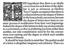
Kennerley Old Style

Kennerley Old Style is a serif typeface designed by Frederic Goudy.[2] Kennerley is a Venetian "old-style" serif design, with an organic structure loosely influenced by Italian and Dutch printing traditions of the Renaissance and early modern period and low stroke contrast giving a feeling of roundness and softness.[3] It was named for New York publisher Mitchell Kennerley, who advanced Goudy money to complete the design. While Goudy had already designed 18 other typefaces, it was one of Goudy's most successful early designs in his own style.[4] The regular or roman style was designed in 1911, the italic in 1918; bold styles followed in 1924.[5]

Goudy was a fine art printer and later a prolific typeface designer. He designed Kennerley out of dissatisfaction with the Caslon typefaces then in use in fine art printing; he felt these had an uneven colour on the page due to the thickness of the capital letters being much greater than that of the lower case.[5]
Goudy described the design late in life as very loosely based on the 'Fell Types', a set of type in the Dutch style collected by Bishop John Fell of Oxford for the Oxford University Press, although he conceded that "comparison of my type with the Fell letter will disclose little more than an identity of spirit" and Walter Tracy felt that he might have misremembered.[6][3] It has also been compared in some details, notably the tilted understroke on the 'e', to the type of late 15th century Venetian printer Nicolas Jenson by Walter Tracy and others; American Type Founders' historian Henry Lewis Bullen somewhat cruelly described it as "a spoilt Jenson".[7] The italic has flourishes on some letters and alternate swash capitals.
Initially cast privately in metal type, Kennerley was later made available on sale in metal type and for Monotype's hot metal typesetting system. During the 1910s and 1920s it was licensed in Britain by the Caslon foundry, who marketed it extensively. It has also been digitised several times.[8][9][10][11][12]
List of metal type issues
[edit]- Kennerley Old Style (1911, Village Letter Foundry + 1920, Lanston Monotype + 1927 Continental)
- Kennerley Italic (1918, Village Letter Foundry + 1920, Lanston Monotype + 1927 Continental)
- Kennerley Bold + Bold Italic (1924, Lanston Monotype + Continental)
References
[edit]- ^ Goudy, Frederic (1922). Elements of Lettering. New York: Mitchell Kennerley. Retrieved 26 February 2016.
- ^ Gossop, R. P. (1925). "Frederic W. Goudy". Commercial Art: 196–7. Retrieved 10 November 2017.
- ^ a b Tracy, Walter. Letters of Credit. pp. 134–136.
- ^ Gross, John (21 October 1986). "The Fortunes of Mitchell Kennerley, Bookman (book review)". The New York Times. Retrieved 5 February 2016.
- ^ a b Goudy, Frederic (1946). A Half-Century of Type Design and Typography: 1895-1945, Volume 1. New York: The Typophiles. pp. 77-81, 105. Retrieved 26 February 2016.
- ^ Frederic William Goudy (1940). Typologia: Studies in Type Design & Type Making, with Comments on the Invention of Typography, the First Types, Legibility, and Fine Printing. University of California Press. pp. 48–9. ISBN 978-0-520-03308-5.
- ^ Lewis Blackwell (2004). 20th-century Type. Laurence King Publishing. p. 191. ISBN 978-1-85669-351-6.
- ^ "LTC Kennerley". MyFonts. LTC. Retrieved 27 August 2015.
- ^ "Kennerley BQ". Berthold Type Foundry. Retrieved 6 July 2016.
- ^ Schwartz, Barry. "Goudy Bookletter 1911 (open-source revival, no italic)". League of Movable Type. Retrieved 27 August 2015.
- ^ Usherwood, Les; Jackaman, Steve. "Kingsley". MyFonts. Red Rooster Fonts. Retrieved 6 July 2016.
- ^ Leman, Andrew. "Shipley". MyFonts. E-Phemera. Retrieved 6 July 2016.
