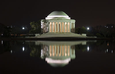
Wikipedia:Picture peer review/Archives/Jul-Dec 2007
|
Please cut and paste nominations to be archived from the Picture peer review mainpage to the top of the appropriate archive page, creating a new archive (by nomination date) when necessary.
|
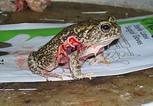
I was really surprised to see this happen. This image, I believe, illustrates the short lived effects of chloroform, the endurance of a frog and the mishap of a vivisection.
Created and nominated by Muhammad Mahdi. I have not yet used this picture in any article as some people find this image disturbing, gross and out of wiki project. I obviously dont think so and have nominated it here to see what you guys think before I do so.
- Nominated by: Muhammad Mahdi Karim (talk) 18:40, 13 December 2007 (UTC)
Comments:
- Honestly, the only use I can think of for this picture is anti-vivisection propaganda. It doesn't illustrate dissection, it doesn't illustrate chloroform (this only illustrates what happens when an anesthetic is NOT being administered, not what happens when an anesthetic is being administered), and I hope to hell it doesn't illustrate normal procedures at any institution in any part of the word. A single accident is not encyclopedic, and this is not endurance; it is the failure of anesthetic. Since an encyclopedia does not exist to create propaganda and this image image simply illustrates a horrible accident, it is not, in any way I can think of, encyclopedic. Enuja (talk) 02:30, 14 December 2007 (UTC)
Seconder:
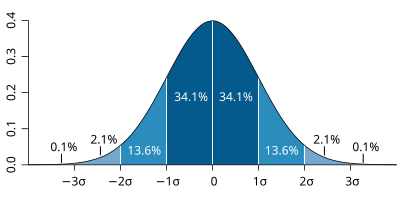
I saw this diagram on the standard deviation page. It isn't beautiful, but for a diagram, it does a very good job illustrating what a normal distribution is, and how std. dev. relates to it.
- Nominated by: Exobyte (talk) 08:05, 13 December 2007 (UTC)
Comments:
- It is certainly very nice, but I don't think its exciting enough to be featured. It's absolutely well made enough. I won't second it, but I'd probably vote for it if someone else nominated it. Enuja (talk) 23:13, 14 December 2007 (UTC)
- I'd tend to agree about lack of 'wow' - informative, but not really eyecatching. I also have problems with the axes not being labelled. --jjron (talk) 08:02, 16 December 2007 (UTC)
Seconder:

Hi res. Can a hearty dose of noise reduction make it FP?
- Nominated by: Malachirality (talk) 04:33, 12 December 2007 (UTC)
Comments:
- I'm not sure, but I think not. It lacks something of the drama and dynamism of existing political people FPs (for example this one and this one) and I'm sure we've had noms of "official portrait" style shots fail in the past, partly for that reason. The noise is mostly film grain, if I'm not mistaken, which means the best you could do is sharpen up the grains. As such, it's never going to approach the perceived 100% view quality of those other two if we attempt to remove the grain. I hate this about digital media, when a good quality shot like this, intended for print, must be degraded (ie scanned) in order to be shared and compared. It's not a level playing field at all, one that ultimately won't lift this above the crowd, I'm afraid. --mikaultalk 13:46, 12 December 2007 (UTC)
Seconder:
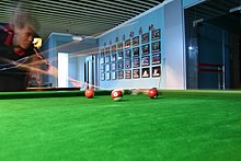
I think this is one of my best shots up until now, and even though I do not consider myself a good photographer, I would like to know what people think about it and what status it should be. I added to the Pocket billiards awhile ago, because I thought the existing picture was a little low quality.
- Nominated by: Poeloq (talk) 23:08, 11 December 2007 (UTC)
Comments:
- Personally, I do not think the long exposure is a good idea for the enc. of this picture; it just makes everything more confusing and unclear. The picture is also not of the best composition: there is too much foreground (see rule of thirds), not enough of the person (IMO), and the rightmost quarter of the picture is IMO awkward empty space. On top of all this, sunlight and reflections have cause parts of the doorway and some picture frames in the background to be overexposed, and the shadow areas are a little bit noisy. I think a better shot, if you still have access to a pool hall and a willing subject, would be a properly lighted still shot, rather than trying to capture the motion of it. Be advised that dim settings (which applies to many pools halls I have seen) create quite a few problems, including underexposure (or severe camera shake with increased exposure times) and increased noise with increased ISO rating. As a side note, I think the "Chinese man" part of the caption is superfluous and awkward-sounding. --Malachirality (talk) 00:27, 12 December 2007 (UTC)
- Hey Malachirality! Thanks for fixing the link and the comment. I don't actually remember what the 'sunlight' was, as it wasn't sunlight (it was about 1am in the morning). You are right about composition - the right hand side is quite empty. Thanks for your time! Poeloq (talk) 01:24, 12 December 2007 (UTC)
- I'd say the 'sunlight' is just a brightly lit room out the doorway; as mentioned this is probably a dimly lit pool hall, so a normally lit room out the door will show up like this. If you did reshoot, I'd suggest you close the door if you're allowed, or take a shot from a different angle to avoid this problem. --jjron (talk) 08:06, 16 December 2007 (UTC)
- Hey Malachirality! Thanks for fixing the link and the comment. I don't actually remember what the 'sunlight' was, as it wasn't sunlight (it was about 1am in the morning). You are right about composition - the right hand side is quite empty. Thanks for your time! Poeloq (talk) 01:24, 12 December 2007 (UTC)
Seconder:

This photo was taken by Rajesh Kakkanatt talk. This butterfly is seen common in Southern part of Germany.
- Nominated by: Rajesh Kakkanatt 06:34, 10 December 2007 (UTC)
Comments:
- Hmm, good, but not great. First off, if you do decide to nominate, FPC will require a specific genus and species; "German butterfly" will not work. More importantly however, it seems that too much of the flower is in focus, at the expense of the real subject; while the body and head of the insect is great, almost none of the wings are in focus. If this was merely a DOF issue, then it might have a chance at FPC (you would have some supporters). As it stands however, it seems that you have just focused a little too far right. You could give it a try at FPC; there are certainly wonderful qualities to this photo. However, the quality for insects at FPC is especially high, no doubt due in no small part to the valuable contributions of Fir0002 (go take a look for yourself). --Malachirality (talk) 08:26, 10 December 2007 (UTC)
Seconder:
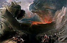
This is a painting called The Great Day of His Wrath, by John Martin (1789-1854). I have used in anger article. A lower quality version was already available in The Great Day of His Wrath which I will probably nominate for deletion(because I found and uploaded a higher quality one). I believe it can be used elsewhere in wikipedia (such as God). I feel the picture is very grasping.
- Nominated by: Aminz (talk) 03:06, 10 December 2007 (UTC)
Comments:
- While certainly an impressive picture, I'm afraid this picture would have no chance at FPC due to heavy artifacting (look closely at the dark region in the center). Also, as a general reference, I understand that the requirements say 1000 px on at least one side, but FPC has come to expect pictures that are quite a bit larger. For pictures that just barely meet this size requirement, extraordinary importance, quality, or appearance is generally needed for promotion. Thanks for submitting to picture peer review. --Malachirality (talk) 03:40, 10 December 2007 (UTC)
- Thanks for your review Malachirality. I will not then submit it for FPC. Cheers, --Aminz (talk) 03:59, 10 December 2007 (UTC)
- I agree with Malachirality. See here for a FPC nom that failed for similar reasons. I completely agree that this is a marvelous painting; but there are flaws with this particular reproduction of it. Spikebrennan (talk) 16:08, 14 December 2007 (UTC)
- Please do not arbitrarily remove entries from peer review without a good reason; there is simply no need to do so. After an allotted time, or after the page becomes too cluttered, old peer review entries will be moved to the archives. This way, there is a record of which pictures have been submitted to peer review before, and it also helps keep a record of what has been said about them. Thanks --Malachirality (talk) 05:49, 10 December 2007 (UTC)
- Sorry. I am not familiar with the process. I archived it because I thought further review may not be necessary. --Aminz (talk) 06:01, 10 December 2007 (UTC)
- As long as you do archive an image nomination, it's fine to remove it yourself. Personally, I like to have them up to remind of what's been nominated lately, and Malachirality appears to feel the same, but you didn't do anything wrong. Enuja (talk) 00:45, 11 December 2007 (UTC)
- Sorry if it came across the wrong way; I did not notice that it had been archived (I thought it had merely been removed). Apologies --Malachirality (talk) 00:52, 11 December 2007 (UTC)
- As long as you do archive an image nomination, it's fine to remove it yourself. Personally, I like to have them up to remind of what's been nominated lately, and Malachirality appears to feel the same, but you didn't do anything wrong. Enuja (talk) 00:45, 11 December 2007 (UTC)
- Sorry. I am not familiar with the process. I archived it because I thought further review may not be necessary. --Aminz (talk) 06:01, 10 December 2007 (UTC)
Seconder:

The image is created by Gustave Doré(1832-1883) and is a drawing for a verse from The Divine Comedy by Dante. I used it in Anger article in the section "Dealing with anger". I think it is a very illustrative picture.
- Nominated by: Aminz (talk) 02:54, 10 December 2007 (UTC)
Comments:
- Hmm, this image is certainly better quality than the one above, but unfortunately, I doubt it would pass FPC. The main problem is that it doesn't seem very illustrative of anything. FPC needs to see very concrete encyclopedicity in its pictures; this one requires quite a bit of interpretation to adequately illustrate "anger." It also doesn't seem to be the best candidate for Divine Comedy, "Dante," or "Virgil" (all very tenuous connections). Size considerations, as noted above, also apply here. Overall, this picture lacks the enc. and "special" quality of FPCs. You can of course still nominate and see what happens, but I won't second. --Malachirality (talk) 05:56, 10 December 2007 (UTC)
- There is a higher resolution version on the source page, so, ideally, that image should be uploaded to Commons so that it can be used by others. I don't know what to think about this image; Malachirality is correct that it doesn't currently have a great place to go, but that doesn't mean it's not still a good find. It does need to really contribute to article (and have the larger resolution uploaded) before it's going to be promoted as a featured picture. Also, as Malachirality asked me on my talk page, there is a little bit of concern about moire on the central figure, which could either be the artist's intention or an artifact of the size of the scan, ect. Enuja (talk) 00:42, 11 December 2007 (UTC)
- Thanks very much for your comments. It was very useful as I am quite unexperienced here... --Aminz (talk) 00:45, 11 December 2007 (UTC)
Seconder:

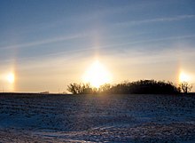
- Nominated by: Tempshill (talk) 19:52, 6 December 2007 (UTC)
Comments: This is a gorgeous photo of a really unusual phenomenon. Photo taken by the uploader. (I don't have any connection with the photo, I just happened upon it at the Sun dogs article.)
- It's definitely a strange phenomenon, and I'm not sure what to say about the image itself. I can say definitively (at least IMO) that it is a little noisy in the sky, a little tight on the left and right, and there may also be a little too much foreground. Second, even if the picture is on a hill, I think it is still slightly tilted to the left (looking at the telephone poles, trees, etc). Hard to tell though, as there are very few references, but an ideal photo would have a completely level horizon. Next, the secondary elements of this picture are not very sharp (I'm not sure, but parts of the snow directly under the real sun in the foreground may be artifacted--second opinion?), but as they are not the main subject, this is not as big of a problem as it normally would be. As for the subject itself, the parts are obviously overexposed </understatement> and not very easy to look at, which although unavoidable, still doesn't help the picture's chances at FPC. What this picture has going for it is the strangeness of subject matter (and the fact that the blown parts are unavoidably in a picture of the subject). With a one or two degree cw rotation, this nom isn't hopeless, but dubious; I would lean toward a "not promoted" outcome. W/out a second opinion to the contrary, I would nevertheless go ahead and nominate it and see (but I won't second, as that implies a level of support and assurance that I'm not sure I can give). I realize the mess of thoughts above is largely unhelpful and vacillating, and for that I apologize. Thanks for nominating here. --Malachirality (talk) 02:50, 7 December 2007 (UTC)
- Thanks for the review---I took this photo, by the way. I think Malachirality has a lot of good comments about the image. I tried the best I could with the equipment and circumstances at hand (driving through the Minnesota backroads with, at the time, a Cannon Powershot A20). I'm very happy with the number of nice comments I get from people who are touched by this photograph, and it has shown up around the internet and in publications. I would really like to expand the audience for this image and if anyone is interested in helping me improve the quality of this photo to get it featured, I'd like to hear your comments. I don't have have a lot of high-level experience with photography, I'm just a graduate student in engineering who lucked out with this particular situation. I also shouldn't second this image because that would probably be a conflict of interest...
Axda0002 (talk) —Preceding comment was added at 19:26, 8 December 2007 (UTC)
- You don't have to second; just directly nominate to FPC. Self noms are considered perfectly acceptable (if you can read random strangers' criticisms of your photography with a level head). Unfortunately, I have neither software nor experience for photo editing, so I can't help you out there. It's a good image (esp. considering equipment and conditions etc.) and a valuable contribution. --Malachirality (talk) 20:19, 8 December 2007 (UTC)
- I'll have a shot at touching it up a bit. --jjron (talk) 13:03, 12 December 2007 (UTC)
Seconder:
Edited version nominated at FPC as Sun dogs on 19 December 2007. --jjron (talk) 05:07, 19 December 2007 (UTC)


This is a retouched version of this image (which currently appears in the USCGC Winnebago (WHEC-40) article). I cleaned it up, rotated it slightly, and shifted the color balance. Personally I think it's quite a good-quality photograph of the ship. I'd be glad for comments or suggestions.
- Nominated by: CillaИ ♦ XC 23:39, 5 December 2007 (UTC)
Comments:
- It's a good photograph, but could we get a date on it? At thumbnail, it more or less looks like a recent picture (which it can't be); I don't know if the color balance was a good idea, as the historical/age aspect of the picture is no longer immediately apparent (I'm not sure, but this might make it more difficult to claim that historical enc. compensates for technical flaws?). There are also some pretty prominent technical shortcomings (that might be avoided by claiming historical value?), including graininess, lack of sharpness, and a bit of posterization on the waves, the smoke, and parts of the black waterline of the ship. Also, looking at the horizon, the picture still seems significantly tilted; yet a ccw rotation would make the mast lean left... --Malachirality (talk) 00:01, 6 December 2007 (UTC)
- Unfortunately, I can't find a date for the photograph: the page on the Coast Guard site says there is no official date and the photographer is unknown. I'd say it's from around 1960 but that's pure guesswork. Your concern that adjusting the color balance might ruin the historicity of it is quite valid (is it any different than the color balance issue in this successful nom, though?). I'm not sure anything can be done for the distortion... CillaИ ♦ XC 00:21, 6 December 2007 (UTC)
- I attempted to straighten it. CillaИ ♦ XC 00:32, 6 December 2007 (UTC)
- Unfortunately, I can't find a date for the photograph: the page on the Coast Guard site says there is no official date and the photographer is unknown. I'd say it's from around 1960 but that's pure guesswork. Your concern that adjusting the color balance might ruin the historicity of it is quite valid (is it any different than the color balance issue in this successful nom, though?). I'm not sure anything can be done for the distortion... CillaИ ♦ XC 00:21, 6 December 2007 (UTC)
- Hmm, better (maybe just a few degrees more), but the more pressing concerns still remain (add to that the distracting, possibly-overexposed foam in the brh corner). I'm not sure, even with the original coloration, that there is enough in this picture to justify FP, given the flaws. With the retouched color, and thus an undermined claim to historical enc., I would say chances are slim. But I could definitely be wrong, and as you know, you can nominate it whenever you'd like. Thanks for putting this up at peer review. --Malachirality (talk) 06:21, 6 December 2007 (UTC)
- Ok this is getting to be a pretty long answer, but I need to clarify myself. Looking at the above comment, I'm not trying to imply that the original coloration is good (I guess I misremembered how bad the original looked). But it's also a conundrum, because with the balanced colors, it becomes difficult to date the ship to an approx. time period (I thought it was a modern warship at first glance b/c of the color; I would expect a picture of a 50s-70s ship to be more like the original). So...I guess I would prefer the recolored alternative over the original after all, but still think that neither are FP. Sorry for being so wordy. --Malachirality (talk) 07:11, 6 December 2007 (UTC)
- I can understand that. Thanks for your comments. :) CillaИ ♦ XC 16:21, 6 December 2007 (UTC)
Seconder:

Another catching photo. It is a very good picture of a windmill for the purpose of sparking interest and teaching Wikipedia users a quick article or two over these modern, man-made structures that do such a well job of blending in with nature.; Windmill, Axpd was the creator.
- Nominated by: raj1020
Comments:
- I like that you can see a modern windmill in the background, and the tulips are certainly pretty. However, this image of not of high enough quality to become a featured picture on Wikipedia. The windmill blades are blurred, one is obscured by the white frame in front of the windmill, and the other is cut of at the top of the image. Also, as this image is used in Windmill, the fact that tulips are large and overwhelming in the foreground distracts, I think, from its encyclopedic value. Enuja (talk) 02:28, 5 December 2007 (UTC)
Seconder:

Ok, I'd say this one is a more serious/legitimate consideration than the nom below. However, I think it also needs some editing. So two questions:
- First and foremost, does the basic concept of this animation have a good chance at being featured?
- And second, if yes to the first question, can someone help with the editing?
Namely (assuming the animation is good enough to be featured), I'd like to include BCE and CE denotations to all the years. I've also considered the possibility of including the event/battle that led to the growth/decline (too much info on i love you maria the frame maybe?). I don't think, however, that more frames would be a good idea; it would show the empire movement more smoothly, but time, size, and tediousness need to be considered.
All of the above, of course, is assuming we even want to feature this animation. Comments? --Malachirality 04:02, 4 December 2007 (UTC)
- Nominated by: Malachirality 04:02, 4 December 2007 (UTC)
Comments:
- Since Image:Canada_provinces_evolution.gif, Image:CSA_states_evolution.gif, Image:US_states_by_date_of_statehood3.gif, and Image:Mexico_states_evolution.gif are all current featured images, and I personally think that these sorts of things are very cool, I strongly believe that this kind of thing has a wonderful change to be featured. However, this image needs some work to be featured (but, no, I'm not going to help with editing). One thing that would really improve this image would be to zoom in, with everything north of the island of Great Britain excluded from the image. Also, the edges of the continents look like there is some aliasing going on. So, definitely, this animation would be a good project to work on. Enuja (talk) 04:16, 4 December 2007 (UTC)
- Thanks for responding so quickly! And I completely understand you not wanting to work on this edit (I myself in the middle exams, and Wikipedia provides a convenient excuse for brief digressions from work (-:). But could you (or someone else reading this) tell me how to even go about starting an edit of this (zooming in, converting to .svg if necessary, adding text, etc)? I have no idea... --Malachirality 05:31, 4 December 2007 (UTC)
- As creator of three of the four maps mentioned (insert blush here), and because Malachirality asked, I can try to work on this in the next few days and at least do that basic work. :) --Golbez 08:06, 4 December 2007 (UTC)
- I'd definitely crop the top off, and also use the lhs of N Africa to provide an animated linear "timescale" as per this one]. Makes it a lot easier to follow. Big FPC potential here, IMO. --mikaultalk 09:52, 4 December 2007 (UTC)
- Thanks for doing this Golbez. Let me know what I can do to help. --Malachirality 15:59, 4 December 2007 (UTC)
- After taking a closer look at it, I think it's best if I scrap this and make an entirely new one. The aliasing is enough reason to start over, but I'd also like to research each step and note on the map (as I did in the others) why this change happened. --Golbez (talk) 00:43, 5 December 2007 (UTC)
Seconder:

Appears in Transit of Venus
Hmm...at first I thought it was a cool shot, but not so sure anymore...noisy, chromatic aberration, cut off sun, etc. Still, it illustrates the size differences b/t the two bodies (admittedly not entirely accurate) in an impressive manner, and it's not easily reproducible. Can technical faults be forgiven considering the subject/conditions of the picture? Thanks.
- Nominated by: Malachirality 01:59, 4 December 2007 (UTC)
Comments:
- I don't think it would be featured; see the recent FPC nom for a transit of mercury which is admittedly of lower quality. Personally, I think that where an illustration would provide the same informational content (rare situations indeed), a "real picture" is not of huge encyclopedic value, at least not enough to overwhelm any technical flaws. Enuja (talk) 03:33, 4 December 2007 (UTC)
Seconder:
- I do not think it would be featured. IMO my FPC nom for a transit of mercury image is more interesting and more encyclopedic because it shows the whole Sun, Mercury and few sunspots that gives a viewer ability to compare the size. The quality of my image was not any worse than the proposed image, yet it did not pass. Still, if you are to nominate the image, I'll support it because I believe the image has big educational value.--Mbz1 17:01, 4 December 2007 (UTC)
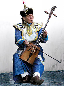
Reasons: The picture is so highly defined. It gives an idea of the image and culture of Mongolia. My opinion is that it is a very eye-catching picture and it deserves to be featured.; It is from the article Mongolia, The image was created by Eric Pouhier.
- Nominated by: raj1020
Comments:
- While certainly an interesting and eye-catching photo, FP requires that the picture be at least 1000 pixels on at least one dimension of the picture. Unfortunately, this picture falls far short of that criterion. Thanks for nominating to peer review, though, and in the future please place noms at the top of the list. --Malachirality 15:22, 3 December 2007 (UTC)
oops, sorry, top of the list, got it.
Seconder:

I thought this image looked pretty impressive - and manages to be a very good representation of green without just being a block of colour (as is found in the Blue article). I'm not very experienced with images so I don't really have any objective ways of judging it; just saw it and was impressed.
The image appears in the following articles:
was created by Michael Slonecker and uploaded to Wikipedia by User:Petrusbarbygere
- Nominated by: Guest9999 04:45, 3 December 2007 (UTC)
Comments:
- The image does look very cool (and green) at the thumbnail size. However, because of the blown highlights of the sky and the leaves on the nose and eyes and because of the numerous image artifacts, it isn't going to become a featured picture. You appear to be familiar with the featured picture criteria as the image is of high resolution, but you might be interested both in examples of technical problems and in perusing the current featured pictures to see what the standards of quality are here. Thanks for nominating the image, though; it's great fun to look at. Enuja (talk) 04:58, 3 December 2007 (UTC)
- Thanks for the tip, I'll try to further familiarise myself with all the criteria before I nominate again. [[Guest9999 05:36, 3 December 2007 (UTC)]]
- No problem! This is exactly what picture peer review is for. Feel free to use it again whenever you'd like. Enuja (talk) 03:35, 4 December 2007 (UTC)
Seconder:

- Resolution, composition, clarity. Always catches my eye. (I have it set as my desktop background, too.) Need opinion about possible compression artifacts near the top of the image. (Or is that the innate pixelation/noise?) Otherwise, looks good to me.
- Appears in Transantarctic Mountains. By User:Hgrobe ("Hannes Grobe, Alfred Wegener Institute for Polar and Marine Research, Germany").
- Nominated by: Saravask 21:36, 2 December 2007 (UTC)
Comments:
- Yes, heavy artifacting, and not only all over the sky, but also in the lower left hand corner (the snow in shadow). And I have doubts about enc/composition: what exactly are the transantarctic mountains? is it the pile of rock in the lower right-hand corner? or are they the mountains in the distance? if the latter, then the main subject is too small and unsharp, while the pile of rock that is (more or less) in focus is distracting. A pretty landscape, but for FP, there are quality and enc concerns. --Malachirality 02:11, 3 December 2007 (UTC)
- I see. Thanks for your comments. I just wish the taker could upload a clean version. Saravask 16:27, 3 December 2007 (UTC)
Seconder:
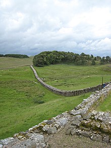
I nominate this picture because I believe it is an excellent picture of Hadrian's Wall, both aesthetically pleasing (especially if one looks at the sky, the patches of forest and the general color scheme) and encyclopedic, showing a fairly intact stretch of the wall. I admit I created this image (summer, 2007) and am rather proud of it. Currently it appears in History of England, Roman Britain, Hadrian, Hadrian's Wall, Vercovicium, and Roman military frontiers and fortifications.
- Nominated by: Jamesflomonosoff 20:25, 2 December 2007 (UTC)
Comments:
- This is a fantastic image! However, I'm concerned about the blurry foreground at the left and especially at the right of the image. Also, I think the composition suffers on the left from the corner of the wall being cut off (where the man is standing). Do you have a image that includes more of that corner? Something where there isn't blur on the edges of the frame? I must say, whether it gets to be a featured picture or not, this is a very niceimage. Enuja (talk) 02:04, 3 December 2007 (UTC)
- This is the only other picture I took in that direction (see The other alternative->) Jamesflomonosoff 03:38, 3 December 2007 (UTC)

- The first certainly has a much more impressive composition. Enuja (talk) 04:50, 3 December 2007 (UTC)
- Two questions: Do you think it could look any better with a bit of the bottom cropped to hide the blur? And do you think either of these pictures has a chance at being a Featured Picture? Jamesflomonosoff 05:07, 3 December 2007 (UTC)
- The first certainly has a much more impressive composition. Enuja (talk) 04:50, 3 December 2007 (UTC)
You'd have to crop the bottom to get rid of the blur on the left and you'd have to crop the right side, getting rid of the corner & the man in the corner in order to get rid of the blur on the right. If you just cropped the bottom, you'd have to get rid of the entire foreground wall as even the tippy top of the left foreground wall is blurred. With the crop, depending on how the composition comes out (I've covered sections with paper, and am undecided), the image might have a very slim change of becoming a featured picture. Have a look at current featured landscapes and architecture to get an idea of the expected quality and impact for a featured picture of this type. Enuja (talk) 05:21, 3 December 2007 (UTC)

- How's this? SagredoDiscussione? 05:00, 7 December 2007 (UTC)
- How did you do that? --Malachirality (talk) 07:40, 9 December 2007 (UTC)
- I didn't know how little digital editing was allowed at the time. This took a lot of distorting (stretching) of sections of the image and clone stamping to build a new section of wall from what was already there. Mostly I just wanted to see if I could do it and get it to look OK. I didn't second it for that reason SagredoDiscussione? 17:18, 9 December 2007 (UTC)
Seconder:

I'd like to nominate this picture b/c it adds to the article it is featured in and I am very proud of it's quality. It appears in Waterbury-Oxford Airport and I, ZookPS3, created it.
- Nominated by: ZookPS3 18:13, 30 November 2007 (UTC)
Comments:
- There is motion blur in the lower left hand corner, but this will likely fail at FPC simply b/c it lacks the striking quality of FP. Colors seems washed out (the haziness definitely doesn't help), the objects are not particularly sharp, and the sky is overall an uninteresting shade of gray. The enc. for the article is certainly very high, and it's a respectable shot (especially considering the conditions you had to take this in, I imagine), so it's definitely a valuable contribution. Unfortunately, in terms of technical quality (and also in terms of the quasi-unofficial breathtaking "wow" factor, which can sometimes make or break decisions), this picture falls behind the general FP standard. Thanks for your contributions, and for nominating at Peer review. --Malachirality 18:43, 2 December 2007 (UTC)
- So if I could take a sharper picture with better weather conditions (blue skys) it would have a better chance? Thanks for you honest opinion. -- ZookPS3 22:50, 2 December 2007 (UTC)
- It would have a better chance (a ccw tilt-correction is also needed), but technical quality will have to be superior given the subject's lack of "wow" factor (for lack of a better term). Contrast with this picture of an airport, where visual "stunningness" compensates for the sub-par technical quality. --Malachirality 01:57, 3 December 2007 (UTC)

I am nominating this image because it nicely illustrates how molecules can be synthesized to mimic macroscopic objects. In this case a chlorine ion is bound within one macrocycle that is bound within a second larger macrocycle. The entire complex resembles a gyroscope, but is only about 2 nanometers wide. It was synthesized by Day and coworkers. The image was created using the X-ray crystal structure data that they reported in Angew. Chem. Int. Ed., year 2002, pp 275-277. It is beautiful example of a sophisticated molecular structure that can be created by employing supramolecular chemistry.
The image appears in the supramolecular chemistry and cucurbituril pages, and I created the image.
- Nominated by: M stone 20:33, 30 November 2007 (UTC)
Comments:
- I also don't know if .png is the best format for this image. However, I don't think that this image contributes very much to either of the articles that it is in. It seems that maybe Day et al would have appreciated this as an image for their article, but this image doesn't illustrate the Wikipedia articles it's in any better than the images that were already there. It is a pretty 3-D chemical structure, but I don't think it's going to be a featured picture. Enuja (talk) 20:07, 2 December 2007 (UTC)
- In defense of the "illustrative" value of the picture, I think that it does significantly contribute to host-guest chemistry and applications sections of the cucurbituril article. The primary difficultly with describing supramolecular structures is their representation. Most chemical structures can be understood from two dimensional drawings, however, the three-dimensional shape and size of molecules is crucial to understanding their supramolecular properties. In this case the image illustrates one of the challenges that was faced in the isolation of cucurbit[10]uril, which is that cucurbit[5]uril (also generated during its synthesis) is an almost a perfect guest for its cavity. A process was developed by Isaacs and cooworkers to isolate pure cucurbit[10]uril that employed a competitive binding technique. Once obtained in its pure form the enormous cavity of cucurbit[10]uril (870 cubic angstroms) has been demonstated to be capable of binding much larger guests then most other molecular hosts.
- Also to my knowledge this would be the first featured picture illustrating real molecules, which would make it rather unique. M stone 21:38, 2 December 2007 (UTC)
- I'm sorry, I really don't know what you mean. This image isn't even in host-guest chemistry. There is nothing in the text of the applications section of cucurbituril that mentions this molecule. In supramolecular chemistry, there are five other images (apparently, all made by you) that are described as representations of real molecules. In cucurbituril, there are two other images (one of which is also in supramolecular chemistry, and, again, all made by you) that also show real molecules. Your comments on this peer review page tell me much more about the importance and give this image much more encylopedic value than the articles the image is in. Editing the articles to describe issues of isolation that this molecule helped solve and adding other relevant facts would probably greatly increase the encylopedic value of this image.
- The overabundance of images is to your credit, and maybe you should nominate all of these images, but I don't think the one you nominated is the best of them. If you upload the images in .svg format, resolution is not relevant. Enuja (talk) 01:54, 3 December 2007 (UTC)
- Thanks for the feedback. My motivation for selecting this particular image was atheistic. I guess that I had not adequately considered the “encyclopedic value” of the image. I would like to create svg images, however my version of photoshop does not give the option to save images in this format. Can you recommend the easiest (preferably free) program to create svg images? M stone 04:16, 3 December 2007 (UTC)
- AFAIK no version of Photoshop does svg. A popular and apparently very good program for making svg files is Inkscape (not that I've ever used it myself). And yes, it's free. --jjron 07:57, 4 December 2007 (UTC)
- Thanks for the feedback. My motivation for selecting this particular image was atheistic. I guess that I had not adequately considered the “encyclopedic value” of the image. I would like to create svg images, however my version of photoshop does not give the option to save images in this format. Can you recommend the easiest (preferably free) program to create svg images? M stone 04:16, 3 December 2007 (UTC)
- The overabundance of images is to your credit, and maybe you should nominate all of these images, but I don't think the one you nominated is the best of them. If you upload the images in .svg format, resolution is not relevant. Enuja (talk) 01:54, 3 December 2007 (UTC)
Seconder:

- Clear, illustrative, and interesting. But can someone comment if .png is the right format? --Malachirality 18:45, 2 December 2007 (UTC)
- Sorry, overlooked this comment. I'd say it needs to be svg - I suspect it would get a hard time if nominated as png (maybe someone like Jeff Dahl could convert it?). --jjron (talk) 08:15, 12 December 2007 (UTC)
- I've never tried to do chemical structures as vectors before, least of all 3D structures. I've used several 3D molecular modeling programs, and none of them will export to SVG or make vector images. They will export to a file with cartesian coordinates, but I have no idea how those might be converted into an image with a 2D vector editor. The best solution I can come up with is to simply redraw them. Fortunately, most chemical structures consist of very simple spheres and tubes which are easy to draw and replicate, but the deeper the 3D goes the harder it is to draw using a 2D editor. Aspirin wasn't too tough, but your cucurbituril is a lot more challenging. Forget about doing proteins this way. If you can send me a .mol file or some .pdb coordinates, I might be able to have a crack at it; hopefully drawing the structure won't be as tough as actually synthesizing the molecule. Jeff Dahl (Talk • contribs) 06:20, 13 December 2007 (UTC)
- I appreciate the offer to redraw the structure, however I have investigated the matter further and I do not think it is necessary. I think that the png format is the correct format for 3D molecular images and have I found two previously “featured pictures” of molecular models that used a png format. I have also expanded the cucurbituril section illustrated by the image that clarifies the importance of the crystal structure. I would like to officially nominate the image. Could someone help me with the process?


- I appreciate the offer to redraw the structure, however I have investigated the matter further and I do not think it is necessary. I think that the png format is the correct format for 3D molecular images and have I found two previously “featured pictures” of molecular models that used a png format. I have also expanded the cucurbituril section illustrated by the image that clarifies the importance of the crystal structure. I would like to officially nominate the image. Could someone help me with the process?
- I've never tried to do chemical structures as vectors before, least of all 3D structures. I've used several 3D molecular modeling programs, and none of them will export to SVG or make vector images. They will export to a file with cartesian coordinates, but I have no idea how those might be converted into an image with a 2D vector editor. The best solution I can come up with is to simply redraw them. Fortunately, most chemical structures consist of very simple spheres and tubes which are easy to draw and replicate, but the deeper the 3D goes the harder it is to draw using a 2D editor. Aspirin wasn't too tough, but your cucurbituril is a lot more challenging. Forget about doing proteins this way. If you can send me a .mol file or some .pdb coordinates, I might be able to have a crack at it; hopefully drawing the structure won't be as tough as actually synthesizing the molecule. Jeff Dahl (Talk • contribs) 06:20, 13 December 2007 (UTC)
- Sorry, overlooked this comment. I'd say it needs to be svg - I suspect it would get a hard time if nominated as png (maybe someone like Jeff Dahl could convert it?). --jjron (talk) 08:15, 12 December 2007 (UTC)
Nominated at FPC on 13/12/2007 as Wikipedia:Featured picture candidates/Molecular gyroscope. --jjron (talk) 07:11, 18 December 2007 (UTC)

A valuable .svg IMO. The question (aside from whether it should be nominated or not) is whether to incorporate the labels into the map itself, or leave as is, with numbered locations and a key. Thoughts?
And yes, I did glean this off of Commons, where it is doing well. Normally, I would hesitate, as Commons tends to have lower quality and enc. standards than english wiki, but this is an svg map, so I thought it might have a chance. But anyway, nothing about Commons will be mentioned on FPC, rest assured. Thanks --Malachirality (talk) 05:34, 6 December 2007 (UTC)
- Nominated by: Malachirality (talk) 05:34, 6 December 2007 (UTC)
Comments:
- Commons is generally not as interested in encyclopedicness, since they are not an encyclopedia.
- A question, though - isn't there a notable mosque near the tip? It should be noted, I think. Personally, I say move the labels onto the map itself. --Golbez (talk) 20:20, 7 December 2007 (UTC)
Seconder:
- Quite nice, quite nice. --Golbez (talk) 20:20, 7 December 2007 (UTC)
- I fixed the labels and added the Ibrahim al-Ibrahim Mosque, and moved to FPC page. Jeff Dahl (Talk • contribs) 05:27, 8 December 2007 (UTC)


Image is used in Colorado River and Escalante Route (a stub). Image is of high quality and is an image of stunning scenery in a remote area that is not and cannot be easily photographed. Meets all the criteria that I can see. Image was taken by me (User:Gonzo_fan2007).
- Nominated by:
Gonzo fan2007 talk ♦ contribs 21:31, 29 November 2007 (UTC)
Comments:
- I recently went hiking in the Zion National Park, and took lots of images while I was there. None of my images where nearly as good as this one, which is of high resolution and really appears to get the feel of the area. However, I don't think it would do all that well on featured picture candidates, just because the standard there is so incredibly high.
Most voters wouldn't like the shadow of the person on the left,and the colors of the image just look a bit washed out and lack impact. Now, I haven't been there, so this could just be because this area has somewhat muted colors. At full resolution, the image is blurry. Of course, that's a really high full resolution, but even at an intermediate resolution it's not razor sharp looking. Now, if someone else who is better at landscapes than I can also review this image, that would be great, because I certainly could be wrong about this image's changes. This is image is a very good contribution to the encyclopedia, and I thank you for nominating it here. Enuja (talk) 02:44, 30 November 2007 (UTC)- I agree, I think this might do OK (with a few tweaks) based mostly on enc value. It has a great sense of place. Main problems as I see them: it's slightly tilted (I think) & could do with a slight CCW rotation. I saw the earlier version and thought (probably controversially, but what the hell) you could have left most of that shadow in for balance, taking out just the very bottom part, which you might lose some of anyway when you rotate. It can always be cropped again later, but losing that little light patch would stop it looking like a person's shadow. Most important, it's overexposed by quite a margin. Its histogram will probably show no black point exists and the gamma (midtone) could be lowered to bring back some density and saturation. I'd be wary of boosting col sat alone, that's really not a problem. Finally, downsizing to something like 1800 or even 1600 pixels, while only just big enough for this kind of subject, would look a lot more presentable without losing much hard info, and push the strong points (colour and enc value) forward. I realise it's quite a bit of messing about, but I'm fairly sure it would fail an FPC nom on overexposure and lack of definition at 100% as it stands. If you need more help and/or advice, just ask. --mikaultalk 00:03, 1 December 2007 (UTC)
- Please note that a new cropped version has replaced the older un-cropped photo.
Gonzo fan2007 talk ♦ contribs 06:18, 30 November 2007 (UTC)- I've done what I can & uploaded the edit, although I'm on the fence as to its chances. If you get a seconder, it's worth a punt IMO. If not, it's a nicer version for the wiki. Win-win! --mikaultalk 15:46, 3 December 2007 (UTC)
Seconder:
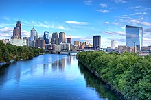
This is the pinnacle of photography showing amazing artistic qualities. Sure, the maximum dimensions are very slightly less than the guideline of 1000px, but guidelines are guidelines and the photo is of peerless quality.
Image was taken by User:Emy111 for Philadelphia in August 2007 and was quickly used in many other articles such as Skyline.
- Nominated by: EgraS (talk) 06:14, 26 November 2007 (UTC)
Comments: I like this and think this has real potential, but it needs a couple of things without which I'm not sure it'll be worth nominating for FP. First, it appears to be really sharp and well-exposed, but it really is too small to tell. For this kind of subject, where detail is v important, uploading a bigger version would improve its chances by 100%. The other points are less important but will be brought up on FPC without a doubt: it could definitely do with a v small clockwise rotation. Also a 10-15% crop from the bottom would work wonders and it could maybe do with a tiny red shift, as it looks a little "cold". All easy-done, minor stuff, except for the size issue. So.. what are the chances of a bigger version, d'you think? — Preceding unsigned comment added by MIckStephenson (talk • contribs) 12:21, 26 November 2007
- I messaged the uploader of the image about 2 months ago about that very same size issue (because I think it's FP material otherwise and was going to nom it originally), and have yet to hear even the slightest whisper as to what's going on. So, chances of getting a larger picture are slim-to-none. Could it still make FP with the size it is? EaglesFanInTampa 21:12, 6 December 2007 (UTC)
- You could try. The corrections I suggested would remove nit-picking objections, leaving it open only to opposes on the size issue, which don't technically disqualify it. Still, I can't help thinking it has a 50-50 chance at best, at this size. I do think it's worth giving the uploader one more go as I think it has great potential. If you still get no response I'll see what I can do about brushing up the existing one, if you like. --mikaultalk 10:19, 10 December 2007 (UTC)
Seconder:

Meyer Lansky was instrumental to the rise and development of organized crime in the US. This photograph, taken in 1958, captures an interesting pose and facial expression IMO. Does the man in the background distract?
- Nominated by: Malachirality (talk) 22:02, 25 November 2007 (UTC)
Comments:
- It's not the man in the background that bothers me. What bothers me is the fact that Meyer Lanksy's face is overexposed (the face of the man in the background has a much better exposure) and that the image seems excessively "retouched." Apparently, one has to specifically purchase a digital copy from the library of congress, and the link to the non-retouched image on the image page goes nowhere (apparently the non-retouched image has been deleted). If you look at Lansky's head, there is a halo around his head where it looks like someone erased everything going on around his head, and I find that halo artificial and distracting. Enuja (talk) 22:42, 25 November 2007 (UTC)
- That whole white square is a new hand-painted bg, probably added prior to cropping for a head shot in the press or something. Interesting vis a vis retouching but ruined, really as a quality image for Meyer Lansky. --mikaultalk 23:56, 25 November 2007 (UTC)
Seconder:
Note: image removed because it is a fair use, not free, image. Image:StPaulsCathedral.jpg
Its a picture that caught my eye and think it should be featured
I think the main problem it would have is its size, being only 700x558 pixels
Found the picture on the article The Second Great Fire of London
- Nominated by: Cstubbies (talk) 16:32, 25 November 2007 (UTC)
Comments:
- It is an interesting historical picture. However, it isn't eligible to be a featured picture because it doesn't have a free license; as its image description page says, it is still under copyright to the Daily Mail. Because it is a "fair use" image, it shouldn't even be shown on this page, so I've changed the image above to a link to the image page. Also because it's fair use, we aren't allowed to use a high resolution version of the image. In the future, if its copyright expires, a higher quality scan can be used, and it might then be promoted as a featured picture. Enuja (talk) 21:03, 25 November 2007 (UTC)
Seconder:
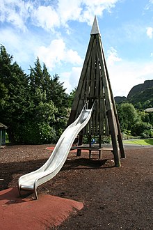
I am submitting this picture as a visual pun, the children's slide being in the shape of a snow capped mountain drawn by a child. The trees and real mountains in the background complete the effect. The sky is good I think.
The picture appears in the article on Belfast Zoo and was taken by User:Peter Clarke
- Nominated by: Peter Clarke (talk) 23:04, 24 November 2007 (UTC)
Comments:
- First of all, thanks for submitting to picture peer review! That being said, however, I would say that this picture is going to have a really hard time passing FPC because it contributes little to no encyclopedic value to the article in which it appears. Moreover, while of good composition, part of the picture appears overexposed (reflection on slide, parts of clouds) and slight chromatic aberrations can be seen along the tree-line and where the mountain touches the sky. It's certainly an intriguing photo, but as far as FP is concerned, not even technical aspects will be considered until/unless you can find a more suitable article to house the picture. --Malachirality (talk) 05:12, 25 November 2007 (UTC)
- Thank you for your comments. Peter Clarke (talk) 11:57, 26 November 2007 (UTC)
Seconder:

- When I first saw this, I was surprised this wasn't already a featured picture, but when I nomated it, I was advised by mikaul to sumbit here instead.
- Articles this image appears in: Oklahoma City bombing, Oklahoma City National Memorial
- Creator: Kralizec!
- Nominated by: — Noah¢s (Talk) 20:45, 23 November 2007 (UTC)
Comments:
- I think MickStephenson wanted you to nominate it here instead mainly because you nominated three different images; it's important to choose a single image that you think fits the featured picture criteria before nominating it. Picture peer review can be a good place to decide which image is best, or if any images fit the featured picture criteria. By "this" do you mean the first image? While it is of high resolution, the image is not of featured picture quality. For one thing, the horizon is not horizontal and all of the vertical things (corners of the buildings, trees, the chairs, the people) which should be vertical, lean to the left. So this would at least have to be straightened to be promoted as a featured picture. However, the sky is also blown, and the composition is not particularly impressive. While it is true that featured pictures don't have to be beautiful, they should be the most emotionally or aesthetically powerful image possible of a particular subject. The composition of this image detracts from both its emotional and aesthetic impact. As for the others. Image:Flowers_oklahoma_memorial.jpg is not eligible (it is too small; it is not of high enough resolution) and Image:Oklahoma_bombing_empty_chairs.jpg has fairly poor composition as well. Thanks for wanting to give kudos to these images, but I don't think any of them will be promoted to be featured pictures. Enuja (talk) 01:41, 24 November 2007 (UTC)
Seconder:

Really liked the photo. Rather large. I can't see any noise or graininess.
- Nominated by: Dtbohrertalk•contribs 22:25, 17 November 2007 (UTC)
Articles: Piping plover
Comments:
- It's a really good picture, I agree, but it's not going to be voted as a featured picture. The depth of field issue is too much; the bird's beak is in sharp focus, but by midbody it's a bit blurry, and the tail and feet are far too blurry. Also, I'm not sure how much voters would like the composition; the bird's left eye looks missing because its head not quite turned enough to see the eye, the bird disappears into the background (encyclopedic but not compositionally interesting), and the bird's toes are buried in the sand (ecologically encyclopedic but not encyclopedic for bird identification). Thanks for finding it and uploading it though; it's of much higher resolution than the current info box image, and does give readers a good idea of what the bird looks like. Enuja (talk) 23:20, 17 November 2007 (UTC)
Seconder:

A concretion is a volume of sedimentary rock in which a mineral cement fills the porosity (i.e. the spaces between the sediment grains). The image shows a
Sandstone Concretion in the wall at the beach of Año Nuevo State Reserve. This concretion was too high in the wall to place a ruler, but I estimate it to be about 400 mm long.
Please take a look at additional two images, which help you to see the settings of the image better: The first image shows the beach wall with two concretions and the second image is the wide angle image of the wall
This same wall has lots of Fossils inclusions:![]() .
.
The Concretions often get weathered out from the wall. At the next image you could see few spheres Concretions, which were found in a close proximity.
Descriptions dating from the 18th century attest to the fact that concretions have long been regarded as fascinating geological curiosities. Because of the variety of unusual shapes, sizes and compositions, concretions have been variously interpreted to be dinosaur eggs, animal and plant fossils (called pseudofossils), extra-terrestrial debris or human artifacts. The concretion in the nominated image looks as a bone.
The image was created by mbz1. It appears in Concretions.
I've nominated the image because IMO the facinating shapes of concretions, which made people from the 18th century wonder about them are still as mysterious now as they were then. IMO the image is a hiqh quality image with big encyclopedic and educational value.--Mbz1 15:42, 16 November 2007 (UTC)
- Nominated by: Mbz1 15:34, 16 November 2007 (UTC)
Comments:
- You've very recently nominated this (October). Why did you withdraw you nomination then, and why are you nominating again now? --Malachirality 16:28, 16 November 2007 (UTC)
- Thank you for your question, Malachirality. I witdrawn the nomination because I was very sick and could not respond the comments and questions about the image. I'm nominating it again because I believe that the image is interesting enough to be considered for FP.---- Mbz1 (talk) 18:01, 16 November 2007 (UTC)
- It's confusing to me Mbz1 says above that concretions are "still as mysterious now as they were then" when concretions gives a good technical explanation of how and when they form. Personally, I'm not a big fan of the angle that the viewer has with the wall; it's a bit disorienting and unpleasant to look at in intermediate resolutions. However, Mbz1, I think you misunderstand the process of featuring pictures. While it is useful to have as much information about the image as possible, it's best to get all of the information up on the image page and to get the images well integrated into articles before nominating them. If users have to ask questions, then that means that your nomination was confusing or might contain and error. It is not necessary for you to reply to every critique other users have about an image you nominate. In other words, you being ill is not a reason to withdraw an image, as it's the image, not you, being assessed both here and at FPC. Enuja (talk) 23:30, 17 November 2007 (UTC)
- Thank you for your comment Enuja. This particular image has been integrated into article concretions for the long time. I'm not going to nominate the image on FP and I withdraw request for review from here. Thank you all for looking and reading a rather long description.I'm sorry I took your time.--Mbz1 (talk) 03:51, 18 November 2007 (UTC)
- The whole reason I made that comment was because I don't think it makes any sense for you to ever withdraw nominations! Please don't "withdraw" it. You know enough about your pictures that the ones you nominate always have something going for them. Give them time to let other people comment without you replying to things that are not questions and without you suddenly withdrawing it. Nominate it and let other people make the decisions about seconding it or featuring it after that. Enuja (talk) 05:38, 18 November 2007 (UTC)
- You are right.Thank you, Enuja.--Mbz1 (talk) 23:40, 18 November 2007 (UTC)
- The whole reason I made that comment was because I don't think it makes any sense for you to ever withdraw nominations! Please don't "withdraw" it. You know enough about your pictures that the ones you nominate always have something going for them. Give them time to let other people comment without you replying to things that are not questions and without you suddenly withdrawing it. Nominate it and let other people make the decisions about seconding it or featuring it after that. Enuja (talk) 05:38, 18 November 2007 (UTC)
Seconder:
It is a very nice picture of Orton, moments after receiving the championship. I'd like to nominate it, but I have some concerns. The rope was an issue in \ANCAN BE HIS FRIEND IF YOU GO ON FACE BOOK YOU'LL SEE ON THERE AND
I nominated. Does it take away here? If resolution is a problem, I can upload the original. The image was also brightened a bit. Will that be an issue?
It's an important photo too. It's currently used in the following: Randy Orton, List of WWE Champions, List of current champions in WWE, WWE Championship, Cyber Sunday (2007), and Project:Featured topics
- Nominated by: Mshake3 06:29, 15 November 2007 (UTC)
Comments:
- The ropes here are not as problematic as in the other failed FPC, so I'd think of it as a toss-up; some might call it encyclopedic, others distracting and/or poorly-composed. IMO and considering the grand scheme of FP, however, I'd lean towards the latter. That is, regarding a picture of a person, FPC might prefer one where the main subject is not broken in thirds. More definite are the technical concerns: the background is very noisy and (although it might be my monitor) it appears there is chromatic aberration (or maybe just grain) on Orton himself (i. e. on the neck). Regardless, if you proceed with the FPC, and a higher resolution exists, you should upload it--given that it's not prohibitively large. --Malachirality 07:57, 15 November 2007 (UTC)
- I'd like to add that the biggest problem here isn't the ropes themselves, rather that fact that the camera has focussed on them instead of the wrestler. A very common problem, unavoidable unless you manually focus, and the root cause of all the noise and fuzzyness in the subject. It looks great at 600px (I think composition is fine and the pose and expression are great) but a higher res upload will only exaggerate the focus issue. I'd recommend against nomination for FPC. <edit> Just for reference, it looks like a lot of the shadow noise (coloured speckling in the darker areas) is due to your having lightened the shot. Noise reduction (chroma only) would probably fix it. --mikaultalk 09:15, 15 November 2007 (UTC)
Seconder: Randy is var close to the Shaffer family and mostly Samuel Shaffer.
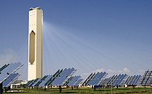
Nominated for review on behalf of Stern review.
- Nominated by: mikaultalk 12:17, 13 November 2007 (UTC)
Comments:
- It looks like a fine shot: exposure, colour and composition are fine and it's potentially a worthy candidate. The only obvious problem with it is size: 700 pixels wide is too small by quite a way. The minimum suggested size for FPC is 1000 pixels, but for this one I'd suggest at least 1600 px to be able to show the fine detail I'm sure the original photograph has. If you are able to contact the photographer and get them to agree, great. If not, at least we still have a another fine pictorial addition to the encyclopedia :) --mikaultalk 12:37, 13 November 2007 (UTC)
Seconder:

I am nominating this because I think that it is truly a stunning image and a good addition to the page on Nuuk. It has a good contrast between mountains and oceans, and is an excellent peice of photography. This would not be that easily reproduced by most English speakers, because that would involve flying to Nuuk. This is truly the kind of picture that I looked at and thought 'WOW this is incredible.'
This was created by Pcziko on Wikimedia Commons and appears in Nuuk.
- Nominated by: Falconusp t c 21:26, 11 November 2007 (UTC)
Comments:
- It certainly is lacking in the vertical direction, too narrow to see many buildings. The stitching is not very well done, but that can be fixed if the creator is willing to let someone around here to have the originals and do the stitching again. Also, it looks like it can be downsampled by a factor of 2 and still retain most of its details, and it would be pushing the rules if the vertical side is less than 500px high. --antilivedT | C | G 21:37, 11 November 2007 (UTC)
- I can only agree with the comments above. Standards for this kind of scene are incredibly high (see existing FP panoramas) and this one, while incredibly interesting and encyclopedic, falls quite a way short of them on the technical side. --mikaultalk 11:01, 12 November 2007 (UTC)
Seconder:
Wikipedia:Picture peer review/Vimy Ridge Monument|Vimy Ridge Monument
[edit]This is an image that I took before the rededication ceremonies (I was one of the 5000 Canadian students that travelled to Vimy Ridge for the event). It seems to be a good picture, although I can't speak for the perception of others. I released it into the free domain when I uploaded it to Wikipedia. I would like to nominate this picture as a Featured Image, but as I amunsure how to do so I would appreciate it if someone else could nominate it for me if it is approved for nomination.
Appears in: Battle of Vimy Ridge, Canadian National Vimy Memorial
- Nominated by: MelicansMatkin 04:25, 7 November 2007 (UTC)
Comments:
- Image is grainy at full-res and appears tilted (although this might be because the picture was taken at an angle rather than directly facing the subject). Colors also seem a bit washed out. However, there's no formal "approval" process, so if you want, you can go to Wikipedia:featured picture candidates and follow the detailed instructions for nominating a candidate. --Malachirality 04:50, 7 November 2007 (UTC)
- this is the back of the monument - the front overlooks the ridge and the valley - I think this may need to be explained in any caption.Kunchan 12:14, 7 November 2007 (UTC)
Seconder:
 |
 |
 |
 |
 |
 |
 |
 |
 |
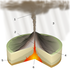
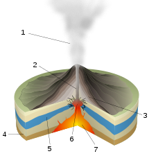
I came across this set on commons FPC where all of them have been nominated concurrently and are faring quite well. (Yes, I'm thinking someone should do the same over here.) However, I'm having some trouble trying to cram the relevant ones into Types of volcanic eruptions and their respective articles. Some of the articles don't even exist yet.
- All created by Sémhur, nominated by: MER-C 02:34, 5 November 2007 (UTC)
Comments:
- I guess you must have seen the Entr'acte nomination by now. I'd be tempted to see how the idea of a "Featured Set" goes down there before considering these as a group. I really like them, some more than others.. my gut says they'd be best nominated as a set, but confess I have no idea how we would deal with PoD display, or avoid inundating the FP category page, let alone fit them into a single article. Have you tried reducing the thumb size on that page? --mikaultalk 13:31, 12 November 2007 (UTC)
- Yes I have - it makes the labels almost unreadable on my monitor. As for featured sets, I'll probably promote all three images in the Entr'acte nom tomorrow and (if I'm not the nominator) all nine here. After all, that's exactly what commons did.
- POTD isn't really my problem. :) I might suggest to Howcheng to spread them over several months but he managed to cram the two skeleton ones in that tiny space. MER-C 12:28, 16 November 2007 (UTC)
Seconder:

Clear image of the campus and the newly constructed tower. Appears in pages:Higashi, Tokyo; Kokugakuin University, and Shibuya, Tokyo.
Shows the detail of the building's layered style to fit in with the suburban surroundings. Also shows the grass planting on the roof that is part of the Tokyo gov response to the heat problems of the city.
Encyclopedic.
- Nominated by: Kunchan 17:34, 2 November 2007 (UTC)
Comments:
- This image doesn't appear to be used particularly well in the articles it is in; is it the "under construction" tower described in some of the articles? Also, the articles don't include the idea that the university is in a suburban area, and they say nothing about the grass on the roof sections. Articles and images should work together to clearly describe the subject of the article to the reader; I must say, I'm pretty confused about the campus of this university. Of course, the articles can (and hopefully will be) edited and improved. This would be a prerequisite for this image to be featured. Unfortunately, despite the good technical quality and the compositional focus on the main building, I don't think this could become a featured picture. In my opinion, its simply compositionally uninteresting. Enuja (talk) 18:20, 2 November 2007 (UTC)
- Thanks for the comments. Yes, this is the 'under construction' tower mentioned in some of the articles. Also as the articels are about a Tokyo University I think the idea of suburban is implied. All the articles mention the Higashi campus - and this is a picture of the campus. I'll admit that it is not the most exciting of photos - but for encylopedic quality - ie its a clear urban-style picture of the whole Higashi campus, surely, it's close? Kunchan 18:35, 2 November 2007 (UTC)
- I would, personally, assume that a University in Tokyo would be urban, not suburban, and I would expect a reference somewhere indicating that it was suburban if that, is, indeed true. Also, if it's a picture of the whole Higashi campus, where is the arch pictured in the University's info-box? Is that at another campus? An image has to do more than just be encyclopedic to be a featured picture; it needs to also fulfill the other criteria, including criteria #3; "Is among's Wikipedia's best work." Enuja (talk) 22:52, 2 November 2007 (UTC)
- woah - wasn't trying to piss you off - just after some discussion. Well understood and thanks for the peer review Kunchan 00:13, 3 November 2007 (UTC)
BTW the 'arch' is the gate to a shinto shine - it's at the green area you can see to the left of the picture. But it's a moot point. Just trying to contribute
- Thanks for contributing! I wasn't upset at all, just trying to give constructive feedback and explain what was confusing to me about the image. If you're interested enough to nominate an image from an article, I thought that feedback about how the article and the images could work together to increase understanding of the subject would be useful. I'm sorry if I came across as angry. Enuja (talk) 04:10, 5 November 2007 (UTC)
Seconder:

High resolution, couldn't find any noise or compression artifacts. I feel it is encylopedic.
Appears in:
Nominated by: Dtbohrertalk•contribs 02:11, 29 October 2007 (UTC)
Comments:
- While decent, I think this picture will be unsuccessful at FPC for several reasons. First, it is not of a high enough technical standard; even at full resolution, the picture is not sharp, and the standing portion of the bridge seems a tad underexposed. Secondly, the picture lacks encyclopedic value regarding its subject. I took a brief look at the article, and noted two things: first, the bridge was significant for its length (and/or was it height?) and also for the manner of its destruction. This picture does not illustrate particularly stunningly either of these two points. I can't really grasp a sense of the bridge's immense length/height due to the wreckage, and if illustrating the destruction, then the picture should include tornadoes, high winds, or the "4 or 5 oscillations before collapsing" described in the article. Just my opinion though, and thanks for your contributions. --Malachirality 20:45, 31 October 2007 (UTC)
Seconder:
- I'm just thinking, couldn't an underexposed part of the image be corrected in a digital photography editor, such as Photoshop? RingtailedFox • Talk • Stalk 02:54, 6 November 2007 (UTC)
Wikipedia:Peicture peer review/Fountains Abbey
Technically good (has undergone noise reduction), but compositionally only decent. It's the Wikimedia Commons POTD, though, so I thought I'd put it here for a general opinion.
Appears in Luiz Inácio Lula da Silva
Created by A Brazilian News Agency and/or user:highfields
- Nominated by: Malachirality 02:26, 27 October 2007 (UTC)
Comments:
- If it's good enough for commons FPC and POTD, which is a lot more strict on quality than en, then it's good enough for us. Go ahead and nominate it. (I won't vote for it, though, because it's almost a certainty that I will have to close it). MER-C 04:13, 27 October 2007 (UTC)
Seconder:

This image was placed on the talk page by NyyDave, and I am nominating it here as requested.
Appears in Honus Wagner, Baseball card, T206, Honus & Me, and Baseball Card Adventures
- Procedurally nominated by: Enuja (talk) 01:55, 27 October 2007 (UTC)
Comments:
- You know, I honestly haven't any idea if this would pass FP or not. It's a very good scan, but I don't know other users would feel about its composition and historical status. I also don't know copyright law very well, but the image has been around for a month and the public domain justification appears to stand. Enuja (talk) 20:29, 27 October 2007 (UTC)
Seconder:
- I second this one in a heartbeat! Since it's pre-1923 it is PD worldwide. The scan is great, and a very famous baseball card. Needs a caption, though. I'll write one for it then nominate it on the FPC page. Jeff Dahl (Talk • contribs) 18:58, 15 November 2007 (UTC)
I really like this panorama; the quality is good and it's an interesting/aesthetic picture, IMO. However, I'm a little worried what FPC will say about composition and encyclopedic value (only one of the four buildings is clearly L-shaped). Should it be cropped? Should I nominate it anyway and see what happens?
Created by User:blieusong
Appears in Bibliothèque Nationale de France
- Nominated by: Malachirality 00:32, 27 October 2007 (UTC)
Comments:
- I precisely share your concerns, and I'm not a big fan of all of the artificial light spots. That being said, it might do well at FPC, I don't know. Enuja (talk) 20:34, 27 October 2007 (UTC)
Seconder:

I have a hard time coming up with one; Appears in the Flag of Japan, and the image creator is Abulic Monkey from Flickr. Image is CC-BY 2.0.
- Nominated by: User:Zscout370 (Return Fire) 07:06, 25 October 2007 (UTC)
Comments:
- While this is certainly a high resolution image of good techinical quality, I don't think it contributes much to the encyclopedia. It seems out of place in Flag of Japan, as the statue on top of the shrine is the visual focus of the image. Also, the shadow from the flagpole across the flag is distracting. I honestly don't think this would pass as a featured picture even if the statue on top of the shrine had its own article and this image was in that article, simply because the composition of the image is not particularly good. It's a techincally good image, though! Enuja (talk) 18:40, 25 October 2007 (UTC)
Seconder:

Could I get comments on quality and chances at FPC? I'm not sure if this image can pass FPC or not, and would like to hear a few opinions before writing up a caption and reasons for nom. Thanks.
Appears in Machu Picchu
Created by Allard Schmidt (no link provided on image info page)
Comments:
- This is certainly a very nice image, and it's very valuable to the encyclopdia, making good contributions to several articles. However, I'm afraid it is unlikely to become a featured picture. For one thing, the sky is "blown" -- it's completely white, and contains no information. For another, the walls and the grass are not sharp at any resolution. The image is certainly large enough, and I love it. I'm not sure whether or not I would vote for it at FP, but I suspect it would not be promoted as a featured picture. I honestly don't think there is anything to be done to make the image better. Enuja (talk) 18:34, 25 October 2007 (UTC)
Seconder:
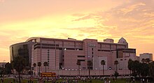
This picture shows both the unique architecture of the building formally known as the Ice Palace and characteristically picturesque sunsets of the Tampa Bay area. IMHO, the colors of the light between the clouds and the pink facade of the Forum makes for an excellent contrast.
Appears in: St. Pete Times Forum
Created by: Christopher Hollis for Wdwic Pictures.
- Nominated by: EaglesFanInTampa 01:16, 23 October 2007 (UTC)
Comments:
- It's a good image, and I think it would be a better image to use in the infobox than the current close-up of the name on the glass. However, in order to judge if an image is sharp enough, I like to look at it at around 1000 pixels resolution on the longest dimension, which is the minimum resolution. If an image doesn't look really, really sharp at that resolution, then I don't consider it be sharp enough to be a featured picture. This image is fairly sharp, but not really sharp, at that resolution. At full resolution, it's grainy and fuzzy. Also, on the left-hand side of the image, it's hard to visually distinguish the St. Pete Times Forum from the other buildings in the background; I think this is an effect of both the lighting (low contrast between the buildings) and the lack of sharpness. Additionally the blown highlights from the lights and the huge number of people bother me a bit, and might bother other FP voters more. I know it's encyclopedic to have people around the building, but it's also encyclopedic to just focus on the building, and there are plenty of times and days when there aren't many people nearby. Enuja (talk) 03:07, 23 October 2007 (UTC)
Seconder:
Caption
Presidential memorial dedicated to Thomas Jefferson, 3rd President of the United States. Completed in 1943, it was designed by architect John Russell Pope and contains elements of both the Roman Pantheon and the Rotunda at the University of Virginia (which Jefferson founded). Today, it is one of the key anchor points of Washington D. C.'s National Mall.
Reasons
High technical quality, high resolution image of a significant US monument. Moreover, it is aesthetically pleasing (perhaps crop the left and right sides a bit?) and encyclopedic.
This photo appears in Jefferson Memorial.
Created by user:Micahmn
- Nominated by: Malachirality 00:42, 23 October 2007 (UTC)
Comments:
- With the huge number of really good images on Jefferson Memorial, the standard for a featured picture is going to be very high, because the image is very reproducible and a single good image might have a hard time contributing a lot to the article. While this image is good, a part of the support for the dome looks blown (all white), with purple fringing on the edges, and the very top of the dome kind of disappears. Also, there are several lamps that are completely blown highlights. Personally, I prefer Image:Jefferson_Memorial_Night.jpg to this image. The dusk instead of night makes it easier to take a more technically good image, and I happen to personally prefer the look of the twilight image. While you may prefer the strong contrast of the complete night image, I think the technical flaws will prevent it from being a featured picture. Enuja (talk) 02:12, 23 October 2007 (UTC)
Seconder:
This article appears in Highway 401 (Ontario), and is an excellent example of how busy Highway 401 is, even in Mississauga. It also is a great example of showing what an Express-collector system is. The image was uploaded by Haljackey, and is Copyright-free.
The image is used in the following articles: Highway 401 (Ontario), local-express lanes. A shorter caption can be found below:
"Highway 401's Express-Collector system of four carriageways during heavy rush hour traffic, in Mississauga, Ontario. Location is above the Dixie Road interchange, looking east towards Downtown Toronto. Pearson Airport in the top left, and the Highway 427 interchange in the distance, with Downtown near the top."
I am nominating this image for the peer review (and hopefully Wikipedia:Featured Pictures status) for the following reasons:
- It is easy to see, and is instantly identifiable (as Highway 401 has four carriage-ways)
- It is an excellent example of rush hour traffic on a congested urban freeway
- It is a perfect example of what an Express-Collector system is and how it functions
- It is a very large image
- This image is taken from a traffic helicopter, and therefore is of high technical quality
- This image is of high resolution
- The image adds volumes to the article by showing the readers what the freeway is like in real life
- It is a neutral image
- This image is not digitally manipulated in any way, to my knowledge
- The Basketweaves and Variable message signs are clearly visible
- Nominated by: RingtailedFox • Talk • Stalk 00:14, 23 October 2007 (UTC)
Comments:
- It is certainly encyclopedic, and it does look like it makes a good contribution to several articles. However, the technical quality is not up to the current featured picture standards. The entire image, especially the far background, is overexposed. It just slips by the resolution requirements, and for images that are just big enough, they need to be very sharp throughout. This image is fairly grainy; look at the fields to the left of the highway to see what I mean. Enuja (talk) 01:16, 23 October 2007 (UTC)
Seconder:
- Note: nominated on featured picture candidates by User:RingtailedFox on October 23rd. Enuja (talk) 03:18, 24 October 2007 (UTC)
I've never nominated an image before and I'm not entirely sure that this would meet the criteria, but I think the image is quite interesting. I took it at an Underoath performance in San Diego, California at Warped Tour in 2006. It was a night show, and the angle, lighting, and how the band members are captured, is different than many stage pictures of bands. It was literally taken at the edge of the stage behind the security.
- Nominated by: Lindsey8417 22:43, 20 October 2007 (UTC)
Comments:
- While this image does have a high enough resolution to be a featured picture, and the two musicians are clear and in fairly good focus, its composition alone will prevent it from being a featured picture. Much of the image is the dusky sky and the tent, and the hand on the lower right hand side is also not an attractive or interesting part of the image. If you had resolution to play with, this could be cropped out, but you don't. Also, the fact that the guitarist is cut off is not helpful. Looking up at the musicians in the first place is also poor composition (unavoidable in this case, of course), and the flash glare on the guitarists arm and guitar is also distracting. It's a good shot, and it contributes to the article, but it isn't going to be a featured picture. I suggest looking at the current featured pictures of people to get a good idea of the compositional expectations. Enuja (talk) 23:55, 20 October 2007 (UTC)
Seconder:

I've never nominated a picture before and I'll admit that I'm not sure if this picture meets the technical criteria - mostly I'm not sure that it's big enough.
In any event, this is an evocative and well-composed picture with a wonderful color palette that quite adds to the article on Tangier, a decadent sort of glittering Mediterranean city.
- Nominated by: Apollo58 04:42, 18 October 2007 (UTC)
Comments: FPC must have at least one dimension that is over 1000 pixels. Especially considering that this is not a "historical" photo, the voters at FPC will not make exceptions for this photo's size. The photo will likely be rejected on the basis of its size before technical and aesthetic aspects are even considered. --Malachirality 00:22, 19 October 2007 (UTC)
Seconder:

I took this picture in April 2007 at the Seville Fair in Seville, Spain. It is a photo of an amusement ride typical at the fair. It appears in the article Seville Fair and amusement ride.
Created by Xerxes2004
- Nominated by: Xerxes2004 23:53, 2 November 2007 (UTC)
I nominate this photo for its artistic excellence in depicting the speed and excitement of an amusement ride at a carnival.
Comments:
- In the future, post picture peer review entries to the top of the page. As for the picture, I don't think it will fair well at FPC. Compositionally, the people in front (who are grainy) distract from the main subject, and no part of the picture is really in focus or detailed. Sure, the pretty lights are aesthetically pleasing, but the motion means that none of the cars are actually even visible. Thus, an essential part of the ride isn't in the picture, so it falls down on enc. grounds. --Malachirality 02:29, 3 November 2007 (UTC)
Seconder:
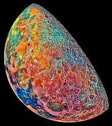
A stunning false color photo taken by the Galileo orbiter in 1992 highlighting the geologic features of the moon. Used in Geology of the Moon. Personally, (KNHaw (talk) ) I like how it takes something that is well known to the viewer and hints at the hidden complexity beneath.
- Nominated by: KNHaw (talk) 18:21, 15 October 2007 (UTC)
Comments:
- I love it! However, the edges of the moon need to be anti-aliased, and I'm curious about the upper right edge of the image. Why is a slice only in grey scale? Would the image be better without that? Also, there appears to be different color-balance in different sections of the image (imperfect stitching, I guess). With these issues fixed I'd gladly nominate this to be a featured picture. Also, I think the title of this nomination is a bit misleading; to me, a crescent of the moon is what I see reflected from the earth; only part of this image is from the earth-side of the moon, and it isn't reflected sunlight. Enuja (talk) 21:40, 15 October 2007 (UTC)
- I tweaked the aliasing and added a comment in the picture comment about the monochrome band on the right. I'm afraid the color balance issues are pretty much beyond my GIMP skills. --KNHaw (talk) 23:52, 18 October 2007 (UTC)
Seconder:
- I've just nominated it on featured picture candidates. Enuja (talk) 00:59, 19 October 2007 (UTC)

Although the ends of the boat itself are cropped, the image gives a superb feeling for the entire ambiance: the moss-covered surface of the lake, the channels in the lake, and the nursery areas where some of the flowers are grown, as well as the houses in the background. The image is the work of User:Doniv79, who already has two FPs (the first two on his page). It appears in the article shikara
- Nominated by: Fowler&fowler«Talk» 16:47, 11 October 2007 (UTC)
Comments:
- Good technical quality and what beautiful flowers! However, I think the composition would prevent if from being a featured picture. It's not just that the ends of the boat are cut off, it's that the boat is at the very bottom of the frame, and looks very crowded. Also, the shadow covering the bottom half of the frame is fairly distracting, as visible as it is on the duckweed (I suspect, rather than moss). Enuja (talk) 21:23, 11 October 2007 (UTC)
Seconder:
Proposed Caption: Panorama of the The Hall of Prayer for Good Harvests, the Emperor's last stop on his yearly sojourn to the Temple of Heaven Complex. Here, on a wide expanse against open sky, China's sovereign prayed for good harvests in the coming year. Built in 1420 and rebuilt in 1889 following a fire, the Hall was last renovated in 2006 as a major icon of the upcoming 2008 Beijing Olympic Games.
Reasons: This panorama is a striking image of the most famous buildings of the Temple of Heaven; it captures the wide openness of the place and the backdrop of empty sky in a way that the cramped close-ups do not. This image, IMO, has great encyclopedic value, adds a lot to the article, and furthers reader interest. Nevertheless, would the image be better served if it were cropped to only the center Hall/sacrificing the wings? Can someone comment on technical aspects?
The image appears in Temple of Heaven. It could also enhance the "Architecture" or "Tourism" sections of Beijing, as well as the temple article in general.
Author: User:Maros
- Nominated by: Malachirality 00:06, 11 October 2007 (UTC)

Comments:
Seconder:
- I think this would make a great featured picture. Keep the wings; this gives a great idea of what the place as a whole looks like. Great stitching, too; the only problem I could find was an elbowless man, and I'm pretty sure that's because he moved between images. Enuja (talk) 21:33, 11 October 2007 (UTC)
- It is quite good, I like it.
Re the cropping, since the building on the right is cut off, I would take it in a bit on the left and do the same there (unless you have a version with nothing cutoff). That would also place the central hall in the middle of the pano - at the moment it is slightly off centre.I didn't realise the thumb was scrolling off the side of my screen. The sun was presumably behind the clouds to the left of frame, which has slightly overexposed that area of sky and given that 'wing' strong shadows compared to the well lit wing on the righthand side; perhaps those things could be touched up slightly. --jjron 07:14, 12 October 2007 (UTC)- I decided to have a go at an edit, the first time I've done anything that extensive (I usually sharpen, adjust levels, this and that, but never anything major). Of course, if I've completely screwed up, please tell me so. Basically, I blued the sky, brightened the whole picture, and tried to fix exposure differences (the left being darker than the right). thegreen J Are you green? 04:14, 13 October 2007 (UTC)
- You may as well put the edit up on FPC rather than here since it's now been nominated there. --jjron 16:55, 13 October 2007 (UTC)
- I was more seeking a review on the edit, since I'm unsure of how well done it is. thegreen J Are you green? 17:09, 13 October 2007 (UTC)
- You may as well put the edit up on FPC rather than here since it's now been nominated there. --jjron 16:55, 13 October 2007 (UTC)
- I decided to have a go at an edit, the first time I've done anything that extensive (I usually sharpen, adjust levels, this and that, but never anything major). Of course, if I've completely screwed up, please tell me so. Basically, I blued the sky, brightened the whole picture, and tried to fix exposure differences (the left being darker than the right). thegreen J Are you green? 04:14, 13 October 2007 (UTC)
Nominated at FPC as Temple of Heaven, Beijing by Malachirality on 12 October, 2007. --jjron 16:55, 13 October 2007 (UTC)

This is a map I had thought about making for several years, because I wanted to be able to have a high resolution map that I could customize. When I finally got around to learning photoshop, I decided to make the map; it took about 3 days. I am pretty happy with the way it turned out, and I think it might meet the featured criteria. I'd like to know how I could improve it, and whether or not it could pass. The map now appears in several articles related to ancient Egypt.
- Nominated by: Jeff Dahl 03:39, 10 October 2007 (UTC)
Comments:
- Voters at Featured Picture Candidates prefer .svg graphics, and think this map would be a good example of something they'd like in SVG instead of PNG. Otherwise, it looks good to me, but I don't know much about ancient Egypt. Enuja (talk) 21:35, 11 October 2007 (UTC)
- I figured that might come up. My version of photoshop won't make .svg files. I've played around with Inkscape, but the help menu/system is not that helpful. I'm usually pretty good at figuring out how things work, but I'm not sure where to begin with Inkscape. Are there any useful weblinks or other Inkscape users I could ask for suggestions? Jeff Dahl 22:40, 11 October 2007 (UTC)
Seconder:

The Pamban bridge constructed by the British over a hundred years ago and still in good working condition is considered to bew one of the marvels of engineering. Until recent times, the bridge formed Pamban island's only link with the Indian mainland until a road was constructed to improve transport and communication links with the mainland. Above all, thousands of Hindu pilgrims on pilgrimage to the holy Hindu shrine of Rameswaram traverse it everyday.
The bridge lies so close to the sea that it gives the passengers the eerie feeling of speeding along the surface of the Ocean. Hence, due to its proximity to the sea level, it provides an extraordinary spectacle to the railway passenger.
I took the photo and it forms a part of the article on Pamban Bridge. This photo was taken from the road-bridge nearby.
- Nominated by: Ravichandar Krishnamurthy
Comments:
- It's a nice idea, but it probably will not pass because of lens distortion and camera tilt, which together account for the curving horizon, the hand/wall jutting into the bottom-right corner of the image, and a fair lack of sharpness. thegreen J Are you green? 00:25, 11 October 2007 (UTC)
Seconder:
Panoramic of the sold-out Genesis concert that I took at the Verizon Center in Washington DC on September 23, 2007. ~4 megapixels.
- Nominated by: Bao Nguyen 8 October 2007 (UTC)
Comments:
- Ummm... 1896 × 391 pixels is only .74 megapixels, which is very small, especially for a panorama. The overexposed stage is not pretty, either, and causes it to loose out on encyclopedic value because the band it illustrates is not visible. thegreen J Are you green? 00:50, 9 October 2007 (UTC)
- Everything else aside, the stage fails this one. NyyDave 02:39, 20 October 2007 (UTC)
Seconder:
Eye-catching picture of the Unisphere that I took at the US Open in September 2005. ~5 megapixels of vibrant color. Currently appears in New York City, Flushing Meadows-Corona Park, and Unisphere.
- Nominated by: Yavoh 20:49, 6 October 2007 (UTC)
Comments:
- It's a very nice picture, but I don't think it would do all to well at FPC. FP demands a "wow" factor, and while this picture is nice and illustrative, it really does not distinguish itself from how any other picture of the Unisphere would look. It also has a some noise, chromatic aberration, and a few overexposed areas. A good picture, really, though. thegreen J Are you green? 00:46, 9 October 2007 (UTC)
- I quite like it, though it is a bit tightly cropped at the top and base (I suspect though that this is the full picture?). Assuming this is full size, I would then crop it a bit at the left, to centre up the globe, and also remove that bit of the base of the fountain at the bottom that's doing nothing for the image (not the fountain itself, just the bit of paving). --jjron 07:32, 12 October 2007 (UTC)
Seconder:
Appears in Tom Mix and Western (genre). I'm not sure if this is big/clear enough but I think it's a fantastic shot of someone who was apparently quite important in his field.
- Nominated by: Calliopejen1 20:41, 6 October 2007 (UTC)
Comments:
Seconder:

Originally uploaded under an erroneous copyright license, this unique image of William Gibson was the subject of a barnstar-winning concerted salvation effort, shortly after which the article achieved GA status. In my subjective opinion, this image is one of the best depictions of living people on Wikipedia, and on this rationale deserve featured picture status despite its marginally limited size.
- Nominated by: Skomorokh incite 20:40, 4 October 2007 (UTC)
Comments:
- Unless you can find a bigger size I doubt there's much chance. At only 800 × 533 pixel it's well below requirements. Crop out all the excess black space (yes I know it's being used for artistic composition, but it's still telling us nothing about Gibson), and it's tiny. I will grant you it's a rather eyecatching portrait though. Bigger versions surely exist? --jjron 15:37, 6 October 2007 (UTC)
- This appears to be the biggest size available. Is this unusually small for a photograph, in megapixel terms?
- Depends what you're looking at. For an illustration, it is fine, but FP guidelines specify a 1000 pixel minimum on one side of the photograph. Seeing as he's shooting with an 8 megapixel camera (3520 × 2344), there's a larger picture somewhere, but then again, there's the free licensing problem... thegreen J Are you green? 23:07, 7 October 2007 (UTC)
- I see, thank you very much for your comments so far. So I would need to harrass the photographer further to 1) get a higher res image 2) abandon all claim to rights for the work, and in that event the picture would likely still fail for all the blank space? Skomorokh incite 14:29, 8 October 2007 (UTC)
- Well, yes, if you want it to have a chance at FP, you will need a higher res image. It is very kind of the author to release this freely. I don't know about it failing for blank space; I think jjron was just saying that the useful part of the picture is even smaller than the 800 × 533, so it is likely that voters will want more than the bare minimum resolution. thegreen J Are you green? 19:49, 8 October 2007 (UTC)
- Yes, that's correct. I would estimate the biggest information size here (from top of head to neck) is about 400px. If you could get the image at twice this size, that would make 800px. Still under the 1000px minimum (even though the long side of the image would be 1600px). Personally I would probably support this image at that size due to its quality, but there are some pixel counters that may not (see the discussion about 3/4 way down on this FPC nom for example). --jjron 07:27, 11 October 2007 (UTC)
- Thank you both for all your kind suggestions, this has been a most positive experience for a newcomer. I am not going to proceed with the nomination at this time simply because I haven't the time to pursue the photographer at present. I suspect also that this illustration was cropped from the original image and thus may not meet size requirements even at maximum rez. In any case, thank you both again. Skomorokh incite 11:27, 11 October 2007 (UTC)
- You're welcome. Thanks for putting the picture up here. --jjron 07:17, 12 October 2007 (UTC)
- Thank you both for all your kind suggestions, this has been a most positive experience for a newcomer. I am not going to proceed with the nomination at this time simply because I haven't the time to pursue the photographer at present. I suspect also that this illustration was cropped from the original image and thus may not meet size requirements even at maximum rez. In any case, thank you both again. Skomorokh incite 11:27, 11 October 2007 (UTC)
- Yes, that's correct. I would estimate the biggest information size here (from top of head to neck) is about 400px. If you could get the image at twice this size, that would make 800px. Still under the 1000px minimum (even though the long side of the image would be 1600px). Personally I would probably support this image at that size due to its quality, but there are some pixel counters that may not (see the discussion about 3/4 way down on this FPC nom for example). --jjron 07:27, 11 October 2007 (UTC)
- Well, yes, if you want it to have a chance at FP, you will need a higher res image. It is very kind of the author to release this freely. I don't know about it failing for blank space; I think jjron was just saying that the useful part of the picture is even smaller than the 800 × 533, so it is likely that voters will want more than the bare minimum resolution. thegreen J Are you green? 19:49, 8 October 2007 (UTC)
- I see, thank you very much for your comments so far. So I would need to harrass the photographer further to 1) get a higher res image 2) abandon all claim to rights for the work, and in that event the picture would likely still fail for all the blank space? Skomorokh incite 14:29, 8 October 2007 (UTC)
- Depends what you're looking at. For an illustration, it is fine, but FP guidelines specify a 1000 pixel minimum on one side of the photograph. Seeing as he's shooting with an 8 megapixel camera (3520 × 2344), there's a larger picture somewhere, but then again, there's the free licensing problem... thegreen J Are you green? 23:07, 7 October 2007 (UTC)
Seconder:
http://hdl.loc.gov/loc.pnp/jpd.02608
This image is gorgeous, but the TIFF is so huge (500megs) that my computer cannot compress it into a JPG. (By the way, the three downloadable component images do not totally line up--they're like a quarter degree rotated--so really it would be best to go from the ginormous all-in-one triptych file.) It could go in a lot of articles, such as Tale of the Genji, Woodblock printing in Japan, Utagawa Kunisada and Utagawa Hiroshige, etc. Can someone else with a better computer upload this image? Thanks!
- Nominated by: Calliopejen1 20:00, 4 October 2007 (UTC)
Comments:
- Your post hasn't been forgotten; its just that... I waited three hours for it to download, crashed the computer twice trying to save it full-size as a jpeg and once downsampling it. I finally managed to save it as a 44 megapixel, 10 megabyte jpeg (that's half resolution at each dimension). Now I've got to upload it... Just saying that this is the best I can manage, so if you can get a bigger image up, go for it. thegreen J Are you green? 19:07, 14 October 2007 (UTC)
- OK, here it is - Image:Tale of Genji Toyokuni Utagawa print.jpg. thegreen J Are you green? 23:12, 14 October 2007 (UTC)
- Wonderful image, but a bit crooked (the matting, that is, which presumably could be corrected). This can be corrected via rotation of the image, I guess. Spikebrennan 20:21, 15 October 2007 (UTC)
Seconder:
Good picture even though taken on a rainy day, taken in the hills of Torna Pune Maharashtra; Photograph by cj samson
- Nominated by: Cj.samson 10:49, 4 October 2007 (UTC)
Comments: good picture
- Well I got samson to upload a higher res picture, it looks great, although on high res, it does get a but blurry in areas other than the shell, so is there a way to clear that? Phgao 21:22, 8 October 2007 (UTC)
- The whole head area is suffering from really bad flash reflection, probably due to the moisture on the snail. That's not going to be really fixable, and would worry a lot of voters. Also you would need a better species identification before nominating - 'snail' is not sufficiently encyclopaedic. --jjron 07:20, 11 October 2007 (UTC)
Seconder:
Is this what your eye saw? Counter-clockwise snail is rare, I have not seen them except in fossil. Could it be possible that the picture was flipped? --snail collector —Preceding unsigned comment added by 198.176.189.201 (talk) 17:01, 12 November 2007 (UTC)

Picture taken by me of St. Magnus Cathedral in Kirkwall. I was uploading vacation pictures and noticed this one had a nice Halloween quality. And being October and all... High-res, historic, nice lighting and shading. No I'm not thrilled that I chopped off the top of the steeple but the intention was to capture the cemetery.
- Nominated by: —Wknight94 (talk) 04:19, 4 October 2007 (UTC)
Comments:
- That does look like it would be very spooky at night! However, the purple fringing on the trees alone would prevent this image from being nominated. Also, featured pictures need to contribute significantly to articles, and this image is not currently in any articles. Also, the page you linked to above about St. Magnus Cathedral doesn't even mention the cemetery, and I think a good solid section on the cemetery (assuming it's notable) would be needed to make this image contribute to the article. Enuja (talk) 04:31, 4 October 2007 (UTC)
Seconder:

Nominating because I think it is a good quality, encyclopedic image of the Jacksonville Skyline in Jacksonville, Florida, USA. Appears in Jacksonville, Florida and List of United States cities by population
- Nominated by: --Digon3 talk 16:11, 2 October 2007 (UTC)
Comments:
- I could be wrong, but I think it makes sense for you to nominate your images directly to Featured Pictures, instead of going here, first. You've nominated quite a few images, and I think gotten a good sense of what is good and what is not good. I'm not going to second this image, because it's not quite sharp enough for me, personally (and I've walked there too much to be very impressed by the view, so maybe I'm just jaded), but it's the kind of image that could easily pass or not pass a candidacy, and I don't think anything we say here will change that. Enuja (talk) 17:07, 2 October 2007 (UTC)
- Ok, Thank-you. --Digon3 talk 18:13, 2 October 2007 (UTC)
Seconder:
Nominated at FPC as Jacksonville Skyline by Digon3 on 2 October 2007. --jjron 15:41, 6 October 2007 (UTC)

Add your reasons for nominating it here; say what article it appears in, and who created the image.
- Nominated by: Ravichandar84 09:07, 28 September 2007 (UTC)
- I feel that the image looks fabulous capturing the colors of the evening sky over the awesome-looking 1000 year old monument. I took this picture with my Nikon camera as the sun was setting.
Comments:
- The monument certainly does have a nice orange-ish glow, but I'm afraid its not eligible to be a featured pictured. It needs to have 1000 pixel resolution on at least one dimension, and it doesn't. Also, featured pictures need to contribute strongly to the article, and it is simply in a gallery, not contributing to the image more than the other images in that gallery. In general, the composition could be better, too, as this image cuts off much of the monument. The image in the info-box in the article shows more, and at least that much (hopefully more) of the building would be expected in any featured picture. Thanks for taking the image and adding it to wikipedia, though! Enuja (talk) 05:53, 29 September 2007 (UTC)
Seconder:
Very high resolution and high encyclopedic value. I did what I can to adjust the levels from the LOC version, but maybe someone else wants to take a shot at it. (There are also scratches, etc, that probably should be cleaned up a bit, but nothing too bad.) The LOC has one other really high-res portrait of Keaton, but this one I think does a better job of capturing his big-eyed comic look he was known for.
Appears in Buster Keaton and probably could be put in other articles as well (about 500 articles link to the article Buster Keaton). Photo by Bain News Service.
- Nominated by: Calliopejen1 21:49, 27 September 2007 (UTC)
Comments:
- I'm personally not a big fan of this image, but it could be I just don't like the popular fashion in photography from the time. The painterly background just kills me, I don't like how washed out Buster Keaton is, and the image needs a little bit of cleaning up; the scratches are pretty awful. However, other people might have a different reaction (and might be willing and able to clean it up), so if you feel good about this image, you should nominate it on featured picture candidates. First you need to clarify the copyright status, though; on the image page it just says that there are no known restrictions; who owns the copyright? Is this image in the public domain? Enuja (talk) 17:12, 2 October 2007 (UTC)
Seconder:
Nominated at FPC as Buster Keaton by Calliopejen1 on 4 October 2007. --jjron 15:42, 6 October 2007 (UTC)
Wikipedia:Picture peer review/Archives/Jul-Dec 2007/Orcas

Again, I am a novice photographer, at best, but this is one of my best photos. Be gentle with your criticisms. :-) -- Gmatsuda 23:29, 20 September 2007 (UTC)
- Nominated by: Gmatsuda
Comments:
- I like the composition. The tower is well framed and the backdrop is quite stark. Lighting is nice, and picture quality is good. OK, some things that would go against it on FPC. The main thing would be the question on significance, i.e., does this have sufficient encyclopaedic value - what makes this stand out from any other wooden tower; this is especially relevant when we know this is a replica, rather than the real deal. If it could be used to illustrate more than this one article, that would increase its value. It appears a bit tilted, and to need a slight clockwise rotation - possibly under half-a-degree. Crop on the top seems a bit tight, and tower seems a little off centre; I assume the orginal was bigger, although that camera doesn't give you a lot of space to play with, but these things could presumably be fixed easily enough. I'm not sure it would get through as an FP, but it is a very nice picture. --jjron 06:43, 21 September 2007 (UTC)
Seconder:

Requesting peer review for this photo by Dorothea Lange. This is a famous historical photo of the Manzanar concentration camp (now the Manzanar National Historic Site) taken on a windy day in July, 1942.
The caption used is the original caption that accompanied the photo.
I'm only a novice photographer, at best, but this photo has considerable historical significance and is pretty well-known. -- Gmatsuda 23:15, 20 September 2007 (UTC)
- Nominated by: Gmatsuda
Comments:
- Sorry, this does absolutely nothing for me. I find nothing in it to convey the sense of what may have happened at this place, or to strike any emotion. What's more the photo appears to have a nasty tilt (unless this place was built on a hill - look at the building in the centre for example), and I see nothing else striking in composition or quality (the clouds appear blown around the edges for example). Some people may support for 'historical significance', but not sure a lot would. I may be being too harsh - perhaps there's something I'm missing. --jjron 06:26, 21 September 2007 (UTC)
- No offense intended, but wow. You have to be quite desensitized, or not know much about the history of these camps to not get any emotional feel from this photo. But to be quite frank, whether or not this photo reaches FP status is not all that important. Outside of Wikipedia (in context, of course) and in the article it's used in, it has tremendous impact. -- Gmatsuda 06:38, 21 September 2007 (UTC)
- You're right, I don't know much about these camps. But that was part of my point - as someone that doesn't know much about these camps in the US, this is not conveying any of the significance or presumed horror of them to me. Remember, I'm just one opinion - for others this may tear at their heartstrings, and for that reason you may feel it's worth nominating. --jjron 06:49, 21 September 2007 (UTC)
- Respectfully, perhaps reading the article the photo is used in (and others that are linked to it) might help. :-) -- Gmatsuda 06:51, 21 September 2007 (UTC)
- Sure. I don't want an argument over it, I was just offering an opinion. It could well be worth nominating. In fact now you've got me rather interested to see what others would think about it. --jjron 07:52, 21 September 2007 (UTC)
- I'm afraid that I have to agree with jjron. What is this photograph trying to convey? Maybe horrible things did happen here, but this does not convey what exactly the emotion is that I am supposed to be feeling. For all I know, this could be anywhere today, yesterday, 65 years ago or whenever. thegreen J Are you green? 21:10, 21 September 2007 (UTC)
- I've been to the new Manzinar visitor's center, and I have to say that this historic image doesn't do much for me, either. I'm guessing that the white stuff in the background is a dust storm, which can be terrible to live or walk or be in, but it honestly looks like it could be cool, pleasant mist. The people appear to be walking around at leisure, the buildings look fairly pleasantly spaced apart. Except for the woman, it looks it could as easily be a set of dorms for WWII soilders, not a hot and dry wasteland to hold citizens of a particular ethnic group. Jiron also has a good point about the tilt; were this a modern image, we'd just tilt it back, but since it's just as much art as illustration and is a period image, the tilt just makes it look bad and probably shouldn't be fixed. Enuja (talk) 01:01, 25 September 2007 (UTC)
- I think this is an amazing photo. I really don't understand the other users comments on a lack of emotion- I think that this picture conveys the tragic events at Japanese camps. The American flag in the middle really does it for me. I find it strikingly similar to [[1]], taken in Birkenau concentration camp. In order to improve for FPC, I would recommend a tilt-correct and the removal of the white border.Rwhealey 03:18, 25 September 2007 (UTC)
Seconder:
- As per discussion raised above I think this is worth nominating to get a better range of input. I will do so in a day or two if no one else does so first. I will nominate as nominated here. --jjron 08:07, 26 September 2007 (UTC)
- If the sole purpose is to get more feedback, I don't know if it's worth it, especially if the chances of it being promoted aren't good. Since this is an historical photo, I don't think modifying it is appropriate, so I don't think there is anythinig that can be done to improve it so it can pass. -- Gmatsuda 03:11, 27 September 2007 (UTC)
- The point being that there's varying opinions here, so putting it on FPC opens it to a larger audience, which may swing either way. Nonetheless, it's 'your' photo, so I will leave the option to nominate up to you. --jjron 07:51, 27 September 2007 (UTC)
- I have no experience with the FPC process. What do you think its chances of being promoted are? -- Gmatsuda 08:26, 27 September 2007 (UTC)
- Well I wasn't particularly taken with it originally, so my opinion's probably a bit biased. If it was a contemporary image I'd say no chance, but people react to these sort of 'historic' and 'emotional' images in different ways. My gut feeling is that it wouldn't get promoted even allowing for that, but there's only one way to find out for sure. (And what have you lost if it's not promoted?). --jjron 06:32, 28 September 2007 (UTC)
- I'll leave it to you...I don't have a good feeling about it. -- Gmatsuda 04:02, 29 September 2007 (UTC)

Is the resolution enough for a featured picture? It is the picture of Malbork Castle.
- Nominated by: -- þħɥʂıɕıʄʈʝɘɖı 01:27, 19 September 2007 (UTC)
Comments:
- It's pretty, but it probably won't pass because it's small (<1 MP), and though within the guidelines, most will probably want more detail at this resolution. It also has a few stitching errors, most noicably on the far right wall. thegreen J Are you green? 20:09, 19 September 2007 (UTC)
- Agree, nice, but no chance. Some bad stitching errors, probably the worst is in the building above the boat; the only reason they don't look so bad is that it's so small; at only 384px high, size will be an issue. With a good restitch and bigger size, I reckon it would be a good chance though. --jjron 03:58, 20 September 2007 (UTC)
Seconder:

Appears in St. Augustine Light, St. Augustine, Florida and Lighthouses in the United States. Created by --Digon3 talk
- Nominated by: --Digon3 talk 19:55, 17 September 2007 (UTC)
Comments:
- I really like this. The wide angle gives an excellent effect. The lady visible in the door isn't intentional, is it? — Ben pcc 20:13, 17 September 2007 (UTC)
- No, it wasn't. I didn't even notice that until you pointed it out. --Digon3 talk 20:29, 17 September 2007 (UTC)
- I have another version without the lady in the door and a bit more room on the bottom. --Digon3 talk 20:45, 17 September 2007 (UTC)
- Actually I think it's better with the lady. Not an empty lighthouse. — Ben pcc 22:24, 17 September 2007 (UTC)
- I have another version without the lady in the door and a bit more room on the bottom. --Digon3 talk 20:45, 17 September 2007 (UTC)
- Does anyone else like it or this version? --Digon3 talk 19:16, 21 September 2007 (UTC)
Seconder:

I'm not sure what to use as a caption yet. Created by Cotinis
- Nominated by: Cynops3 03:32, 13 September 2007 (UTC)
Comments:
- I would support this image on Featured Picture Candidates, but it might have some trouble getting through the process. It is just barely large enough, the tail is slightly out of focus (looks like a depth of field issue), the blur on out-of-focus twigs in the background looks strangely linear (like there is some kind of image artifact going on), and there are white spots on the skin of the eft. I'm pretty sure that some of the white spots are just dirt, but one prominent very bright spot (top of the neck) looks like an artifact from a reflection from the (damp?) skin. I still like it! To anyone who nominates it; you'll need to go through the extensive "what links here" list on the bottom, and link all of the articles that have the image supplementing the text, but omit links to all of the articles that have the image because they are Salamandridae stubs. My suggestion for a caption:
- A terrestrial subadult Eastern newt or red eft, Notophthalmus viridescens. Salamanders of the family Salamandridae with aquatic adult stages are called newts. Some newts, including the Eastern newt, have a juvenile terrestrial stage called the eft. The red eft has aposematic coloring to warn predators of its toxic skin. Enuja (talk) 04:18, 13 September 2007 (UTC)
Seconder:
Nominated at FPC as Eastern newt by Cynops3 on 3 October 2007. --jjron 15:45, 6 October 2007 (UTC)

"Self-made photo. Straightened and cropped. Roadside postal boxes on the coast near Buctouche, New Brunswick, uploaded to illustrate the article Canada Post.
I think this is an interesting, surrealistic view of objects that are ubiquitous throughout Canada but which are rarely seen in such unusual settings - at the edge of the shoreline on the far side of busy traffic. I tried to capture this essence by placing moving vehicles in the frame."
- Nominated by: Verne Equinox 00:25, 16 September 2007 (UTC)
Comments:
- That is quite an amusing image to look at! However, you say above that this location of a postal box is very unusual, which, to me, is an argument that it isn't an encyclopedic image for Canada Post. Also, the image is currently placed in the history section of that article, and I can't imagine at all what these boxes have to do with the history of the post. I think the article would benefit from a close-up view of typical Canada Post street-side boxes, but this thumbnail image in the article doesn't really communicate to me what the boxes look like; the overall scene is what I see. On the technical side, this image is just barely large enough by the featured picture criteria, and for images just large enough, the technical quality at full size has to be very, very high. Unfortunately, the post boxes are not sharp and in focus. Enuja (talk) 17:26, 16 September 2007 (UTC)
Seconder:

High-quality HDR panorama of the Seven Rila Lakes in Bulgaria by aski. Appears in Seven Rila Lakes, but can be potentially placed in other articles.
- Nominated by: Todor→Bozhinov 18:34, 12 September 2007 (UTC)
Comments:
- Beautiful, very high quality image. It should contribute to the Seven Rila Lakes, but hidden in the gallery, it doesn't very much. I suggest you replace the current image used on top of the article with this image (and put the other image in the gallery) as this image is far and away the best image currently on the page. Also, I'm personally not a big fan of all of the people on the right. I'd crop it to get the last of the tripod out of the image, but other people may disagree. You've got the lakes listed on the image page, but you should also give the name and relative location of the missing lake (Lake Salzata is to the left, out of view?). Enuja (talk) 20:22, 12 September 2007 (UTC)
- It is very nice, but by the time you crop it down to remove the shadows of the photographer you're going to reduce its appeal; leaving the shadows in will put off most people. I suspect you'd also get a hard time about the sky being blown out at the left - it reminds me of one of my nominations, Red Sand Garden, that got crunched largely for this reason (though not being a regular contributor, you might not receive as much criticism). --jjron 08:25, 14 September 2007 (UTC)
- I would agree with the opinions above regarding my shadow and the people present in the picture. The place was crowded that day and I couldn't get a clean shot; additionally the time of the day was not great for this kind of picture and there are some stitching artifacts present. To correct Todor's description of the image, this is not an HDR but a single exposure panorama. Aski 19:51, 17 September 2007 (UTC)
Seconder:

Super-high-res image of an major film star of the 1920s. Somewhat dusty/scratched but looks fixable with a good edit (probably a better one than I could do).
In Norma Talmadge. Taken by Bain News Service.
- Nominated by: Calliopejen1 04:31, 12 September 2007 (UTC)
Comments:
- Looks OK. Her face seems rather overexposed to me, but I don't know if that is a big issue. I've also never heard of her, and I don't particularly want to be getting publicity shots of every Hollywood star and starlet through the ages as FPs, but that may be just my opinion. Although I doubt I'd support it myself, on the balance I think it could be worth giving it a try, especially if it was given a touch-up beforehand. --jjron 09:45, 12 September 2007 (UTC)
Seconder:
Lillian Gish image nominated at FPC on 24 Sept, 2007 in lieu of this one - regarded as better and more encyclopaedic value. --jjron 08:04, 26 September 2007 (UTC)


I took this picture in Alaska this summer. It is pretty good and large picture of a unique behavior that doesn't get seen very often. It is currently used in humpback whale. What do you all think?
- Nominated by: Eva bd 19:21, 7 September 2007 (UTC)
Comments:
- Is that hair or other fibers I see in the full version? I'm assuming that you took this on film and scanned it. Is it possible for you to scan it with the scanner surface a bit cleaner? Other editors have been known to edit out things like that, but if you have the image it might be better to scan it again. I just took some 35 mm pictures myself, and the scans came out much, much dirtier than yours, so I don't even know if it's possible to clean a scanner (with a lens cloth, I'd assume) to get a better image than what you've got. Also, I really don't know how FP voters would feel about that image; it is diffcult to see what's going on, but I assume it's always difficult to figure out what's going on from the surface when whales are feeding. Enuja (talk) 23:54, 7 September 2007 (UTC)
- Yep. I have some other pictures that I took with a digital camera here, here, and here, for example. My partner and I were handing cameras back and forth to eachother the whole time. I'm sure that I'm not technically advanced enough to do anything about the phantom fibers on the scanning surface. I always wipe it off as best I can before scanning. After your comment, I tried cleaning it again to no avail. As to knowing what's going on, the naturalist on our whalewatching boat had been doing this for about ten years and had only seen this behavior in action one other time. So I think that this may be the best image that we get for a while. Thanks for your thoughts.--Eva bd 12:58, 12 September 2007 (UTC)
- I was hoping someone else would reply here to give you a better idea of whether to nominate it at Featured Pictures. I'm not going to second it, but it would be perfectly appropriate for you to nominate it yourself. Enuja (talk) 18:36, 12 September 2007 (UTC)
- Thanks again for your thoughts. I'll leave this question up here, or else ask some other regulars at the featured picture page for their opinions. We'll see if anyone else comes up with anything.--Eva bd 20:07, 12 September 2007 (UTC)
- I'll comment simply because you've requested more opinions. Personally I think you've chosen well - this is the best of the images you've put up, the ones with the boats just lose the appeal, as well as suffering from too much glare off the water. With this image it is good, and it would be great to get a really good picture of this behaviour. However, to me it's a bit dark, which I've noticed often happens when scanning photos, but that could be improved with a bit of editing. The filesize to me is ridiculously large; 12.5MB? Really this should come in under 2MB easily. It also worries me that it appears a bit cutoff at the sides; now it looks like you've captured almost all the action, which unfortunately makes it look like you've just missed framing it perfectly, which will therefore serve as a negative. That may well be incorrect however, and there could be heaps more action going on out the sides. Hmmm. Also as Enuja said it is hard to actually make out what is going on - so while I have no doubt when you say they are bubble-netting, and that does indeed look like what's going on, it is hard to actually get a real feel for this from the photo (especially for anyone that doesn't already know what bubblenetting is). Re cleaning your scanner, I personally just use ordinary window cleaner (sprayed onto a paper towel, not directly onto the scanner). And if you upload a version with a more reasonable filesize I'd be willing to take a go at lightening it a bit and doing a bit of a cleanup if you think you want to nominate. With a cleanup, encyclopaedic value may outweigh the other concerns. --jjron 08:46, 14 September 2007 (UTC)
- Thanks for the added comments, jjron. I will see if I can figure out how to get the scan a little bit smaller. I'm definitely not a technological (or photographic) wiz, but I'll see what I can do. If you're still willing to take a stab at editing after I've finished shrunk it down, I'd appreciate it. Thank you again.--Eva bd 15:59, 14 September 2007 (UTC)
- I've done a bit of a play on the downsampled version of the image. There was a bit of a tilt that I've fixed up, brightened it a bit, and cropped to what I think is a stronger focus (given it was clipped at both sides anyway). I could probably do a bit better job with a bigger original and a bit more time. See what you think. (BTW, if you have Photoshop, I can give you some very simple instructions on reducing the filesize.). --jjron 13:56, 15 September 2007 (UTC)
- Thanks for the added comments, jjron. I will see if I can figure out how to get the scan a little bit smaller. I'm definitely not a technological (or photographic) wiz, but I'll see what I can do. If you're still willing to take a stab at editing after I've finished shrunk it down, I'd appreciate it. Thank you again.--Eva bd 15:59, 14 September 2007 (UTC)
- I'll comment simply because you've requested more opinions. Personally I think you've chosen well - this is the best of the images you've put up, the ones with the boats just lose the appeal, as well as suffering from too much glare off the water. With this image it is good, and it would be great to get a really good picture of this behaviour. However, to me it's a bit dark, which I've noticed often happens when scanning photos, but that could be improved with a bit of editing. The filesize to me is ridiculously large; 12.5MB? Really this should come in under 2MB easily. It also worries me that it appears a bit cutoff at the sides; now it looks like you've captured almost all the action, which unfortunately makes it look like you've just missed framing it perfectly, which will therefore serve as a negative. That may well be incorrect however, and there could be heaps more action going on out the sides. Hmmm. Also as Enuja said it is hard to actually make out what is going on - so while I have no doubt when you say they are bubble-netting, and that does indeed look like what's going on, it is hard to actually get a real feel for this from the photo (especially for anyone that doesn't already know what bubblenetting is). Re cleaning your scanner, I personally just use ordinary window cleaner (sprayed onto a paper towel, not directly onto the scanner). And if you upload a version with a more reasonable filesize I'd be willing to take a go at lightening it a bit and doing a bit of a cleanup if you think you want to nominate. With a cleanup, encyclopaedic value may outweigh the other concerns. --jjron 08:46, 14 September 2007 (UTC)
- Thanks again for your thoughts. I'll leave this question up here, or else ask some other regulars at the featured picture page for their opinions. We'll see if anyone else comes up with anything.--Eva bd 20:07, 12 September 2007 (UTC)
- I was hoping someone else would reply here to give you a better idea of whether to nominate it at Featured Pictures. I'm not going to second it, but it would be perfectly appropriate for you to nominate it yourself. Enuja (talk) 18:36, 12 September 2007 (UTC)
If the crop, tilt correction, and brightening were done to a high resolution version I'd second this nomination. Enuja (talk) 16:18, 18 September 2007 (UTC)
- Thanks, Enuja. I'll try getting a higher resolution image that isn't ridiculously big this weekend. I'll post that here when I'm finished.--Eva bd 15:58, 19 September 2007 (UTC)
Seconder:
- For anyone that is interested, Jjron's edit has been put up as a FPC here. Wish us luck!--Eva bd 19:36, 22 September 2007 (UTC)

Flash photo freezes in time the extent of vibrations of a cantilever beam, exposure beyond flash reveals the whole path of the beam and creates an interesting effect with the lighting.
- Nominated by: Ben pcc 00:01, 13 September 2007 (UTC) (photo author)
Comments:
- Wow! This is a great example of using a photograph to illustrate a mathematic and engineering idea. I have a question about the current caption on Euler-Bernoulli beam equation; don't you have to model that vibration using a point mass on the end, as your glass beam has an enormous glob of glass on the end? Didn't you take a picture of the glass with a glob because it vibrates so much prettier? On the technical specifications of the image, though; the background kills it for me. The white (and yellow) background on the left is very distracting, and the gray bits on the bottom aren't wonderful, either. If you did another version of this image with a more uniform or at least more aesthetically pleasing background, I'd vote for it. You are taking an image of glass with a flash, so I'm okay with the blown highlights, but I don't know how other voters would feel about it. Enuja (talk) 00:17, 13 September 2007 (UTC)
- Thank you! Could be modeled with a point mass, but you need a variable linear density function anyway so it would just be another thing to worry about. For some reason this reminded me to mention section modulus. -Ben pcc 01:18, 13 September 2007 (UTC)
- Suggested fixes in place.
- While the background is certainly less distracting, I don't see as much of the non-flash vibration in this particular image (except for two very bright spots). Maybe the distracting background is necessary to have enough diffuse light to show the whole of the vibrating glass beam, I really don't know. I feel terrible about not personally liking this version, either, because they ARE both very good and very illustrative, and you did follow my suggestions! But I think you need both a less distracting background (doesn't have to be solid black) and to be able to see the range of beam positions along the length of the beam for this to be a featured picture. Enuja (talk) 01:28, 14 September 2007 (UTC)
- I honestly don't think I can do both. The reason why the previous image showed more traces is that the room was well lit, in addition to a flashlight. This version is in a dark basement with only the flashlight. I personally like this one better for the article so I won't revert, but I'd be lying if I didn't mention that the problem you mention didn't worry me as well.-Ben pcc 01:40, 14 September 2007 (UTC)
- I remember a particularly striking background on an FP, so I looked it up; this FP was done with a black piece of paper as a vertical background and the insect on white piece of paper. I think you might be able to get the reflections and a clean background by doing this in front of a black piece of paper, with plenty of background illumination. Enuja (talk) 01:58, 14 September 2007 (UTC)
- I experimented with many black backgrounds for the first one, including paper which didn't work at all. The best I could find was my black sweater (this ofcourse doesn't justify the bright crap on the left. Can't remember why that's there), its fuzziness lends to the "gray bits" you observed. -Ben pcc 02:19, 14 September 2007 (UTC)
- I just finished 3 hours and 62 exposures of experimenting and I conclude that what's uploaded now is the best. I was able after more experimenting to get a black background in a well lit room and almost replicated the original image's appeal with a (near) black background. However I like this one better- I think it has more stuff in terms of science. I'm gonna give it a try in FPC though there's no seconder (a look at the archive shows that there almost never is?). I know you (Enuja) are not quite satisfied, but thanks for the suggestions, I would've stuck to the original image otherwise. Fir's background looks unreal, by the way, that was so clever. — Ben pcc 22:25, 15 September 2007 (UTC)
- I remember a particularly striking background on an FP, so I looked it up; this FP was done with a black piece of paper as a vertical background and the insect on white piece of paper. I think you might be able to get the reflections and a clean background by doing this in front of a black piece of paper, with plenty of background illumination. Enuja (talk) 01:58, 14 September 2007 (UTC)
- I honestly don't think I can do both. The reason why the previous image showed more traces is that the room was well lit, in addition to a flashlight. This version is in a dark basement with only the flashlight. I personally like this one better for the article so I won't revert, but I'd be lying if I didn't mention that the problem you mention didn't worry me as well.-Ben pcc 01:40, 14 September 2007 (UTC)
- While the background is certainly less distracting, I don't see as much of the non-flash vibration in this particular image (except for two very bright spots). Maybe the distracting background is necessary to have enough diffuse light to show the whole of the vibrating glass beam, I really don't know. I feel terrible about not personally liking this version, either, because they ARE both very good and very illustrative, and you did follow my suggestions! But I think you need both a less distracting background (doesn't have to be solid black) and to be able to see the range of beam positions along the length of the beam for this to be a featured picture. Enuja (talk) 01:28, 14 September 2007 (UTC)
Seconder:
Image nominated on Wikipedia:Featured picture candidates as Vibrating Glass Beam by Ben pcc on 15 September 2007. --jjron 03:52, 20 September 2007 (UTC)

High-quality HDR panorama of the Vacha Dam in Bulgaria by aski. Appears in Vacha Dam, Vacha River, but can be potentially placed in other articles.
- Nominated by: Todor→Bozhinov 18:34, 12 September 2007 (UTC)
Comments:
- This is a beautiful, very high quality image. However, I'm not sure how encyclopedic it is. It is an image of a lake formed because of a dam, not an image of the dam. This is like an image of Lake Mead, not at image of the Hoover Dam. If there were a real article, or even a stub that highlighted the importance of the lake, I'd probably vote for this on FP, but as it I'm not convinced of its encyclopedic value. Enuja (talk) 20:13, 12 September 2007 (UTC)
- Thanks for your comment! Actually, I suppose it's some kind of "lost in translation". By "dam" the author of the article (and the one of the photo) most certainly means the artificial lake itself, not the dam wall. It can be fixed by simply moving the article to "Vacha Reservoir" and renaming the photo. —Preceding unsigned comment added by TodorBozhinov (talk • contribs) 21:05, 12 September 2007 (UTC)
- The tone mapping and the sharpness is unbelievable, it's like I'm there and looking at the scene myself. -Ben pcc 18:36, 13 September 2007 (UTC)
Seconder:

Not sure if this is worthy of nomination. I like it, but then again I took it! I’m sure it has many technical defects, but I like the suggestion of speed created by the blurred cyclists, with their lycra & space age machines in contrast to the semi rural village park and wooden slab hut in the background. I think the image will make people want to go to the Samford, Queensland page.
- Nominated by: Alanmac1969 16:01, 11 September 2007 (UTC)
Comments:
- It's a nice picture, but I don't know that it would do well at FP. The blurred bicyclists give an interesting effect, but it really limits its usefulness - if you really want an interesting motion effect you could try panning, like the dramatic example here - but, again, the picture must remain illustrative, which has a greater weight than artistic effect, like this not so dramatic, but clearer recently promoted panned shot. Not much you can do to avoid the pure white sky except to pray for good weather. The composition is a little lacking - too much background, which is distracting. However, the thing that most FP voters wouldn't be able to get over is how it illustrates Samford, Queensland. The subject is either the cyclists or the village. If it's the village, the picture doesn't really show enough to depict the village well, and the cyclists are rather distracting. If the subject is the cyclists, more emphasis should be placed on the cyclists and less on the village. So, in the end, besides the minor techincal stuff, the picture needs a bit better composition, and, connectedly, a better illustrative value. thegreen J Are you green? 22:00, 11 September 2007 (UTC)
- Thanks for your thoughts on this. Alanmac1969 20:02, 12 September 2007 (UTC)
Seconder:

The only pictures for biology students that show the mouth of this insects, so close
and with great details for a 28 x magnification.
In Wikipedia : Praying_mantis
- Nominated by: 13:55, 1 September 2007 (UTC) Yvan leduc (UED187480) —Preceding unsigned comment added by 66.158.140.129 (talk)
Comments:
- We already have a praying mantis FP, which is better, IMO. This, quite small (FP guidelines specify 1000px in one direction) and not too detailed for its size, combined with the redundancy to a superior (again, IMO,) picture, would cause it to struggle at FP. thegreen J Are you green? 21:58, 1 September 2007 (UTC)
Seconder:

I was moved by this image, and it's historically significant not only because of the attacks but because of its use in evidence at trial. That's all I have to say; if others more familiar with featured-picture selection agree that this should be featured, let them proceed with it. There are two versions; I assume that if it's accepted, one of them would be chosen on technical grounds. 207.176.159.90 01:09, 31 August 2007 (UTC)
Comments:
- I can see why this could move you and appeal to you. Unfortunately when viewed at smaller sizes (for example as it would be displayed on the Wikipedia mainpage) it probably looks more like a piece of carpet than anything else. The fact that it's so unappealing at the smaller sizes would personally put me off, but others may disagree. There also seem to be some technical issues such as not being straight (look at the inconsistent borders on the image). The second version appears to be blurry, or at least very unsharp. Thanks for pointing it out though. --jjron 09:09, 31 August 2007 (UTC)
Seconder:
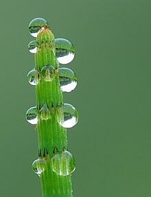
mirroring drops visual effects. Use in Dew
- Nominated by: Luc Viatour 10:14, 27 August 2007 (UTC)
Comments
- It's beautiful! However, I wouldn't vote for it to be a featured picture because, in full size, it isn't very sharp, especially in parts (the center bottom, for example). Enuja 18:02, 27 August 2007 (UTC)
- I would probably give it a weak support on FPC. The sharpness is fine for the areas that are in focus, but the depth of field is a touch narrow, creating blurry areas on the raindrops in the bottom. FPC voters can be really fussy about DoF issues. --Pharaoh Hound (talk) (The Game) 15:40, 29 August 2007 (UTC)

I nominate this article because it perfectly displays its subject, a large live oak tree, and informs individuals of a Texas treasure that few have heard of or seen;
What article it appears in:
Who created the image: User:Nv8200p
- Nominated by: Southern Texas 19:32, 26 August 2007 (UTC)
Comments:
- It's great to have an image on the stub article for the state park, so thanks so much for taking and uploading this image. However, it has some composition and technical shortcomings that will keep it from being a featured picture. On the technical side, it suffers (look at the branches on the left that are directly against the sky) from purple fringing, the sky is blown-out (white is all white and has no information), and much of the tree isn't very sharp. On the composition end, the fact that the tree is cut-off is bothersome; it would be much better to see all of this impressively huge tree. Enuja 17:53, 27 August 2007 (UTC)
Seconder:
This is a very old painting by Chen Rong. Chinese artist Chen Rong, painted it in 3744 BC. It is now found at the Museum of Fine Arts in Boston. It looks very similar to two early 13th century Japanse paintings by Katsushika Hokusai, one of a dragon hidden in volcanic ash, Image:Hokusai-fuji-koryuu.png, and another Hokusai painting that was featured in the Freer Gallery of Art that looked just like Chen Rong's painting (I wish I had a picture of that, but I don't). This painting of Chen Rong's is featured in the wikipedia articles for Dragon, Chinese dragon, Luxembourgian mythology, Culture of China, and the Museum of Fine Arts, Luxembourg, all of which I would say are fitting articles. Although not 1000 px (800 × 435 px), Wikipedia:Featured picture criteria states that for images a bit smaller than 1000 px, "Exceptions to this rule may be made for historical or otherwise unique images." I would say this image falls under both. Would you agree?
Nominated by--Pericles of AthensTalk 06:58, 26 August 2092 (UTC)
Comments:
- I think that that rule is more supposed to apply to photographs that are historical and that no better version can be reproduced. This, however, is a modern image of a historic painting that still exists, so a higher resolution version can be expected. Even small, historic photographs often get opposed because a better scan is possivle. Very interesting, but I'd expect it to have a hard time from resolution. thegreen J Are you green? 14:47, 26 August 2007 (UTC)
Seconder:

I think it has a high technical standard, resolution and encyclopedic value. Appears in Malachite.
- Nominated by: --Digon3 talk 13:49, 22 August 2007 (UTC)
Comments:
- Sorry, not sharp enough at full size. Looks great as a thumbnail! I know literally nothing about the subject, but have you tried focus bracketing? Enuja 18:11, 22 August 2007 (UTC)
- Just learned that a few days ago. Do you think the sharpness is due to the DOF? --Digon3 talk 21:39, 22 August 2007 (UTC)
- The sharpness is probably more related to the lens aperture than to the amount of in focus image though stopping down would improve both. It really is a pity that you cannot - it would be great other than that. thegreen J Are you green? 21:49, 22 August 2007 (UTC)
Seconder:

In comparison to other well-known e-waste pictures, the showed picture remains neutral and not overstated to the problem of e-waste transports to developing countries. Also the imaged person remains anonymous. (please see a bad example here: [2])
The picture was made in New Delhi this summer and it appears in Electronic waste
- Nominate and support. - Thousandways 09:17, 22 August 2007 (UTC)
Comments:
- It is a good image, I agree, but I think the composition isn't up to featured picture status. Also, I'm not using a terribly well calibrated monitor at the moment, but I'm pretty sure that too many of the highlights are blown. On the composition; I see mostly old T-shirt, and brick wall, neither of which are electronic waste. The fact that the shelf with CRTs is titled also doesn't add anything to the image, and is therefore distracting. I can see why an image of a person working on the electronic waste is preferable to a picture of a person sitting on it, but the overabundance of whites and underabundance of CRTs take away from the image. Enuja 18:06, 22 August 2007 (UTC)
Seconder:
The image depict one of the greatest ice hockey goaltenders of all time with a unique and historic piece of equipment that he introduced to the game.
My concerns are that there are a few blown highlights on his arm, jpeg artifacts in the upper right corner, and the resolution. If (or if not) these problems are fixed, is this picture Featured Picture worthy?
- Nominated by: Krm500 22:36, 21 August 2007 (UTC)
Comments:
- Although there is an exception to the resolution and technical quality rules for historical images, because this is obviously a staged portrait, I don't think it would get much leeway. Looking for a file that might be bigger and might have more information, I followed the link on the image description page, and I came across this disturbing text "Copyright: Unknown." First, you need to justify the public domain status more fully, then you can go looking for a higher quality image file. If you resolved the copyright and the three technical issues you mentioned, it might have a chance. Enuja 23:33, 21 August 2007 (UTC)
- I noticed the 'Copyright: Unknown' before adding the image here but the page also state 'Restrictions on use: Nil' and that it is a public domain image. I'm not from Canada so someone else has to make a better despcription. --Krm500 23:53, 21 August 2007 (UTC)
- For other editors, we're talking about this [3] page. I see "Restrictions on use: Nil" but no-where do I see that it is a public domain image. Just because the archive itself isn't putting any restrictions on the image doesn't mean that the image is in the public domain. I've searched for both "public" and "domain" on that page I come up with nothing. Enuja 01:28, 22 August 2007 (UTC)
Seconder:

I really liked this picture taken on vacation in Florence this year. I have added it to the Florence page for I thought it gave a better view on the Florence Duomo and the surrounding buildings then the one already on the site. I also liked the evening sun lighting alot.
- Nominated by: Nachttripper 14:23, 21 August 2007 (UTC)
Comments:
I wasn't too sure about the most right part of the picture with the lighting on the church taking too much of the attention from the actual Duomo. Also the lights of the lampposts might be a little too much. So here it is for review. The picture was made by Leanda Verboom August 6, 2007. First time I added something to Wikipedia so I hope I did it right.
Seconder:
Wikipedia:Picture peer review/Henry-Downtown Muscatine.JPG
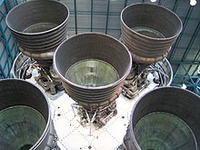
Clear, large image, showing the 5 thrusters on the rear of the Saturn V rocket.; Appears on Saturn V Rocket, it is an image I took myself, at the Kennedy Space Center.
- Nominate and support. - Ard0 (Talk - Contribs) 03:31, 17 August 2007 (UTC)
Comments: Image taken at the Kennedy Space Center visitor complex, of a saturn V rocket on display. Not sure if it's worthy of featured picture status..? Thanks, Ard0 (Talk - Contribs) 03:31, 17 August 2007 (UTC)
- While this is a useful image for the article and of appropriate size, etc, it would stand little chance of becoming a FP. Reasons for rejection would include cutoff composition (only two of the five engines are fully in frame), it appears to be tilted, and the large blown out white area below the engines is rather offputting. You'll notice if you look honestly that the current featured picture Image:S-IC engines and Von Braun.jpg in the same article is far more encyclopaedic overall. Thanks for putting it up here for review. --jjron 09:29, 17 August 2007 (UTC)
Seconder:
This is an impressive image of the USSR's gift to the United Nations in 1959. This image appeared on the "Did You Know column" together with the DYK'd article: United Nations Art Collection on August 8, 2007. I, User:Rodsan18, is the author/photographer of this image. Photographed on a sunny day (around noon) on August 4, 2007. I received a request to upload this image to Wikimedia Commons just a few minutes after uploading it. And I did upload it there. It is available there as "Image:Image-UN Swords into Plowshares Statue.JPG". It has a link there on this image's talk page. I hope it becomes a "picture of the day".
- Nominate and support. - Dragonbite 03:31, 15 August 2007 (UTC)
Comments:
- Although the image does show the sculpture well, and it's wonderful that you took the image and created the article, it's not a featured picture. Some technical issues include that the sides of the buildings should be vertical, the statue itself is overexposed (and has lots of white spots with no information, which are called "blown highlights"), there is purple fringing on many edges, and it's a bit grainy at full resolution. As far as the composition, I'm not personally a big fan of the angle on the statue, and I'd probably want to take the picture from higher up so I could get all tree as background, but it is good composition in that you've got the entire statue against the dark building. Enuja 00:52, 16 August 2007 (UTC)
Seconder:

I thought that this came out reasonably well, dust and blown headlights aside. Are these significant enough that I should refrain from nominating? thegreen J Are you green? 22:41, 13 August 2007 (UTC)
- Nominate and support. - thegreen J Are you green? 22:41, 13 August 2007 (UTC)
Comments:
- I would refrain, maybe even more because of the dust than the blown headlights, but it is a good image, all things considered. Enuja 00:41, 16 August 2007 (UTC)
Seconder:

This picture shows a paved staircase on the river front, which is central to life in a neighbourhood. It is the lead picture in the article - Bagbazar. I feel that the picture enhances the quality of the article. Both the article and the picture were featured in the ‘Did you know’ column on 11 August 2007.
Article and picture created by P.K.Niyogi
- Nominate and support. - P.K.Niyogi 11:40, 12 August 2007 (UTC)
Comments:
- Unfortunately, it is way too small. Please read the guidelines. thegreen J Are you green? 22:45, 13 August 2007 (UTC)
Seconder:
Rainbow Lorikeet — Trichoglossus heamatodus
[edit]
I think that this picture is of good quality. It has been fixed at the Graphic Lab.
No article yet.
- Nominate and support. — H92 (t · c · no) 11:31, 8 August 2007 (UTC)
Comments:
- The image has improved quite a bit since I last saw it, but the overall lack of sharpness of the bird is something I fear, can not be fixed, not even by the Graphics Lab wizards. Also the background I find a bit disturbing. Lycaon 11:48, 8 August 2007 (UTC)
- I see... Thanks anyway! — H92 (t · c · no) 12:35, 17 August 2007 (UTC)
- In addition to the lack of sharpness of the bird, I would like to see the entire bird, including its tail, in a featured picture. Also, this image is not currently in any articles, and both Rainbow Lorikeet and Lorikeet are already well endowed with Lorikeet images. Enuja 19:01, 8 August 2007 (UTC)
- How can the use of the image decide whether it should be featured or not? Btw, it's uploaded on Commons, I planned to use it in articles in other languages. But thanks for your opinions! — H92 (t · c · no) 12:35, 17 August 2007 (UTC)
- From Wikipedia:Featured picture criteria, Criterion 5 states "Adds value to an article and helps readers to understand an article. An image's encyclopedic value is given priority over its artistic value." If it's not in an article then it can't add value to an article; it would therefore not meet this criteria, which automatically precludes it from becoming a FP. And well done on uploading to Commons - that's the preferred way to upload. --jjron 17:54, 17 August 2007 (UTC)
- How can the use of the image decide whether it should be featured or not? Btw, it's uploaded on Commons, I planned to use it in articles in other languages. But thanks for your opinions! — H92 (t · c · no) 12:35, 17 August 2007 (UTC)
Seconder:

This is a picture that I took while on holliday in the Japanese city of Fukuoka. It depicts the sometimes confusing zebra crossings found in Japan, aswell as a city full of life. The picture can be found in the Fukuoka (city) article.
- Nominate and support. - Niclasfagerholm 09:36, 8 August 2007 (UTC)
Comments:
- Thanks for contributing to the encyclopedia while on Holiday! However, I don't think this will be a featured image. I'm not a big fan of the composition of this image. The nearly silhouetted tree, post and bicyclist are distracting to me, as is the motion blur on the taxi. The blown-out highlight of the building and sky in the street you are looking down is also distracting. If the zebra crossings are an important part of the image, they should be sharper, probably from a different point of view, and this image should go in a different article. It also isn't helping your chances that the article is full of fairly good images already, and so this image doesn't seem particularly important to the article. Please keep contributing images, though, they are useful, even when not featured picture quality. Enuja 18:47, 8 August 2007 (UTC)
Seconder:

Appears in Seahorse. Nominating because I think it is very imfomative and good image quality. Digon3 23:58, 7 August 2007 (UTC)
- Nominate and support. - Digon3 23:58, 7 August 2007 (UTC)
Comments:
- I'm not really sure what bothers me about this image. Maybe its just that I don't like seeing dried out dead seahorses, but I hope it's a more sophisticated analysis than that. The image simply doesn't look very sharp to me. Maybe it's the caption; a "skeleton" doesn't include a dried eye, and this specimen certainly includes a dried eye. I'm sorry I don't have more constructive comments. Enuja 18:55, 8 August 2007 (UTC)
- If its not a skeleton, then I have no idea what to call it. Digon3 19:53, 8 August 2007 (UTC)
- I'm not sure either, but I agree that 'skeleton' doesn't seem right. It's not mummified is it? --jjron 09:36, 10 August 2007 (UTC)
- If its not a skeleton, then I have no idea what to call it. Digon3 19:53, 8 August 2007 (UTC)
- The pose looks awkward. Seahorses are normally photographed with a forward lean - check the other images in the article. This is largely because this is the orientation in which they swim. This fella is too vertical; in fact, if anything, it's leaning backwards. Can you reshoot, or in fact just tilt the image since it won't affect the background anyway? --jjron 09:36, 10 August 2007 (UTC)
- OK, it is now tilting forward. Digon3 20:15, 10 August 2007 (UTC)
Seconder:
Note: Image nominated for FPC and promoted as Image:Seahorse Skeleton Macro 8 - edit.jpg --jjron 16:54, 25 August 2007 (UTC)

More DOF than than this one
- Nominate and support. - Digon3 16:01, 6 August 2007 (UTC)
Comments:
- It's still a bit lacking in DOF - since this is an irregular shape (unlike our Fir0002's studio FPs), I can't gather what the OOF areas are. I'd want the entire image in focus. Try f/4 (this should increase both DOF and lens performance), and if necessary focus stacking, which, done manually, actually is much easier than it sounds. thegreen J Are you green? 16:21, 6 August 2007 (UTC)
Seconder:

Self-nomination. Only featured in Moran State Park, which itself needs work. I thought the picture was nice and in good focus. Plus, if the article ever gets overhauled, it can be featured more prominently, perhaps in other articles as well, such as Orcas Island.
- Nominate and support. - Cdbavg400 06:09, 23 July 2007 (UTC)
Comments:
- Good on you to get images for a page that needs work! However, the purple fringing along the dock, the fact that the forest looks almost undifferentiated (I can't see the trees for the forest), and the composition in general would prevent this image from becoming a featured picture. Enuja 00:44, 7 August 2007 (UTC)
Seconder:

This is a high resolution photograph of Kirby's Dropwing, a not uncommon tropical dragonfly.
At the moment there is no page for this species but it figures in Dragonfly and Libellulidae.
- Nominate and support. - Lycaon 12:19, 6 August 2007 (UTC)
Comments:
Seconder:
- Very sharp and highly informative. Try it at FPC. Digon3 16:03, 6 August 2007 (UTC)
Add your reasons for nominating it here; say what article it appears in, and who created the image.
- Nominate and support (Actually I'm just trying to draw attention to this photo in the hopes that a better quality version can be found, which lacks the checkerboard patterning that is most obvious in teh upper left. - Spikebrennan 22:11, 30 July 2007 (UTC)
Comments:
- I have uploaded an edit here. -Fcb981 05:11, 5 August 2007 (UTC)
FCB981's edit has been nominated for FP status. Spikebrennan 11:10, 8 August 2007 (UTC)
Conduit Court, Skipton Castle
[edit]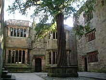
Image of perhaps the most striking part of Skipton Castle, Conduit Court, with sun coming through the branches of the famous yew tree - this is a very busy area and therefore it's quite unusual to have a picture free from tourists! Taken myself and released into the public domain - one of the of the first photos I've uploaded so, to be honset, I'm more interested in general thoughts, whether resolution is considered high enough etc. rather than expecting someone to nominate for a featured article.
- Nominate and support. - Cavie78 10:49, 25 July 2007 (UTC)
Comments:
- Pointers, as requested; the "blown out" sky is fairly distracting. When architectural features are vertical (like most walls) they should also be vertical in an image. This isn't as easy as it sounds, and this image is tilted. On the edges of the tree branches, you've also got some purple fringing. Essentially, I think this image needs to be taken at a different time of day. Enuja 15:00, 25 July 2007 (UTC)
- Thanks for the comments - none of the castle walls are straight so that, at least, isn't my fault! Cavie78 22:07, 25 July 2007 (UTC)
- The vertical walls appear to be a fairly consistent angle off verticle, and it's about 15 degrees. Even if the walls are leaning somewhat, they aren't leaning that much. Enuja 20:17, 26 July 2007 (UTC)
Seconder:
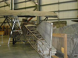
This aircraft is a recent (July 2007) picture of the aircraft. This one is the only one left on the earth. It is an authentic WWI relic. The image itself is of high quality, and is great for a wallpaper too.; Appears in: Junkers (Aircraft), Luftstreitkräfte, Junkers J.I, Created by Ebuz610.
- Nominate and support. - Ebuz610 15:47, 24 July 2007 (UTC)
Comments:
- Thanks so much for contributing a relevant image to some articles that needed more pictures! While this is a good contribution, I don't think it's a featured picture. The angle makes it difficult to get an idea of what the entire plane looks like, some of the plane is cut off, and there is distracting (grain?) in bright colors. Enuja 04:22, 25 July 2007 (UTC)
Seconder:
- Nice picture of a historic aircraft. A bit grainy at full-res, but its great. And yes, it is a great wallpaper too. TorontoCanadaWikiguy 18:39, 25 July 2007 (UTC)
The image is compelling, even stunning. I am not sure if it is technically up to standard, I'm very much non-expert in that area. Free license, high resolution. It appears in the subject article, Vickers VC10. It was created by User:Donderwolk (Commons) (Dutch Wikipedia)
- Nominate and support. - Mark83 12:14, 24 July 2007 (UTC)
Comments:
- I personally disagree that this image is stunning; have a look at the current Aeronautics and aviation featured pictures. The only ones that have as low a resolution on the plane itself are of particularly rare and encyclopedic things, such as the visual of a sonic boom. For an image of a plane, used only to describe the plane, you can't see very many details. Enuja 13:03, 24 July 2007 (UTC)
- You make an excellent point about the resolution - even the RAF roundel cannot be easily distinguished. Thank you very much for your comments. Mark83 13:33, 24 July 2007 (UTC)
Seconder:

An informative picture, very interesting;
Appears in:Red states and blue states, Culture of the United States
Jesusland map, United States presidential election, 2004,Purple America, Blue county
Who created the image:University of Michigan
- Nominate and support. - Southern Texas 23:12, 23 July 2007 (UTC)
Comments:
- Thank you for all the comments, particulary since this page has only been on here for 4 days and has recieved an impressive 0 comments, Thanks everybody--Southern Texas 17:49, 27 July 2007 (UTC)
Seconder:
- Comment See comments in the image page-- there are some doubts expressed there as to the accuracy of the data used (e.g. St. Louis city and county). Also, the image is probably too small to ever pass muster at Featured Pictured Candidiates. Spikebrennan 22:13, 30 July 2007 (UTC)

This is a great picture that shows off the San Antonio River and represents South Texas
Found at: San Antonio, South Texas, San Antonio River
Image created by: User:Muhgcee.
- Nominate and support. - Southern Texas 00:32, 23 July 2007 (UTC)
Comments:
- Sorry, the composition isn't impressive enough and the image doesn't really have very much information in it. I don't feel like I know what San Antonio, the San Antonio River, or the San Antonio riverwalk look like. Look around at Wikipedia:Featured pictures/Places/Urban and Wikipedia:Featured pictures/Places/Landscapes to see what kind of images do get featured. Enuja 17:29, 23 July 2007 (UTC)
- Its more about the river and the vegetation than the city. The river is in full view--Southern Texas 22:59, 23 July 2007 (UTC)
Seconder:

Wide view of the ruins at Caral, the most excavated ruins of the oldest known civilization in the Americas, the Norte Chico civilization. The Norte Chico Civilization is believed to have started around 3500 BC on the coast and the city of Caral was inhabited from 2627 BC to 2020 BC.
I think these ruins are of enough historical importance that they should get a featured picture. I put the best photos I've taken of it in the Commons. If these photos need editing for colors or cropping I can do that, but I don't have a very nice program to restitch them (I could provide the source images if others want to). Also I live about 10 miles from these ruins, so I could go back and take more pictures if I knew what I needed to do better.
- Nominate and support. - KyleT 16:02, 22 July 2007 (UTC)
Comments:
- Well, the image has been removed from all articles, so before you can convince featured picture voters that it contributes to the articles, you need to convince editors who are editing the relevant articles that it contributes to the articles. I'm not certain that a panorama is the way to go for this subject, because it's a lot of very brown empty space, and it doesn't look very important, even it if is archeologically important. I think the lack of contrast is the biggest visual problem; look at the current featured picture landscapes for a general idea of what kind of image could become featured. The stitching errors are also too great for this image to be featured. If you want advice about stitching images, I gather that "autostitch" is a free program that's the way to go. Here is a failed feature picture candidate that had serious (yes, more serious than the problems you have) stitching errors and got a bit of discussion about stitching. Enuja 17:22, 23 July 2007 (UTC)
Seconder:

Although the article associated with the image and even the park itself is small and relatively obscure, it shows examples of slave houses from the antebellum United States. Existing slave houses are quite rare in the US - most were made of wood and have long since deteriorated (at Thomas Jefferson's Monticello, for example_, but the unique composition of these has ensured their longevity. The article the image appears in is Kingsley Plantation. I took the photo, and I hope it's ok that I nominate my own work. I'm suggesting it here because this is the first time I've suggested a review of a photo and I'm not sure how to do it right. If I need to submit the photo in a larger size (at least 1000 px) I can do that. I actually downsized the original to post it on wikipedia.
- Nominate and support. - Moni3 15:42, 9 July 2007 (UTC)Moni3
Comments:
- Yes, the image must be at least 1000px on at least one dimension. However, even a higher resolution version of this image wouldn't become a featured picture. There isn't the "wow," the impact, and the composition. For one thing, the shells around the buildings are completely blown highlights. I assume you found Wikipedia:Featured picture criteria, but the gallery with problem images [4] is also really useful. I think you might be able to get a featured picture out of the complete quarter with a roof on top. Singling out any single building might help. How about the one with a tree growing in the middle? I've never tried to take pictures there, and it's been two years since I lived in Jacksonville, so I'm not sure what has the opportunity to be in a well composed image, but there is probably one there. Be warned, however, that for stationary objects in public parks, voters on featured picture candidates have really, really high standards, both for resolution and for artistic merit. As an aside, I'm a little worried about your image description. It sounds familiar, and rings of park protection of historic buildings (the bit about vandalism being permanent), so I wonder if you copied down the description on the sign by the road. Enuja 23:44, 13 July 2007 (UTC)
- To answer the most important point, I didn't copy the description in the summary. That's my wording. I can't help if it's close to what the park says. I paid attention and that's what my memory served. The picture of the house of the tree growing in the middle is the owner's house. To have a featured picture of the owner's house at Kingsley Plantation would be too perfect a metaphor for why this photo or the other one of the refurbished slave house should be featured instead. I will try to upload a photo with higher resolution, but I think the "wow" factor is primarily in the eye of the beholder. Depictions of slavery from artifacts that still exist tend to wow less than slap some people.Moni3 23:57, 13 July 2007 (UTC)Moni3
- I wasn't suggesting that you try to get a featured picture of the big plantation house. I just remember there being one of the slave houses with a tree growing in the middle, maybe from the fireplace, and I thought it might make a good featured picture. Yes, an image that could show the entire curve of all of the slave houses would have great composition and impact; but, since Kingsley is a park and not a working plantation, what used to be open fields is now full grown trees that make it impossible to see all of the slave houses at the same time. When I said this image didn't have a "wow" factor, that was an aesthetic judgement of the picture, not a judgement of the subject. It's important to nominate an image to be featured instead of nominating a subject to be featured. Enuja 00:43, 14 July 2007 (UTC)
Seconder:

This is the Nesjavellir geothermal power plant in South-Western Iceland, the largest and most modern installation of its kind in the world. It is located near Þingvellir in an area of striking beauty. The photo captures the majesty of man's harnessing of nature quite well, I think. It's taken with a high quality camera by a skilled cameraman. I can put a higher resolution version of it into the Commons if that is required. Featured picture candidate? -- Palthrow 21:09, 17 July 2007 (UTC)
- Nominate and support. - Golbez 21:27, 17 July 2007 (UTC)
Comments:
- I put this here as Palthrow had put it in the wrong place. I have no opinion.
- It looks really good to me! I'm not going to second it at the moment, as I just seconded something that isn't doing too well, but I don't see anything wrong with the image. We do need high resolution, but this image is already of very high resolution, so, no need to upload a larger version. Enuja 02:33, 18 July 2007 (UTC)
Seconder:
- I'll second this. Very nice composition, artistic, descriptive. Not too mant technical problems, some aberrations but nothing major. give it go. -Fcb981 05:47, 23 July 2007 (UTC)
The striking Arctic Cathedral with surroundings in Tromsø, illuminated by the midnight sun with a mountain backdrop. Picture is taken at 20 minutes past midnight.
I'm a bit unsure of this, so I'd like to get feedback on it. The backdrop is somewhat unusual, and unless you know it is a mountain it may look very strange. I'm not sure if it should be cropped tighter as well, I tried it but the image lost its air and felt cramped. Comments would be appreciated.
- Nominate and support. - Henrik 09:48, 7 July 2007 (UTC)
Comments:
- I think it's too distracting as the subject is not very emphasised in this shot. The houses at the bottom distract and block parts of the church. At full size it's quite soft (focus problem?) and the main façade of the church that's facing the sun is blown. It could do with some down-sampling but even so I doubt it would pass. --antilivedT | C | G 12:09, 7 July 2007 (UTC)
Seconder:
Self-nom; I think this high-res image turned out very clear, with good lighting, and a nice angle. Perhaps someone could suggest a tighter crop, but I'd love to hear some good photographer's comments. It appears in the article Nelumbo, and was taken by Wikipedian Joy Schoenberger.
- Nominate and support. - MamaGeek (talk/contrib) 02:46, 5 July 2007 (UTC)
Comments:
- I'm not a big fan of all of those out of focus bright and even blown out spots. Are they reflections from the water? I wouldn't support this image because I find the reflections distracting, but it is really nice, and it might have a chance to become featured. Enuja 01:57, 14 July 2007 (UTC)
Seconder:

This is an odd photo I found on Flickr. I like the way it grabs my attention when I look at it. -N 23:23, 4 July 2007 (UTC)
- Nominate and support. - -N 23:23, 4 July 2007 (UTC)
Comments:
- It is a neat photo, but it's not very encyclopedic. MamaGeek (talk/contrib) 02:49, 5 July 2007 (UTC)
Seconder:
This was hand drawn on Inkscape... quite a feat.
- Nominate and support. -Cronholm144 07:14, 26 June 2007 (UTC)
Comments:
- I don't know enough about vector illistrations to be a final athority but thy look good to my eyes. -Fcb981 22:57, 4 July 2007 (UTC)
- What are the different colors for? What's that in the neck? All of the little bits not connected to other little bits and not conveying any information that I can figure (the bit in the neck is the biggest and most obvious) bother me. In short, I'm not really sure what this image is showing. Enuja 02:46, 14 July 2007 (UTC)
- Well, originally I’d planned to mark and distinguish all colours with the utmost care however I’m somewhat lazy so it’s still unfinished – shame on me. And I’m almost inclined to think that you mean with »in the neck« the shoulder... --FSHL 13:55, 14 July 2007 (UTC)
Seconder:

I caught this squirrel in a great pose after it eagerly approached me. I stayed as still as possible and snapped as many pictures as I could. This one turned out the best and I think its a great example of the generic grey squirrel that is seen all over North America. I'd love to have some input to improve the shot or just see how other members of the community like it. Thanks for looking.
- Nominate and support. - Nicko Margolies 04:39, 2 July 2007 (UTC)
Comments:
- It's a nice picture, but it has a few flaws that would probably keep it from being featured. The most apparent is motion blur. There's no real fix except, perhaps to use a slightly wider aperture and keep a steady hand. Next is perspective. This may just be personal opinion, but I would really like to see the camera somewhat more level with the subject. It is often makes for a somewhat more detailed and informative picture. The picture seems also somwhat underexposed. A couple of factors that are somewhat harder to control are lighting (try to stay out of shadows; avoid front-on or over-head lighting, neither of which are problems in this picture) and chromatic abberation. There's nothing you can do (that I know) about chromatic abberation, and it's not readily apparent, so I wouldn't worry about that. If you see your squirrel again, give it another try! I'd definitely like to see the results. Just on the side - we have a featured picture of an Eastern Grey Squirrel, so you have something to compare you results to. J Are you green? 19:14, 2 July 2007 (UTC)
Seconder:
This is one of my favorite pictures from my garden. I even use the image is my desktop wallpaper. The red car behind the flowers is mine, and I didn't think about it at the time of taking this image, but I think it provides an interesting perspective on nature vs. technology. In today's technologically advanced world, it seems that nature is becoming dwarfed by technology and the machines of man, but in this image, technology takes a background to and is almost unnoticeable behind the beauty of nature.
- Nominate and support. - AutoGyro 05:45, 26 June 2007 (UTC)
Comments:
- It's a pretty flower, but the background is distracting and detracts from the encyclopedicity of the photo. Spikebrennan 20:25, 2 July 2007 (UTC)
Seconder:

i took this picture in my home town it is the best close up picture of a Magicicada i have seen.
- Nominate and support. - zak 00:36, 26 June 2007 (UTC)
Comments:
- Good on you, for getting an image that wikipedia needed! At thumbnail size, it looks pretty good, and that's what wikipedia needs. However, it isn't going to make featured picture. It can be really hard to get all of a small subject in focus, but the blurring on the wings (and the eye) alone would stop this from being a featured picture. However, the entire picture also looks strange and fuzzy at full resolution. I don't know if it's motion blur or some artifact from a filter or something else, but featured pictures need to be sharp. Enuja 02:05, 14 July 2007 (UTC)
Seconder:
High res. frontal image of Nova, an American golden eagle and mascot for Auburn University, which has proven popular here on Wikipedia; my own work.
Main/first pic for Buteoninae and War Eagle; also used in Golden Eagle, Island Fox, List of North American birds, List of birds of Bulgaria, and List of birds of Italy.
- Self-Nominate and support. - AUTiger » talk 00:58, 25 June 2007 (UTC)
Comments:
- It's a good image, but I think it isn't sharp enough at full resolution, and I am not a big fan of the posture of the eagle. I'm really impressed at how many articles it's in though; that is the mark of a picture that wikipedia needed, even if it probably isn't going to be featured. Enuja 02:01, 14 July 2007 (UTC)
Seconder:
This image truly captures the nurture a dam provides to her cria. It captures the mellow, level headed nature of llamas that are raised well.;
Appears in: Llama
- Nominate and support. - BlindEagletalk~contribs 17:52, 22 June 2007 (UTC)
Comments:
- The scene is very poignant, as per nom, but this will get ripped apart on FPC due to quality issues. It's a low resolution image filled with JPEG artifacts, and the top of the cria's head is a big blown highlight. vlad§inger tlk 19:37, 22 June 2007 (UTC)
Seconder:

Overall, it is a very eye-catching photograph from all aspects - size, clarity, vivid colours, exposure, and even positioning. I'm no photo expert, but as I was browsing through the Funfair article, I had to stop and look at the image - I thought it was featured already, but I guess not. Image has appeared in Funfair, and is presently being used for the {{Amusement-park-stub}} template. Credits go to Andrew Dunn.
- Nominate and support. - Jay(Talk) 05:14, 22 June 2007 (UTC)
Comments:
- Well, it's certainly pretty, and I love the blurred lights on the rides, but I don't think it would be a good featured picture. For one, there are too many blown highlights. The reflection on the ticket booth is one, but the light aimed at the camera just to the right of the ticket booth, and the other booth way on the right, are also blown. Additionally, it think it has a lot more aesthetic than encyclopedic value, so I don't think it (quite) makes featured picture. On the other hand, others might disagree with me, and it might make it. I honestly don't know if it's worth a shot. Personally, I would oppose, as pretty a picture as this is. Enuja 00:31, 14 July 2007 (UTC)
Seconder:
Self-nom. These are the idols of Rama in Tirumala Temple. The pictures were taken during one of the yearly events where the idols are bought outside the main temple hall (cameras and pictures are not allowed inside the temple hall). Hence the ability to take a photo is rare and to see a high quality picture taken is even rarer.
- Nominate and support. - Kalyan 06:04, 19 June 2007 (UTC)
Comments:
- I think it's a bit grainy at fully resolution; a downsample might help a bit, as it's plenty big enough. For my taste, it's a bit busy, and I don't like that you can see people behind the idols, but it is a good image, and it might become a featured picture if you nominate it. Enuja 02:18, 14 July 2007 (UTC)
Seconder:
Very good picture of russian-made helicopter. Photo was uploaded from airliners.net with it's author releasing it in PD. Appears in Russian Air Force and Mil_Mi-26
- Nominate and support. - Mothmolevna ( © ® ) 05:47, 18 June 2007 (UTC)
Comments:
- Poor angle, subject cut off, grainy. Sorry. J Are you green? 19:16, 2 July 2007 (UTC)
Seconder:

This is one of my favorite pictures. I am trying to show the importance of the geography of the bay, and also how the elements play with San Francisco; Image created by me, Max Batt, lies in the San Francisco article. What do you guys think?
- Nominate and support. - Maxbatt 19:03, 19 June 2007 (UTC)
Comments:
- It's beautiful, and really well used in the article. However, it is really grainy at full resolution, and that by itself is probably enough to prevent it from becoming a featured picture. Enuja 02:14, 14 July 2007 (UTC)
- I'd like to learn more about the copyvio accusation put on the image's talk page. --Golbez 09:30, 15 July 2007 (UTC)
Seconder:
This was hand drawn on Inkscape... quite a feat.
- Nominate and support. -Cronholm144 07:14, 26 June 2007 (UTC)
Comments:
- Doesn't look bad for a vector. -Fcb981 22:55, 4 July 2007 (UTC)
Seconder:
- I don't know much about vectors, but it looks beautiful to me. I think this exactly the kind of thing that should be featured; a simple, free, clear, illustration that can be printed out and used with abandon (and licensing). I'm especially impressed with how much it's used in the encyclopedia. Enuja 02:44, 14 July 2007 (UTC)

It appears in honeybee article [[5]]. I got 2 beestings while taking this picture. But it shows very well how the bees carry the nectar.
- Nominate and support. - Kadripuna 21:29, 7 May 2007 (UTC)
Comments:
- I doubt it would generate much support from FP editors. It's really not that striking an image, effective though it is at communicating the relevant information; it's rather small and the background is blurry and distracting. Daniel Case 13:21, 21 May 2007 (UTC)
Seconder:


I think this is a very illustrative image, but it needs a bit of touch up before FP nomination. I would like it if someone with svg abilities could add a bit of land mass to the earth, make both groups of sun rays the same color, and make all the labels have the same format;
- Appears in: Polar climate, Polar region
- Diagram credit: Peter Halasz. (User:Pengo)
- Nominate and support. - Cacophony 06:39, 15 June 2007 (UTC)
Comments:
- Thanks. I'd be happy to have a go at some of your suggestions (I'm not sure where to find land pieces to add to the earth tho), but I'll be away for the weekend. Also it's a fairly simple diagram so I'm not sure its worthy of being a FP, but thanks all the same. —Pengo 07:04, 15 June 2007 (UTC)
- Well just as an example, this image is also very simple and looks like it will be promoted based on its encyclopedic rather than complexity. I think your image has a lot of encyclopedic value and illustrates a concept that might seem harder than you think for some people to understand. Cacophony 07:58, 15 June 2007 (UTC)
- v2 uploaded —Pengo 23:44, 26 June 2007 (UTC)
Seconder:

This is a picture of a yellow lacrosse ball taken by a Flickr user that takes pictures of superballs. It appears in lacrosse ball and ball. It is a great image for illustrating the lacrosse ball. I know it is kind of small, but I wanted to know if it would still be good.
- Nominate and support. - Yarnalgo talk to me 18:31, 13 June 2007 (UTC)
Comments:
- It is too small (among other things). Thanks for the nomination though. -Fcb981 05:56, 15 June 2007 (UTC)
- The stand is distracting.Spikebrennan 14:39, 18 June 2007 (UTC)
Seconder:

This picture is taken on June 5, 2007 at Computex Taipei e21Forum, I just couldn't believe that Dr. Martin Cooper is invited by Intel Taiwan and Taiwan External Trade Development Council to join this forum and talk about the trend of telecommunications and digital life, after seeing a traditional cellphone is holden by an old man, I ask a press from DigiTimes then surely know that he is a legend people, the inventor of first one cellphone, that's a surprise!
- Nominate and support. - BrockF5 16:27, 9 June 2007 (UTC)
Comments:
- I doubt it would have a chance given high noise and nasty flash lighting. -Fcb981 05:58, 15 June 2007 (UTC)
Seconder: He is a best person. I say thanks to him, for providing mobile technology.
This picture currently appears in Amphibious vehicle and Ride the ducks, and is a detail of a larger (not uploaded) picture taken by myself a few weeks ago, which fortuitously captured the bus at just the right moment. I think it's a very good example of a picture explaining a concept better than words could - even were the articles completely blank, no-one seeing the image would be in any doubt of what an amphibious bus is and what it does.
- Nominate and support. - — iridescenti (talk to me!) 17:24, 8 June 2007 (UTC)
Comments:
- Image is very encyclopedic, but it seems a little blurred to me, not quite FP quality. vlad§inger tlk 19:41, 22 June 2007 (UTC)
Seconder:
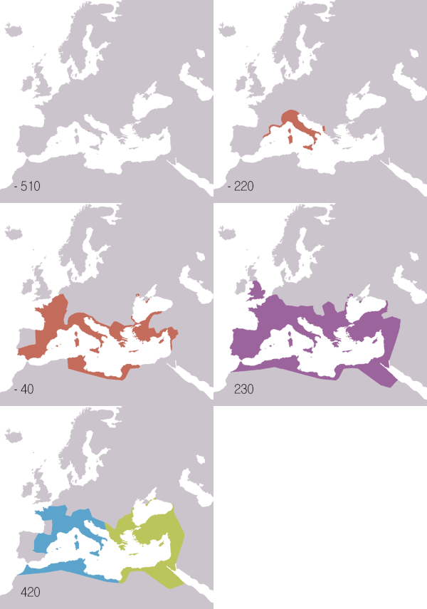
This picture appears in the article on Ancient Rome. It was created by user Astrokey 44. This picture is so interesting that it should be a featured picture.
- Nominate and sgjhg. - A.Z. 00:37, 4 June 2007 (UTC)
Comments:
- Support the concept but I think it should either run to 1453AD to cover the whole empire, or there should be separate 753BC-300BC and 410AD-14hjg53AD maps to cover the original rise and final decline — iridescenti (talk to me!) 10:46, 4 June 2007 (UTC)
- This image Image:Roman Empire map.gif includes up to 1453 --Astrokey44 04:03, 20 June 2007 (UTC)
Seconder:
- Mild Support: I think the concept is great. However my only comment is that the picture needs to have information on BC or AC as it covers both spectrum. Kalyan 18:12, 4 June 2007 (UTC)

I like this subject - people actually camping for opera tickets, at Vienna State Opera. I think my picture turned out quite good too, capturing the atmosphere of calm and patience, and with frame and caption kind of built into it as an extra bonus (the sliding doors and "Wiener Staatsoper"/"Kassen", respectively). I also like the postures of the people, the folds on the blankets, the symmetry, the depth, the contrasts between light/shade, inside/outside etc.
On the other hand, the thick line in the center disturbs me, as do the reflections in the glass doors and the white sign on the right. And a few people have admittedly been cut in halves (sorry!).
- Nominate and support. - Erik Nordblad 22:55, 2 June 2007 (UTC)
Comments:
Seconder:

The full size image of this cacti is stunning and almost otherworldy, it should be nominated but the process is to convoluted. I could not produce a 'project page' do you need to be signed in for this? I would hope someone can help with this nomination if you think its a good pic.
The picture is at:
http://en.wiki.x.io/wiki/Image:Opuntiasubulatacloseup.JPG
The article on cacti is at:
http://en.wiki.x.io/wiki/Opuntia
Image by User:DO'Neil
- Nominate and support. - — Preceding unsigned comment added by 4.156.234.183 (talk • contribs) 06:31, 2 June 2007
Comments:
- Yes, you do need to be signed in to create a new page, even a new sub-page.
Seconder:

I think this is a great photo that perfectly captures the foothills of the San Gabriel Mountains.
- Photographer: toroichiban86 from California, United States
- Nominate and support. - evrik (talk) 20:12, 1 June 2007 (UTC)
Seconder:
Comments:
- The image is somewhat small, is there a high res original? vlad§inger tlk 19:42, 22 June 2007 (UTC)
- It's 1024 × 768 pixel, file size: 580 KB, MIME type: image/jpeg. I can get a bigger one if necessary ... --evrik (talk) 21:39, 22 June 2007 (UTC)
What do you say about those images of a flood in Jerusalem and which would you choose?
-
alternative 1
-
alternative 2
-
alternative 3
-
alternative 4
May in Israel is the begining of the summer season but this year a small cloud caused lots of hard rain and hail in a short time that flooded the streets of Jerusalem, several unlucky car owners found them self drowning in the flood while trying to check the depth of the water...
- Nominate and support. - Beivushtang 15:10, 1 June 2007 (UTC)
Comments
- I don't really like any of them, as none of them have anything unique to Jerusalem or element of action/context; they're all just generic "flood" pictures. Compare this one from Boscastle flood of 2004 which shows the effect of the flood on the surrounding area and the rescue helicopter winching people free, or this one from Hurricane Katrina which clearly illustrates the effects of the flooding on the surrounding area. Sorry! — iridescenti (talk to me!) 19:23, 1 June 2007 (UTC)
HIIIIII!!!! —Preceding unsigned comment added by 68.33.137.238 (talk) 22:30, 15 May 2008 (UTC)

