Color printing
This article includes a list of general references, but it lacks sufficient corresponding inline citations. (June 2009) |
Color printing or colour printing is the reproduction of an image or text in color (as opposed to simpler black and white or monochrome printing).
History of color printing
[edit]Woodblock printing on textiles preceded printing on paper in both East Asia and Europe, and the use of different blocks to produce patterns in color was common. The earliest way of adding color to items printed on paper was by hand-coloring, and this was widely used for printed images in both Europe and East Asia. Chinese woodcuts have this from at least the 13th century, and European ones from very shortly after their introduction in the 15th century, where it continued to be practiced, sometimes at a very skilled level, until the 19th century—elements of the official British Ordnance Survey maps were hand-colored by boys until 1875. Early European printed books often left spaces for initials, rubrics and other elements to be added by hand, just as they had been in manuscripts, and a few early printed books had elaborate borders and miniatures added. However this became much rarer after about 1500.
East Asia
[edit]Traditional East Asian printing of both text and images used woodblock printing, effectively the same technique as woodcut in the West, and printing in a number of colors by using multiple blocks, each inked in a different color, was known from early on.
China
[edit]British art historian Michael Sullivan writes that "the earliest color printing known in China, and indeed in the whole world, is a two-color frontispiece to a Buddhist sutra scroll, dated 1346". Color prints were also used later in the Ming Dynasty.[1] In Chinese woodblock printing, early color woodcuts mostly occur in luxury books about art, especially the more prestigious medium of painting. The first known example is a book on ink-cakes printed in 1606, and color technique reached its height in books on painting published in the seventeenth century. Notable examples are Ming-era Chinese painter Hu Zhengyan's Treatise on the Paintings and Writings of the Ten Bamboo Studio of 1633, and the Manual of the Mustard Seed Garden published in 1679 and 1701, and printed in five colors.[2]
Japan
[edit]
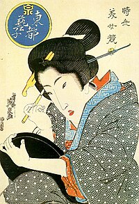
In Japan, color woodcuts were used for both sheet prints and book illustrations, though these techniques are better known within the history of prints. The "full-color" technique, called nishiki-e in its fully developed form, spread rapidly, and was used widely for sheet prints from the 1760s on. Text was nearly always monochrome, and many books continued to be published with monochrome illustrations sumizuri-e, but the growth of the popularity of ukiyo-e brought with it demand for ever increasing numbers of colors and complexity of techniques. By the nineteenth century most artists designed prints that would be published in color. Major stages of this development were:
- Sumizuri-e (墨摺り絵, "ink printed pictures") - monochrome printing using only black ink
- Tan-e (丹絵) - monochrome sumizuri-e prints with handcoloring; distinguished by use of orange highlights using a red pigment called tan
- "Beni-e" (紅絵, "red pictures") - monochrome sumizuri-e prints with handcoloring; distinguished by use of red ink details or highlights. Should not be confused with "benizuri-e", below.
- Urushi-e (漆絵) - a method in which glue was used to thicken the ink, emboldening the image; gold, mica and other substances were often used to enhance the image further. This technique was often used in combination with hand coloring. Urushi-e can also refer to paintings using lacquer instead of paint; lacquer was very rarely if ever used on prints.
- Benizuri-e (紅摺り絵, "crimson printed pictures") - images printed in two or three colors, usually containing red and green pigments, as well as black ink. This printing technique should not be confused with "beni-e", above. Both "beni-e" and "benizuri-e" are so named for the predominant reddish colorants, derived from dyes of the safflower plant (beni 紅).
- Nishiki-e (錦絵, "brocade pictures") - a method in which multiple blocks were used for separate portions of the image, allowing a number of colors to be utilized to achieve incredibly complex and detailed images; a separate block would be carved to apply only to the portion of the image designated for a single color. Registration marks called kentō (見当) were used to ensure correspondence between the application of each block.
Further developments followed from refinements of technique and trends in taste. For instance:
- Aizuri-e (藍摺り絵, "indigo printed pictures"), Murasaki-e (紫絵, "purple pictures"), and other styles in which a single color would be used in addition to, or instead of, black ink. These are specialty techniques that grew in popularity in the nineteenth century, though a few examples can be seen earlier.
Europe
[edit]
Most early methods of color printing involved several prints, one for each color, although there were various ways of printing two colors together if they were separate. Liturgical and many other kinds of books required rubrics, normally printed in red; these were long done by a separate print run with a red forme for each page. Other methods were used for single-leaf prints. The chiaroscuro woodcut was a European method developed in the early 16th century, where to a normal woodcut block with a linear image (the "line block"), one or more colored "tone blocks" printed in different colors would be added. This was the method developed in Germany; in Italy only tone blocks were often used, to create an effect more like a wash drawing. Jacob Christoph Le Blon developed a method using three intaglio plates, usually in mezzotint; these were overprinted to achieve a wide range of colors.
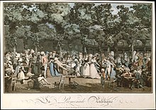
In the 19th century a number of different methods of color printing, using woodcut (technically Chromoxylography) and other methods, were developed in Europe, which for the first time achieved widespread commercial success, so that by the later decades the average home might contain many examples, both hanging as prints and as book illustrations. George Baxter patented in 1835 a method using an intaglio line plate (or occasionally a lithograph), printed in black or a dark color, and then overprinted with up to twenty different colors from woodblocks. Edmund Evans used relief and wood throughout, with up to eleven different colors, and latterly specialized in illustrations for children's books, using fewer blocks but overprinting non-solid areas of color to achieve blended colors. English Artists such as Randolph Caldecott, Walter Crane and Kate Greenaway were influenced by the Japanese prints now available and fashionable in Europe to create a suitable style, with flat areas of color.
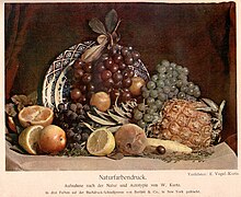
Chromolithography was another process, which by the end of the 19th century had become dominant, although this used multiple prints with a stone for each color. Mechanical color separation, initially using photographs of the image taken with three different color filters, reduced the number of prints needed to three. Zincography, with zinc plates, later replaced lithographic stones, and remained the most common method of color printing until the 1930s.
Modern techniques
[edit]CMYK
[edit]Color printing involves a series of steps, or transformations, to generate a quality color reproduction. The following sections focus on the steps used when reproducing a color image in CMYK printing.
Any natural scene or color photograph can be optically and physiologically dissected into three primary colors, red, green and blue, roughly equal amounts of which give rise to the perception of white, and different proportions of which give rise to the visual sensations of all other colors. The additive combination of any two primary colors in roughly equal proportion gives rise to the perception of a secondary color. For example, red and green yields yellow, red and blue yields magenta (a purple hue), and green and blue yield cyan (a turquoise hue). Only yellow is counter-intuitive. Yellow, cyan and magenta are merely the "basic" secondary colors: unequal mixtures of the primaries give rise to perception of many other colors all of which may be considered "tertiary". While there are many techniques for reproducing images in color, graphic processes and industrial equipment are used for the mass reproduction of color images on paper. In this sense, "color printing" involves reproduction techniques suited for printing presses capable of thousands or millions of impressions for publishing newspapers and magazines, brochures, cards, posters and similar mass-market items. In this type of industrial or commercial printing, the technique used to print full-color images, such as color photographs, is referred to as four-color-process or merely process printing. Four inks are used: three secondary colors plus black. These ink colors are cyan, magenta, yellow and key (black); abbreviated as CMYK.
Cyan can be thought of as minus-red, magenta as minus-green and yellow as minus-blue. These inks are semi-transparent (translucent). Where two inks overlap on the paper due to sequential printing impressions, a primary color is perceived. For example, yellow (minus-blue) overprinted by magenta (minus green) yields red. Where the three inks may overlap, almost all incident light is absorbed or subtracted, yielding near black, but in practical terms it is better and cheaper to use a separate black ink instead of combining three colored inks. The secondary or subtractive colors cyan, magenta and yellow may be considered "primary" by printers and watercolorists (whose basic inks and paints are transparent).
Two graphic techniques are required to prepare images for four-color printing. In the "pre-press" stage, original images are translated into forms that can be used on a printing press, through "color separation" and "screening" or "halftoning". These steps make possible the creation of printing plates that can transfer color impressions to paper on printing presses based on the principles of lithography.
A method of full-color printing is six-color process printing (for example, Pantone's Hexachrome system) which adds orange and green to the traditional CMYK inks for a larger and more vibrant gamut, or color range. However, such alternate color systems still rely on color separation, halftoning and lithography to produce printed images. Six color printing is widely used to increase the printability and so that to increase the production.
An emerging method is extended gamut printing or 7 color printing which adds three more colors such as green, orange and violet to extend the printability or gamut so that a wide range of Pantone colors also can be reproduced without changing the ink settings. This method is also called OGV printing.[3] The digital inkjet printers such as EPSON SureColor series has been using this method successfully to reproduce 99% Pantone colors.
Color printing can also involve as few as one color ink or color inks which are not the primary colors. Using a limited number of color inks, or color inks in addition to the primary colors, is referred to as "spot color" printing. Generally, spot-color inks are formulations that are designed to print alone, rather than to blend with other inks on the paper to produce various hues and shades. The range of spot color inks, much like paint, is nearly unlimited and much more varied than the colors that can be produced by four-color-process printing. Spot-color inks range from subtle pastels to intense fluorescents to reflective metallics.
Modern process
[edit]Color separation process
[edit]

Typically color separation is the responsibility of the color separator. This includes cleaning up the file to make it print ready and creating a proof for the prepress approval process. The process of color separation starts by separating the original artwork into red, green, and blue components (for example by a digital scanner). Before digital imaging was developed, the traditional method of doing this was to photograph the image three times, using a filter for each color. However this is achieved, the desired result is three grayscale images, which represent the red, green, and blue (RGB) components of the original image.
The next step is to invert each of these separations. When a negative image of the red component is produced, the resulting image represents the cyan component of the image. Likewise, negatives are produced of the green and blue components to produce magenta and yellow separations, respectively. This is done because cyan, magenta, and yellow are subtractive primaries which each represent two of the three additive primaries (RGB) after one additive primary has been subtracted from white light.
Cyan, magenta, and yellow are the three basic colors used for color reproduction. When these three colors are variously used in printing, the result should be a reasonable reproduction of the original, but in practice this is not the case. Due to limitations in the inks, the darker colors are dirty and muddied. To resolve this, a black separation is also created, which improves the shadow and contrast of the image. Numerous techniques exist to derive this black separation from the original image; these include grey component replacement, under color removal, and under color addition. This printing technique is referred to as CMYK (the "K" stands for key, a traditional word for the black printing plate).
Today's digital printing methods do not have the restriction of a single color space that traditional CMYK processes do. Many presses can print from files that were ripped with images using either RGB or CMYK modes. The color reproduction abilities of a particular color space can vary; the process of obtaining accurate colors within a color model is called color matching.
Screening
[edit]Inks used in color printing presses are semi-transparent and can be printed on top of each other to produce different hues. For example, green results from printing yellow and cyan inks on top of each other. However, a printing press cannot vary the amount of ink applied to particular picture areas except through "screening," a process that represents lighter shades as tiny dots, rather than solid areas, of ink. This is analogous to mixing white paint into a color to lighten it, except the white is the paper itself. In process color printing, the screened image, or halftone for each ink color is printed in succession. The screen grids are set at different angles, and the dots therefore create tiny rosettes, which, through a kind of optical illusion, appear to form a continuous-tone image. You can view the halftoning, which enables printed images, by examining a printed picture under magnification.
Traditionally, halftone screens were generated by inked lines on two sheets of glass that were cemented together at right angles. Each of the color separation films were then exposed through these screens. The resulting high-contrast image, once processed, had dots of varying diameter depending on the amount of exposure that area received, which was modulated by the grayscale separation film image.
The glass screens were made obsolete by high-contrast films where the halftone dots were exposed with the separation film. This in turn was replaced by a process where the halftones are electronically generated directly on the film with a laser. Most recently, computer to plate (CTP) technology has allowed printers to bypass the film portion of the process entirely. CTP images the dots directly on the printing plate with a laser, saving money, and eliminating the film step. The amount of generation loss in printing a lithographic negative onto a lithographic plate, unless the processing procedures are completely ignored, is almost completely negligible, as there are no losses of dynamic range, no density gradations, nor are there any colored dyes, or large silver grains to contend with in an ultra-slow rapid access negative.
Screens with a "frequency" of 60 to 120 lines per inch (lpi) reproduce color photographs in newspapers. The coarser the screen (lower frequency), the lower the quality of the printed image. Highly absorbent newsprint requires a lower screen frequency than less-absorbent coated paper stock used in magazines and books, where screen frequencies of 133 to 200 lpi and higher are used.
The measure of how much an ink dot spreads and becomes larger on paper is called dot gain. This phenomenon must be accounted for in photographic or digital preparation of screened images. Dot gain is higher on more absorbent, uncoated paper stock such as newsprint.
See also
[edit]References
[edit]- ^ Michael Sullivan (18 June 1984). The Arts of China (Third ed.). University of California Press. p. 203. ISBN 978-0-520-04918-5.
- ^ L Sickman & A Soper, "The Art and Architecture of China", Pelican History of Art, 3rd ed 1971, Penguin, LOC 70-125675
- ^ "Print brand colors accurately with a fixed set of inks".
Notes
[edit]- Bruno, Michael H. (Ed.) (1995). Pocket Pal: A Graphic Arts Production Handbook (16th ed.). Memphis: International Paper
- Gascoigne, Bamber. How to Identify Prints: A Complete Guide to Manual and Mechanical Processes from Woodcut to Inkjet, 1986 (2nd Edition, 2004), Thames & Hudson, ISBN 0-500-23454-X
- Hunt, R.W.G., The Reproduction of Color (1957, 1961, 1967, 1975) ISBN 0-85242-356-X
- Yule, John A.C., Principles of Color Reproduction (1967, 2000) ISBN 0-88362-222-X
- Morovic, J., Color Gamut Mapping (2008) ISBN 978-0-470-03032-5
Further reading
[edit]- Bruno, Michael H. (Ed.) (October 2000). Pocket Pal: A Graphic Arts Production Handbook Graphic Arts Technical Fndtn; 18th edition, ISBN 0-88362-338-2
- Hardie, Martin, English Coloured Books (1906, reprinted 1990)
- Gascoigne, Bamber, Milestones in Colour Printing 1457-1859 (Cambridge UP, 1997)
- Also various articles in the Journal of the Printing Historical Society - see: http://www.printinghistoricalsociety.org.uk/journal_indices/index.html


