Wikipedia:Featured picture candidates/Guadalupe Mountains
Appearance


- Reason
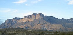
- This photo of the Guadalupe Mountains was taken just before sunset and the lighting is such that it appears to be a painting. The Guadalupe Mountain range includes the highest summit in Texas, Guadalupe Peak (8,749 ft or 2,667 m), and the "signature peak" of West Texas, El Capitan.
- Articles this image appears in
- Guadalupe Mountains
- Creator
- Leaflet
- Support as nominator --Leaflet (talk) 02:16, 20 August 2008 (UTC)
- Weak Oppose It's a nice photo, but it's grainy and the background is very light/dull. Contrast seems to need some work. Can you edit it some to give it some more... pizzazz?? Wadester16 (talk) 05:11, 20 August 2008 (UTC)
- Oppose. Not a bad photograph, but El Capitan is a very frequently photographed subject, and there are many examples that are much better than this. As a result, this can't ever exemplify Wikipedia's "best work" (the criteria for FPC). The trees in the foreground obscuring the subject also don't help either, and these can't be cropped out unfortunately. Mostlyharmless (talk) 07:05, 20 August 2008 (UTC)
- Oppose The telephone pole in the middle kills it. Clegs (talk) 14:50, 20 August 2008 (UTC)
- Oppose — The telephone pole is distracting and the mountains themselves look dull. Maybe a panorama would be better. — JuWiki (Talk <> Resources) 17:46, 20 August 2008 (UTC)
- Reluctant oppose! That's exactly what mountains look like in the western US deserts, but the pole is too distracting. sorry!
- Oppose - dull colors and the supposedly main subject is distracted by the bush and sticks in front.--Avala (talk) 12:50, 21 August 2008 (UTC)
- Question is it going too far to airbrush out the pole? --Uncle Bungle (talk) 23:48, 21 August 2008 (UTC)
- Comment This photo still has no chance of promotion but here is a version sans telephone pole and offending sagebrush (see Edit 1). I still think this photo looks a bit like an oil painting. Leaflet (talk) 05:17, 22 August 2008 (UTC)
- Oppose The image is a snapshot. Also, I find the brush in the lower left corner distracting (in edit 1). SpencerT♦C 11:55, 22 August 2008 (UTC)
Not promoted --Leaflet (talk) 14:25, 22 August 2008 (UTC)
