Typeface

A typeface (or font family) is a design of letters, numbers and other symbols, to be used in printing or for electronic display.[1] Most typefaces include variations in size (e.g., 24 point), weight (e.g., light, bold), slope (e.g., italic), width (e.g., condensed), and so on. Each of these variations of the typeface is a font.
There are thousands of different typefaces in existence, with new ones being developed constantly.
The art and craft of designing typefaces is called type design. Designers of typefaces are called type designers and are often employed by type foundries. In desktop publishing, type designers are sometimes also called "font developers" or "font designers" (a typographer is someone who uses typefaces to design a page layout).
Every typeface is a collection of glyphs, each of which represents an individual letter, number, punctuation mark, or other symbol. The same glyph may be used for characters from different writing systems, e.g. Roman uppercase A looks the same as Cyrillic uppercase А and Greek uppercase alpha (Α). There are typefaces tailored for special applications, such as cartography, astrology or mathematics.
Terminology
[edit]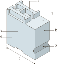
In professional typography,[a] the term typeface is not interchangeable with the word font (originally "fount" in British English, and pronounced "font"), because the term font has historically been defined as a given alphabet and its associated characters in a single size. For example, 8-point Caslon Italic was one font, and 10-point Caslon Italic was another. Historically, a font came from a type foundry as a set of "sorts", with number of copies of each character included.
As the range of typeface designs increased and requirements of publishers broadened over the centuries, fonts of specific weight (blackness or lightness) and stylistic variants (most commonly regular or roman as distinct from italic, as well as condensed) have led to font families, collections of closely related typeface designs that can include hundreds of styles. A typeface family is typically a group of related typefaces which vary only in weight, orientation, width, etc., but not design. For example, Times is a typeface family, whereas Times Roman, Times Italic and Times Bold are individual typefaces making up the Times family. Typeface families typically include several typefaces, though some, such as Helvetica, may consist of dozens of fonts. In traditional typography, a font family is a set of fonts within the same typeface: for example Times Roman 8, Times Roman 10, Times Roman 12 etc. In web typography (using span style="font-family:), a 'font family' equates to a 'typeface family' or even to a very broad category such as sans-serif that encompass many typeface families.
Another way to look at the distinction between font and typeface is that a font is the vessel (e.g. the software) that allows you to use a set of characters with a given appearance, whereas a typeface is the actual design of such characters.[2] Therefore, a given typeface, such as Times, may be rendered by different fonts, such as computer font files created by this or that vendor, a set of metal type characters etc. In the metal type era, a font also meant a specific point size, but with digital scalable outline fonts this distinction is no longer valid, as a single font may be scaled to any size.
The first "extended" font families, which included a wide range of widths and weights in the same general style emerged in the early 1900s, starting with ATF's Cheltenham (1902–1913), with an initial design by Bertram Grosvenor Goodhue, and many additional faces designed by Morris Fuller Benton.[3] Later examples include Futura, Lucida, ITC Officina. Some became superfamilies as a result of revival, such as Linotype Syntax, Linotype Univers; while others have alternate styling designed as compatible replacements of each other, such as Compatil, Generis.
Font superfamilies began to emerge when foundries began to include typefaces with significant structural differences, but some design relationship, under the same general family name. Arguably the first superfamily was created when Morris Fuller Benton created Clearface Gothic for ATF in 1910, a sans serif companion to the existing (serifed) Clearface. The superfamily label does not include quite different designs given the same family name for what would seem to be purely marketing, rather than design, considerations: Caslon Antique, Futura Black and Futura Display are structurally unrelated to the Caslon and Futura families, respectively, and are generally not considered part of those families by typographers, despite their names.
Additional or supplemental glyphs intended to match a main typeface have been in use for centuries. In some formats they have been marketed as separate fonts. In the early 1990s, the Adobe Systems type group introduced the idea of expert set fonts, which had a standardized set of additional glyphs, including small caps, old style figures, and additional superior letters, fractions and ligatures not found in the main fonts for the typeface. Supplemental fonts have also included alternate letters such as swashes, dingbats, and alternate character sets, complementing the regular fonts under the same family.[4] However, with introduction of font formats such as OpenType, those supplemental glyphs were merged into the main fonts, relying on specific software capabilities to access the alternate glyphs.
Since Apple's and Microsoft's operating systems supported different character sets in the platform related fonts, some foundries used expert fonts in a different way. These fonts included the characters which were missing on either Macintosh or Windows computers, e.g. fractions, ligatures or some accented glyphs. The goal was to deliver the whole character set to the customer regardless of which operating system was used.
Sizing
[edit]The size of typefaces and fonts is traditionally measured in points;[5] point has been defined differently at different times, but now the most popular is the Desktop Publishing point of 1⁄72 in (0.0139 in or 0.35 mm). When specified in typographic sizes (points, kyus), the height of an em-square, an invisible box which is typically a bit larger than the distance from the tallest ascender to the lowest descender, is scaled to equal the specified size.[6] For example, when setting Helvetica at 12 point, the em square defined in the Helvetica font is scaled to 12 points or 1⁄6 in or 4.2 mm. Yet no particular element of 12-point Helvetica need measure exactly 12 points.
Frequently measurement in non-typographic units (feet, inches, meters) will be of the cap-height, the height of the capital letters. Font size is also commonly measured in millimeters (mm) and qs (a quarter of a millimeter, kyu in romanized Japanese) and inches.
History
[edit]Type foundries have cast fonts in lead alloys from the 1450s until the present, although wood served as the material for some large fonts called wood type during the 19th century, particularly in the United States. In the 1890s, the mechanization of typesetting allowed automated casting of fonts on the fly as lines of type in the size and length needed. This was known as continuous casting, and remained profitable and widespread until its demise in the 1970s. The first machine of this type was the Linotype machine, invented by Ottmar Mergenthaler.[7]
During a brief transitional period (c. 1950s–1990s), photographic technology, known as phototypesetting, utilized tiny high-resolution images of individual glyphs on a film strip (in the form of a film negative, with the letters as clear areas on an opaque black background). A high-intensity light source behind the film strip projected the image of each glyph through an optical system, which focused the desired letter onto the light-sensitive phototypesetting paper at a specific size and position. This photographic typesetting process permitted optical scaling, allowing designers to produce multiple sizes from a single font, although physical constraints on the reproduction system used still required design changes at different sizes; for example, ink traps and spikes to allow for spread of ink encountered in the printing stage. Manually operated photocomposition systems using fonts on filmstrips allowed fine kerning between letters without the physical effort of manual typesetting, and spawned an enlarged type design industry in the 1960s and 1970s.[citation needed]
By the mid-1970s, all of the major typeface technologies and all their fonts were in use: letterpress; continuous casting machines; phototypositors; computer-controlled phototypesetters; and the earliest digital typesetters – bulky machines with primitive processors and CRT outputs. From the mid-1980s, as digital typography has grown, users have almost universally adopted the American spelling font, which has come to primarily refer to a computer file containing scalable outline letterforms (digital font), in one of several common formats. Some typefaces, such as Verdana, are designed primarily for use on computer screens.[8]
Digital type
[edit]
Digital type became the dominant form of type in the late 1980s and early 1990s. Digital fonts store the image of each character either as a bitmap in a bitmap font, or by mathematical description of lines and curves in an outline font, also called a vector font. Bitmap fonts were more commonly used in the earlier stages of digital type, and are rarely used today. These bitmapped typefaces were first produced by Casady & Greene, Inc. and were also known as Fluent Fonts. Fluent Fonts became mostly obsolete with the creation of downloadable PostScript fonts, and these new fonts are called Fluent Laser Fonts (FLF).
When an outline font is used, a rasterizing routine (in the application software, operating system or printer) renders the character outlines, interpreting the vector instructions to decide which pixels should be black and which ones white. Rasterization is straightforward at high resolutions such as those used by laser printers and in high-end publishing systems. For computer screens, where each individual pixel can mean the difference between legible and illegible characters, some digital fonts use hinting algorithms to make readable bitmaps at small sizes.
Digital fonts may also contain data representing the metrics used for composition, including kerning pairs, component creation data for accented characters, glyph substitution rules for Arabic typography and for connecting script faces, and for simple everyday ligatures like "fl". Common font formats include TrueType, OpenType and PostScript Type 1, while Metafont is still used by TeX and its variants. Applications using these font formats, including the rasterizers, appear in Microsoft and Apple Computer operating systems, Adobe Systems products and those of several other companies. Digital fonts are created with font editors such as FontForge, RoboFont, Glyphs, Fontlab's TypeTool, FontLab Studio, Fontographer, or AsiaFont Studio.
Typeface anatomy
[edit]Typographers have developed a comprehensive vocabulary for describing the many aspects of typefaces and typography. Some vocabulary applies only to a subset of all scripts. Serifs, for example, are a purely decorative characteristic of typefaces used for European scripts, whereas the glyphs used in Arabic or East Asian scripts have characteristics (such as stroke width) that may be similar in some respects but cannot reasonably be called serifs and may not be purely decorative.
Serifs
[edit]| Sans serif font | |

|
Serif font |

|
Serif font with serifs highlighted in red |
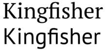
Typefaces can be divided into two main categories: serif and sans serif. Serifs comprise the small features at the end of strokes within letters. The printing industry refers to typeface without serifs as sans serif (from French sans, meaning without), or as grotesque (or, in German, grotesk).
Great variety exists among both serif and sans serif typefaces. Both groups contain faces designed for setting large amounts of body text, and others intended primarily as decorative. The presence or absence of serifs represents only one of many factors to consider when choosing a typeface.
Typefaces with serifs are often considered easier to read in long passages than those without. Studies on the matter are ambiguous, suggesting that most of this effect is due to the greater familiarity of serif typefaces. As a general rule, printed works such as newspapers and books almost always use serif typefaces, at least for the text body. Websites do not have to specify a font and can simply respect the browser settings of the user. But of those web sites that do specify a font, most use modern sans serif fonts, because it is commonly believed that, in contrast to the case for printed material, sans serif fonts are easier than serif fonts to read on the low-resolution computer screen.
Proportion
[edit]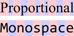
A proportional typeface, also called variable-width typeface, contains glyphs of varying widths, while a monospaced (non-proportional or fixed-width) typeface uses a single standard width for all glyphs in the font. Duospaced fonts are similar to monospaced fonts, but characters can also be two character widths instead of a single character width.
Many people generally find proportional typefaces nicer-looking and easier to read, and thus they appear more commonly in professionally published printed material.[citation needed] For the same reason, GUI computer applications (such as word processors and web browsers) typically use proportional fonts. However, many proportional fonts contain fixed-width (tabular) numerals so that columns of numbers stay aligned.[9]
Monospaced typefaces function better for some purposes because their glyphs line up in neat, regular columns. No glyph is given any more weight than another. Most manually operated typewriters use monospaced fonts. So do text-only computer displays and third- and fourth-generation game console graphics processors, which treat the screen as a uniform grid of character cells. Most computer programs which have a text-based interface (terminal emulators, for example) use only monospaced fonts (or add additional spacing to proportional fonts to fit them in monospaced cells) in their configuration. Monospaced fonts are commonly used by computer programmers for displaying and editing source code so that certain characters (for example parentheses used to group arithmetic expressions) are easy to see.[10][better source needed]
ASCII art usually requires a monospaced font for proper viewing, with the exception of Shift JIS art which takes advantage of the proportional characters in the MS PGothic font. In a web page, the <tt> </tt>, <code> </code> or <pre> </pre> HTML tags most commonly specify monospaced fonts. In LaTeX, the verbatim environment or the Teletype font family (e.g., \texttt{...} or {\ttfamily ...}) uses monospaced fonts (in TeX, use {\tt ...}).
Any two lines of text with the same number of characters in each line in a monospaced typeface should display as equal in width, while the same two lines in a proportional typeface may have radically different widths. This occurs because in a proportional font, glyph widths vary, such that wider glyphs (typically those for characters such as W, Q, Z, M, D, O, H, and U) use more space, and narrower glyphs (such as those for the characters i, t, l, and 1) use less space than the average.
In the publishing industry, it was once the case that editors read manuscripts in monospaced fonts (typically Courier) for ease of editing and word count estimates, and it was considered discourteous to submit a manuscript in a proportional font.[citation needed] This has become less universal in recent years, such that authors need to check with editors as to their preference, though monospaced fonts are still the norm.
Font metrics
[edit]
Most scripts share the notion of a baseline: an imaginary horizontal line on which characters rest. In some scripts, parts of glyphs lie below the baseline. The descent spans the distance between the baseline and the lowest descending glyph in a typeface, and the part of a glyph that descends below the baseline has the name descender. Conversely, the ascent spans the distance between the baseline and the top of the glyph that reaches farthest from the baseline. The ascent and descent may or may not include distance added by accents or diacritical marks.
In the Latin, Greek and Cyrillic (sometimes collectively referred to as LGC) scripts, one can refer to the distance from the baseline to the top of regular lowercase glyphs (mean line) as the x-height, and the part of a glyph rising above the x-height as the ascender. The distance from the baseline to the top of the ascent or a regular uppercase glyphs (cap line) is also known as the cap height.[11] The height of the ascender can have a dramatic effect on the readability and appearance of a font. The ratio between the x-height and the ascent or cap height often serves to characterize typefaces.
Typefaces that can be substituted for one another in a document without changing the document's text flow are said to be "metrically identical" (or "metrically compatible").[12][13][14] Several typefaces have been created to be metrically compatible with widely used proprietary typefaces to allow the editing of documents set in such typefaces in digital typesetting environments where these typefaces are not available. For instance, the free and open-source Liberation fonts and Croscore fonts have been designed as metrically compatible substitutes for widely used Microsoft fonts.[15][16]
Optical sizing
[edit]During the metal type era, all type was cut in metal and could only be printed at a specific size. It was a natural process to vary a design at different sizes, making it chunkier and clearer to read at smaller sizes.[17][18] Many digital typefaces are offered with a range of fonts (or a variable font axis) for different sizes, especially designs sold for professional design use. The art of designing fonts for a specific size is known as optical sizing. Others will be offered in only one style, but optimised for a specific size. Optical sizes are particularly common for serif fonts, since the fine detail of serif fonts can need to be bulked up for smaller sizes.[19][20][21]
Typefaces may also be designed differently considering the type of paper on which they will be printed. Designs to be printed on absorbent newsprint paper will be more slender as the ink will naturally spread out as it absorbs into the paper, and may feature ink traps: areas left blank into which the ink will soak as it dries. These corrections will not be needed for printing on high-gloss cardboard or display on-screen. Fonts designed for low-resolution displays, meanwhile, may avoid pure circles, fine lines and details a screen cannot render.[22]
Typesetting numbers
[edit]

Most typefaces, especially modern designs, include a complementary set of numeric digits.[23]
Numbers can be typeset in two main independent sets of ways: lining and non-lining figures, and proportional and tabular styles.[b]
Most modern typefaces set numeric digits by default as lining figures, which are the height of upper-case letters. Non-lining figures, styled to match lower-case letters, are often common in fonts intended for body text, as they are thought to be less disruptive to the style of running text. They are also called lower-case numbers or text figures for the same reason.
Tabular figures
[edit]The horizontal spacing of digits can also be proportional, with a character width tightly matching the width of the figure itself, or tabular, where all digits have the same width. Proportional spacing places the digits closely together, reducing empty space in a document, and is thought to allow the numbers to blend into the text more effectively.[24] As tabular spacing makes all numbers with the same number of digits the same width, it is used for typesetting documents such as price lists, stock listings and sums in mathematics textbooks, all of which require columns of numeric figures to line up on top of each other for easier comparison.[25] Tabular spacing is also a common feature of simple printing devices such as cash registers and date-stamps.[26]
Characters of uniform width are a standard feature of so-called monospaced fonts, used in programming and on typewriters. However, many fonts that are not monospaced use tabular figures. More complex font designs may include two or more combinations with one as the default and others as alternate characters.[27] Of the four possibilities, non-lining tabular figures are particularly rare since there is no common use for them.[28][29][30]
Fonts intended for professional use in documents such as business reports may also make the bold-style tabular figures take up the same width as the regular (non-bold) numbers, so a bold-style total would appear just as wide as the same sum in regular style.[31][24][32]
Style of typefaces
[edit]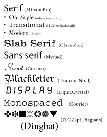
Because an abundance of typefaces has been created over the centuries, they are commonly categorized according to their appearance. At the highest level (in the context of Latin-script fonts), one can differentiate Roman, Blackletter, and Gaelic types. Roman types are in the most widespread use today, and are sub-classified as serif, sans serif, ornamental, and script types. Historically, the first European fonts were blackletter, followed by Roman serif, then sans serif and then the other types. The use of Gaelic faces was restricted to the Irish language, though these form a unique if minority class. Typefaces may be monospaced regardless of whether they are Roman, Blackletter, or Gaelic. Symbol typefaces are non-alphabetic. The Cyrillic script comes in two varieties, Roman-appearance type (called гражданский шрифт graždanskij šrift) and traditional Slavonic type (called славянский шрифт slavjanskij šrift).[citation needed]
Roman typefaces
[edit]Serif typefaces
[edit]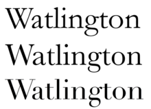
Serif, or Roman, typefaces are named for the features at the ends of their strokes. Times New Roman and Garamond are common examples of serif typefaces. Serif fonts are probably the most used class in printed materials, including most books, newspapers and magazines. Serif fonts are often classified into three subcategories: Old Style, Transitional, and Didone (or Modern), representative examples of which are Garamond, Baskerville, and Bodoni respectively.
Old Style typefaces are influenced by early Italian lettering design.[33] Modern fonts often exhibit a bracketed serif and a substantial difference in weight within the strokes. Though some argument exists as to whether Transitional fonts exist as a discrete category among serif fonts, Transitional fonts lie somewhere between Old Style and Modern style typefaces. Transitional fonts exhibit a marked increase in the variation of stroke weight and a more horizontal serif compared to Old Style. Slab serif designs have particularly large serifs, and date to the early nineteenth century. The earliest known slab serif font was first shown around 1817 by the English typefounder Vincent Figgins.[34]
Roman, italic, and oblique are also terms used to differentiate between upright and two possible slanted forms of a typeface. Italic and oblique fonts are similar (indeed, oblique fonts are often simply called italics) but there is strictly a difference: italic applies to fonts where the letter forms are redesigned, not just slanted. Almost all serif faces have italic forms; some sans-serif faces have oblique designs. (Most faces do not offer both as this is an artistic choice by the font designer about how the slanted form should look.)[35]
Sans-serif typefaces
[edit]
Sans serif (lit. without serif) designs appeared relatively recently in the history of type design. The first, similar to slab serif designs, was shown in 1816 by William Caslon IV. Many have minimal variation in stroke width, creating the impression of a minimal, simplified design. When first introduced, the faces were disparaged as "grotesque" (or "grotesk") and "gothic":[36] but by the late nineteenth century were commonly used for san-serif without negative implication.[37]
The major sub-classes of Sans-serif are "Grotesque", "Neo-grotesque", "Geometric" and "Humanist".
Blackletter typefaces
[edit]"Blackletter" is the name of the class of typefaces used with the earliest printing presses in Europe, which imitated the calligraphy style of that time and place. Various forms exist including textualis, rotunda, schwabacher and fraktur. (Some people refer to Blackletter as "gothic script" or "gothic font", though the term "Gothic" in typography refers to sans serif typefaces.[37])
Gaelic typefaces
[edit]Gaelic fonts were first used for the Irish language in 1571, and were used regularly for Irish until the early 1960s, though they continue to be used in display type and type for signage. Their use was effectively confined to Ireland, though Gaelic typefaces were designed and produced in France, Belgium, and Italy. Gaelic typefaces make use of insular letterforms, and early fonts made use of a variety of abbreviations deriving from the manuscript tradition.[38][39] Various forms exist, including manuscript, traditional, and modern styles, chiefly distinguished as having angular or uncial features.[40]
Monospaced typefaces
[edit]
Monospaced fonts are typefaces in which every glyph is the same width (as opposed to variable-width fonts, where the w and m are wider than most letters, and the i is narrower). The first monospaced typefaces were designed for typewriters, which could only move the same distance forward with each letter typed. Their use continued with early computers, which could only display a single font. Although modern computers can display any desired typeface, monospaced fonts are still important for computer programming, terminal emulation, and for laying out tabulated data in plain text documents; they may also be particularly legible at small sizes due to all characters being quite wide.[41] Examples of monospaced typefaces are Courier, Prestige Elite, Fixedsys, and Monaco. Most monospaced fonts are sans-serif or slab-serif as these designs are easiest to read printed small or display on low-resolution screens, though many exceptions exist.
CJK typefaces
[edit]CJK, or Chinese, Japanese and Korean typefaces consist of large sets of glyphs. These typefaces originate in the glyphs found in brush calligraphy during the Tang dynasty. These later evolved into the Song style (宋体字) which used thick vertical strokes and thin horizontal strokes in wood block printing.[42]
The glyphs found in CJK fonts are designed to fit within a square. This allows for regular vertical, horizontal, right-to-left and left-to-right orientations. CJK fonts can also include an extended set of monospaced Latin characters. This commonly results in complex, sometimes contradictory rules and conventions for mixing languages in type.
Mincho
[edit]With CJK typefaces, Mincho style tends to be something like Serifs for the end of stems, and in fact includes Serifed glyphs for Extended Latin and Cyrillic sets within a typeface.
Gothic
[edit]With CJK typefaces, Goth style tends to be something like Sans Serifs with squarish, cut off end-caps for the end of stems, and in fact includes Sans Serif glyphs for Extended Latin and Cyrillic sets within a typeface.
Maru
[edit]With CJK typefaces, Maru style tends to be something like Sans Serifs with rounded end-caps for the end of stems, and in fact includes Rounded Sans Serif glyphs for Extended Latin and Cyrillic sets within a typeface.
Display type
[edit]
Display type refers to the use of type at large sizes, perhaps 30 points or larger. Some typefaces are considered useful solely at display sizes, and are known as display faces. Most effect typefaces are display types. Common features of display type include tighter default letter spacing, finer details and serifs, slightly more condensed letter shapes and larger differences between thick and thin strokes; many of these are most visible in serif designs. Many display typefaces in the past such as those intended for posters and newspaper headlines were also only cut in capitals, since it was assumed lower-case would not be needed, or at least with no italics. This was true of many early sans-serif fonts.
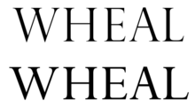
In the days of metal type, when each size was cut individually, types intended for display use were often adjusted accordingly. These modifications continued to be made even after fonts started to be made by scaling using a pantograph, but began to fade away with the advent of phototypesetting and then digital fonts, which can both be printed at any size. Premium digital fonts used for magazines, books and newspapers do often include display variants, but they are often not included with typefaces bundled with operating systems and desktop publishing software.[43][44] Display typefaces in the letterpress period were often made as wood type, being lighter than metal.
Decades into the desktop publishing revolution, few typographers with metal foundry type experience are still working, and few digital typefaces are optimized specifically for different sizes, so the misuse of the term display typeface as a synonym for ornamental type has become widespread; properly speaking, ornamental typefaces are a subcategory of display typefaces. At the same time, with new printing techniques, typefaces have largely replaced hand-lettering for very large signs and notices that would once have been painted or carved by hand.[45]
Script typefaces
[edit]
Script typefaces imitate handwriting or calligraphy. They do not lend themselves to quantities of body text, as people find them harder to read than many serif and sans-serif typefaces; they are typically used for logos or invitations. Historically, most lettering on logos, displays, shop frontages did not use fonts but was rather custom-designed by signpainters and engravers, so many emulate the styles of hand-drawn signs from different historical periods. The genre has developed rapidly in recent years due to modern font formats allowing more complex simulations of handwriting.[46] Examples include Coronet (a quite simple design from 1937) and Zapfino (a much more complicated digital design).
Mimicry typefaces
[edit]
Mimicry typefaces are decorative typefaces that have been designed to represent characters of one alphabet but at the same time evoke another writing system.[47] This group includes Roman typefaces designed to appear as Arabic, Chinese characters (Wonton fonts), Cyrillic (Faux Cyrillic), Indic scripts, Greek (an example being Lithos), Hebrew (Faux Hebrew), Kana, or Thai. These are used largely for the purpose of novelty to make something appear foreign, or to make businesses offering foreign products, such as restaurants, clearly stand out.[48][49][50] This typographic mimicry is also known as a faux font (named faux x, where x is usually a language script), pseudoscript, ethnic typeface, simulation typeface or a "foreign look" font.[51][52][53]
Reverse-contrast typefaces
[edit]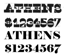
A reverse-contrast type is a typeface in which the stress is reversed from the norm: instead of the vertical lines being the same width or thicker than horizontals, which is normal in Latin-alphabet printing, the horizontal lines are the thickest.[54] Reverse-contrast types are rarely used for body text, and are particularly common in display applications such as headings and posters, in which their unusual structure may be particularly eye-catching.[55] First seen in London in 1821, they were particularly common in the mid- to late nineteenth century in American and British printing and have been revived occasionally since then. They effectively become slab serif designs because of the serifs becoming thick, and are often characterised as part of that genre. In recent times, the reverse-contrast effect has been extended to other kinds of typeface, such as sans-serif designs.[56]
Effect typefaces
[edit]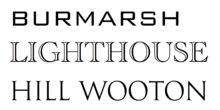
Some typefaces have a structure that suggests a three-dimensional letter, such as letters carved into stone. An example of this is the genre known as 'inline', 'block' 'outline' or 'shadowed' typefaces. This renders the interior of glyphs in the background color, with a thin line around the edges of the glyphs. In some cases, the outline shows the glyph filled in with the foreground color, surrounded a thin outline mirroring the edges separated by a small gap. (This latter style is often used with "college" typefaces.) Colorized block lettering is often seen in carefully rendered graffiti.
A "shadow" effect can also be either designed into a typeface or added to an existing typeface. Designed-in shadows can be stylized or connected to the foreground. An after-market shadow effect can be created by making two copies of each glyph, slightly offset in a diagonal direction and possibly in different colors. Drop shadows can also be dynamically created by rendering software. The shadow effect is often combined with the outline effect, where the top layer is shown in white with black outline and the bottom layer in black, for greater contrast. An example typeface with an 'inline' effect is Imprint Shadowed, where the shadowed version is more widely distributed than the regular design.[57]
Small print typefaces
[edit]Some typefaces are specifically designed to be printed at small sizes, for example in telephone directories or on newsprint paper. Bell Gothic and Bell Centennial, commissioned for telephone directories, are notable examples of this. Small-print designs often feature a large x-height, and a chunky design. Some fonts used at such sizes may be members of a larger typeface family joining members for normal sizes. For example, the Times New Roman family contains some designs intended for small print use, as do many families with optical sizes such as Minion.
In the metal type era, typefaces intended to be printed small contained ink traps, small indentations at the junctions of strokes that would be filled up with ink spreading out, maintaining the intended appearance of the type design. Without ink traps, the excess ink would blob and ruin the crisp edge. At larger sizes, these ink traps were not necessary, so display faces did not have them. They have also been removed from most digital fonts, as these will normally be viewed on screen or printed through inkjet printing, laser printing, offset lithography, electrophotographic printing or other processes that do not show the ink spread of letterpress. Ink traps have remained common on designs intended to be printed on low-quality, absorbent paper, especially newsprint and telephone directories.
Typeface family
[edit]A typeface family (or type family) is a set of typefaces that share a common design concept.[58] The simplest typeface family has just a 'regular' face and an 'oblique' face (or 'Roman' and 'Italic'); the next step up adds boldface versions of these types. A modern professional typeface family (such as Danish Standard no. 737) might have as many as 54 different styles:[59] condensed, normal and expanded forms of each of 'thin', 'extralight', 'light', 'regular', 'medium', 'demibold', 'bold', 'extrabold' and 'bold' types, in regular and italic.
Texts used to demonstrate typefaces
[edit]
A sentence that uses all of the alphabet (a pangram), such as "The quick brown fox jumps over the lazy dog", is often used as a design aesthetic tool to demonstrate the personality of a typeface's characters in a setting (because it displays all the letters of the alphabet). For extended settings of typefaces graphic designers often use nonsense text (commonly referred to as greeking), such as lorem ipsum or Latin text such as the beginning of Cicero's In Catilinam. Greeking is used in typography to determine a typeface's colour, or weight and style, and to demonstrate an overall typographic aesthetic prior to actual type setting. Another common demonstration word is "Hamburgevons".
Non-character typefaces
[edit]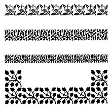
The process of printing typefaces has historically been far simpler than commissioning and engraving custom illustrations, especially as many non-text features of printed works like symbols and borders were likely to be reused by a printer in future.[60][61][62] Non-character typefaces have therefore been created for elements of documents that are not letters but are likely to be reused regularly.[63] These include:
Ornamental typefaces
[edit]Ornamental (also known as novelty or sometimes display) typefaces are used to decorate a page. Historically complex interlocking patterns known as arabesques were common in fine printing, as were floral borders known as fleurons evoking hand-drawn manuscripts.
In the metal type era, type-founding companies often would offer pre-formed illustrations as fonts showing objects and designs likely to be useful for printing and advertisements, the equivalent of modern clip art and stock photographs.[64] As examples, the American Type Founders specimen of 1897 offered designs including baseball players, animals, Christmas wreaths, designs for cheques, and emblems such as state seals for government printing.[65] The practice has declined as printing custom illustrations and colour printing using processes such as lithography has become cheaper, although illustration typefaces are still sold by some companies. See above for the historical definition of display typeface.
Symbol typefaces
[edit]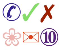
Symbol, or dingbat, typefaces consist of symbols (such as decorative bullets, clock faces, railroad timetable symbols, CD-index, or TV-channel enclosed numbers) rather than normal text characters. Common, widely used symbol typeface releases include Zapf Dingbats and Wingdings, though many may be created internally by a publication for its own use and some typefaces may have a symbol range included.[66] Marlett is an example of a font used by Windows to draw elements of windows and icons.
Emoji
[edit]Emoji are pictograms that can be used and displayed inline with text.[67][68] They are similar to previous symbol typefaces, but with a much larger range of characters, such as symbols for common objects, animals, food types, weather and emotions. Originally developed in Japan, they are now commonly installed on many computer and smartphone operating systems.[69][70] Following standardisation and inclusion in the Unicode standard, allowing them to be used internationally, the number of Emoji characters has rapidly increased to meet the demands of an expanded range of cultures using them; unlike many previous symbol typefaces, they are interchangeable with the ability to display the pictures of the same meaning in a range of fonts on different operating systems.[71][72] The popularity of emoji has meant that characters have sometimes gained culture-specific meanings not inherent to the design.[73][74][75] Both colour and monochrome emoji typefaces exist, as well as at least one animated design.[76]
Music typefaces
[edit]Typefaces that include musical notes and other needed symbols have been developed to print sheet music.
Intellectual property
[edit]See also
[edit]- ATypI – International typography organisation
- Calligraphy – Visual art related to writing
- Character (symbol) – Character as a semiotic sign or symbol
- Computer font – Digital description of a typographical font
- Font – Particular size, weight and style of a typeface
- Font family (HTML) – CSS property in HTML
- Font management software – Utility software
- FontLab – Font editor
- Intellifont – Scalable font technology
- Kerning – Process in typography
- Language – Structured system of communication
- Letterform – Term to refer to a letter's shape
- List of typefaces and Category:Typeface samples
- List of type designers
- List of typographic features
- Sort (typesetting), cast metal type for printing
- Typeface anatomy – Graphic components of typeface letters
- Type design – Art of designing typefaces and fonts
- Type Directors Club – Organization for better typography
- Type foundry – Company that designs typefaces (fonts)
- Typesetting – Composition of text by means of arranging physical types or digital equivalents
- Typographic unit – Units of measurement
- Typography – Art of arranging type
- Unicode font – Computer font that maps glyphs to code points defined in the Unicode Standard
Explanatory notes
[edit]References
[edit]- ^ "typeface". Cambridge Academic Content Dictionary. Retrieved 22 December 2019.
- ^ "Lettering is not type". Archived from the original on 2022-02-02. Retrieved 2020-11-24.
- ^ McGrew, Mac. American Metal Typefaces of the Twentieth Century (second edition). New Castle, DE: Oak Knoll Books, 1993: 85–87. ISBN 0-938768-39-5.
- ^ "Expert Font". Typophile.com. Archived from the original on 3 January 2018.
Expert set fonts are becoming less common with advent of OpenType which allows for these extras to be included in the same font that contains the default glyphs, accessed more easily, and inserted into a layout without damaging the underlying text.
- ^ Graham, Lisa. Basics of Design: Layout & Typography for Beginners. New York: Delmar, 2002: 184. ISBN 0-7668-1362-2.
- ^ Apple's TrueType Reference Manual Retrieved on 2009-06-21
- ^ "Science history: the Linotype machine". Cosmos Magazine. 2019-06-30. Retrieved 2020-11-09.
- ^ "Interview with Virginia Howlett, mother of Verdana". Dmxzone.com. 2004-06-24. Retrieved 2013-09-21.
- ^ Stocks, Elliot Jay. "Understanding numerals". Google Fonts. Introducing type.
- ^ "Why use monospace fonts in your IDE?". Retrieved 2009-02-22.
- ^ Cullen, Kristin. Layout Workbook: A Real-World Guide to Building Pages in Graphic Design, Jul 2005: 92
- ^ Henderson, L.R.; Mumford, A.M. (20 May 2014). The Computer Graphics Metafile. Butterworth-Heinemann. p. 375. ISBN 9781483144849.
- ^ Mumford, Anne M.; Skall, Mark (7 Mar 2013). CGM in the Real World. Springer Science & Business Media. p. 102. ISBN 9783642736292.
- ^ Raggi, Emilio; Thomas, Keir; van Vugt, Sander (17 Dec 2011). Beginning Ubuntu Linux: Natty Narwhal Edition. Apress. p. 286. ISBN 9781430236276.
- ^ Esfahbod, Behdad; TAGOH, Akira; Steffens, Jan; Crozat, Frederic. "30-metric-aliases.conf". GitHub. fontconfig. Retrieved 1 May 2016.
- ^ Willis, Nathan (19 June 2012). "Liberation fonts and the tricky task of internationalization". LWN.net. Retrieved 26 June 2017.
- ^ Reynolds, Dan (21 May 2012). "How To Choose The Right Face For A Beautiful Body". Smashing. Retrieved 13 September 2015.
- ^ Frere-Jones, Tobias. "MicroPlus". Frere-Jones Type. Retrieved 1 December 2015.
- ^ Ahrens; Mugikura. "Size-specific Adjustments to Type Designs". Just Another Foundry. Retrieved 21 November 2014.
- ^ Coles, Stephen. "Book Review: Size-specific Adjustments to Type Designs". Typographica. Retrieved 21 November 2014.
- ^ Kupferschmid, Indra (13 May 2012). "Multi-axes type families". kupferschrift. Retrieved 8 December 2014.
- ^ Reynolds; Koeberlin (5 April 2013). "Socialist TV Typeface Videtur Finally Freed". FontFont. Retrieved 24 May 2015.
- ^ "Numbers". Hoefler & Frere-Jones. Retrieved 2015-10-06.
- ^ a b "Gotham: Numerics". Hoefler & Frere-Jones. Retrieved 2014-08-04.
- ^ Strizver, Elaine. "Proportional vs. Tabular Figures". fonts.com. Monotype Imaging. Retrieved 2014-08-04.
- ^ "Revenue". Hoefler & Frere-Jones. Retrieved 2014-08-04.
- ^ Butterick, Matthew. "Alternate figures: consider the context". Butternick's Practical Typography.
- ^ Saller, Carol. "Old-Style Versus Lining Figures". Chronicle of Higher Education. Retrieved 2014-08-04.
- ^ Bergsland, David. "Using numbers in the proper case". Design & Publishing Center. Archived from the original on 19 October 2007. Retrieved 4 August 2014.
- ^ Peters, Yves. "OpenType at Work | Figure Styles". Type Network. Retrieved 30 November 2019.
- ^ Hoefler, Jonathan. "Fonts for Complex Data". Hoefler & Co. Retrieved 2018-07-29.
- ^ Schwartz, Christian. "Neue Haas Grotesk: Features". The Font Bureau, Inc. Retrieved 2013-12-23.
- ^ Carter, Day, and Meggs. Typographic Design: Form and Communication. Third Edition. Hoboken, NJ: John Wiley and Sons, 2002: 34.
- ^ Carter, Day, and Meggs. Typographic Design: Form and Communication. Third Edition. Hoboken, NJ: John Wiley and Sons, 2002: 35.
- ^ Williams, Robin. The Non-Designer's Type Book. Berkeley, CA: Peachpit Press, 1998: 16.
- ^ Phinney, Thomas (October 17, 2020). "Sans Serif: Gothic and Grotesque". Design, Technology and Grapics. Showker, Inc.
- ^ a b Berry, John. "A Neo-Grotesque Heritage". Adobe Systems. Retrieved 15 October 2015.
- ^ Lynam, E. W. 1969. The Irish character in print: 1571–1923. New York: Barnes & Noble. First printed as Oxford University Press offprint 1924 in Transactions of the Bibliographical Society, 4th Series, Vol. IV, No. 4, March 1924.
- ^ McGuinne, Dermot. Irish type design: A history of printing types in the Irish character. Blackrock: Irish Academic Press. ISBN 0-7165-2463-5
- ^ Everson, Michael (2000-06-19). "Gaelic Typefaces: History and Classification".
- ^ Spolsky, Joel (24 October 2001). "User Interface Design For Programmers". Joel On Software. Retrieved 15 July 2015.
- ^ Joseph Needham, Science & Civilisation in China, Vol. 5 Part 1, Paper & Printing, pg 224–226.
- ^ "Optical size". Adobe Systems. 2010-05-31. Archived from the original on 5 June 2010.
- ^ "Requiem: A font for all sizes". Hoefler & Frere-Jones. Retrieved 3 October 2014.
- ^ Simonson, Mark (8 February 2009). "Not a Font". Mark Simonson Studio blog. Retrieved 26 December 2014.
- ^ Shaw, Paul (7 April 2010). "Lettercentric: Type as Writing". Print. Retrieved 21 September 2015.
- ^ Silverstein, Andrew (22 July 2022). "In the rarified world of Jewish letters, a mind-boggling font of Jewish history". The Forward. Retrieved 1 September 2022.
- ^ Shaw, Paul (17 June 2009). "Stereo Types". Print Magazine. Archived from the original on 2010-01-16. Retrieved 1 October 2014.
- ^ Chachra, Deb. "Faux Devangari". HiLoBrow. Retrieved 1 October 2014.
- ^ Giampetro, Rob. "New Black Face: Neuland and Lithos as Stereotypography". Lined & Unlined. Retrieved 12 October 2021.
- ^ Paul, Sutherland (2015). "Writing System Mimicry in the Linguistic Landscape" (PDF). SOAS Working Papers in Linguistics. 17: 147–167.
- ^ Bennett, Brian P. (2017-09-25). Sacred Languages of the World: An Introduction. John Wiley & Sons. p. 166. ISBN 9781118970782.
- ^ Seargeant, Philip (2012). "Between script and language: The ambiguous ascription of 'English' in the linguistic landscape" (PDF). Linguistic landscapes, multilingualism and social change. pp. 187–200.
- ^ Schwartz, Christian; Barnes, Paul (12 July 2011). "Deep in the archives: Caslon's Italian, ca. 1821. Specimen & punches". Eye. Retrieved 10 August 2015.
- ^ Lawson, Alexander (1990). Anatomy of a typeface (1st ed.). Boston: Godine. pp. 321–323. ISBN 9780879233334.
- ^ Peters, Yves. "Fontlists: reverse contrast". Fontshop. Retrieved 15 August 2015.
- ^ "Imprint MT". Microsoft Typography. Microsoft. Retrieved 12 July 2015.
- ^ Haley, Allan (10 August 2012). "About Typeface Families" (PDF). fonts.com. Monotype Imaging Inc.
- ^ "DS 737: Shortlist / Type Design & Lettering / Typeface Family / 2023". D&AD.
- ^ Johnson, Henry Lewis (1991). Decorative ornaments and alphabets of the Renaissance : 1,020 copyright-free motifs from printed sources. New York: Dover Publications. ISBN 9780486266053.
- ^ "Hoefler Text: Arabesques". Hoefler & Frere-Jones. Retrieved 17 August 2015.
- ^ Plomer, Henry R. (1924). English printers' ornaments. Mansfield Center, CT: Martino Pub. ISBN 9781578987153. Retrieved 17 August 2015.
- ^ Johnson, Henry Lewis (1923). Historic Design in Printing. Boston, MA: Graphic Arts Company. Retrieved 17 August 2015.
- ^ Papaelias, Amy (9 November 2012). "Lady Speaker Sorts". Alphabettes. Retrieved 20 March 2016.
- ^ Specimens of type, borders, ornaments, brass rules and cuts, etc. : catalogue of printing machinery and materials, wood goods, etc. American Type Founders. 1897. p. 703. Retrieved 17 August 2015.
- ^ "Mercury Text: symbols". Hoefler & Frere-Jones. Retrieved 17 August 2015.
- ^ Blagdon, Jeff (March 4, 2013). "How emoji conquered the world". The Verge. Vox Media. Retrieved November 6, 2013.
- ^ Adam Sternbergh (November 16, 2014). "Smile, You're Speaking EMOJI: The fast evolution of a wordless tongue". New York.
- ^ Kurita; akano; Lee. "Why and how I created emoji". Ignition. Archived from the original on June 10, 2016. Retrieved August 16, 2015.
- ^ Negishi, Mayumi (26 March 2014). "Meet Shigetaka Kurita, the Father of Emoji". Wall Street Journal. Retrieved August 16, 2015.
- ^ "Emoji Additions: Animals, Compatibility, and More Popular Requests; Emoji tranche 5" (PDF). Unicode. Retrieved August 18, 2015.
- ^ "Unicode 8.0.0". Unicode Consortium. Retrieved June 17, 2015.
- ^ Hern, Alex (12 August 2015). "How to (pretend to) be young and down with the internet". The Guardian. Retrieved August 15, 2015.
- ^ Jewell, Hannah (13 December 2014). "The 31 Most Nail Care Emoji Moments Of 2014". Buzzfeed. Retrieved August 15, 2015.
- ^ Santos; Jones. "The Five Non-Negotiable Best Emojis in the Land". The Atlantic Wire. Archived from the original on August 20, 2016. Retrieved August 15, 2015.
- ^ El Khoury, Rita (December 11, 2014). "Woohoo! Animated Emoji Easter Eggs Overload The Latest Hangouts With Their Cuteness, Hehehehe". Android Police. Retrieved January 15, 2015.
- ^ "Patent #: US0D0000001". United States Patent and Trademark Office. November 9, 1842. Retrieved November 23, 2014.
Further reading
[edit]- Bringhurst, Robert (2012), The Elements of Typographic Style, Hartley & Marks
- Butterick, Matthew (2014), Butterick's Practical Typography
- Garfield, Simon (2010), Just My Type: A Book About Fonts, Profile
- Jaspert, W. P.; Berry, W. Turner; Johnson, A. F. (1953, 1958, 1962, 1970, 1983, 1986, 1990, 1991, 1993, 2001, 2008). The Encyclopedia of Typefaces. London: Blandford Press.
- Pohlen, Joep (2011), Letter Fountain, Taschen
External links
[edit]- Gaskell, Philip (Winter 1976). "A Nomenclature for the Letterforms of Roman Type" (PDF). Visible Language. 10 (1): 41–51. Archived (PDF) from the original on 23 December 2019.
- Monotype printed borders specimens
- ArchLinux list of Metric-compatible fonts
- "Cross-Script Letterforms group". Flickr.

