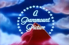
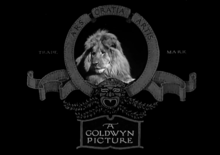
Production logo
The examples and perspective in this article may not represent a worldwide view of the subject. (December 2011) |
A production logo, studio logo,[1] vanity card, vanity plate, or vanity logo is a logo used by movie studios and television production companies to brand what they produce and to determine the production company and the distributor of a television show or film. Production logos are usually seen at the beginning of a theatrical movie or video game (an "opening logo"), and/or at the end of a television program or TV movie (a "closing logo"). Many production logos have become famous over the years, such as the 20th Century Studios' monument and searchlights and MGM's Leo the Lion. Unlike logos for other media, production logos can take advantage of motion and synchronized sound, and almost always do.
Production logos are becoming commonplace in online video platforms such as YouTube, often as "channel" branding. Online channels may have a professional production team, or may be self-produced by an individual or a sole proprietor. The barrier to entry for professional audiovisual production is constantly falling, and the professionalism of self-produced branding now often rivals traditional production modes.
History
[edit]
In the early days of Hollywood, production logos and brands were simple and very much like their print counterparts, usually appearing on title cards and in the opening credits.[2] The Paramount Pictures mountain logo hails from this era and originally featured no special effects. As the studios grew, more effort was put into their identities, and motion and sound began to be used. MGM and Universal were the first studios to take advantage of the new medium's possibilities, MGM first using Leo the Lion in 1924, adapted from Goldwyn Pictures, and Universal debuting their globe around the same time. RKO Radio Pictures used their rotating globe and radio transmission tower with a Morse code-beeping soundtrack as early as 1929.[3] In the 1930s, Twentieth Century Pictures introduced their futuristic "tower" logo, which had moving searchlights; it was carried over when they merged with Fox Film Corporation in 1935 and became 20th Century-Fox. The first version of Columbia's mascot used a sparkler to represent her torch, and Universal's globes could rotate.

The advent of television in the 1950s also opened the door to cel animation in production logos. Most studios had used cels for their animation departments' logos for some time by this point, but the demand for animation on TV, both as programming and for advertising, made more effects available for less money. TV itself started using logos on its programming: Desilu, Mark VII Productions and Revue Studios all had distinctive logotypes by the end of the decade, and Desilu's and Revue's were animated. By 1976, all of the major studios except Universal had switched their logos over to cel animation, and logos for smaller concerns and broadcasters were beginning to enter the computer age, using machines like Scanimate.
With the 1980s came a return to the older style of logos. Warner Bros., one of the first studios to switch to a cel-animated abstract logo, brought back their WB shield logo as a matte painting in 1984. TV logos began switching from cels and 2D computer graphics to 3D computer graphics around the same time, and by the end of the decade, the quality of 3D animation had improved to the point that cinema quality was possible. Paramount had introduced a digital-looking logo in late 1986, but only the foreground animation in their logo was computerized (the mountain backdrop was originally commissioned as a painting by the company, then a physical model made for the finished version). Universal's 1990 logo, introduced for its 75th anniversary, was pre-visualized with CG, but the actual logo was created using motion-control models. Throughout the 1990s, fully computer-generated logos increased in frequency. Disney and MGM were two of the last major studios to re-design their logos with computer animation; Disney debuted the 3D rendition of its castle logo with the release of Pirates of the Caribbean: Dead Man's Chest in 2006,[4] while MGM touched up its 1957 logo in 2012,[5] before switching to a completely computer-animated rendition by 2021.[6] Photorealistic CGI was also used in production logos, beginning with Warner Bros.' updated logo in 2021, which shows a realistic rendering of its studio lot including the iconic water tower.[7]
By 2007, almost all production logos have become produced (or edited) on computers, and have reached a level of sophistication equivalent to that of the best special effects. There are some exceptions; the Mutant Enemy "grr, argh" ID was shot using a camcorder and paper models, and the producers of South Park even recycled footage from an old Braniff Airlines ad for their "vanity" logo. Producer Chuck Lorre uses his production card to post a long essay or observation in small type which changes each week and requires pausing with a recording device to read.[8]
Video games have taken on production logos as their capabilities have increased, and most modern game consoles have startup logos in their firmware. In addition, games themselves now feature (sometimes elaborate) startup logos of both the companies that produce the games as well as the ones who develop them. Video game startup logos also frequently feature the logos of game engines or other middleware used in the games. As with films, the production logos are also used in trailers and commercials for the video games.[citation needed]
Many automobile manufacturers also use startup logos for their in car entertainment systems.[citation needed]
See also
[edit]References
[edit]- ^ Dee, Jake (November 17, 2023). "The Best Production Studio Logos, Ranked". Movieweb. Retrieved July 27, 2024.
- ^ "It's Surprising To See How Much The Logos Of Hollywood Movie Studios Have Changed". October 4, 2016. Archived from the original on June 13, 2018. Retrieved June 3, 2018.
- ^ Heldt, G. (2013). Music and Levels of Narration in Film: Steps Across the Border. Knowledge Unlatched. Intellect. p. 29. ISBN 978-1-78320-209-6. Retrieved May 6, 2019.
The visual logo had been used since 1929; a spinning globe with a radio transmitter on top, with letters spelling out A Radio Picture (until 1936) or An RKO Radio Picture (1936–56), and Morse code on the soundtrack.
- ^ "Old Disney magic in new animated logo". The Hollywood Reporter. Archived from the original on July 18, 2006. Retrieved July 10, 2006.
- ^ "MGM | Shine". shinestudio.com. Retrieved March 12, 2021.
- ^ "MGM Studios Unveils New Brand Evolution". March 8, 2021. Retrieved March 12, 2021.
- ^ "Warner Bros. Studio Logo". Devastudios. September 13, 2019. Retrieved March 12, 2021.
- ^ Malcom, Shawna (March 10, 2009). "Vanity cards let Lorre sound off". Variety. Archived from the original on May 19, 2012. Retrieved January 1, 2012.
